


 本文展示了如何使用纯CSS代码创建10种风格各异的Loading动画,包括不同形状、颜色和动画效果,适合前端初学者学习和借鉴。
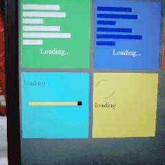
十个各自样式的Loading图 纯CSS代码
渣渣画质,样式如图
<style>
    *{
        margin: 0;
    }
    body{
        background-color: #4d4d50;
    }
    div{
        margin: 5px;
    }
    .one{
        width: 150px;
        height: 140px;
        background-color: #19a855;
        padding-top: 10px;
        float: left;
    }
    .one p,.two p{
        text-align: center;
        color: #f1f1f1;
    }
    .one .case1{
        width: 100px;
        height: 10px;
        background-color: #f1f1f1;
        animation: case1 2.25s infinite;
    }
    @keyframes case1 {
        0% {width : 0%;}
        50% {width : 90px;}
        100% {width : 0%;}
    }

    .one .case2{
        width: 10px;
        height: 10px;
        background-color: #f1f1f1;
        animation: case2 2s infinite;
    }
    @keyframes case2 {
        0% {width : 0%;}
        50% {width : 100px;}
        100% {width : 0%;}
    }

    .one .case3{
        width: 10px;
        height: 10px;
        background-color: #f1f1f1;
        animation: case3 1.75s infinite;
    }
    @keyframes case3 {
        0% {width : 0%;}
        50% {width : 95px;}
        100% {width : 0%;}
    }

    .one .case4{
        width: 10px;
        height: 10px;
        background-color: #f1f1f1;
        animation: case4 2.5s infinite;
    }
    @keyframes case4 {
        0% {width : 0%;}
        50% {width : 80px;}
        100% {width : 0%;}
    }

    .one .case5{
        width: 10px;
        height: 10px;
        background-color: #f1f1f1;
        animation: case5 1.5s infinite;
    }
    @keyframes case5 {
        0% {width : 0%;}
        50% {width : 105px;}
        100% {width : 0%;}
    }

    .one .case6{
        width: 10px;
        height: 10px;
        background-color: #f1f1f1;
        animation: case6 4s infinite;
    }
    @keyframes case6 {
        0% {width : 0%;}
        50% {width : 75px;}
        100% {width : 0%;}
    }
/* ==第二个Loading图= */
.two{
width: 150px;
height: 140px;
background-color: #3b62b8;
padding-top: 10px;
float: left;
}
.two .case1{
width: 100px;
height: 10px;
background-color: #170d74;
animation: case1 2.25s infinite;
}
    .two .case2{
        width: 10px;
        height: 10px;
        background-color: #170d74;
        animation: case2 2s infinite;
    }

    .two .case3{
        width: 10px;
        height: 10px;
        background-color: #170d74;
        animation: case3 1.75s infinite;
    }

    .two .case4{
        width: 10px;
        height: 10px;
        background-color: #170d74;
        animation: case4 2.5s infinite;
    }

    .two .case5{
        width: 10px;
        height: 10px;
        background-color: #170d74;
        animation: case5 1.5s infinite;
    }

    .two .case6{
        width: 10px;
        height: 10px;
        background-color: #170d74;
        animation: case6 4s infinite;
    }
/* =第三个Loading图=== */
.three{
width: 150px;
height: 140px;
background-color: #bf3037;
padding-top: 10px;
float: left;
position: relative;
}
.three p{
text-align: center;
margin: auto;
}
.three .top{
width: 10px;
height: 10px;
border-radius: 50%;
background-color: #dd6f44;
position: absolute;
left: 65px;
top: 10px;
animation: top 2s infinite;
    }
    @keyframes top{
        0% {top : 10px;}
        50% {top : 40px;}
        100% {top : 10px;}
    }
    .left{
        height : 10px;
        width : 10px;
        border-radius : 50%;
        background-color : #dd6f44;
        position : absolute;
        bottom : 10px;
        left : 10px;
        animation :left 2s infinite;
    }
    @keyframes left{
        0% {bottom : 10px; left : 10px;}
        50% {bottom : 50px; left : 40px;}
        100% {bottom : 10px; left : 10px;}
    }

    .right{
        height : 10px;
        width : 10px;
        border-radius : 50%;
        background-color : #dd6f44;
        position : absolute;
        bottom : 10px;
        right : 10px;
        animation : right 2s infinite;
    }
    @keyframes right{
        0% {bottom : 10px; right : 10px;}
        50% {bottom : 50px; right : 40px;}
        100% {bottom : 10px; right : 10px;}
    }

    /* ============第四个Loading图============= */
    .four{
        background-color : #ffa773;
        height : 140px;
        width : 150px;
        padding-top : 10px;
        float : left;
        position : relative;
    }
    .boule {
        height : 10px;
        width : 10px;
        position : absolute;
        top : 80px;
        left : 10px;
        background-color : #bf6530;
        border-radius : 50%;
        animation : boule 2s infinite;
        }

        @keyframes boule {
        0% {left : 10px;opacity : 0;}
        50% {height : 20px; width : 20px; opacity : 1;}
        100% {left : 120px; opacity : 0; height : 10px; width : 10px;}
        }

    /* ============第五个Loading图============= */
    .five{
        background-color : #592780;
        height : 140px;
        width : 150px;
        padding-top : 10px;
        float : left;
        position : relative;
    }
    .five .cercle{
        height : 50px;
        width : 50px;
        position : absolute;
        top : 45px;
        left : 45px;
        border-radius : 50%;
        background : linear-gradient(#D8A6FF,#FFECEE);
        animation : cercle 2s infinite;
    }
    @keyframes cercle {
        0% {transform : rotate(0deg);}
        100% {transform : rotate(10080deg);}
    }
    .cercleCache {
        height : 40px;
        width : 40px;
        position : absolute;
        border-radius : 50%;
        background-color : #592780;
        z-index : 5;
        }
/* =====第六个 */
.six{
background-color : #6b6975;
height : 140px;
width : 150px;
padding-top : 10px;
float : left;
position : relative;
}
    .rond {
        height  : 100px;
        width : 100px;
        border : 1px solid #fff;
        border-radius : 50%;
        position :absolute;
        top : 20px;
        left : 15px;
        animation : rond 2s infinite;
        -webkit-animation : rond 2s infinite;
        }

    @keyframes rond {
        0% {transform : rotate(0deg);}
        100% {transform : rotate(360deg);}
        }
     .test {
        height : 10px;
        width : 10px;
        position : absolute;
        background-color : #fff;
        border-radius : 50%;
        top : 0px;
        left : 10px;
        }
/* =第七个 /
/ 和第一个还有第二个很相像 */
.seven{
background-color : rgb(69, 93, 170);
height : 140px;
width : 150px;
padding-top : 10px;
float : left;
position : relative;
}
.seven .vague{
position: absolute;
top:72px;
left: 20px;
}
.vague1{
height: 5px;
width: 5px;
background-color: #170d74;
float : left;
animation : vague1 2.5s infinite;
}
@keyframes vague1 {
0% {height : 5px;}
50% {height : 30px;}
100% {height : 5px;}
}
.vague2 {
height : 5px;
width : 5px;
background-color : #170d74;
float : left;
animation : vague2 2.5s infinite;
-webkit-animation : vague2 2.5s infinite;
animation-delay : 0.5s;
-webkit-animation-delay : 0.5s;
}
@keyframes vague2 {
0% {height : 5px;}
50% {height : 30px;}
100% {height : 5px;}
}
.vague3 {
height : 5px;
width : 5px;
background-color : #170d74;
float : left;
animation : vague3 2.5s infinite;
-webkit-animation : vague3 2.5s infinite;
animation-delay : 1s;
-webkit-animation-delay : 1s;
}
@keyframes vague3 {
0% {height : 5px;}
50% {height : 30px;}
100% {height : 5px;}
}
.vague4 {
height : 5px;
width : 5px;
background-color : #170d74;
float : left;
animation : vague4 2.5s infinite;
-webkit-animation : vague4 2.5s infinite;
animation-delay : 1.5s;
-webkit-animation-delay : 1.5s;
}
@keyframes vague4 {
0% {height : 5px;}
50% {height : 30px;}
100% {height : 5px;}
}
.vague5 {
height : 5px;
width : 5px;
background-color : #170d74;
float : left;
animation : vague5 2.5s infinite;
-webkit-animation : vague5 2.5s infinite;
animation-delay : 2s;
-webkit-animation-delay : 2s;
}
@keyframes vague5 {
0% {height : 5px;}
50% {height : 30px;}
100% {height : 5px;}
}
.vague6 {
height : 5px;
width : 5px;
background-color : #170d74;
float : left;
animation : vague6 2.5s infinite;
-webkit-animation : vague6 2.5s infinite;
animation-delay : 2.5s;
-webkit-animation-delay : 2.5s;
}
@keyframes vague6 {
0% {height : 5px;}
50% {height : 30px;}
100% {height : 5px;}
}
/* =第八个Loading图======= /
/ 动画比较难理解 */
.eight{
background-color : rgb(175, 89, 117);
height : 140px;
width : 150px;
padding-top : 10px;
float : left;
position : relative;
}
.tranform{
position : absolute;
top : 85px;
left : 30px;
}
.transform1 {
height : 30px;
width : 30px;
border-radius : 50%;
background-color : #444444;
position : absolute;
top : 85px;
left : 15px;
opacity : 0;
animation : transform 4s infinite;
-webkit-animation : transform 4s infinite;
}
.transform2 {
height : 30px;
width : 30px;
border-radius : 50%;
background-color : #444444;
position : absolute;
top : 85px;
left : 54px;
opacity : 0;
animation : transform 4s infinite;
-webkit-animation : transform 4s infinite;
animation-delay : 0.5s;
-webkit-animation-delay : 0.5s;
}
.transform3 {
height : 30px;
width : 30px;
border-radius : 50%;
background-color : #444444;
position : absolute;
top : 85px;
left : 94px;
opacity : 0;
animation : transform 4s infinite;
-webkit-animation : transform 4s infinite;
animation-delay : 1s;
-webkit-animation-delay : 1s;
}
@keyframes transform {
0% {border-radius : 0px; opacity : 0;}
20% {border-radius : 0px; opacity : 1;}
40% {border-radius : 0px; opacity : 0;}
60% {border-radius : 50%; opacity : 0;}
80% {border-radius : 50%; opacity : 1;}
100% {border-radius : 50%; opacity : 0;}
}
/* ======第九个Loading图 /
/ 造一个长方形的长条,然后中间填充相等长度的内容条,然后设置动画将长方形的条填充满 /
.nine{
width:150px;
height: 140px;
background-color:#07f1f1;
float:left;
position: relative;
padding-top : 10px;
}
.progress{
height : 10px;
width : 120px;
position : absolute;
top : 60px;
left : 10px;
background-color: #111111;
/ box-shadow : 0px 0px 10px #111111 inset; /
/ 当设置的背景颜色后就不需要再设置box-shadow了 /
}
.charge {
height : 10px;
width : 120px;
position : absolute;
top : 0px;
left : 0px;
background-color : #C9F76F;
margin : 0px;
animation : charge 7s infinite;
box-shadow : 0px 0px 5px #222 inset;
/ inset的阴影可能更逼真 */
}
@keyframes charge{
0% {width : 0px;}
100% {width : 100%;}
}
/* ==第十个Loading /
.ten{
width:150px;
height: 140px;
background-color:#bcbe42 ;
float:left;
position: relative;
padding-top : 10px;
}
.spinner{
height : 40px;
width : 40px;
/ background-color : #61615E; */
border : 2px solid #61615e;
border-left-color : transparent;
border-right-color : transparent;
border-radius : 50%;
animation : spin 2s infinite;
}
@keyframes spin {
    0% {transform : rotate(0deg);}
    50% {transform : rotate(360deg);}
    100% {transform : rotate(0deg);}
}

</style>
Loading...
<!-- =============第二个loading图=========== -->
<div class="two">
    <div class="case1"></div>
    <div class="case2"></div>
    <div class="case3"></div>
    <div class="case4"></div>
    <div class="case5"></div>
    <div class="case6"></div>
    <div>
        <p>Loading...</p>
    </div>
</div>

<!-- ===============第三个loading图============================== -->
<div class="three">
    <div>
        <p>loading ...</p>
    </div>
    <div class="top"></div>
    <div class="left"></div>
    <div class="right"></div>
</div>
<!-- =======第四个Loading======== -->
Loading
Loading
loading
<!-- =======第七个Loading====== -->
  <div class="seven">
    <div class="load">
      <p>loading</p>
    </div>
    <div class="vague">
      <div class="vague1"></div>
      <div class="vague2"></div>
      <div class="vague3"></div>
      <div class="vague4"></div>
      <div class="vague5"></div>
      <div class="vague6"></div>
    </div>
  </div>

  <!-- ======第八个Loading====== -->
  <div class="eight">
    <div class="transform">
      <div class="transform1"></div>
      <div class="transform2"></div>
      <div class="transform3"></div>
    </div>
     <div class="load">
      <p>loading</p>
    </div>
  </div>


  <!-- ==========第九个Loading============== -->
  <div class="nine">
    <div class="progress">
      <div class="charge"></div>
    </div>
    <div class="load">
      <p>loading</p>
    </div>
  </div>

  <!-- ========第十个Loading====== -->
  <div class="ten">
    <div class="spinner"></div>
    <div class="load">
            <p>loading</p>
          </div>
</div>


 扫一扫
扫一扫


 823
823

 被折叠的 条评论
为什么被折叠?
被折叠的 条评论
为什么被折叠?
 到【灌水乐园】发言


