


 本文介绍了WPF中的资源字典(ResourceDictionary)的使用,它允许在整个项目中定义并重用资源。资源字典区分了StaticResource和DynamicResource,并详细讲述了如何在Windows8应用中使用StaticResource。此外,还讲解了FrameworkElement.Resources和Application.Resources的区别,前者为页面资源,后者为全局应用资源。通过创建资源字典,可以在App.xaml中合并并应用到各个XAML页面。文章通过示例展示了如何定义和应用资源字典,以及如何在Button样式中使用。
Wpf中的资源(Resources)和资源字典(ResourceDictionary)又有些不同,资源:作用于当前Xaml,若要用于其他Xaml的话又要重新定义。资源字典:给整个项目定义的资源,可用于整个项目中的各Xaml
资源字典(ResourceDictionary)在Wpf应用程序中,XAML资源分为StaticResource(静态资源) 和 DynamicResource(动态资源)。
注意:
- Windows8应用中,XAML资源仅支持StaticResource(静态资源);
- 资源应用域不同,XAML资源可分为FrameworkElement.Resources和 Application.Resources
- FrameworkElement.Resources是将资源对象应用于同一个对象数的不同对象上,称之为页面资源,通常被定义在XAML页面根元素上。
- Application.Resources是贯穿整个应用级别的资源,通常被定义在App.xaml页面
FrameworkElement.Resources(页面资源):前面已经举例,这里就不详述。
Application.Resourcess(贯穿整个应用级别的资源)
首先要定义资源字典:
- 选择应用程序【鼠标右键】à【添加】à【资源字典】
- 弹出添加新项窗口,选择【资源字典(WPF)】à名称命名à点击【添加】创建 资源字典
- 创建资源字典成功就可以编写字典了
举个栗子,这次还是来祸害我们的Button:
<ResourceDictionary xmlns="http://schemas.microsoft.com/winfx/2006/xaml/presentation"
xmlns:x="http://schemas.microsoft.com/winfx/2006/xaml"
xmlns:local="clr-namespace:WpfNorth.Tool.Dictionary">
<!--新增按钮-->
<Style x:Key="BtnInsertStyle" TargetType="Button">
<Setter Property="Width" Value="80"/>
<Setter Property="Height" Value="30"/>
<Setter Property="Foreground" Value="White"/>
<Setter Property="BorderThickness" Value="0"/>
<Setter Property="Background" Value="#43a9c7"/>
<Setter Property="Template">
<Setter.Value>
<ControlTemplate TargetType="Button">
<Border x:Name="border" Background="{TemplateBinding Background}" BorderBrush="{TemplateBinding BorderBrush}" BorderThickness="{TemplateBinding BorderThickness}" SnapsToDevicePixels="True">
<Grid>
<Grid.ColumnDefinitions>
<ColumnDefinition Width="1*"/>
<ColumnDefinition Width="2*"/>
</Grid.ColumnDefinitions>
<Image Margin="5" Grid.Column="0" Source="" Stretch="Uniform" VerticalAlignment="Center"/>
<!--Text:绑定模板-->
<TextBlock Grid.Column="1" Text="{TemplateBinding Content}" Foreground="{TemplateBinding Foreground}" VerticalAlignment="Center" HorizontalAlignment="Left"/>
</Grid>
</Border>
<ControlTemplate.Triggers>
<Trigger Property="IsMouseOver" Value="True">
<Setter TargetName="border" Property="Background" Value="#2f96b4"/>
</Trigger>
<Trigger Property="IsPressed" Value="True">
<Setter TargetName="border" Property="Background" Value="#2a89a4"/>
</Trigger>
</ControlTemplate.Triggers>
</ControlTemplate>
</Setter.Value>
</Setter>
</Style>
<!--修改按钮-->
<Style x:Key="BtnUpdateStyle" TargetType="Button">
<Setter Property="Width" Value="80"/>
<Setter Property="Height" Value="30"/>
<Setter Property="Foreground" Value="White"/>
<Setter Property="BorderThickness" Value="0"/>
<Setter Property="Background" Value="#43a9c7"/>
<Setter Property="Template">
<Setter.Value>
<ControlTemplate TargetType="Button">
<Border x:Name="border" Background="{TemplateBinding Background}" BorderBrush="{TemplateBinding BorderBrush}" BorderThickness="{TemplateBinding BorderThickness}" SnapsToDevicePixels="True">
<Grid>
<Grid.ColumnDefinitions>
<ColumnDefinition Width="1*"/>
<ColumnDefinition Width="2*"/>
</Grid.ColumnDefinitions>
<Image Margin="5" Grid.Column="0" Source="" Stretch="Uniform" VerticalAlignment="Center"/>
<!--Text:绑定模板-->
<TextBlock Grid.Column="1" Text="{TemplateBinding Content}" Foreground="{TemplateBinding Foreground}" VerticalAlignment="Center" HorizontalAlignment="Left"/>
</Grid>
</Border>
<ControlTemplate.Triggers>
<Trigger Property="IsMouseOver" Value="True">
<Setter TargetName="border" Property="Background" Value="#2f96b4"/>
</Trigger>
<Trigger Property="IsPressed" Value="True">
<Setter TargetName="border" Property="Background" Value="#2a89a4"/>
</Trigger>
</ControlTemplate.Triggers>
</ControlTemplate>
</Setter.Value>
</Setter>
</Style>
<!--删除按钮-->
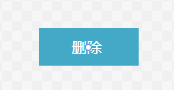
<Style x:Key="BtnDeleteStyle" TargetType="Button">
<Setter Property="Width" Value="80"/>
<Setter Property="Height" Value="30"/>
<Setter Property="Foreground" Value="White"/>
<Setter Property="BorderThickness" Value="0"/>
<Setter Property="Background" Value="#43a9c7"/>
<Setter Property="Template">
<Setter.Value>
<ControlTemplate TargetType="Button">
<Border x:Name="border" Background="{TemplateBinding Background}" BorderBrush="{TemplateBinding BorderBrush}" BorderThickness="{TemplateBinding BorderThickness}" SnapsToDevicePixels="True">
<Grid>
<Grid.ColumnDefinitions>
<ColumnDefinition Width="1*"/>
<ColumnDefinition Width="2*"/>
</Grid.ColumnDefinitions>
<Image Margin="5" Grid.Column="0" Source="" Stretch="Uniform" VerticalAlignment="Center"/>
<!--Text:绑定模板-->
<TextBlock Grid.Column="1" Text="{TemplateBinding Content}" Foreground="{TemplateBinding Foreground}" VerticalAlignment="Center" HorizontalAlignment="Left"/>
</Grid>
</Border>
<ControlTemplate.Triggers>
<Trigger Property="IsMouseOver" Value="True">
<Setter TargetName="border" Property="Background" Value="#2f96b4"/>
</Trigger>
<Trigger Property="IsPressed" Value="True">
<Setter TargetName="border" Property="Background" Value="#2a89a4"/>
</Trigger>
</ControlTemplate.Triggers>
</ControlTemplate>
</Setter.Value>
</Setter>
</Style>
<!--打印按钮-->
<Style x:Key="BtnPrintStyle" TargetType="Button">
<Setter Property="Width" Value="80"/>
<Setter Property="Height" Value="30"/>
<Setter Property="Foreground" Value="White"/>
<Setter Property="BorderThickness" Value="0"/>
<Setter Property="Background" Value="#43a9c7"/>
<Setter Property="Template">
<Setter.Value>
<ControlTemplate TargetType="Button">
<Border x:Name="border" Background="{TemplateBinding Background}" BorderBrush="{TemplateBinding BorderBrush}" BorderThickness="{TemplateBinding BorderThickness}" SnapsToDevicePixels="True">
<Grid>
<Grid.ColumnDefinitions>
<ColumnDefinition Width="1*"/>
<ColumnDefinition Width="2*"/>
</Grid.ColumnDefinitions>
<Image Margin="5" Grid.Column="0" Source="" Stretch="Uniform" VerticalAlignment="Center"/>
<!--Text:绑定模板-->
<TextBlock Grid.Column="1" Text="{TemplateBinding Content}" Foreground="{TemplateBinding Foreground}" VerticalAlignment="Center" HorizontalAlignment="Left"/>
</Grid>
</Border>
<ControlTemplate.Triggers>
<Trigger Property="IsMouseOver" Value="True">
<Setter TargetName="border" Property="Background" Value="#2f96b4"/>
</Trigger>
<Trigger Property="IsPressed" Value="True">
<Setter TargetName="border" Property="Background" Value="#2a89a4"/>
</Trigger>
</ControlTemplate.Triggers>
</ControlTemplate>
</Setter.Value>
</Setter>
</Style>
<!--保存按钮-->
<Style x:Key="BtnSaveStyle" TargetType="Button">
<Setter Property="Width" Value="80"/>
<Setter Property="Height" Value="30"/>
<Setter Property="Foreground" Value="White"/>
<Setter Property="BorderThickness" Value="0"/>
<Setter Property="Background" Value="#43a9c7"/>
<Setter Property="Template">
<Setter.Value>
<ControlTemplate TargetType="Button">
<Border x:Name="border" Background="{TemplateBinding Background}" BorderBrush="{TemplateBinding BorderBrush}" BorderThickness="{TemplateBinding BorderThickness}" SnapsToDevicePixels="True">
<Grid>
<Grid.ColumnDefinitions>
<ColumnDefinition Width="1*"/>
<ColumnDefinition Width="2*"/>
</Grid.ColumnDefinitions>
<Image Margin="5" Grid.Column="0" Source="" Stretch="Uniform" VerticalAlignment="Center"/>
<!--Text:绑定模板-->
<TextBlock Grid.Column="1" Text="{TemplateBinding Content}" Foreground="{TemplateBinding Foreground}" VerticalAlignment="Center" HorizontalAlignment="Left"/>
</Grid>
</Border>
<ControlTemplate.Triggers>
<Trigger Property="IsMouseOver" Value="True">
<Setter TargetName="border" Property="Background" Value="#2f96b4"/>
</Trigger>
<Trigger Property="IsPressed" Value="True">
<Setter TargetName="border" Property="Background" Value="#2a89a4"/>
</Trigger>
</ControlTemplate.Triggers>
</ControlTemplate>
</Setter.Value>
</Setter>
</Style>
<!--关闭按钮-->
<Style x:Key="BtnCloseStyle" TargetType="Button">
<Setter Property="Width" Value="80"/>
<Setter Property="Height" Value="30"/>
<Setter Property="Foreground" Value="White"/>
<Setter Property="BorderThickness" Value="0"/>
<Setter Property="Background" Value="#43a9c7"/>
<Setter Property="Template">
<Setter.Value>
<ControlTemplate TargetType="Button">
<Border x:Name="border" Background="{TemplateBinding Background}" BorderBrush="{TemplateBinding BorderBrush}" BorderThickness="{TemplateBinding BorderThickness}" SnapsToDevicePixels="True">
<Grid>
<Grid.ColumnDefinitions>
<ColumnDefinition Width="1*"/>
<ColumnDefinition Width="2*"/>
</Grid.ColumnDefinitions>
<Image Margin="5" Grid.Column="0" Source="" Stretch="Uniform" VerticalAlignment="Center"/>
<!--Text:绑定模板-->
<TextBlock Grid.Column="1" Text="{TemplateBinding Content}" Foreground="{TemplateBinding Foreground}" VerticalAlignment="Center" HorizontalAlignment="Left"/>
</Grid>
</Border>
<ControlTemplate.Triggers>
<Trigger Property="IsMouseOver" Value="True">
<Setter TargetName="border" Property="Background" Value="#2f96b4"/>
</Trigger>
<Trigger Property="IsPressed" Value="True">
<Setter TargetName="border" Property="Background" Value="#2a89a4"/>
</Trigger>
</ControlTemplate.Triggers>
</ControlTemplate>
</Setter.Value>
</Setter>
</Style>
</ResourceDictionary>
写好资源字典后,下一步就是在App.xaml中合并资源字典:
<Application x:Class="WpfNorth.App"
xmlns="http://schemas.microsoft.com/winfx/2006/xaml/presentation"
xmlns:x="http://schemas.microsoft.com/winfx/2006/xaml"
xmlns:local="clr-namespace:WpfNorth"
StartupUri="LoginWindow.xaml">
<Application.Resources>
<ResourceDictionary>
<ResourceDictionary.MergedDictionaries>
<!--封装好的公共样式-->
<ResourceDictionary Source="Tool/Dictionary/Buttons.xaml"/>
</ResourceDictionary.MergedDictionaries>
</ResourceDictionary>
</Application.Resources>
</Application>
再然后就是应用了,创建一个button按钮然后应用资源:
<Button x:Name=”button” Content=” 删除按钮” Style=”{StaticResource BtnDeleteStyle}”/>


 扫一扫
扫一扫


 1894
1894

 被折叠的 条评论
为什么被折叠?
被折叠的 条评论
为什么被折叠?
 到【灌水乐园】发言


