


效果图如下 截图动不了其实是能动的 和箭头指向一致的动画有 里面的icon也是可以更换的

使用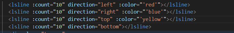
<template>
  <div class="toptop" :style="getstyle(1)">
    <div class="linecon" :class="direction">
      <div class="keyinner" v-for="item in count" :key="item">
        <i class="el-icon-caret-left" v-if="direction == 'left'" />
        <i class="el-icon-caret-right" v-if="direction == 'right'" />
        <i class="el-icon-caret-top" v-if="direction == 'top'" />
        <i class="el-icon-caret-bottom" v-if="direction == 'bottom'" />
      </div>
    </div>
  </div>
</template>

<script>
export default {
  props: ["count", "direction", "color"],
  methods: {
    getstyle() {
      if (this.direction == "right") {
        return {
          width: this.count * 20 + "px",
          height: "20px",
          backgroundColor: this.color ? this.color : "gray",
        };
      } else if (this.direction == "left") {
        return {
          width: this.count * 20 + "px",
          height: "20px",
          backgroundColor: this.color ? this.color : "gray",
        };
      } else if (this.direction == "top") {
        return {
          height: this.count * 20 + "px",
          width: "20px",
          backgroundColor: this.color ? this.color : "gray",
        };
      } else if (this.direction == "bottom") {
        return {
          height: this.count * 20 + "px",
          width: "20px",
          backgroundColor: this.color ? this.color : "gray",
        };
      }
    },
  },
};
</script>

<style lang="scss" scoped>
.toptop {
  overflow: hidden;
  background-color: gray;
  margin-bottom: 10px;
}
.linecon {
  display: flex;
  align-items: center;
  justify-content: flex-start;
  overflow: hidden;
  flex-wrap: wrap;
  will-change: transform;

  .keyinner {
    width: auto;
    height: 20px;
    font-size: 20px;
    color: #fff;
  }
}
.linecon.left {
  animation: scaleAnimationleft 0.2s ease-in-out infinite;
}
.linecon.top {
  display: block;
  animation: scaleAnimationtop 0.2s ease-in-out infinite;
}
.linecon.right {
  animation: scaleAnimationright 0.2s ease-in-out infinite;
}
.linecon.bottom {
  animation: scaleAnimationbottom 0.2s ease-in-out infinite;
}
@keyframes scaleAnimationleft {
  0% {
    transform: translateX(20px);
  }
  50% {
    transform: translateX(10px);
  }
  100% {
    transform: translateX(0px);
  }
}
@keyframes scaleAnimationright {
  0% {
    transform: translateX(-20px);
  }
  50% {
    transform: translateX(-10px);
  }
  100% {
    transform: translateX(0px);
  }
}
@keyframes scaleAnimationbottom {
  0% {
    transform: translateY(-20px);
  }
  50% {
    transform: translateY(-10px);
  }
  100% {
    transform: translateY(0px);
  }
}
@keyframes scaleAnimationtop {
  0% {
    transform: translateY(20px);
  }
  50% {
    transform: translateY(10px);
  }
  100% {
    transform: translateY(0px);
  }
}
</style>


 扫一扫
扫一扫


 578
578

 被折叠的 条评论
为什么被折叠?
被折叠的 条评论
为什么被折叠?
 到【灌水乐园】发言


