


python数据可视化基础之matplotlib、seaborn、plotnine对比
前言
import numpy as np
import pandas as pd
import matplotlib.pyplot as plt
import seaborn as sns
from plotnine import *
-
在数据可视化方面,python和R语言还是有一定差距的,但是matplotlib、Seaborn、plotnine等静态图表绘制包,可以在很大程度上实现R语言ggplot2及其拓展包的可视化效果。每种包都有其特点
- matplotlib 图表绘制函数可以实现不同的坐标系,包括二维、三维直角坐标和极坐标系,但最大问题参数繁多、条理不清,而绘制多数据系列的语法更为繁琐
- Seaborn 相对于matplotlib可以绘制更多的统计分析图表,但是各个图表的绘制函数参数不统一,难以梳理清晰的关系
- plotnine 语法相对清晰。可以绘制很美观的个性图表,但暂时只能实现二维坐标系*(2019年新出的)*
-
下面分别以这三个绘图包做一个简单的对比,使用相同的数据集绘制散点图、统计直方图和箱型图,所用数据如下所示:
df = pd.read_csv(r'Data/绘图包对比数据.csv')
df.tail()#后五条数据
| age | tau | Class | SOD | male | |
|---|---|---|---|---|---|
| 328 | 0.987849 | 5.767258 | Uncertain | 5.342334 | 1 |
| 329 | 0.986684 | 6.145622 | Uncertain | 5.347108 | 0 |
| 330 | 0.988263 | 5.897676 | Uncertain | 5.676754 | 1 |
| 331 | 0.984351 | 4.805741 | Uncertain | 4.875197 | 1 |
| 332 | 0.986877 | 5.551835 | Uncertain | 4.948760 | 0 |
- 使用matplotlib绘制
fig = plt.figure(figsize=(15,4),dpi =90)
#散点图
plt.subplot(131)
plt.xlabel('SOD')
plt.ylabel('tau')
plt.scatter(df['SOD'], df['tau'], c='black', s=15,  marker='o')
#统计直方图
plt.subplot(132)
plt.xlabel('SOD')
plt.ylabel('Count')
n, bins, patches = plt.hist(df['SOD'], 30, density=False, facecolor='w',edgecolor="k")
#箱型图
plt.subplot(133)
plt.xlabel('Class')
plt.ylabel('SOD')
labels=np.unique( df['Class'])
data = [df[df['Class']==label]['SOD'] for label in labels]
plt.boxplot(data,notch=False,labels=labels)

- 使用Seaborn绘制
sns.set_style("darkgrid")
sns.set_context("notebook", font_scale=1.5, rc={'font.size': 12, 'axes.labelsize': 18, 'legend.fontsize':15,
                                                'xtick.labelsize': 15,'ytick.labelsize': 15})
fig = plt.figure(figsize=(13,4),dpi =90)
ax1 = fig.add_subplot(131)
ax2 = fig.add_subplot(132)
ax3 = fig.add_subplot(133)
#散点图
sns.scatterplot(x="SOD", y="tau", data=df,color='k',ax = ax1)
#统计直方图
sns.distplot(df['SOD'], kde=False,bins=30,
                      hist_kws=dict(edgecolor="k", facecolor="w",linewidth=1,alpha=1),ax = ax2)
#箱型图
box_sns=sns.boxplot(x="Class", y="SOD", data=df,
                    width =0.6,palette=['w'],ax = ax3)
for i,box in enumerate(box_sns.artists):
    box.set_edgecolor('black')
    box.set_facecolor('white')
    for j in range(6*i,6*(i+1)):
         box_sns.lines[j].set_color('black')

- 使用plotnine绘制
- 暂时没有找到plotnine绘制三种不同种类的子图的方法
#散点图
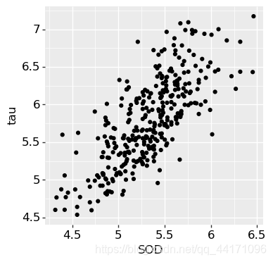
p1=(ggplot(df, aes(x='SOD',y='tau')) + geom_point()+
theme(text=element_text(size=12,colour = "black"),aspect_ratio =1,dpi=100,figure_size=(4,4)))
#直方图
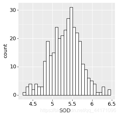
p2=(ggplot(df, aes(x='SOD')) + geom_histogram(bins=30,colour="black",fill="white")+
theme(text=element_text(size=12,colour = "black"),aspect_ratio =1,dpi=100,figure_size=(4,4)))
#箱型图
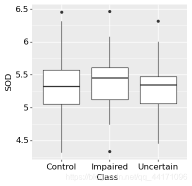
p3=(ggplot(df, aes(x='Class',y='SOD'))+ geom_boxplot(show_legend=False)+
theme(text=element_text(size=12,colour = "black"),aspect_ratio =1,dpi=100,figure_size=(4,4)))
print([p1,p2,p3])


 6950
6950

 被折叠的 条评论
为什么被折叠?
被折叠的 条评论
为什么被折叠?
 到【灌水乐园】发言


