


前言:
在写项目的时候,用到了element-plus,在这个项目中需要使用tabs组件,但是使用element-plus 的tab组件来满足项目中的tab样式,有的时候会有点麻烦,且自己也想动手试试封装一个tab组件,于是,开干!!
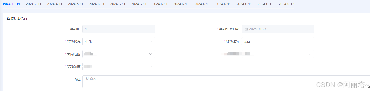
最终效果图:
这里面的选中下横线用的是绝对定位
<div class="indicator" :style="indicatorStyle"></div>
.indicator {
position: absolute;
bottom: 0;
height: 2px;
background-color: @themeColor;
transition: transform 0.3s ease;
}
其中还需要去计算他的宽度 width 和 移动量 transform
/**
*这里通过computed 来计算
* index :标记选中的是第几个* tabs :获取所有 tab的信息
* translateX:横向移动的数据
* width:单个tab的款宽度---注意:如果需要在选中tab的后面加一个标识,比如:“当前”,则 * width和translate 计算有误,后面会出兼容版本
*/const indicatorStyle = computed(() => {
const panelParent = myTabsRef.value
if (panelParent) {
let index: number
if (dps.isIndex) {
index = Number(dps.active)
} else {
index = dps.data.findIndex((r: any) => r[getDefaultProps.value.id] === dps.active)
}
const tabs = panelParent.querySelectorAll('.myTab__header_item')
let translateX = 0, width = 0
// 移动指示器到选中的标签
if (tabs.length && index !== -1) {
const selectedTab = tabs[index]
const selectedTabRect = selectedTab.getBoundingClientRect()
width = selectedTabRect.width
const tabsHeaderRect = selectedTab.parentNode.getBoundingClientRect()
translateX = selectedTabRect.left - tabsHeaderRect.left
}
return {
transform: `translateX(${translateX}px)`,
width: `${width}px`
}
}
return {}
})
具体代码:
<script setup lang="ts">
import { ref, computed } from 'vue'const emits = defineEmits(['update:active'])
interface Props {
data: any // tab的数组数据
active: string | number// 选中标识
isIndex?: boolean
props?: any// 对象数组的对象里面的属性对应
padBottom:string // 高亮横线距离tab文字的距离
}
const dps = withDefaults(defineProps<Props>(), {
data: [],
active: '',
padBottom:'14px'
})const getDefaultProps = computed(() => {
return dps.props || {
id: 'elementId',
name: 'elementName'
}
})const myTabsRef = ref()
const indicatorStyle = computed(() => {
const panelParent = myTabsRef.value
if (panelParent) {
let index: number
if (dps.isIndex) {
index = Number(dps.active)
} else {
index = dps.data.findIndex((r: any) => r[getDefaultProps.value.id] === dps.active)
}
const tabs = panelParent.querySelectorAll('.myTab__header_item')
let translateX = 0, width = 0
// 移动指示器到选中的标签
if (tabs.length && index !== -1) {
const selectedTab = tabs[index]
const selectedTabRect = selectedTab.getBoundingClientRect()
width = selectedTabRect.width
const tabsHeaderRect = selectedTab.parentNode.getBoundingClientRect()
translateX = selectedTabRect.left - tabsHeaderRect.left
}
return {
transform: `translateX(${translateX}px)`,
width: `${width}px`
}
}
return {}
})const onTabClick = (item: any, index: number) => {
emits('update:active', { ...item, index: index })
}
</script><template>
<div class="myTab tabs-container" ref="myTabsRef" v-if="data.length">
<div class="myTab__header">
<div class="indicator" :style="indicatorStyle"></div>
<div class="myTab__header_box">
<div class="myTab__header_item" :style="{paddingBottom:padBottom}" :class="{ 'active': active === (isIndex ? index : item[getDefaultProps.id]) }"
v-for="(item, index) in data" :key="index" @click="onTabClick(item, index)">
<slot name="label" :index="index" :row="item">{{ item[getDefaultProps.name] }}</slot>
</div>
</div>
</div>
<slot name="right"></slot>
</div>
</template><style lang="less" scoped>
.myTab {
display: flex;
justify-content: space-between;
column-gap: 12px;
}.myTab__header {
position: relative;
border-bottom: 1px solid #F6F7FA;
flex: 1;
overflow-x: auto;&:hover::-webkit-scrollbar-thumb {
background: #dddddd;
}&_box {
flex: 1;
white-space: nowrap;
}.indicator {
position: absolute;
bottom: 0;
height: 2px;
background-color: @themeColor;
transition: transform 0.3s ease;
}&_item {
display: inline-block;
// padding-bottom: 14px;
min-width: 56px;
margin-left: 24px;
text-align: center;
color: #666;
cursor: pointer;&:first-child {
margin-left: 0;
}&.active {
font-weight: 600;
}&.active,
&:hover {
color: @themeColor;
}
}
}
</style>
以上就是完整代码了
单个tab的款宽度-需注意:如果需要在选中tab的后面加一个标识,比如:“当前”,则 width和translate 计算有误,后面会出兼容版本
后续会出兼容版本,尽情期待


 扫一扫
扫一扫


 746
746

 被折叠的 条评论
为什么被折叠?
被折叠的 条评论
为什么被折叠?
 到【灌水乐园】发言


