


之前有写过自定义一个复选框的样式。
链接:http://blog.youkuaiyun.com/u014291497/article/details/52081774
又做了一个左右滑动开关效果的复选框。
效果图:
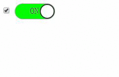
上图左侧为了显示数据变化所以显示出来,实际使用中设置display:none 属性就可以了。
本示例中全部使用HTML及CSS实现。
github地址:https://github.com/justforuse/HTML-CSS-JS/tree/master/customize-radio
代码:
<!DOCTYPE html><html lang="en"><head> <meta charset="UTF-8"> <title></title> <script></script> <style> .text { display: none; } .on{ color:#333; } .off{ color:#eee; } .circle { position: absolute; display: inline-block; } #radio ~label { background-color: grey; } #radio ~label .circle { left: 0; transition: all 0.3s; --webkit-transition: all 0.3s; } #radio ~label .on { display: none; } #radio ~ label .off { display: inline-block; } #radio:checked ~ label { background: lime; } #radio:checked ~label .circle { left: 50px; } #radio:checked ~label .on { display: inline-block; } #radio:checked ~ label .off { display: none; } label { display: inline-block; position: relative; height: 30px; width: 80px; border-top-left-radius: 15px 50%; border-bottom-left-radius: 15px 50%; border-top-right-radius: 15px 50%; border-bottom-right-radius: 15px 50%; box-shadow: 0 0 2px black; } label .circle { display: inline-block; height: 26px; width: 26px; border-radius: 50%; border: 2px solid #333; background-color: #eee; } label .text { text-indent: 30px; line-height: 28px; font-size: 18px; font-family: sans-serif; text-shadow: 0 0 2px #ddd; } </style></head><body> <div class="container"> <input type="checkbox" id="radio" name="switch"> <label for="radio" class="radio"> <span class="circle"></span> <span class="text on">ON</span> <span class="text off">OFF</span> </label> </div></body></html>
- 1
- 2
- 3
- 4
- 5
- 6
- 7
- 8
- 9
- 10
- 11
- 12
- 13
- 14
- 15
- 16
- 17
- 18
- 19
- 20
- 21
- 22
- 23
- 24
- 25
- 26
- 27
- 28
- 29
- 30
- 31
- 32
- 33
- 34
- 35
- 36
- 37
- 38
- 39
- 40
- 41
- 42
- 43
- 44
- 45
- 46
- 47
- 48
- 49
- 50
- 51
- 52
- 53
- 54
- 55
- 56
- 57
- 58
- 59
- 60
- 61
- 62
- 63
- 64
- 65
- 66
- 67
- 68
- 69
- 70
- 71
- 72
- 73
- 74
- 75
- 76
- 77
- 78
- 79
- 80
- 81
- 82
- 83
- 84
- 85
- 86
- 87
- 88
- 89
- 90
- 91
- 92
- 93
- 94
- 95
- 96
- 97
- 98
- 99
此文档的作者:justforuse
Github Pages:justforuse
再分享一下我老师大神的人工智能教程吧。零基础!通俗易懂!风趣幽默!还带黄段子!希望你也加入到我们人工智能的队伍中来!https://blog.youkuaiyun.com/jiangjunshow


 扫一扫
扫一扫


 1222
1222

 被折叠的 条评论
为什么被折叠?
被折叠的 条评论
为什么被折叠?
 到【灌水乐园】发言


