


背景
公司ui设计图要求柱状图立体,同指标柱状图之间要有间距。之前的js是抄的同事的,但没有间距,网上找了一些,都挺复杂。就看了一下源码,立体效果是通过多个柱状图series堆叠成的。所以就在两个指标中间加了一个和背景颜色一样的series,就可以分开了。
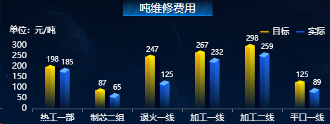
效果图
参数
x轴数组,两个指标数组和指标名称。
js源码
import * as echarts from "echarts";
export function echartsBar(id,x,y1,y1Name,y2,y2Name) {
  var chartDom = document.getElementById(id);
  var myChart = echarts.init(chartDom);
  var option;
  const sideData =  y1;//[220, 182, 191, 234, 290, 330];
  const sideData1 = y2;// [100, 110, 120, 134, 190, 230];
  const name1 = y1Name;
  const name2 = y2Name;
  // var x = ['1', '2', '3', '4', '5', '6'];
  option = {
    tooltip: {
      trigger: 'axis'
    },
    legend: {
      top : 0,
      right: 5,
      itemHeight:4,
      itemWidth:12,
      data: [
        {
          name: name1,
          textStyle: {
            color: 'white'
          }
        },
        {
          name: name2,
          textStyle: {
            color: 'white'
          }
        }
      ]
    },
    grid: {
      top:"30px",
      left:"5px",
      right:"0px",
      bottom:"0px",
      containLabel: true
    },
    toolbox: {
      show: true,
    },
    calculable: true,
    xAxis: [
      {
        type: 'category',
        splitLine: {
          show: false
        },
        data: x,
        axisLabel: {
          show: true,
          textStyle: {
            color: "#fff" //X轴文字颜色
          },
        },
      }
    ],
    yAxis: [
      {
        name:'单位:元/吨',
        nameTextStyle: {
          color: "#fff"
        },
        type: 'value',
        splitLine: {
          show: false
        },
        axisLabel: {
          show: true,
          textStyle: {
            color: "#fff" //X轴文字颜色
          },
        },
      }
    ],
    series: [
      {
        name: name1,
        tooltip: {
          show: false
        },
        type: 'bar',
        barWidth: 7,
        itemStyle: {
          normal: {
            color: new echarts.graphic.LinearGradient(0, 1, 0, 0, [{
              offset: 0,
              color: "rgba(255, 187, 0, 0)" // 0% 处的颜色
            }, {
              offset: 1,
              color: "rgba(255, 187, 0, 1)", // 100% 处的颜色
            }], false)
          }
        },
        data: sideData,
        barGap: 0,
       },
      {
        name: name1,
        type: 'bar',
        barWidth: 7,
        itemStyle: {
          normal: {
            color: new echarts.graphic.LinearGradient(0, 1, 0, 0, [{
              offset: 0,
              color: "rgba(255, 230, 0, 0)" // 0% 处的颜色
            }, {
              offset: 1,
              color: "rgba(255, 230, 0, 1)", // 100% 处的颜色
              //opacity:0.5
            }], false)
          }
        },
        barGap: 0,
        data: sideData,
        label: {
          show: true,
          position: 'top',
          textStyle: {
            color: 'white',
            fontSize: 10
          }
        }
      }, {
        name: name1,
        tooltip: {
          show: false
        },
        type: 'pictorialBar',
        itemStyle: {
          borderWidth: 1,
          borderColor: '#FFE600',
          color: '#FFE600' // 控制顶部方形的颜色
        },
        symbol: 'path://M 0,0 l 90,0 l -60,60 l -90,0 z',
        symbolSize: ['13', '5'], // 第一个值控制顶部方形大小
        symbolOffset: ['3', '-3'], // 控制顶部放行 左右和上下
        symbolRotate: -16,
        symbolPosition: 'end',
        data: sideData,
        barGap: 0,
        z: 3,
      },
      {
        name: name1,
        type: 'bar',
        barWidth: 7,
        tooltip: {
          show: false
        },
        itemStyle: {
          normal: {
            color: new echarts.graphic.LinearGradient(0, 1, 0, 0, [{
              offset: 0,
              color: "rgba(1, 6, 38, 1)" // 0% 处的颜色
            }, {
              offset: 1,
              color: "rgba(1, 6, 38, 1)", // 100% 处的颜色
              //opacity:0.5
            }], false)
          }
        },
        barGap: 0,
        data: sideData,
        label: {
          show: false,
          position: 'top',
          textStyle: {
            color: 'white',
            fontSize: 10
          }
        }
      },
      {
        name: name2,
        tooltip: {
          show: false
        },
        type: 'bar',
        barWidth: 7,
        itemStyle: {
          normal: {
            color: new echarts.graphic.LinearGradient(0, 1, 0, 0, [{
              offset: 0,
              color: "rgba(26,102,255,0)" // 0% 处的颜色
            }, {
              offset: 1,
              color: "rgba(26,102,255,0.9)", // 100% 处的颜色
            }], false)
          }
        },
        data: sideData1,
        barGap: 0,

      },
      {
        name: name2,
        type: 'bar',
        barWidth: 7,
        itemStyle: {
          normal: {
            color: new echarts.graphic.LinearGradient(0, 1, 0, 0, [{
              offset: 0,
              color: "rgba(51,153,255,0)" // 0% 处的颜色
            }, {
              offset: 1,
              color: "rgba(26,102,255,1)", // 100% 处的颜色
            }], false)
          }
        },
        barGap: 0,
        data: sideData1,
        label: {
          show: true,
          position: 'top',
          textStyle: {
            color: 'white',
            fontSize: 10
          }
        }
      }, {
        name: name2,
        tooltip: {
          show: false
        },
        type: 'pictorialBar',
        itemStyle: {
          borderWidth: 1,
          borderColor: '#fff',
          color: '#66B2FF' // 顶部方块的颜色
        },
        symbol: 'path://M 0,0 l 90,0 l -60,60 l -90,0 z',
        symbolSize: ['13', '7'], // 第一个值控制顶部方形大小
        symbolOffset: ['-3', '-3'], // 控制顶部放行 左右和上下
        symbolRotate: -16,
        symbolPosition: 'end',
        barGap: 0,
        data: sideData1,
        z: 3,

      }
    ]
  };
  myChart.setOption(option, true);
}


 3576
3576

 被折叠的 条评论
为什么被折叠?
被折叠的 条评论
为什么被折叠?
 到【灌水乐园】发言


