


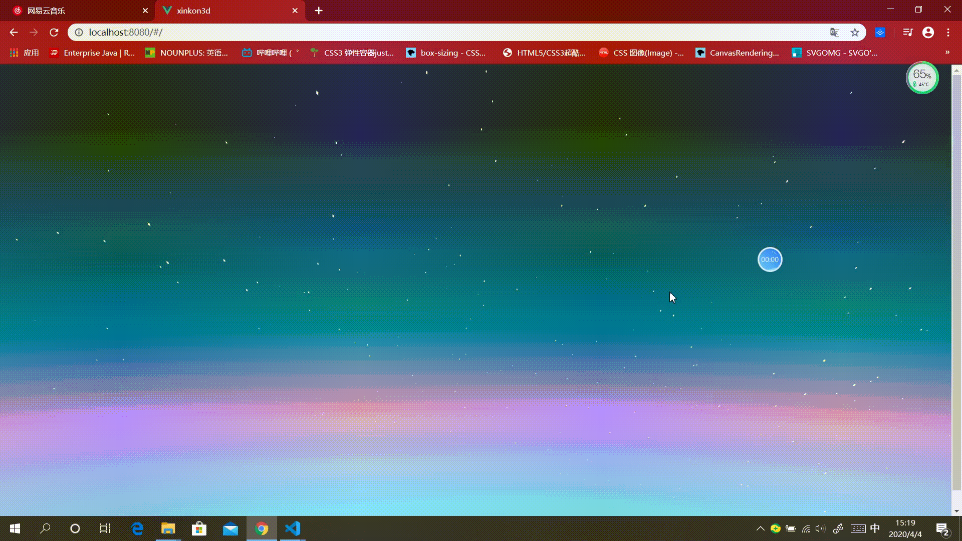
先看效果:
<template>
  <div class="home">

      <div class="two">
        <div class="three" v-for="(item, index) in items" :key="index" ref="three"></div>
      </div>

  </div>
</template>

<script>
export default {
  name: 'home',
  data () {
    return {
      items: 800,
      distance: 800
    }
  },
  mounted () {
    const starArr = this.$refs.three
    starArr.forEach(item => {
      const speed = 0.2 + (Math.random() * 1)
      const thisDistance = this.distance + (Math.random() * 360)
      console.log(Math.random())
      item.style.transformOrigin = `0 0 ${thisDistance}px`
      item.style.transform = `translate3d(0, 0, -${thisDistance}px) rotateY(${(Math.random() * 360)}deg) rotateX(${(Math.random() * -50)}deg) scale(${speed})`
    })
  }
}
</script>
<style lang="scss" scoped>

* {
  margin: 0;
  padding: 0;
  box-sizing: border-box;
}

  .home {
    position:relative;
    width: 100%;
    height: 750px;

    background: radial-gradient(260% 67%  at bottom center,  #80DEEA 10%,  #CE93D8 40%,  #00838F 65%, #263238 130%);

  overflow: hidden;
  }

  .two {
    position: absolute;
    left: 50%;
    transform-style: preserve-3d;
    transition: perspective(500deg);
    perspective-origin: 50% 100%;
    -webkit-perspective-origin: 50% 100%;
    -moz-perspective-origin: 50% 100%;
    animation: xinkon 90s linear infinite;
    bottom: -100px;

    .three {
      width: 2px;
      height: 2px;
      background: #FFF9C4;
      position: absolute;
      top: 0;
      left: 0;
      backface-visibility: hidden;
      -webkit-backface-visibility: hidden;
      -moz-backface-visibility: hidden;
      -ms-backface-visibility: hidden;
  }
  }
  @keyframes xinkon {
    0% {
            transform: perspective(400px) rotateZ(20deg) rotateX(-40deg) rotateY(0);
        }
    100% {
        transform: perspective(400px) rotateZ(20deg) rotateX(-40deg) rotateY(-360deg);
    }
  }
</style>


 扫一扫
扫一扫


 413
413

 被折叠的 条评论
为什么被折叠?
被折叠的 条评论
为什么被折叠?
 到【灌水乐园】发言


