


 本文展示如何结合HTML和CSS构建一个动态的时钟效果。通过纯CSS实现的时钟可以实时显示当前时间,展现了CSS在视觉设计上的潜力。
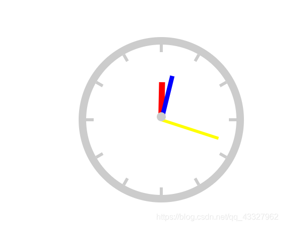
css时钟效果
利用html+css做出的时钟效果如下:
index.html
<!DOCTYPE html>
<html>
<head lang="en">
    <meta charset="UTF-8">
    <title></title>
    <style>
        .box {
            width: 200px;
            height: 200px;
            border: 10px solid #ccc;
            border-radius: 110px;
            margin: 100px auto;
            position: relative;
        }
        .line {
            width: 4px;
            height: 200px;
            background: #ccc;
            position: absolute;
            left: 50%;
            margin-left: -2px;
        }
        /*时钟刻度线*/
        .line1 {
            transform: rotate(30deg);
        }
        .line2 {
            transform: rotate(60deg);
        }
        .line3 {
            transform: rotate(90deg);
        }
        .line4 {
            transform: rotate(120deg);
        }
        .line5 {
            transform: rotate(150deg);
        }
        .line6 {
            transform: rotate(180deg);
        }
        /*将刻度线遮住,只留一点点*/
        .mask {
            width: 180px;
            height: 180px;
            background: #fff;
            border-radius: 90px;
            position: absolute;
            margin: 10px;
        }
        /*时针*/
        .hour {
            width: 8px;
            height: 50px;
            background: red;
            position: absolute;
            left: 50%;
            top: 50%;
            margin-left: -4px;
            margin-top: -50px;
            /*43200s匀速转动一圈*/
            animation: move 43200s linear infinite;
            /*设置旋转的中心点为中间底部*/
            transform-origin: center bottom;
        }
        /*分针*/
        .minute {
            width: 6px;
            height: 60px;
            background: blue;
            position: absolute;
            left: 50%;
            top: 50%;
            margin-left: -3px;
            margin-top: -60px;
            /*3600s转一圈,匀速转动*/
            animation: move 3600s linear infinite;
            /*设置旋转的中心点为中间底部*/
            transform-origin: center bottom;
        }
        /*秒针*/
        .second {
            width: 4px;
            height: 80px;
            background: yellow;
            position: absolute;
            left: 50%;
            top: 50%;
            margin-left: -2px;
            margin-top: -80px;
            /*60s转一圈,分60步*/
            animation: move 60s infinite steps(60);
            /*设置旋转的中心点为中间底部*/
            transform-origin: center bottom;
        }
        /*最中心的遮罩层*/
        .circle {
            width: 12px;
            height: 12px;
            border-radius: 6px;
            background: #ccc;
            position: absolute;
            left: 50%;
            margin-left: -6px;
            margin-top: 90px;
        }
        /*旋转从0度到360度*/
        @keyframes move {
            from {
                transform: rotate(0deg);
            }
            to {
                transform: rotate(360deg);
            }
        }

    </style>
</head>
<body>
<div class="box">
    <div class="line line1"></div>
    <div class="line line2"></div>
    <div class="line line3"></div>
    <div class="line line4"></div>
    <div class="line line5"></div>
    <div class="line line6"></div>
    <div class="mask"></div>
    <div class="hour"></div>
    <div class="minute"></div>
    <div class="second"></div>
    <div class="circle"></div>
</div>
</body>
</html>


 扫一扫
扫一扫


 660
660

 被折叠的 条评论
为什么被折叠?
被折叠的 条评论
为什么被折叠?
 到【灌水乐园】发言


