


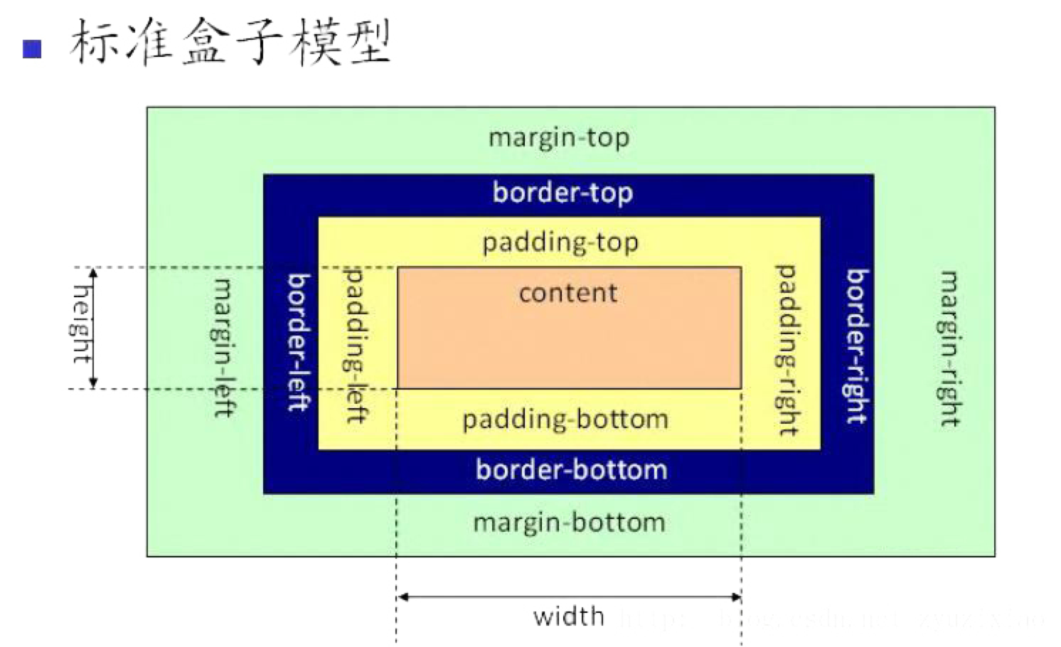
不同盒模型
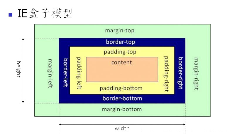
如果没有设置,则默认位IE盒子模型
box-sizing: border-box;//IE盒子设定
BFC(Block Formatting Context)叫做“块级格式化上下文"
BFC 触发条件
(1)float的属性不为none;
(2)position为absolute或fixed;
(3)display为inline-block,table-cell,table-caption,flex;
(4)overflow不为visible
IFC(inline Formatting Context)叫做“行级格式化上下”
IFC触发条件
display:inline;
特点:
(1)内部的盒子会在水平方向,一个个地放置;
(2)IFC的高度,由里面最高盒子的高度决定;
(3)当一行不够放置的时候会自动切换到下一行;
● 长度单位:
○ 相对长度单位
■ 相对字体长度单位:em、ex,CSS3:rem、ch
■ 相对视区长度单位:vh、vw、vmin、vmax
○ 绝对长度单位
■ px
■ 不常用的:pt、cm、mm、pc
○ 十六进制色。
○ RGB 颜色:每个参数 (red、green 以及 blue) 定义颜色的强度,可以是介于 0 与 255 之间的整数,或者是百分比值(从 0% 到 100%)。
○ RGBA 颜色:rgba(red, green, blue, alpha)。alpha 参数是介于 0.0(完全透明)与 1.0(完全不透明)的数字。
○ HSL 颜色:hsl(hue, saturation, lightness)。色度,饱和度,亮度。
○ HSLA 颜色:在 HSL 基础上,多了透明度
CSS 选择器的分类?
● 通用元素选择器
● 标签选择器
● 类选择器ID 选择器
● 属选择器性:为拥有指定属性的 HTML 元素设置样式(例如:[title]{...})
● 伪类选择器
● 伪元素选择器
● 子元素选择器:选择某个元素的子元素(h1 > em {..})
● 关系选择器
○ 后代选择器:可以选择作为某元素后代的元素(h1 em {..})
○ 相邻后代选择器
○ 兄弟选择器
○ 相邻兄弟选择器:选择紧接在另一个元素后的元素(h1 + p{..})
● 触发以下条件则会产生层叠上下文:
○ 根元素 (HTML)
○ z-index 值不为 "auto"的 绝对/相对定位,
○ 一个 z-index 值不为 "auto"的 flex 项目 (flex item),即:父元素 display: flex|inline-flex
○ opacity 属性值小于 1 的元素(参考 the specification for opacity),
○ transform 属性值不为 "none"的元素,
○ mix-blend-mode 属性值不为 "normal"的元素,
○ filter值不为“none”的元素,
○ perspective值不为“none”的元素,
○ isolation 属性被设置为 "isolate"的元素,
○ position: fixed
○ 在 will-change 中指定了任意 CSS 属性,即便你没有直接指定这些属性的值(参考 这篇文章)
○ -webkit-overflow-scrolling 属性被设置 "touch"的元素
○ CSS 2.1 定义了以下 4 个布局模型。
■ block layout,块级布局。侧重于垂直方向。
■ inline layout,行内布局。侧重于水平方向。
■ table layout,表格布局。
■ positioned layout
○ CSS 3 引入了以下布局模型。
■ flex layout,弹性盒布局。与方向无关。主要适用于应用程序的组件及小规模的布局。
(最常用)
■ CSS Grid Layout。
justify-content
- flex-start: 项目与容器的左侧对齐。
-
flex-end: 项目与容器的右侧对齐。
-
center: 项目在容器的中心对齐。
-
space-between: 项目以相等的间距显示。
-
space-around: 项目以相等的间距显示。
-
align-items: -
flex start:项目与容器顶部对齐。
flex-end:物品与容器底部对齐。
center:项目在容器的垂直中心对齐。
baseline:项目显示在容器的基线处。
stretch:拉伸物品以适应容器。
-
flex-direction:
row: 项目的放置方向与文本方向相同。
row-reverse: 项目的放置方向与文本方向相反。
column: 项目从上到下放置。
column-reverse: 项目从下到上放置。flex-wrap
-
nowrap: 每一项都适合一行。
-
wrap: 项目换行到附加行。
wrap-reverse: 项目反向换行到附加行。 -
html基础之弹性布局(dispaly :flex)
-
-设置父元素 display: flex; 这会使每个子元素自动变为伸缩项; 所谓伸缩项,就是说当父元素的宽度不足以容纳所有子元素时,会将子元素进行等比例收缩直到父容器足以一行放下所有子元素;
注意,设为 Flex 布局以后,子元素的float、clear和vertical-align属性将失效
-
HTML 表单
表单是一个包含表单元素的区域。
表单元素是允许用户在表单中输入内容,比如:文本域(textarea)、下拉列表(select)、单选框(radio-buttons)、复选框(checkbox) 等等。
-
input-输入框 select-下拉选择框 button-按钮 radio-单选按钮 textarea-文本域
-
datalist-数据列表 (预定义选项列表)
-
提交按钮-submit
-
<!DOCTYPE html>
<html lang="en">

<head>
    <meta charset="UTF-8">
    <meta http-equiv="X-UA-Compatible" content="IE=edge">
    <meta name="viewport" content="width=device-width, initial-scale=1.0">
    <title>Document</title>
    <style>

    </style>

</head>

<body>
    <header>header</header>
    <hr />
    <main>
        <nav>nav
            <menu type="context" id="popup-menu">
                <menu-item>Action</menu-item>
                <menu-item>Another action</menu-item>
                <hr />
                <menu-item>Separated action</menu-item>
            </menu>
        </nav>
        <hr />
        <section>
            <h1>1</h1>
            <h2>2</h2>
            <h3>3</h3>
            <h4>4</h4>
            <h5>5</h5>
            <h6>6</h6>
            <em>11121</em>
            <b>bbb</b>
            <embed />
            <s>Today's Special: Salmon</s>
            <abbr>1212</abbr>
            <del>This text has been deleted</del>
            <dfn id="def-internet">The Internet</dfn>
            <i class="latin">Veni, vidi, vici</i>
            <del>
                <p>“I apologize for the delay.”</p>
            </del>
            <ins cite="../howtobeawizard.html" datetime="2018-05">
                <p>“A wizard is never late …”</p>
            </ins>
            <samp>This is sample text.</samp>
            <p>This text is <sup>superscripted</sup></p>
            <p>The volume of a box is <var>l</var> × <var>w</var> × <var>h</var>, where <var>l</var> represents the length, <var>w</var> the width and <var>h</var> the height of the box.</p>
            <p>
                <strong>imperative</strong>
                Save the document by pressing <kbd>Ctrl</kbd> + <kbd>S</kbd>
                <small>The content is licensed under a Creative Commons Attribution-ShareAlike 2.5 Generic
                    License.</small>
            </p>
            <pre>
                L          TE
                  A       A
                    C    V
                     R A
                      1
            </pre>
        </section>
        <br />
        <progress rang="10" max="100"></progress>
        <hr />
        <video controls src="/media/cc0-videos/friday.mp4">
            <track default kind="captions" srclang="en" src="/media/examples/friday.vtt">
            Download the
            <a href="/media/cc0-videos/friday.mp4">MP4</a>
            video, and
            <a href="/media/examples/friday.vtt">subtitles</a>.
        </video>
        <section>
            main
            <p>
                这是一个段落
            </p>
            <div></div>
            <a href=""></a>
            <img src="" alt="">
            <span>12121</span>
            <br />
            <form>
                <input label="checkbox" type="checkbox" value="" accesskey="" placeholder="xxx" />
                <input label="color" type="color" value="" accesskey="" placeholder="xxx" />
                <input label="color" type="date" value="" accesskey="" placeholder="xxx" />
                <input label="date" type="datetime" value="" accesskey="" placeholder="xxx" />
                <input label="radio" type="radio" value="" accesskey="" placeholder="xxx" />
                <input label="email" type="email" value="" accesskey="" placeholder="xxx" />
                <input label="file" type="file" value="" accesskey="" placeholder="xxx" />
                <input label="month" type="month" value="" accesskey="" placeholder="xxx" />
                <input label="number" type="number" value="" accesskey="" placeholder="xxx" />
                <input label="password" type="password" value="" accesskey="" placeholder="xxx" />
                <textarea placeholder="xx">122</textarea>
                <select id="pet-select" title="selection">
                    <option value="">--Please choose an option--</option>
                    <option value="dog">Dog</option>
                    <option value="cat">Cat</option>
                    <option value="hamster">Hamster</option>
                    <option value="parrot">Parrot</option>
                    <option value="spider">Spider</option>
                    <option value="goldfish">Goldfish</option>
                </select>
                <button type="button">btn</button>

                <button type="reset">btnreset</button>
                <button type="submit">btnsubmit</button>
            </form>

        </section>
        <br />
        <article class="forecast">
            <h1>Weather forecast for Seattle</h1>
            <article class="day-forecast">
                <h2>03 March 2018</h2>
                <p>Rain.</p>
            </article>
            <article class="day-forecast">
                <h2>04 March 2018</h2>
                <p>Periods of rain.</p>
            </article>
            <article class="day-forecast">
                <h2>05 March 2018</h2>
                <p>Heavy rain.</p>
            </article>
        </article>
        <br />
        <section>
            <table>
                <caption>He-Man and Skeletor facts</caption>
                <thead>
                    <tr>
                        <th>table header</th>
                    </tr>
                </thead>
                <tbody>
                    <tr>
                        <td>tbody</td>
                    </tr>
                </tbody>
                <tfoot>table footer</tfoot>
            </table>
            <br />
            <map name="infographic">
                <area rel="noopener" shape="poly" coords="129,0,260,95,129,138"
                    href="https://developer.mozilla.org/docs/Web/HTTP" target="_blank" alt="HTTP">
                <area rel="noopener" shape="poly" coords="260,96,209,249,130,138"
                    href="https://developer.mozilla.org/docs/Web/HTML" target="_blank" alt="HTML">
                <area rel="noopener" shape="poly" coords="209,249,49,249,130,139"
                    href="https://developer.mozilla.org/docs/Web/JavaScript" target="_blank" alt="JavaScript">
                <area rel="noopener" shape="poly" coords="48,249,0,96,129,138"
                    href="https://developer.mozilla.org/docs/Web/API" target="_blank" alt="Web APIs">
                <area rel="noopener" shape="poly" coords="0,95,128,0,128,137"
                    href="https://developer.mozilla.org/docs/Web/CSS" target="_blank" alt="CSS">
            </map>
            <br />
            <img usemap="#infographic" src="/media/examples/mdn-info.png" alt="MDN infographic">
            <picture>
                <source srcset="/media/cc0-images/surfer-240-200.jpg" media="(orientation: portrait)">
                <img src="/media/cc0-images/painted-hand-298-332.jpg" alt="">
            </picture>

            <br />
            <address>
                <a href="mailto:jim@rock.com">jim@rock.com</a><br>
                <a href="tel:+13115552368">(311) 555-2368</a>
            </address>
            <br />
            <blockquote cite="https://www.huxley.net/bnw/four.html">
                <p>Words can be like X-rays, if you use them properly—they’ll go through anything. You read and you’re
                    pierced.</p>
            </blockquote>
            <br />
            </p>
        </section>
        <aside>
            <p>The Rough-skinned Newt defends itself with a deadly neurotoxin.</p>
        </aside>
        <hgroup>
            <h1>Frankenstein</h1>
            <p>Or: The Modern Prometheus</p>
        </hgroup>
        <ul>
            <li><bdi class="name">rs1</bdi>: 1st place </li>
            <li>12 </li>
            <li>13 </li>
        </ul>
        <ol>
            <li>1-1 </li>
            <li>1-2 </li>
            <li>1-3 </li>
        </ol>

        <datalist id="ice-cream-flavors">
            <option value="Chocolate">
            <option value="Coconut">
            <option value="Mint">
            <option value="Strawberry">
            <option value="Vanilla">
        </datalist>
        <details>
            这是石镶嵌
        </details>
        <figure>
            <figcaption>Listen to the T-Rex:</figcaption>
            <audio controls src="/media/cc0-audio/t-rex-roar.mp3">
                <a href="/media/cc0-audio/t-rex-roar.mp3">
                    Download audio
                </a>
            </audio>
        </figure>
        <dialog id="favDialog">
            <form method="dialog">
                <fieldset>
                    <legend>Choose your favorite monster</legend>

                    <input type="radio" id="kraken" name="monster" value="K">
                    <label for="kraken">Kraken</label><br>

                    <input type="radio" id="sasquatch" name="monster" value="S">
                    <label for="sasquatch">Sasquatch</label><br>

                    <input type="radio" id="mothman" name="monster" value="M" />
                    <label for="mothman">Mothman</label>
                </fieldset>
                <select name="" id=""></select>
            </form>
        </dialog>
    </main>
    <footer>footer</footer>

</body>

</html>
IE盒子填充时包含padding,不止content部分
-
常规显示器尺寸:720;
-
focus-visiable的作用?
-
focus-visible是一个CSS伪类,它用于选择在用户使用键盘导航时获得了焦点的元素,而忽略因用户使用鼠标导航而获得焦点的元素。在默认情况下,浏览器在元素获得焦点时都会应用CSS样式,这可能会导致一些意料之外的问题。例如,当用户使用鼠标单击一个表单元素时,元素会获得焦点并应用一些样式,这可能会打断页面的外观。
focus-visible伪类可以帮助解决这个问题。通过使用
focus-visible伪类,可以根据用户的输入方式来应用或不应用样式。只有当元素是通过键盘导航获得焦点时,才会应用已定义的样式。否则,它将像往常一样不应用样式。这可以确保样式只适用于用户希望使用键盘进行交互的元素,可以增加可访问性和质量。以下是一个示例,展示如何在CSS中使用
focus-visible伪类:button:focus-visible { outline: 2px solid blue; }在这个示例中,当一个按钮通过键盘导航获得焦点时,将会显示一个蓝色的2像素边框。但是,如果用户使用鼠标单击按钮来将其获得焦点,则不会显示这个边框。这样就可以避免单击鼠标后出现的不必要的外观变化。
需要注意的是,
focus-visible伪类在某些浏览器中可能需要使用polyfill或JS库来实现。
search:active的作用?
在CSS中,:active伪类用于选择当前激活(被点击)的链接或按钮元素,当用户点击这些元素并保持点击状态时,样式将被应用。
以下是一些使用:active伪类的示例:
a:active {
  color: red;
}
这将会在用户点击一个链接时,将该链接的文本颜色设置为红色,直至用户停止点击。
.button:active {
  background-color: grey;
}
这将会在用户点击一个类名为button的按钮时,将该按钮的背景颜色设置为灰色,直至用户停止点击。
需要注意的是,active伪类只在元素被点击并保持按下状态时应用,当鼠标松开时不再适用。


 扫一扫
扫一扫


 184
184

 被折叠的 条评论
为什么被折叠?
被折叠的 条评论
为什么被折叠?
 到【灌水乐园】发言


