


 本文详细介绍了一种使用CSS实现动态炫彩按钮的方法,通过灵活运用Flex布局、过渡效果及伪元素,创建了具有视觉冲击力的交互按钮,适用于网页设计中提升用户体验。
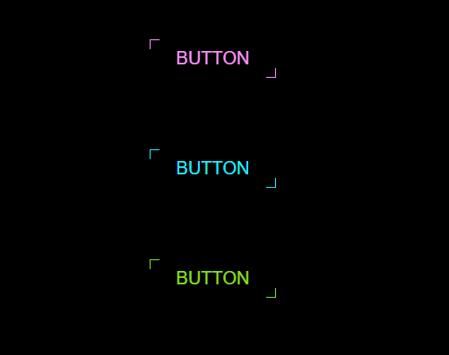
效果:
html部分
<div class="body">
    <a href="#">Button</a>
    <a href="#">Button</a>
    <a href="#">Button</a>
</div>
css部分
.body{
    display: flex;
    flex-direction: column;
    justify-content: center;
    align-items: center;
    background: #000;
    min-height: 100vh;
}
.body a{
    position: relative;
    padding: 10px 30px;
    margin: 40px 0;
    color: #21ebff;
    text-decoration: none;
    font-size: 20px;
    text-transform: uppercase;
    transition: 0.5s;
    overflow: hidden;
}
.body a:hover{
    background: #21ebff;
    color: #111;
    box-shadow: 0 0 50px #21ebff;
    transition-delay: 0.5s;
}
.body a:nth-child(1){
    filter: hue-rotate(115deg);
}
.body a:nth-child(3){
    filter: hue-rotate(270deg);
}
.body a::before{
    content: "";
    position: absolute;
    top: 0;
    left: 0;
    width: 10px;
    height: 10px;
    border-top: 1px solid #21ebff;
    border-left: 1px solid #21ebff;
    transition: 0.5s;
    transition-delay: 0.5s;
}
.body a:hover:before{
    width: 100%;
    height: 100%;
    transition-delay: 0s;
}
.body a::after{
    content: "";
    position: absolute;
    bottom: 0;
    right: 0;
    width: 10px;
    height: 10px;
    border-bottom: 1px solid #21ebff;
    border-right: 1px solid #21ebff;
    transition: 0.5s;
    transition-delay: 0.5s;
}
.body a:hover:after{
    width: 100%;
    height: 100%;
    transition-delay: 0s;
}


 扫一扫
扫一扫


 2036
2036

 被折叠的 条评论
为什么被折叠?
被折叠的 条评论
为什么被折叠?
 到【灌水乐园】发言


