


 本文详细介绍了CSS3中border-image属性的使用,包括source、slice、repeat等参数,以及如何通过border-image-slice和border-image-width等调整效果。同时,文章还探讨了background属性,涵盖background-image、background-size、background-origin、background-clip等多个方面,并特别讲解了线性和辐射渐变的实现方式。
border
border是一个组合属性,它有四个值,每个值代表一个方向,每个方向都有宽度,线条样式和颜色
div{
    width: 100px;
    height: 100px;
    border: 5px solid black;
    border-left: 5px solid red;
    border-right: 5px dashed blue;
    border-top: 5px double #008c8c;
}
<div></div>

border-image
border-image: source slice repeat;
source:url(图片路径) / source:创建渐变色
slice:top right bottom left fill 前四个参数表示四个方向的切割线,最后一个参数表示把内容区也填充了
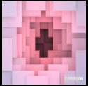
举个例子
border-image-slice: 25% 30% 12% 20%;

此图来自于http://css.doyoe.com/
repeat:stretch/repeat/round/space
stretch:拉伸(默认)
repeat:重复平铺,如果图像超过边界则被截断
round:与repeat类似,但当图像不能以整数次平铺时,会缩放图像。
space:与repeat类似,但当图像不能以整数次平铺时,会使用空白填充
border-image-width:背景图片能显示的宽度,如果值为auto就表示使用slice的值,但是要加px,比如slice为25%,那么width就是25px
border-image-outset:border向外延伸的宽度
这里的例子不好展示,有兴趣的可以自己试试
body{
background-color:black;
}
div{
position: absolute;
left: calc(50% - 50px);
top: calc(50% - 50px);
width: 100px;
height: 100px;
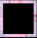
border: 10px solid black;
border-color:lightpink ;
border-image-source:url(./img/1.jpg);
border-image-slice: 10 fill;
}
<div></div>
如果不填fill
background
background-image:url()可以填多张图片 / 渐变色
background-size:像素值/百分比/auto/cover/contain
auto:图片本身大小
cover:一张图片完整的填充整个容器,有可能溢出,不改变原始比例
contain:不改变原始比例下,让容器包含一张完整的图片,有可能留白
background-origin:border-box,padding-box,content-box 从容器的哪里开始填充,默认是padding-box
background-clip:border-box,padding-box,content-box,text 从哪里结束填充,默认是border-box
text是一个特殊的值,表示用文字截背景图片,兼容性不太好
必须配合text-fill-color:transparent一起使用
	div{
            width: 1000px;
            height: 1000px;
            border: 1px solid black;
            font-size: 80px;
            text-align: center;
            line-height: 1000px;
            background-image: url(./img/4.jpg);
            -webkit-background-clip: text;
            -webkit-text-fill-color:transparent;
        }
	<div></div>

可以看到文字的背景是图片填充的。
background-position:背景图片定位,可以用像素值或者百分比
background-attachment:相对于什么定位。scroll默认 相对于容器
local 相对于内容区。fixed 相对于视口。
渐变色
background-image:
线性渐变:
linear-gradient(方向,开始颜色 起始位置,…中间颜色,终止颜色 终止位置)
方向:角度或者关键字
to left:
设置渐变为从右到左。相当于: 270deg
to right:
设置渐变从左到右。相当于: 90deg
to top:
设置渐变从下到上。相当于: 0deg
to bottom:
设置渐变从上到下。相当于: 180deg。默认值
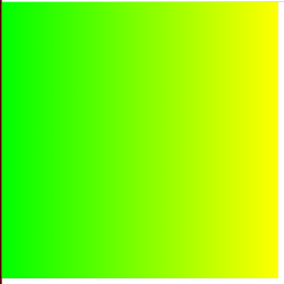
div{
width:200px;
height:200px;
background-image:linear-gradient(to right,#0f0,#ff0);
}
<div></div>
辐射渐变:
radial-gradient(圆心位置,圆的类型,渐变半径的长度,开始颜色,…中间颜色,结束颜色)
圆心位置,两个参数x,y如果只提供一个,第二个默认为50%
圆的类型:circle圆,ellipse椭圆
渐变半径的长度
closest-side:
指定径向渐变的半径长度为从圆心到离圆心最近的边
closest-corner:
指定径向渐变的半径长度为从圆心到离圆心最近的角
farthest-side:
指定径向渐变的半径长度为从圆心到离圆心最远的边
farthest-corner:
指定径向渐变的半径长度为从圆心到离圆心最远的角
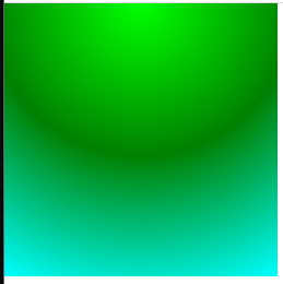
div{
    width: 200px;
    height: 200px;
    background-image: radial-gradient(circle at 100px 0px,#0f0,green,#0ff);
<div></div>
}


 扫一扫
扫一扫


 1703
1703

 被折叠的 条评论
为什么被折叠?
被折叠的 条评论
为什么被折叠?
 到【灌水乐园】发言


