 CSS3与JS实现动态方块下落效果


掉方块
今天时间比较紧,那就写个小小页面解压吧
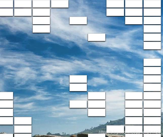
1、效果图
2、思路
创建多个宽、高都相等的小li,进行浮动排列,也可以用弹性布局,创建div包含所有span然后flex:row wrop;然后用css3新增的box-shadow效果会更好哦!
javascript的话
①如果你用li,那就可以用事件浮动去触发鼠标悬停在li上的事件
②如果你用span,那就用document.querySelector(“span”).οnclick=>function(){}是绑定事件
接下来就是事件处理,动态给span一个animation动画,鼠标悬停上面就触动动画,方块rorate(30deg),然后height=9999px。
3、代码
css:
		  body{
	        margin: 0;
	        padding: 0;
          }
          .container{
            width: 100%;
            height: 100vh;
            background: url("../bg3.jpg");
          }
        .container span {
          display: inline-flex;
          width: 8.7%;
          height: 30px;
          background-color: #fff;
          border: 1px solid rgba(0, 0, 0, .2);
          box-sizing: border-box;
          box-shadow: 0 2px 5px rgba(0,0,0,1);
        }
        .container span.fall{
          z-index: 1000;
          background: #f00;
          transition: 0.2s;
          pointer-events: none;
          animation: fall 2s linear forwards;
        }
        @keyframes fall {
          0%{
            transform: translateY(0) rotate(0deg);
          }
          100%{
            transform: translateY(1400px) rotate(20deg);
          }
        }
<div>
	<span></span>
	//...
</div>
</script>
<script >
      $(document).ready(function () {
          $('span').mouseover(function () {
              $(this).addClass('fall');
          });
      });
</script>


 扫一扫
扫一扫


 被折叠的 条评论
为什么被折叠?
被折叠的 条评论
为什么被折叠?
 到【灌水乐园】发言


