


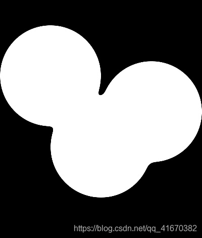
CSS 水滴融合效果
初步介绍:对水滴元素设置filter属性为blur(6px);进行模糊处理,对水滴的上一层容器添加属性:filter:contrast(30);将模糊了的边框提升对比度,实现效果。
<!doctype html>
<html>
<head>
<meta charset="utf-8">
<title></title>
	<style type="text/css">
		.containe{
			background: rgba(0,0,0,1.00);
			width: 400px;
			height: 700px;
			filter: contrast(30);
		}
		.drop1{
			position: absolute;
			border-radius: 50%;
			background:rgba(255,255,255,1.00);
			left: 200px;
			top: 500px;
			transform: translate(-50%,-50%);
			width: 200px;
			height: 200px;
			animation: movetotop 4s ease-in-out 1.273s infinite;
			filter: blur(6px);
		}

		.drop2{
			position: absolute;
			border-radius: 50%;
			background:rgba(255,255,255,1.00);
			left: 300px;
			top: 400px;
			transform: translate(-50%,-50%);
			width: 200px;
			height: 200px;
			animation: movetotop 4s ease-in-out 1.273s infinite;
			filter: blur(6px);
		}

		.drop3{
			position: absolute;
			border-radius: 50%;
			background:rgba(255,255,255,1.00);
			left: 100px;
			top: 300px;
			transform: translate(-50%,-50%);
			width: 200px;
			height: 200px;
			animation: movetotop 4s ease-in-out 1.273s infinite;
			filter: blur(6px);
		}

		@keyframes movetotop{
			100%{top: 300px;}
		}
	</style>
</head>

<body>
	<div class="containe">
		<div class="drop1">

		</div>
		<div class="drop2">

	    </div>
		<div class="drop3">

	    </div>
	</div>
</body>
</html>
效果:
更简单的设置更多水滴的方式:
css中对drop类进行修改,减少代码量:
<!doctype html>
<html>
<head>
<meta charset="utf-8">
<title></title>
	<style type="text/css">
		.containe{
			background: rgba(0,0,0,1.00);
			width: 400px;
			height: 700px;
			filter: contrast(30);
		}
		.drop{
			position: absolute;
			border-radius: 50%;
			background:rgba(255,255,255,1.00);
			left: 200px;
			top: 500px;
			transform: translate(-50%,-50%);
			width: 200px;
			height: 200px;
			animation: movetotop 4s ease-in-out 1.273s infinite;
			filter: blur(6px);
		}

		.drop:nth-child(2){
			transform: translate(20px)
		}

		.drop:nth-child(3){
			transform: translate(-90px)
		}

		@keyframes movetotop{
			100%{top: 300px;}
		}
	</style>
</head>

<body>
	<div class="containe">
		<div class="drop">

		</div>
		<div class="drop">

	    </div>
		<div class="drop">

	    </div>
	</div>
</body>
</html>
结果与上面的相同。
参考视频:
https://www.bilibili.com/video/BV1S64y1F7Y8?from=search&seid=14579192519791550978


 扫一扫
扫一扫


 277
277

 被折叠的 条评论
为什么被折叠?
被折叠的 条评论
为什么被折叠?
 到【灌水乐园】发言


