


 本文介绍了Matplotlib的安装及使用,包括点图、线图、散点图、条形图、等高线图、3D数据、子图、次坐标轴及动画的创建。详细讲解了坐标轴设置、标签修改、注解标注等技巧,并提供了多个相关教程及函数的参考。
1. 安装
pip3 install matplotlib
2. 导入常用库
import matplotlib.pyplot as plt
from matplotlib import *
from pylab import *
import numpy as np
import seaborn as sns

%matplotlib inline
matplotlib 画动态图以及plt.ion()和plt.ioff()的使用
2.1 点图
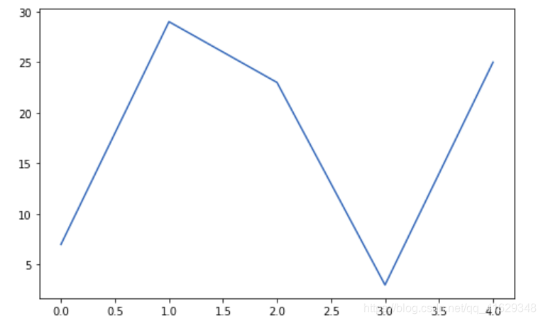
plt.figure(figsize = (8,5))#图的大小为(8,5)
plt.plot([7,29,23,3,25])#默认x为[0,1,2,3,4]
plt.show()
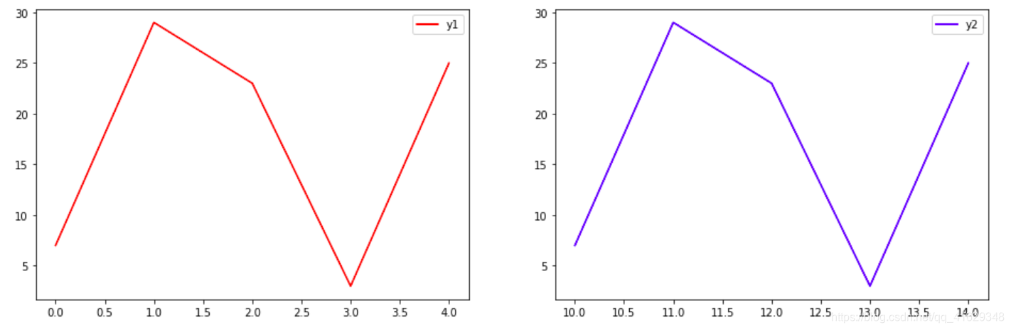
plt.figure(figsize = (16,5))
plt.subplot(1,2,1)
plt.plot([7,29,23,3,25], c = 'r', label = 'y1')
plt.legend()
plt.subplot(1,2,2)
plt.plot([10,11,12,13,14],[7,29,23,3,25], c = 'b', label = 'y2')
plt.legend()
plt.show()
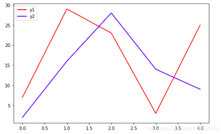
plt.figure(figsize = (8,5))
plt.plot([7,29,23,3,25], c = 'r', label = 'y1')
plt.plot([2,16,28,14,9], c = 'b', label = 'y2')
plt.legend(loc = 'upper left')
plt.show()
2.2 线图
x = np.linspace(-4,4,15)#定义x,在(-4,4)之间生成15个样本数
y = x
plt.plot(x,y)

plt.xlabel('x')
plt.ylabel('y')
plt.savefig('line.png')#保存图片
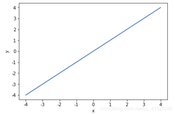
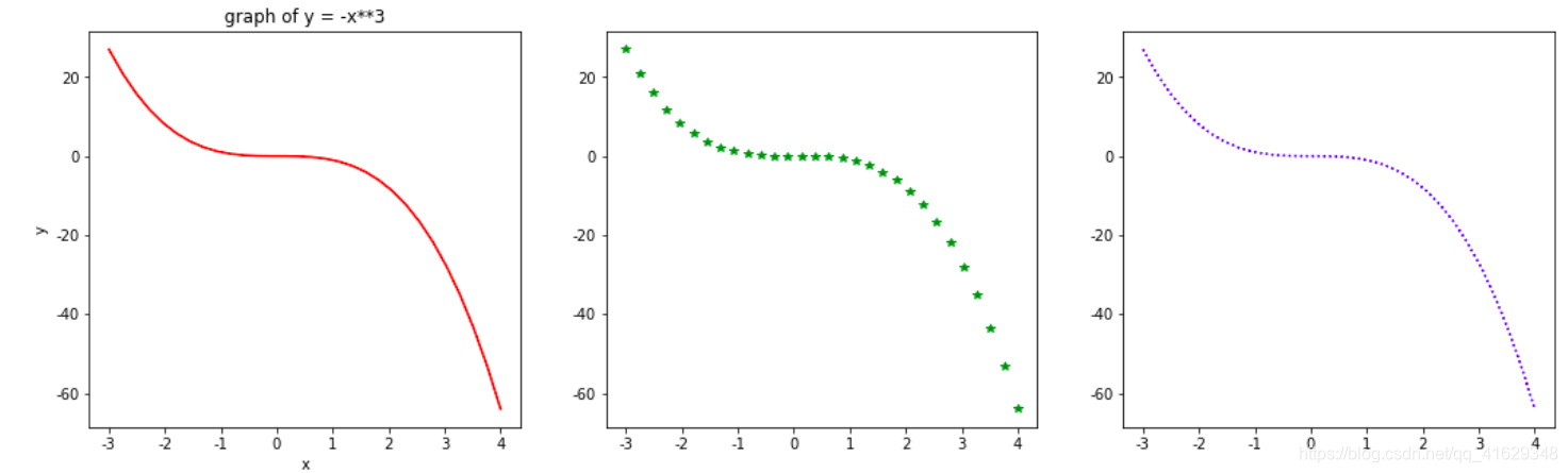
fig = plt.figure(figsize=(18,5))
x = np.linspace(-3,4,30)
y = -x**3
plt.subplot(1,3,1)
plt.plot(x,y,c = 'r')
plt.xlabel('x')
plt.ylabel('y')
plt.title('graph of y = -x**3')
plt.subplot(1,3,2)
plt.plot(x,y,'g*')
plt.subplot(1,3,3)
plt.plot(x,y,'b:')
plt.show()
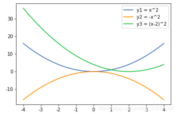
x = np.linspace(-4,4,30)
y1 = x**2
y2 = -x**2
y3 = (x-2)**2
plt.plot(x,y1,label = 'y1 = x^2')
plt.plot(x,y2,label = 'y2 = -x^2')
plt.plot(x,y3,label = 'y3 = (x-2)^2')
plt.legend()
plt.show()
plt.savefig('plots.png')
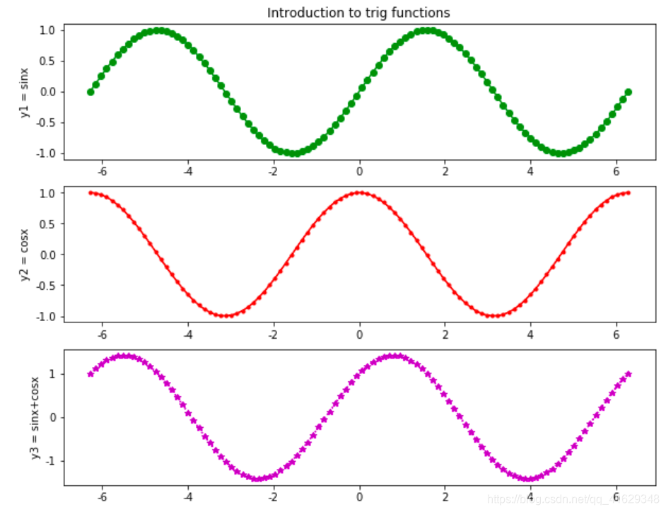
plt.figure(figsize = (10,8))
x = np.linspace(-2*np.pi, 2*np.pi, 100)
y1 = np.sin(x)
y2 = np.cos(x)
plt.subplot(3,1,1)
plt.plot(x, y1, 'go-')
plt.title('Introduction to trig functions', fontsize = 10)
plt.ylabel('y1 = sinx')
plt.subplot(3,1,2)
plt.plot(x, y2, 'r.-')
plt.ylabel('y2 = cosx')
plt.subplot(3,1,3)
plt.plot(x, y1+y2, 'm*:')
plt.ylabel('y3 = sinx+cosx')
plt.show()
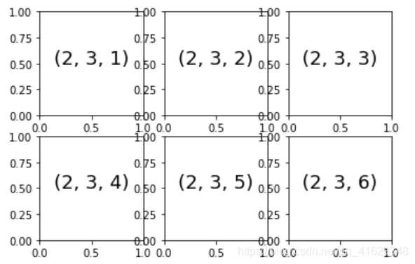
for i in range(1,7):
    plt.subplot(2,3,i)
    plt.text(0.5,0.5,str((2,3,i)),fontsize=18,ha='center')#以文本形式打印
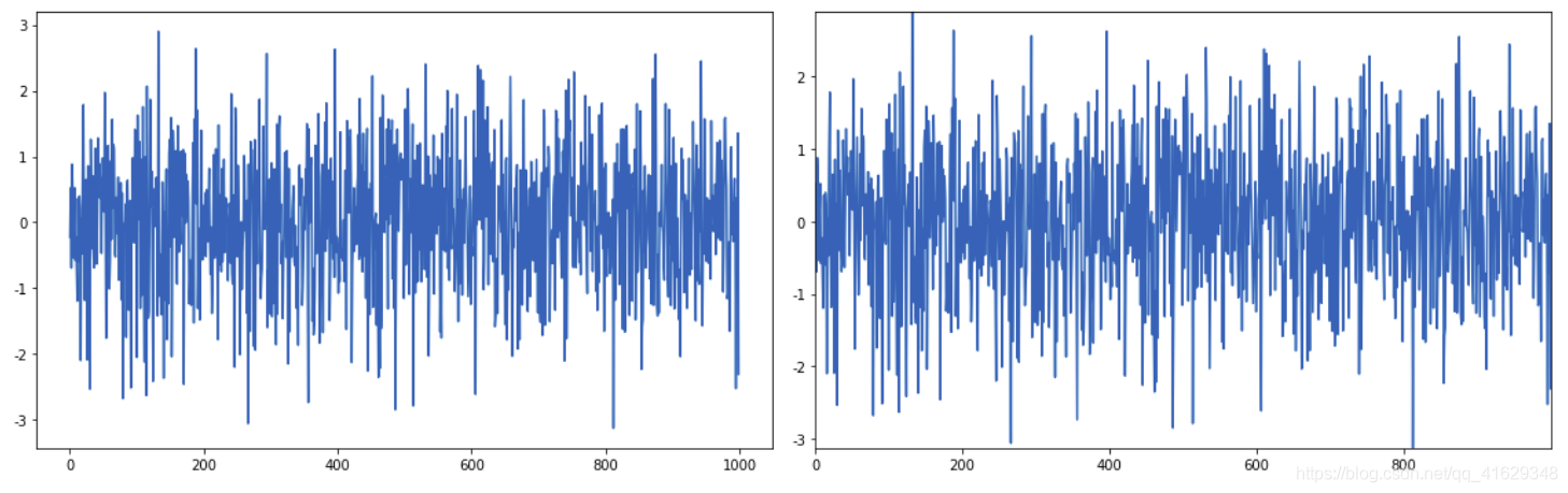
from pylab import *
y = randn(1000)
plt.figure(figsize = (16,5))
plt.subplot(1,2,1)
plot(y)
plt.subplot(1,2,2)
plot(y)
plt.autoscale(tight='x')
plt.tight_layout()
plt.show()
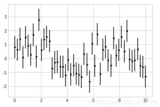
from sympy import *

plt.style.use('seaborn-whitegrid')
x = np.linspace(0,10,50)
dy = 0.8
y = np.sin(x) + dy*np.random.randn(50)

plt.errorbar(x,y,yerr=dy,fmt='.k')
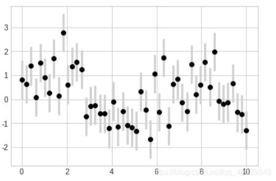
plt.errorbar(x,y,yerr=dy,fmt='o',color='black',ecolor='lightgray',elinewidth=3,capsize=0)
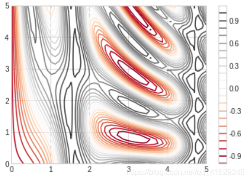
def f(x, y):
    return np.sin(x)**10 + np.cos(10+y*x)*np.cos(x)

x = np.linspace(0,5,50)
y = np.linspace(0,5,40)

X, Y = np.meshgrid(x, y)
Z = f(X, Y)

plt.contour(X,Y,Z,colors='black')
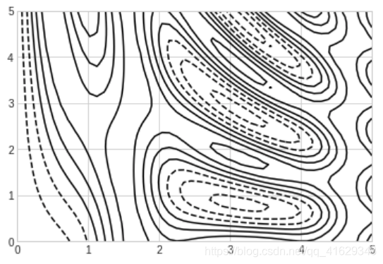
plt.contour(X,Y,Z,20,cmap='RdGy')
plt.colorbar()
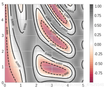
contours = plt.contour(X,Y,Z,3,colors='black')
plt.clabel(contours, inline=True, fontsize=8)

plt.imshow(Z, extent=[0,5,0,5], origin='lower', cmap='RdGy', alpha=0.5)
plt.colorbar()
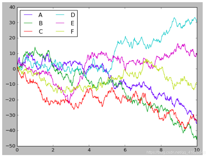
plt.style.use('classic')

#Create some data
rng = np.random.RandomState(0)
x = np.linspace(0,10,500)
y = np.cumsum(rng.randn(500,6),0)

plt.plot(x, y)
plt.legend('ABCDEF', ncol=2, loc='upper left')
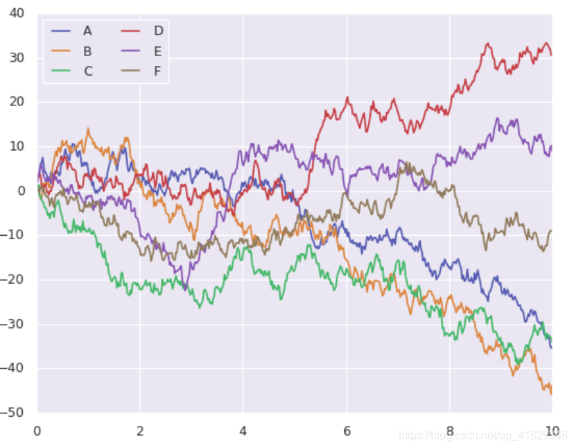
import seaborn as sns
sns.set()

plt.plot(x,y)
plt.legend('ABCDEF', ncol=2, loc='upper left')
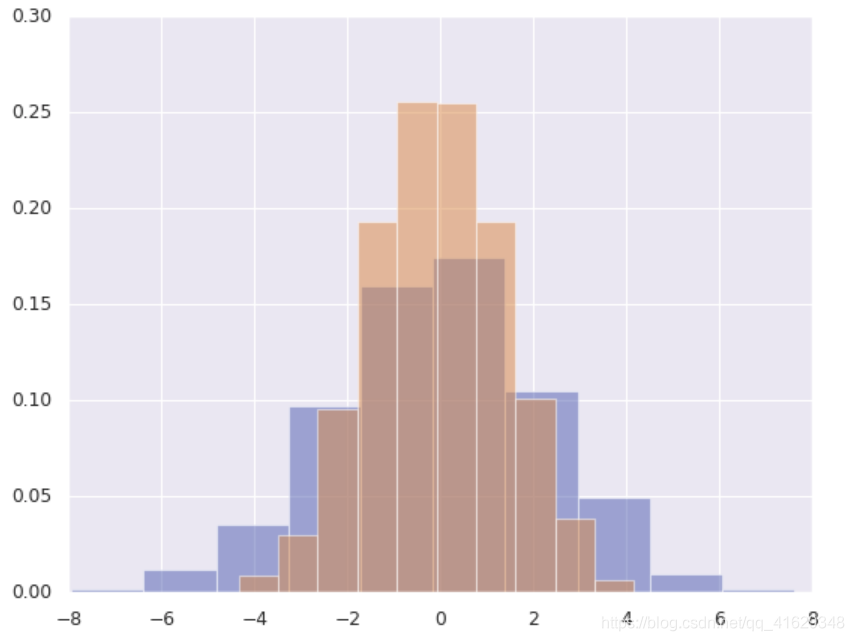
import pandas as pd

data = np.random.multivariate_normal([0,0],[[5,2],[2,2]],size=2000)
data = pd.DataFrame(data, columns=['x', 'y'])

for col in 'xy':
    plt.hist(data[col], normed = True, alpha=0.5)
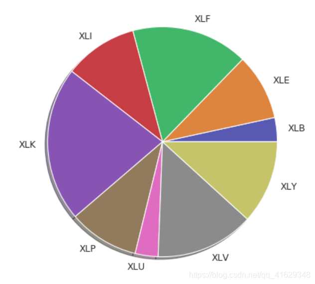
w_init = [0.0339, 0.0934, 0.1644, 0.1034, 0.2177, 0.099, 0.0323, 0.1385, 0.1175]
namelist = ['XLB', 'XLE', 'XLF', 'XLI', 'XLK', 'XLP', 'XLU', 'XLV', 'XLY']
labels = namelist
plt.pie(w_init, labels = labels, shadow = True)
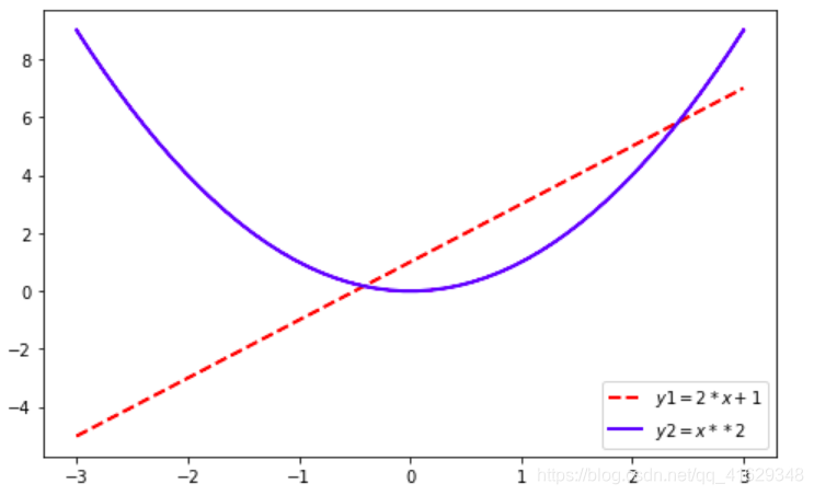
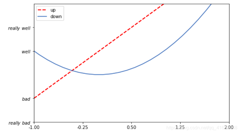
x=np.linspace(-3,3,50)  #定义x,在(-3,3)之间生成50个样本数
y1=2*x+1  #定义y1数据范围
y2=x**2
plt.figure(num = 1, figsize = (8, 5))  #定义图像窗口,编号为1,大小为(8,5)
plt.plot(x,y1,color = 'red', linewidth = 2, linestyle = '--', label = '$y1=2*x+1$')  #画出曲线
plt.legend()
plt.plot(x,y2,color = 'blue', linewidth = 2, label = '$y2=x**2$')
plt.legend()
plt.show() #显示图像
2.3 设置坐标轴
设置坐标轴的范围:
plt.xlim()
plt.ylim()
设置坐标轴的显示:
plt.xlabel()
plt.ylabel()
替换坐标轴刻度:
plt.xticks()
plt.yticks()
设置坐标轴边框属性
调整移动坐标轴
plt.rcParams['font.sans-serif'] = ['SimHei'] #用于正常显示中文
plt.rcParams['axes.unicode_minus'] = False
#解决保存图像是负号'-'显示为方块的问题,或者转换负号为字符串
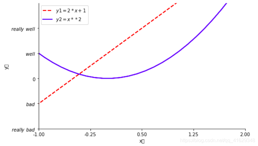
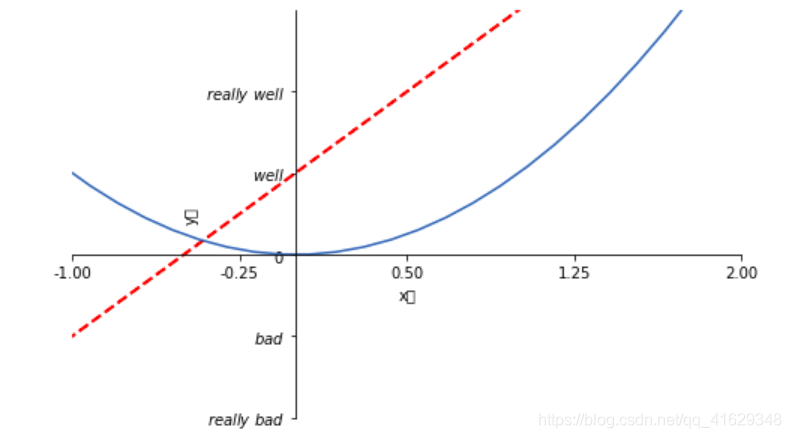
x=np.linspace(-3,3,50) #在(-3,3)之间生成50个样本数
y1=2*x+1
y2=x**2
plt.figure(num=1,figsize=(8,5)) #定义编号为1,大小为(8,5)
plt.plot(x,y1,color = 'red', linewidth = 2, linestyle = '--', label = '$y1=2*x+1$') #画出曲线
plt.legend(loc='best') #显示在最好的位置,自动分配
plt.plot(x,y2,color = 'blue', linewidth = 2, label = '$y2=x**2$')
plt.legend(loc='best') #显示在最好的位置,自动分配
plt.xlim(-1,2) #x轴的范围
plt.ylim(-2,3) #y轴的范围
plt.xlabel("x轴")#x轴的标签
plt.ylabel("y轴")#y轴的标签
new_ticks=np.linspace(-1,2,5) #-1到2分成5段,包含端点
#print('x轴刻度值%s'%new_ticks)
plt.xticks(new_ticks) #进行替换新下标
plt.yticks([-2,-1,0,1,2,],
[r'$really\ bad$','$bad$','$0$','$well$','$really\ well$'])
#第一个方框表示对应y轴上的值,第二个方框表示y轴相对应的显示的文字
#设置边框属性
ax=plt.gca() #get current axis ax有上下左右四个边框
ax.spines['right'].set_color('none') #边框属性设置为None 不显示,即右边框不显示
ax.spines['top'].set_color('none') #上边框不显示
plt.show()
2.4 修改标签名称
loc中的参数:best、upper right、upper left、lower left、lower right、right、center right、
lower center、upper center、center
x=np.linspace(-3,3,50)
y1=2*x+1
y2=x**2
plt.figure(num=2,figsize=(8,5))
plt.xlim(-1,2)
plt.ylim(-2,3)

new_ticks=np.linspace(-1,2,5)
plt.xticks(new_ticks)
plt.yticks([-2,-1,1,2,],
          [r'$really\ bad$','$bad$','$well$','$really\ well$'])

l1,=plt.plot(x,y1,color='red',linewidth=2,linestyle='--',label='linear line')
l2,=plt.plot(x,y2,label='square line')

#单独修改label的信息
plt.legend(loc='best',handles=[l1,l2],labels=['up','down']) #显示在最好的位置,自动分配

plt.show() #显示图
2.5 设置移动坐标轴
#调整移动坐标轴
plt.rcParams['font.sans-serif'] = ['SimHei'] #用于正常显示中文
plt.rcParams['axes.unicode_minus'] = False   #解决保存图像是负号'-'显示为方块的问题,或者转换负号为字符串
x=np.linspace(-3,3,50) #在(-3,3)之间生成50个样本数
y1=2*x+1
y2=x**2
plt.figure(num=2,figsize=(8,5)) #定义编号为2,大小为(8,5)
plt.plot(x,y1,color='red',linewidth=2,linestyle='--')
plt.plot(x,y2)
plt.xlim(-1,2) #x轴的范围
plt.ylim(-2,3) #y轴的范围
plt.xlabel("x轴")
plt.ylabel("y轴")

new_ticks=np.linspace(-1,2,5)  #-1到2分成5段,包含端点
#print(new_ticks)
plt.xticks(new_ticks)  #进行替换新下标
plt.yticks([-2,-1,0,1,2,],
          [r'$really\ bad$','$bad$','$0$','$well$','$really\ well$'])

ax=plt.gca()  #get current axis
ax.spines['right'].set_color('none') #边框属性设置为None 不显示
ax.spines['top'].set_color('none')

ax.xaxis.set_ticks_position('bottom')  #设置x坐标刻度数字或名称的位置,所有属性为:top,bottom,both,default,none
ax.spines['bottom'].set_position(('data',0)) # 设置.spines边框x轴,设置.set_position设置边框的位置,y=0位置;位置所有属性有outward,axes,data
ax.yaxis.set_ticks_position('left')
ax.spines['left'].set_position(('data',0)) #坐标中心点在(0,0)位置

plt.show()
2.6 Annotation标注
annotate(s='str' , # 注释文本内容
         xy=(x,y) ,# 被注释的坐标点
         xytext=(l1,l2) , # 为注释文字的坐标位置
         xycooders,
         extcoords, # 设置注释文字偏移量
         arrowprops, # 箭头参数(dict)
         bbox        # 给标题增加外框(dict)
         va          # verticalalignment设置水平对齐方式
         ha          # horizontalalignment设置垂直对齐方式,可选参数:left,right,center
        )
s 为注释文本内容
xy 为被注释的坐标点
xytext 为注释文字的坐标位置
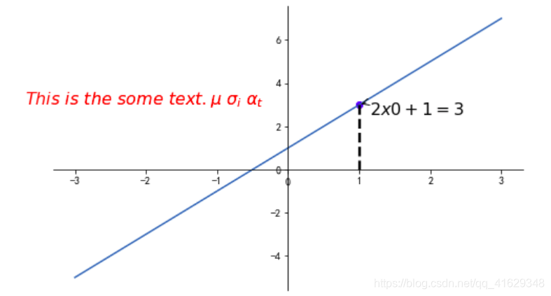
x=np.linspace(-3,3,50)
y=2*x+1
plt.figure(num=1,figsize=(8,5))
plt.plot(x,y)

#移动坐标轴
ax=plt.gca()
ax.spines['right'].set_color('none')
ax.spines['top'].set_color('none')
ax.xaxis.set_ticks_position('bottom')
ax.spines['bottom'].set_position(('data',0))
ax.yaxis.set_ticks_position('left')
ax.spines['left'].set_position(('data',0))

#标注信息
x0=1
y0=2*x0+1
plt.scatter(x0,y0,color='b')
plt.plot([x0,x0],[y0,0],'k--',lw=2.5)  #连接两个点,k表示黑色,lw=line weight 线粗细

#Annotation标注
plt.annotate(r'$2x0+1=%s$' % y0,xy=(x0,y0),xycoords='data',xytext=(+10,-10),textcoords='offset points',fontsize=16,
             arrowprops=dict(arrowstyle='->',connectionstyle='arc3,rad=.2'))
#xycoords='data'  基于数据的值来选位置,xytext=(+30,-30),对于标注位置的描述,textcoords='offset points',xy偏差值,
#arrowprops对图中箭头类型设置

#plt.annotate(s, xy, xycoords, xytext, textcoords, fontsize, arrowprops)
#在annotation标注函数中我们可以设置注释文本的内容,被注释的坐标点位置, 注释文字的坐标位置, 标注箭头类型

plt.text(-3.7,3,r'$This\ is\ the\ some\ text. \mu\ \sigma_i\ \alpha_t$',fontdict={'size':16,'color':'r'})

plt.show()
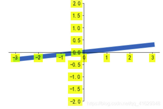
2.7 tick能见度
x=np.linspace(-3,3,50)
y=0.1*x
plt.figure()
plt.plot(x,y,linewidth=10,zorder=1)
plt.ylim(-2,2)

#移动坐标轴
ax=plt.gca()
ax.spines['right'].set_color('none')
ax.spines['top'].set_color('none')
ax.xaxis.set_ticks_position('bottom')
ax.spines['bottom'].set_position(('data',0))
ax.yaxis.set_ticks_position('left')
ax.spines['left'].set_position(('data',0))

#label.set_fontsize(12) 重新调整字体的大小,
#bbox设置目的内容透明度相关系数
#set_bbox(dict(facecolor='white', edgecolor = 'None', alpha = 0.7, zorder = 2))
#facecolor调节box的前景色
#edgecolor设置边框
#alpha设置透明度范围0-1
#zorder设置图层顺序,在z轴方向排序
for label in ax.get_xticklabels()+ax.get_yticklabels():
    label.set_fontsize(12)
    label.set_bbox(dict(facecolor='yellow',edgecolor='None',alpha=0.7,zorder=2))

plt.show()
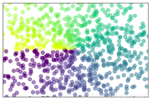
2.8 Scatter散点图
n=1024
X=np.random.normal(0,1,n)
Y=np.random.normal(0,1,n)
T=np.arctan2(Y,X)  #arctan2返回给定的X和Y值的反正切值

#scatter画散点图,size=75,颜色为T,透明度为50%,利用xticks函数来隐藏x坐标轴
plt.scatter(X,Y,s=75,c=T,alpha=0.5)

plt.xlim(-1.5,1.5)
plt.xticks(())  #忽略xticks
plt.ylim(-1.5,1.5)
plt.yticks(()) #忽略yticks
plt.show()
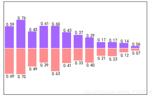
2.9 Bar条形图
n=12
X=np.arange(n)
Y1=(1-X/float(n))*np.random.uniform(0.5,1,n)
Y2=(1-X/float(n))*np.random.uniform(0.5,1,n)

#bar画条形图
plt.bar(X,+Y1,facecolor='#9999ff',edgecolor='white')
plt.bar(X,-Y2,facecolor='#ff9999',edgecolor='white')

#标记值
for x,y in zip(X,Y1):  #zip表示可以传递两个值
    plt.text(x+0.1,y+0.01,'%.2f'%y,ha='center',va='bottom')  #ha表示横向对齐,bottom表示向下对齐
for x,y in zip(X,Y2):
    plt.text(x+0.1,-y-0.01,'%.2f'%y,ha='center',va='top')
plt.xlim(-0.5,n)
plt.xticks(())
plt.ylim(-1.25,1.25)
plt.yticks(())

plt.show()
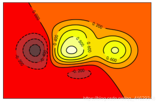
2.10 Contours等高线图
n=256
x=np.linspace(-3,3,n)
y=np.linspace(-3,3,n)
X,Y=np.meshgrid(x,y)  #从坐标向量返回坐标矩阵
#函数用来计算高度值,利用contour函数把颜色加进去,位置参数依次为x,y,f(x,y),透明度为0.75,并将f(x,y)的值对应到camp之中
def f(x,y):
    return (1-x/2+x**5+y**3)*np.exp(-x**2-y**2)

#contourf画等高线图
plt.contourf(X,Y,f(X,Y),10,alpha=0.75,cmap=plt.cm.hot)  #8表示等高线分成多少份,alpha表示透明度,cmap表示color map

C=plt.contour(X,Y,f(X,Y),8,colors='black',linewidth=0.5)
plt.clabel(C,inline=True,fontsize=10)
plt.xticks(()) #隐藏坐标轴
plt.yticks(())

plt.show()
2.11 Image图片
import matplotlib.pyplot as plt
import numpy as np

a = np.array([0.313660827978, 0.365348418405, 0.423733120134,
              0.365348418405, 0.439599930621, 0.525083754405,
              0.423733120134, 0.525083754405, 0.651536351379]).reshape(3,3)

plt.imshow(a, interpolation='nearest', cmap='bone', origin='lower')
plt.show()
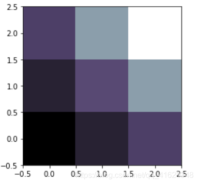
#利用matplotlib打印出图像
a=np.array([0.313660827978,0.365348418405,0.423733120134,
           0.365348418405,0.439599930621,0.525083754405,
           0.423733120134,0.525083754405,0.651536351379]).reshape(3,3)
plt.imshow(a,interpolation='nearest',cmap='bone',origin='lower') #origin='lower'代表就是选择原点位置
plt.colorbar(shrink=.92) #shrink参数是将图片长度变为原来的92%
plt.xticks(())
plt.yticks(())
plt.show()

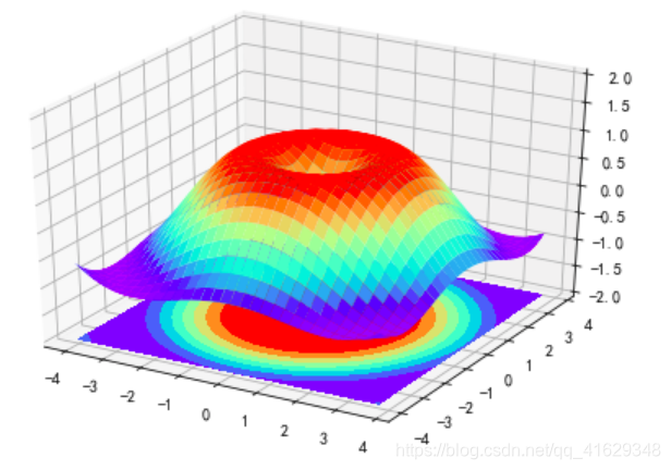
2.12 3D数据
import numpy as np
import matplotlib.pyplot as plt
from mpl_toolkits.mplot3d import Axes3D   #需要导入模块Axes3D

fig=plt.figure() #定义图像窗口
ax=Axes3D(fig)  #在窗口上添加3D坐标轴
#将x和y值编织成栅格
X=np.arange(-4,4,0.25)
Y=np.arange(-4,4,0.25)
X,Y=np.meshgrid(X,Y)
R=np.sqrt(X**2+Y**2)
Z=np.sin(R)  #高度值

#将colormap ranbow填充颜色,之后将三维图像投影到XY平面做等高线图,其中rstride和cstride表示row和column的宽度
ax.plot_surface(X,Y,Z,rstride=1,cstride=1,cmap=plt.get_cmap('rainbow')) #rstride表示图像中分割线的跨图

#添加XY平面等高线 投影到Z平面
ax.contourf(X,Y,Z,zdir='z',offset=-2,cmap=plt.get_cmap('rainbow')) #把图像进行投影的图形 offset表示比0坐标轴低两个位置
ax.set_zlim(-2,2)
plt.show()
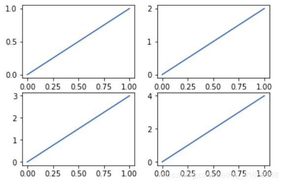
2.13 Subplot
多合一显示
均匀图中图:MatPlotLib可以组合许多的小图在大图中显示,使用的方法叫做subplot
plt.figure()
plt.subplot(2,2,1)  #表示将整个图像分割成2行2列,当前位置为1
plt.plot([0,1],[0,1]) #横坐标变化为[0,1] 竖坐标变化为[0,2]

plt.subplot(2,2,2)
plt.plot([0,1],[0,2])

plt.subplot(2,2,3)
plt.plot([0,1],[0,3])

plt.subplot(2,2,4)
plt.plot([0,1],[0,4])
plt.show()
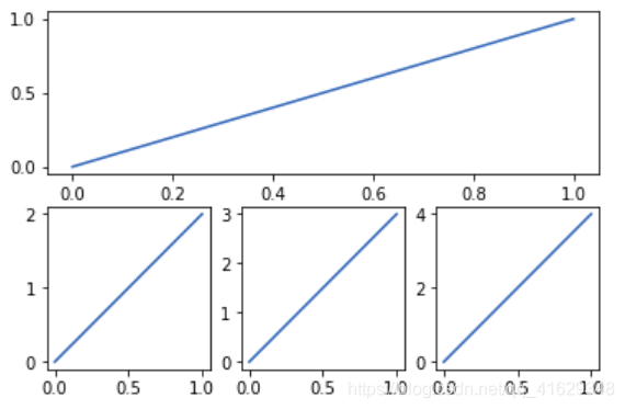
不均匀图中图
plt.figure()
plt.subplot(2,1,1)  #表示将整个图像分割成2行1列,当前位置为1
plt.plot([0,1],[0,1]) #横坐标变化为[0,1] 竖坐标变化为[0,2]

plt.subplot(2,3,4)
plt.plot([0,1],[0,2])

plt.subplot(2,3,5)
plt.plot([0,1],[0,3])

plt.subplot(2,3,6)
plt.plot([0,1],[0,4])
plt.show()
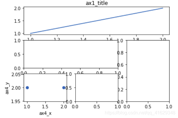
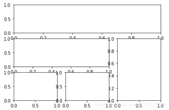
分格显示
   #方法一
    import matplotlib.gridspec as gridspec  #引入新模块
    plt.figure()
    #使用plt.subplot2grid创建一个小图,(3,3)表示将整个图像分割成三行三列,(0,0)表示从第0行0列开始作图,
    #colspan=3表示列的跨度为3.colspan和rowspan缺省时默认跨度为1
    ax1=plt.subplot2grid((3,3),(0,0),colspan=3)
    ax1.plot([1,2],[1,2])
    ax1.set_title('ax1_title')  #设置图的标题

    #将图像分割成3行3列,从第1行0列开始作图,列的跨度为2
    ax2=plt.subplot2grid((3,3),(1,0),colspan=2)

    #将图像分割成3行3列,从第1行2列开始作图,行的跨度为2
    ax3=plt.subplot2grid((3,3),(1,2),rowspan=2)

    #将图像分割成3行3列,从第2行0列开始作图,行与列的跨度默认为1
    ax4=plt.subplot2grid((3,3),(2,0))
    ax4.scatter([1,2],[2,2])
    ax4.set_xlabel('ax4_x')
    ax4.set_ylabel('ax4_y')

    ax5=plt.subplot2grid((3,3),(2,1))
    plt.show()
#方法二
plt.figure()
gs=gridspec.GridSpec(3,3)  #将图像分割成三行三列
ax6=plt.subplot(gs[0,:]) #gs[0:1]表示图占第0行和所有列
ax7=plt.subplot(gs[1,:2]) #gs[1,:2]表示图占第1行和前两列
ax8=plt.subplot(gs[1:,2]) #gs[1,:]表示图占后两行的最后一列
ax9=plt.subplot(gs[-1,0])
ax10=plt.subplot(gs[-1,-2]) #gs[-1,-2]表示这个图占倒数第一行和倒数第2列
plt.show()
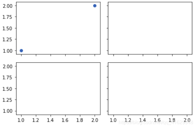
#方法三
#建立一个2行2列的图像窗口,sharex=True表示共享x轴坐标,sharey=True表示共享y轴坐标,
#((ax11,ax12),(ax13,ax14))表示从左到右一次存放ax11,ax12,ax13,ax14
f,((ax11,ax12),(ax13,ax14))=plt.subplots(2,2,sharex=True,sharey=True)
ax11.scatter([1,2],[1,2]) #坐标范围x为[1,2],y为[1,2]
plt.tight_layout() #表示紧凑显示图像
plt.show()
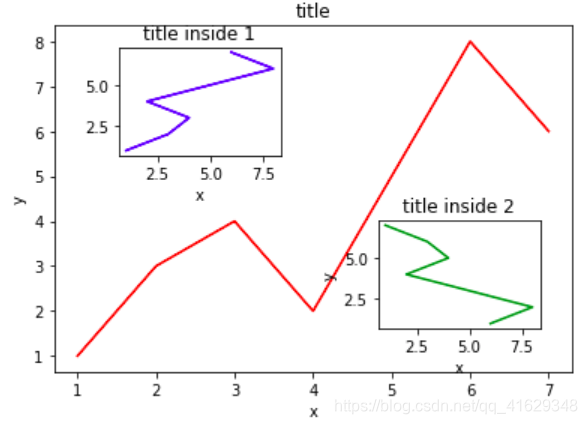
图中图
fig=plt.figure()
#创建数据
x=[1,2,3,4,5,6,7]
y=[1,3,4,2,5,8,6]

#绘制大图:假设大图的大小为10,那么大图被包含在由(1,1)开始,宽8高8的坐标系之中
left,bottom,width,height=0.1,0.1,0.8,0.8
ax1=fig.add_axes([left,bottom,width,height]) #main axes
ax1.plot(x,y,'r')  #绘制大图,颜色为red
ax1.set_xlabel('x') #横坐标名称为x
ax1.set_ylabel('y')
ax1.set_title('title') #图名称为title

#绘制小图,注意坐标系位置和大小的改变
ax2=fig.add_axes([0.2,0.6,0.25,0.25])
ax2.plot(y,x,'b') #颜色为bule
ax2.set_xlabel('x')
ax2.set_title('title inside 1')

#绘制第二个小图
plt.axes([0.6,0.2,0.25,0.25])
plt.plot(y[::-1],x,'g')  #将y进行逆序
plt.xlabel('x')
plt.ylabel('y')
plt.title('title inside 2')
plt.show()
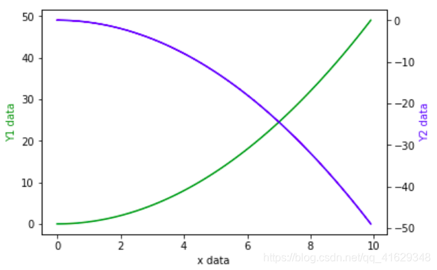
2.14 次坐标轴
#同一个图中有两个y坐标轴
#获取figure默认坐标系:fig, ax1 = plt.subplots()
#通过ax1调用twinx,生成ax2: ax2 = ax1.twinx()
#分别在ax1和ax2中画图

x=np.arange(0,10,0.1)
y1=0.5*x**2
y2=-1*y1
fig,ax1=plt.subplots()

ax2=ax1.twinx()  #镜像显示
ax1.plot(x,y1,'g-')
ax2.plot(x,y2,'b-')

ax1.set_xlabel('x data')
ax1.set_ylabel('Y1 data',color='g') #第一个y坐标轴
ax2.set_ylabel('Y2 data',color='b') #第二个y坐标轴
plt.show()
2.15 Animation动画
import matplotlib.pyplot as plt
import numpy as np
%matplotlib notebook
#在jupyter 中显示动画
from matplotlib.animation import FuncAnimation #引入新模块
fig,ax=plt.subplots()
x=np.arange(0,2*np.pi,0.01)  #数据为0~2PI范围内的正弦曲线
line,=ax.plot(x,np.sin(x))  #line表示列表

#构造自定义动画函数animate,用来更新每一帧上x和y坐标值,参数表示第i帧
def animate(i):
    line.set_ydata(np.sin(x+i/100))
    return line,

#构造开始帧函数init
def init():
    line.set_ydata(np.sin(x))
    return line,

ani=FuncAnimation(fig=fig,func=animate,frames=200,init_func=init,interval=10,blit=False)
#fig:进行动画绘制的figure; func:自定义动画函数,即传入刚定义的函数animate;
#frames:表示动画长度,一次循环所包含的帧数; init_func:自定义开始帧,即传入刚定义的函数init;
#interval表示更新频率,以ms计
#blit选择更新所有点,还是仅更新新变化产生的点。应该选True,但mac用户选择False,否则无法显示动画

plt.show()
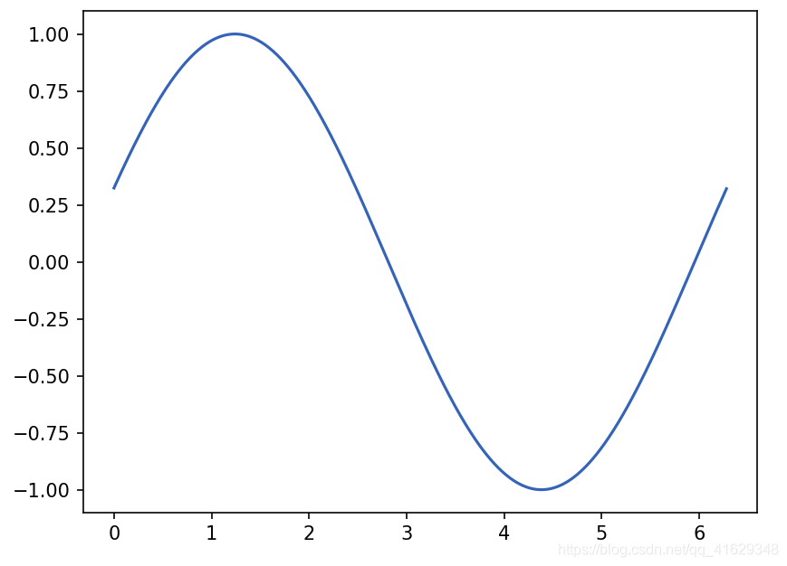 上图是动画的初始帧
%matplotlib notebook
from matplotlib import animation#引入新模块
fig,ax=plt.subplots()
x=np.arange(0,2*np.pi,0.01)#数据为0~2PI范围内的正弦曲线
line,=ax.plot(x,np.sin(x))# line表示列表

#构造自定义动画函数animate,用来更新每一帧上x和y坐标值,参数表示第i帧
def animate(i):
    line.set_ydata(np.sin(x+i/100))
    return line,

#构造开始帧函数init
def init():
    line.set_ydata(np.sin(x))
    return line,

  # frame表示动画长度,一次循环所包含的帧数;interval表示更新频率
  # blit选择更新所有点,还是仅更新新变化产生的点。应该选True,但mac用户选择False。
ani=animation.FuncAnimation(fig=fig,func=animate,frames=200,init_func=init,interval=20,blit=False)
plt.show()
from matplotlib import pyplot as plt
from matplotlib import animation
import numpy as np
fig, ax = plt.subplots()
#我们的数据是一个0~2π内的正弦曲线
x = np.arange(0, 2*np.pi, 0.01)
line, = ax.plot(x, np.sin(x))

#接着,构造自定义动画函数animate,用来更新每一帧上各个x对应的y坐标值,参数表示第i帧
def animate(i):
    line.set_ydata(np.sin(x + i/10.0))
    return line,
#然后,构造开始帧函数init
def init():
    line.set_ydata(np.sin(x))
    return line,
#接下来,我们调用FuncAnimation函数生成动画。参数说明:
#fig 进行动画绘制的figure
#func 自定义动画函数,即传入刚定义的函数animate
#frames 动画长度,一次循环包含的帧数
#init_func 自定义开始帧,即传入刚定义的函数init
#interval 更新频率,以ms计
#blit 选择更新所有点,还是仅更新产生变化的点。应选择True,但mac用户请选择False,否则无法显示动画

ani = animation.FuncAnimation(fig=fig,
                              func=animate,
                              frames=100,
                              init_func=init,
                              interval=20,
                              blit=False)
plt.show()

 #当然,你也可以将动画以mp4格式保存下来,但首先要保证你已经安装了ffmpeg 或者mencoder
 # ani.save('basic_animation.mp4', fps=30, extra_args=['-vcodec', 'libx264'])
%matplotlib notebook
import tensorflow as tf
import numpy as np
import matplotlib.pyplot as plt
from matplotlib import animation
fig, ax = plt.subplots()
x =np.arange(0,2*np.pi,0.01)
 # 返回的是个列表
line , = ax.plot(x,np.sin(x))
def animate(i):
    # xdata 保持不变, ydata 更新成另外一批数据
    # 将0-100都传进去更新一下,i变化时,y也会变化,更新图像
    line.set_ydata(np.sin(x+i/10))
    return line,

def init():
    line.set_ydata(np.sin(x))
    return line,

 # interval 是更新的频率,隔多少毫秒更新一次,这里是隔20ms更新一次
 # blit=True,只更新有变化的点
ani = animation.FuncAnimation(fig=fig,func=animate,frames =100,init_func=init,interval =20,blit=False)
plt.show()
3. 参考
3.1 Matplotlib 教程
3.2 Matplotlib Python 画图教程 (莫烦Python)
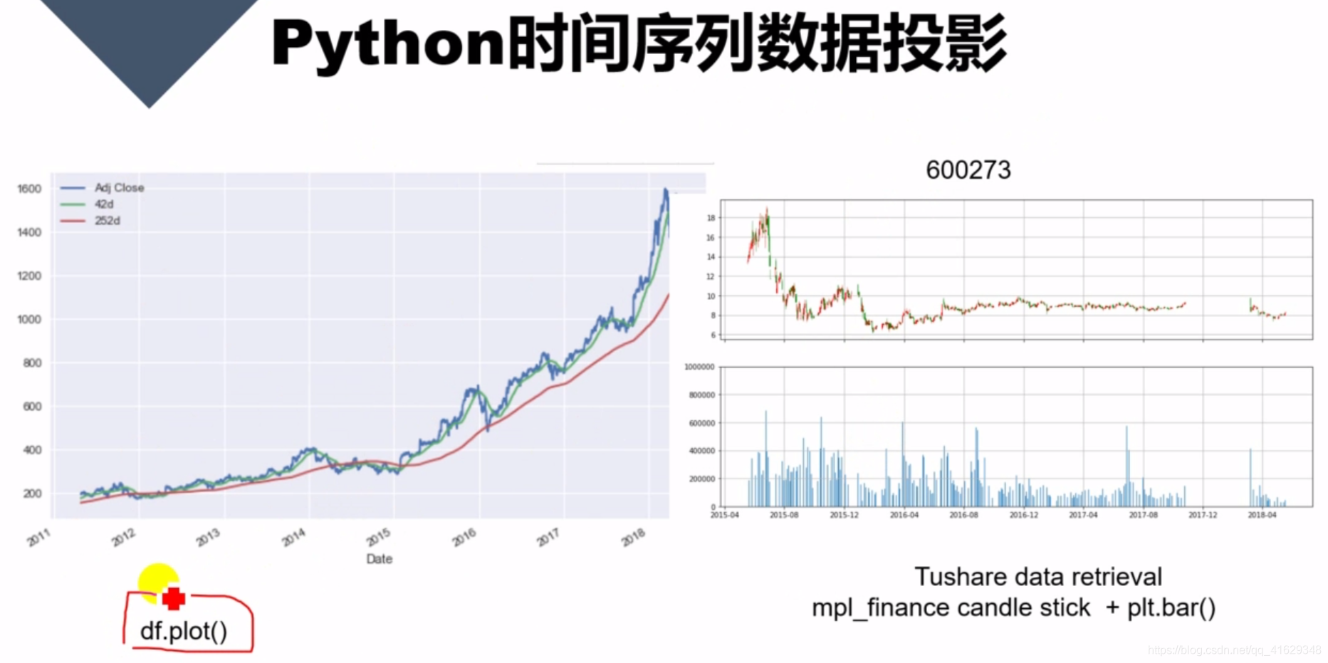
df.plot()
参考:详解pandas.DataFrame.plot( )画图函数
DataFrame.plot( )函数
DataFrame.plot(x=None, y=None, kind='line', ax=None, subplots=False,
                sharex=None, sharey=False, layout=None,figsize=None,
                use_index=True, title=None, grid=None, legend=True,
                style=None, logx=False, logy=False, loglog=False,
                xticks=None, yticks=None, xlim=None, ylim=None, rot=None,
                xerr=None,secondary_y=False, sort_columns=False, **kwds)
参数详解如下:
Parameters:
x : label or position, default None#指数据框列的标签或位置参数

y : label or position, default None

kind : str
‘line’ : line plot (default)#折线图
‘bar’ : vertical bar plot#条形图
‘barh’ : horizontal bar plot#横向条形图
‘hist’ : histogram#柱状图
‘box’ : boxplot#箱线图
‘kde’ : Kernel Density Estimation plot#Kernel 的密度估计图,主要对柱状图添加Kernel 概率密度线
‘density’ : same as ‘kde’
‘area’ : area plot#不了解此图
‘pie’ : pie plot#饼图
‘scatter’ : scatter plot#散点图  需要传入columns方向的索引
‘hexbin’ : hexbin plot#不了解此图

ax : matplotlib axes object, default None#**子图(axes, 也可以理解成坐标轴) 要在其上进行绘制的matplotlib subplot对象。如果没有设置,则使用当前matplotlib subplot**其中,变量和函数通过改变figure和axes中的元素(例如:title,label,点和线等等)一起描述figure和axes,也就是在画布上绘图。

subplots : boolean, default False#判断图片中是否有子图
Make separate subplots for each column

sharex : boolean, default True if ax is None else False#如果有子图,子图共x轴刻度,标签
In case subplots=True, share x axis and set some x axis labels to invisible; defaults to True if ax is None otherwise False if an ax is passed in; Be aware, that passing in both an ax and sharex=True will alter all x axis labels for all axis in a figure!

sharey : boolean, default False#如果有子图,子图共y轴刻度,标签
In case subplots=True, share y axis and set some y axis labels to invisible

layout : tuple (optional)#子图的行列布局
(rows, columns) for the layout of subplots

figsize : a tuple (width, height) in inches#图片尺寸大小

use_index : boolean, default True#默认用索引做x轴
Use index as ticks for x axis

title : string#图片的标题用字符串
Title to use for the plot

grid : boolean, default None (matlab style default)#图片是否有网格
Axis grid lines

legend : False/True/’reverse’#子图的图例,添加一个subplot图例(默认为True)
Place legend on axis subplots

style : list or dict#对每列折线图设置线的类型
matplotlib line style per column

logx : boolean, default False#设置x轴刻度是否取对数
Use log scaling on x axis
logy : boolean, default False
Use log scaling on y axis

loglog : boolean, default False#同时设置x,y轴刻度是否取对数
Use log scaling on both x and y axes

xticks : sequence#设置x轴刻度值,序列形式(比如列表)
Values to use for the xticks

yticks : sequence#设置y轴刻度,序列形式(比如列表)
Values to use for the yticks

xlim : 2-tuple/list#设置坐标轴的范围,列表或元组形式
ylim : 2-tuple/list

rot : int, default None#设置轴标签(轴刻度)的显示旋转度数
Rotation for ticks (xticks for vertical, yticks for horizontal plots)

fontsize : int, default None#设置轴刻度的字体大小
Font size for xticks and yticks

colormap : str or matplotlib colormap object, default None#设置图的区域颜色
Colormap to select colors from. If string, load colormap with that name from matplotlib.

colorbar : boolean, optional  #图片柱子
If True, plot colorbar (only relevant for ‘scatter’ and ‘hexbin’ plots)

position : float
Specify relative alignments for bar plot layout. From 0 (left/bottom-end) to 1 (right/top-end). Default is 0.5 (center)

layout : tuple (optional)  #布局
(rows, columns) for the layout of the plot

table : boolean, Series or DataFrame, default False  #如果为正,则选择DataFrame类型的数据并且转换匹配matplotlib的布局。
If True, draw a table using the data in the DataFrame and the data will be transposed to meet matplotlib’s default layout. If a Series or DataFrame is passed, use passed data to draw a table.

yerr : DataFrame, Series, array-like, dict and str
See Plotting with Error Bars for detail.

xerr : same types as yerr.

stacked : boolean, default False in line and
bar plots, and True in area plot. If True, create stacked plot.

sort_columns : boolean, default False  # 以字母表顺序绘制各列,默认使用前列顺序

secondary_y : boolean or sequence, default False  ##设置第二个y轴(右y轴)
Whether to plot on the secondary y-axis If a list/tuple, which columns to plot on secondary y-axis

mark_right : boolean, default True
When using a secondary_y axis, automatically mark the column labels with “(right)” in the legend

kwds : keywords
Options to pass to matplotlib plotting method

Returns:axes : matplotlib.AxesSubplot or np.array of them
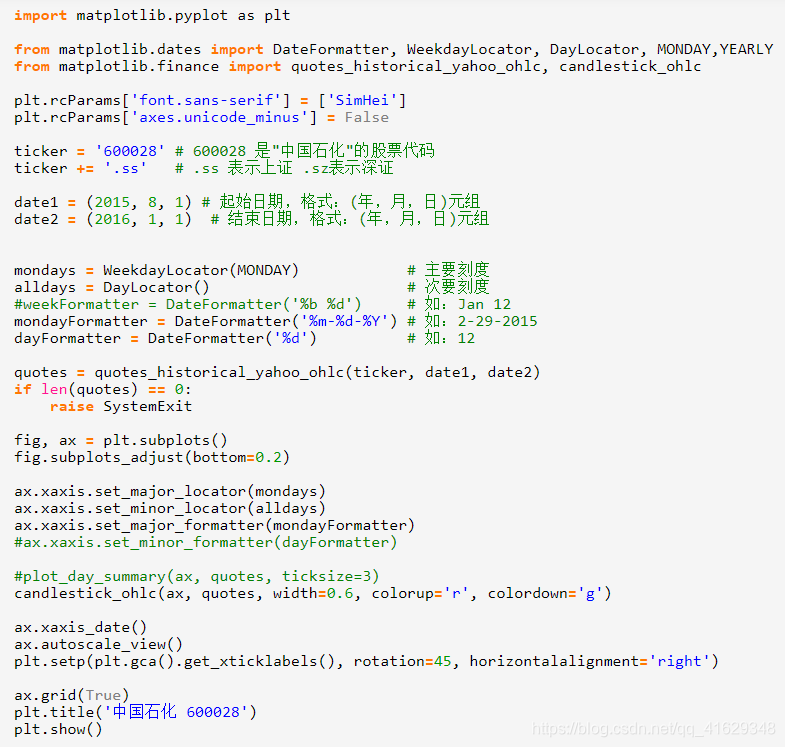
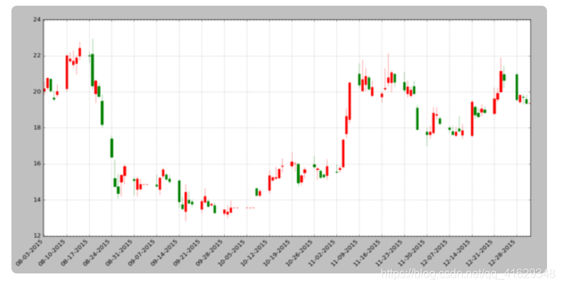
蜡烛图
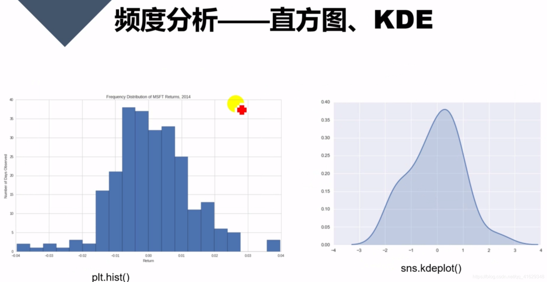
plt.hist()
sns.kdeplot()
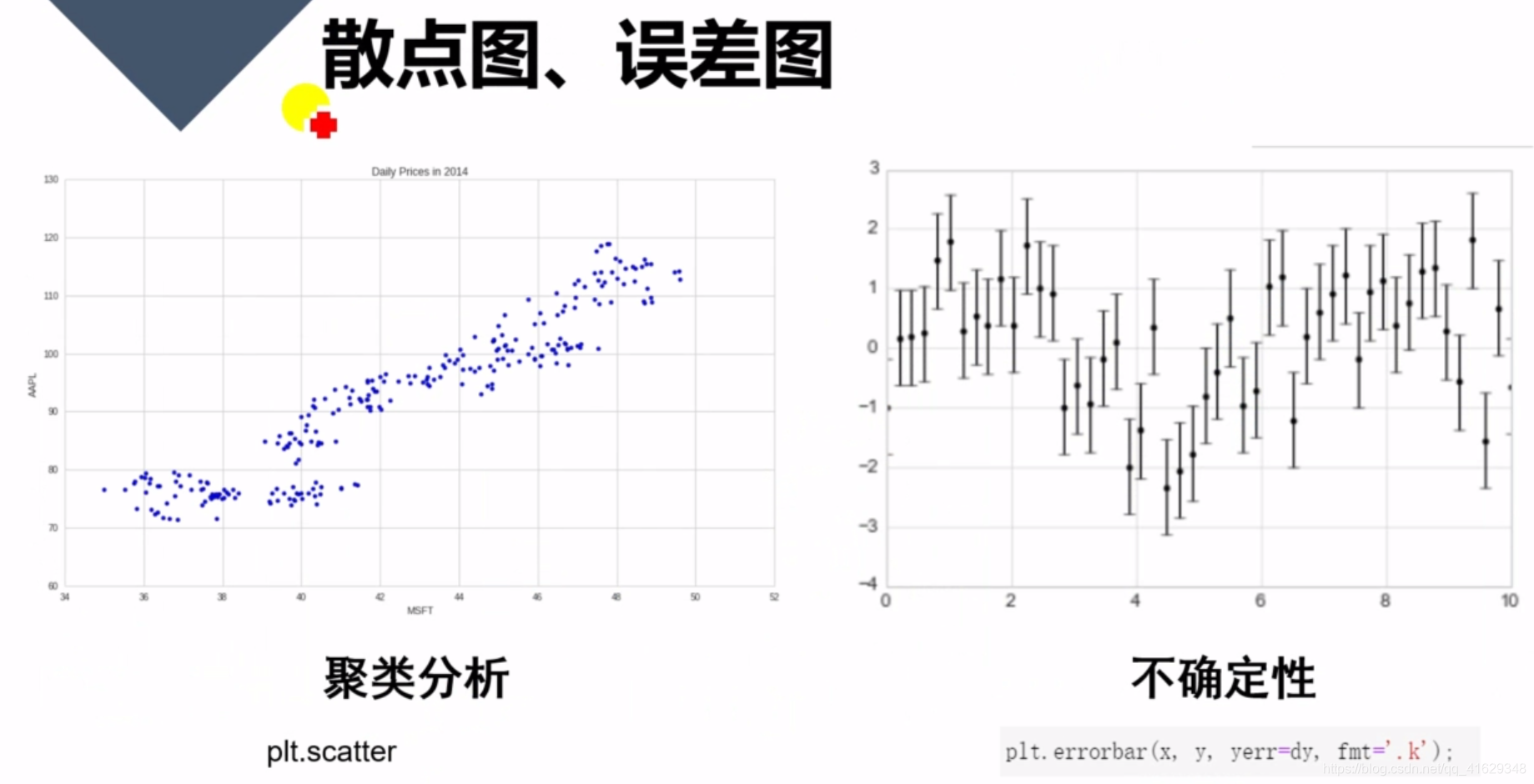
plt.scatter()
plt.errorbar()
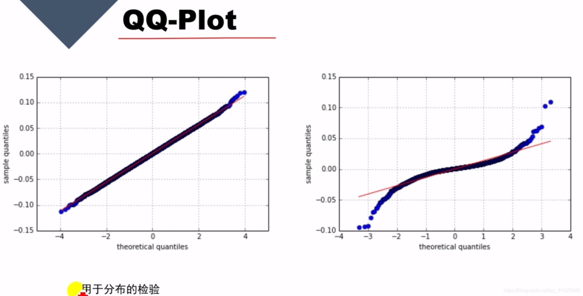
QQ-plot
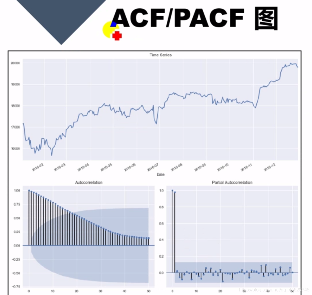
ACF / PACF 图:常用于金融时间序列分析


 被折叠的 条评论
为什么被折叠?
被折叠的 条评论
为什么被折叠?
 到【灌水乐园】发言


