


闲言碎语
最近在修改项目的时候,接触到了flex布局,想到之前在做uniapp的时候,都是使用的flex布局,当时因为着急,在网上找了几个组件就草草的把项目做完了,然后昨天晚上在biliili上看了40分钟的视频,感觉大概能理解了。所以我还是觉得,磨刀不误砍柴工吧,希望大家以后在碰到css,js这些基础问题的时候,花个几个小时去了解一下他,而不是直接百度一下,把活干完就完事儿了。
到这里,如果你对传统css还不是很理解,建议先学习传统的css,请移步CSS入门教程
到这里,如果你想要更获得更形象的,更详细的flex学习内容,请参考阮一峰老师的博客
1.为什么要使用flex布局呢?
传统布局的解决方案,一般都是使用position属性+display属性+float属性来布局的,但是对于哪些特殊的布局非常不方便,比如一行排列多个块元素,比如垂直居中…****
1.1 传统方法实现nav
li{
    width: 100px;
    height: 40px;
    background: pink;
    list-style: none;
    float: left;
    margin-left: 20px;
}

...
<ul>
    <li>1</li>
    <li>2</li>
    <li>3</li>
    <li>4</li>
    <li>5</li>
    <li>6</li>
</ur>
flex方法实现nav
ul{
	display: flex
}
li{
    width: 100px;
    height: 40px;
    background: pink;
    list-style: none;
    margin-left: 20px;
}
1.2 传统方法实现垂直水平居中
// 方法一:
.absolute-transform{
    width: 100px;
    height: 100px;
    background-color: red;
    position: absolute;
    left: 50%;
    top: 50%;
    transform: translate(-50%, -50%);
}

// 方法二
.absolute-margin{
    width: 100px;
    height: 100px;
    background-color: red;
    position: absolute;
    left: 0px;
    top: 0px;
    right: 0px;
    bottom: 0px;
    margin: auto;
 }
flex实现垂直水平居中
// 其实就最后三句话 OK 搞定了!
.felx-container{
   	...
    display: flex;
    align-items: center;
    justify-content: center;
}
2. flex简介
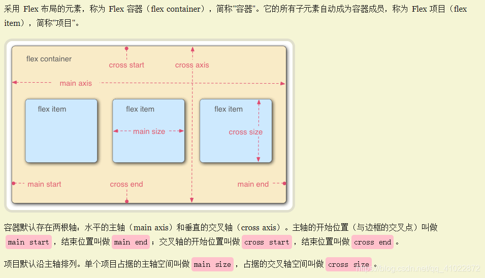
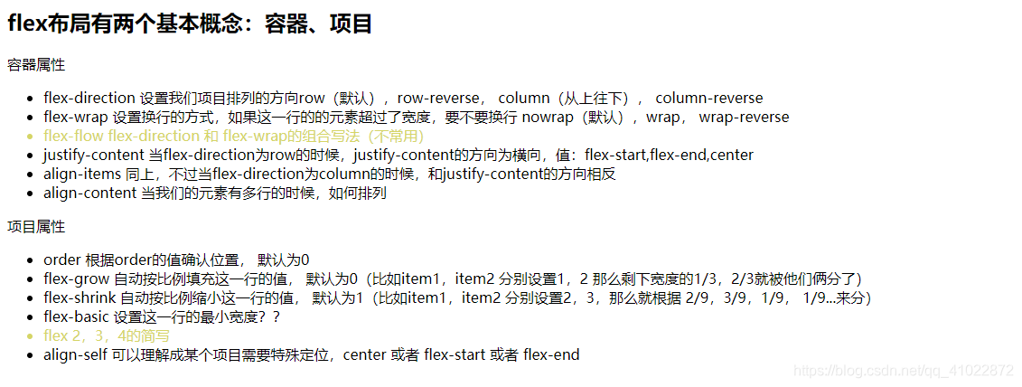
flex中有两个核心的 概念,容器,项目
采用flex布局的元素称为**“容器”,它的子元素成为“项目”**,注意,容器和项目的概念是很重要的,因为flex布局中容器有容器的属性,项目有项目的属性,学完容器+项目中的12个属性,flex就学完了!
3.flex中容器和项目的属性
学习视频: https://www.bilibili.com/video/BV1t7411E7tn?from=search&seid=9651709125081776807
4. 垂直居中的几种方法(可以拷贝以下代码用浏览器打开看)
<!DOCTYPE html>
<html lang="en">
<head>
    <meta charset="UTF-8">
    <meta name="viewport" content="width=device-width, initial-scale=1.0">
    <title>Document</title>
    <style>
      .space{
        background-color: #fff;
        height: 20px;
        width: 1920px;
      }
      .container{
        width: 600px;
        height: 200px;
        background-color: beige;
        text-align: center;
        position: relative;
      }
      .text-center{
        display: inline-block;
        margin: 0 auto;
        line-height: 200px;
        color: red;
      }
      .absolute-transform{
        width: 100px;
        height: 100px;
        background-color: red;
        position: absolute;
        left: 50%;
        top: 50%;
        transform: translate(-50%, -50%);
      }
      .absolute-margin{
        width: 100px;
        height: 100px;
        background-color: red;
        position: absolute;
        left: 0px;
        top: 0px;
        right: 0px;
        bottom: 0px;
        margin: auto;
      }
      .felx-container{
        width: 600px;
        height: 200px;
        background-color: beige;
        display: flex;
        align-items: center;
        justify-content: center;
      }
      .flex-text{
        width: 600px;
        position: absolute;
        align-self: flex-start;
      }
      .flex-item{
        width: 100px;
        height: 100px;
        background-color: red;
      }
    </style>
</head>
<body>
    <h4>
        为什么专门使用一个文件来讲垂直居中呢?因为实在用的太多了,我们在日常开发过程中,
        为了让页面开起来美观,经常需要讲元素内容垂直居中显示
    </h4>
    <div class="container">
      <!-- 这样的做法有点欠妥,当文字过长的时候会出现问题 -->
      <span class="text-center">1.文字居中,将父元素text-align设置为center,line-height和width设成一样</span>
    </div>
    <div class="space">
    </div>
    <div class="container">
      <!-- 这种做法个人觉得很nice,但是听说兼容性不是很好 -->
      <span>2.使用absolute,top:50%, left: 50%,之后利用transform: translate(-50%, -50%)</span>
      <div class="absolute-transform">
      </div>
    </div>
    <div class="space"></div>
    <div class="container">
      <!-- 这种做法利用了margin,看起来比较舒服,想想为什么margin能实现居中,可以参考以下文章 -->
      <!-- https://blog.youkuaiyun.com/LuckyWinty/article/details/104164517/ -->
      <!-- 说一下个人的理解,因为css中有一个文档流的概念,所以,我们的margin-*:auto是根据可用空间来计算的
      这也就是为什么,我们在垂直方向上设置居中,需要指定top,和bottom都为0,其实是在拓展改元素的height和父元素保持一致- -->
      <span>3.使用absolute,<span style="color:red">top,left,right,bottom均为0</span>,margin:auto</span>
      <div class="absolute-margin">
      </div>
    </div>
    <div class="space"></div>
    <div class="felx-container">
      <span class="flex-text">4.使用flex布局,这是最简单的方法,但是需要花一点点事件去学习以下flex布局,很香的,相信我</span>
      <div class="flex-item">
      </div>
    </div>
</body>

</html>


 扫一扫
扫一扫


 1378
1378

 被折叠的 条评论
为什么被折叠?
被折叠的 条评论
为什么被折叠?
 到【灌水乐园】发言


