


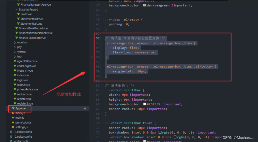
 通过修改element-ui的样式类,利用flex布局的row-reverse属性实现$confirm弹出框中确认和取消按钮的位置互换。在app.vue全局文件中进行调整,设置按钮的margin-left以完善布局。
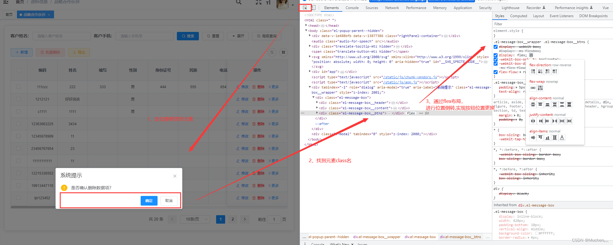
element-ui中$confirm弹出框的确定和取消按钮互换位置
- (1)定位元素
- (2)找到元素class,通过flex布局,进行位置更换
- (3)app.vue中 进行全局修改
/* 确认窗 取消确认按钮位置更换 */
.el-message-box__wrapper .el-message-box__btns {
  display: flex;
  flex-flow: row-reverse;
}

.el-message-box__wrapper .el-message-box__btns .el-button {
  margin-left: 10px;
}
APP.vue内进行全局修改
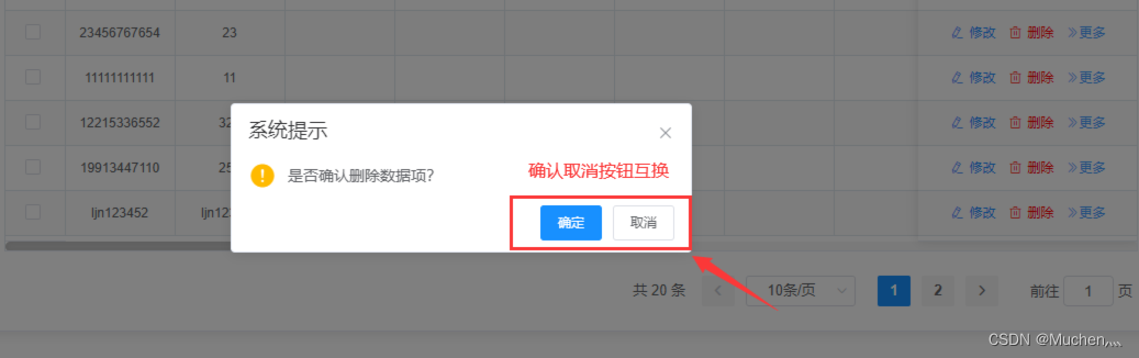
效果展示


 扫一扫
扫一扫


 1686
1686


 被折叠的 条评论
为什么被折叠?
被折叠的 条评论
为什么被折叠?
 到【灌水乐园】发言


