


 本文介绍了如何使用Highcharts创建仪表盘样式图表,包括车速表、圆形进度条和时钟等示例。详细展示了不同仪表盘类型的配置项,如chart.type、pane、yAxis等,并提供了完整的HTML和JavaScript代码。
Highcharts 测量图
配置
chart.type 配置
配置 chart 的 type 为 'gauge' 。chart.type 描述了图表类型。默认值为 "line"。
var chart = {
   type: 'guage'
};
pane 配置
pane 只适用在极坐标图和角度测量仪。此可配置对象持有组合x轴和y周的常规选项。每个x轴和y轴都可以通过索引关联到窗格中。
var pane = {
  startAngle: -150,  // x轴或测量轴的开始度数,以度数的方式给出。0是北
  endAngle: 150      //x轴极坐标或角度轴的最终度数,以度数的方式给出。0是北
};
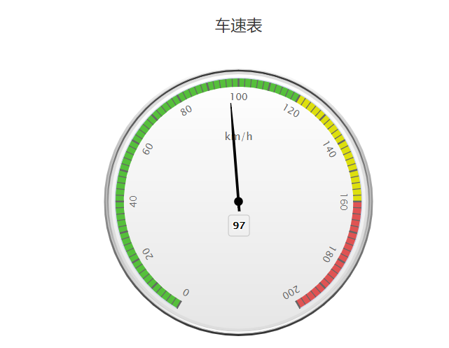
实例
文件名:highcharts_guage_angular.htm
<html>
<head>
<meta charset="UTF-8" />
<title>Highcharts 教程 | 菜鸟教程(runoob.com)</title>
<script src="http://apps.bdimg.com/libs/jquery/2.1.4/jquery.min.js"></script>
<script src="http://code.highcharts.com/highcharts.js"></script>
<script src="http://code.highcharts.com/highcharts-more.js"></script>
</head>
<body>
<div id="container" style="width: 550px; height: 400px; margin: 0 auto"></div>
<script language="JavaScript">
$(document).ready(function() {
   var chart = {
      type: 'gauge',
      plotBackgroundColor: null,
      plotBackgroundImage: null,
      plotBorderWidth: 0,
      plotShadow: false
   };
   var title = {
      text: '车速表'
   };

   var pane = {
      startAngle: -150,
      endAngle: 150,
      background: [{
         backgroundColor: {
            linearGradient: { x1: 0, y1: 0, x2: 0, y2: 1 },
            stops: [
               [0, '#FFF'],
               [1, '#333']
            ]
         },
         borderWidth: 0,
         outerRadius: '109%'
      }, {
         backgroundColor: {
            linearGradient: { x1: 0, y1: 0, x2: 0, y2: 1 },
            stops: [
               [0, '#333'],
               [1, '#FFF']
            ]
         },
         borderWidth: 1,
         outerRadius: '107%'
     }, {
         // default background
     }, {
         backgroundColor: '#DDD',
         borderWidth: 0,
         outerRadius: '105%',
         innerRadius: '103%'
     }]
   };

   // the value axis
   var yAxis = {
      min: 0,
      max: 200,

      minorTickInterval: 'auto',
      minorTickWidth: 1,
      minorTickLength: 10,
      minorTickPosition: 'inside',
      minorTickColor: '#666',

      tickPixelInterval: 30,
      tickWidth: 2,
      tickPosition: 'inside',
      tickLength: 10,
      tickColor: '#666',
      labels: {
         step: 2,
         rotation: 'auto'
      },
      title: {
         text: 'km/h'
      },
      plotBands: [{
         from: 0,
         to: 120,
         color: '#55BF3B' // green
      }, {
         from: 120,
         to: 160,
         color: '#DDDF0D' // yellow
      }, {
         from: 160,
         to: 200,
         color: '#DF5353' // red
      }]
   };

   var series= [{
        name: 'Speed',
        data: [80],
        tooltip: {
           valueSuffix: ' km/h'
        }
   }];

   var json = {};
   json.chart = chart;
   json.title = title;
   json.pane = pane;
   json.yAxis = yAxis;
   json.series = series;

   // Add some life
   var chartFunction = function (chart) {
      if (!chart.renderer.forExport) {
         setInterval(function () {
         var point = chart.series[0].points[0], newVal, inc = Math.round((Math.random() - 0.5) * 20);
         newVal = point.y + inc;
         if (newVal < 0 || newVal > 200) {
            newVal = point.y - inc;
         }
         point.update(newVal);
         }, 3000);
      }
   };

   $('#container').highcharts(json,chartFunction);
});
</script>
</body>
</html>
以上实例输出结果为:
Highcharts 圆形进度条式测量图
配置
chart.type 配置
配置 chart 的 type 为 'solidguage' 。chart.type 描述了图表类型。默认值为 "line"。
var chart = {
   type: 'solidguage'
};
pane 配置
pane 只适用在极坐标图和角度测量仪。此可配置对象持有组合x轴和y周的常规选项。每个x轴和y轴都可以通过索引关联到窗格中。
var pane = {
  startAngle: -150,  // x轴或测量轴的开始度数,以度数的方式给出。0是北
  endAngle: 150      //x轴极坐标或角度轴的最终度数,以度数的方式给出。0是北
};
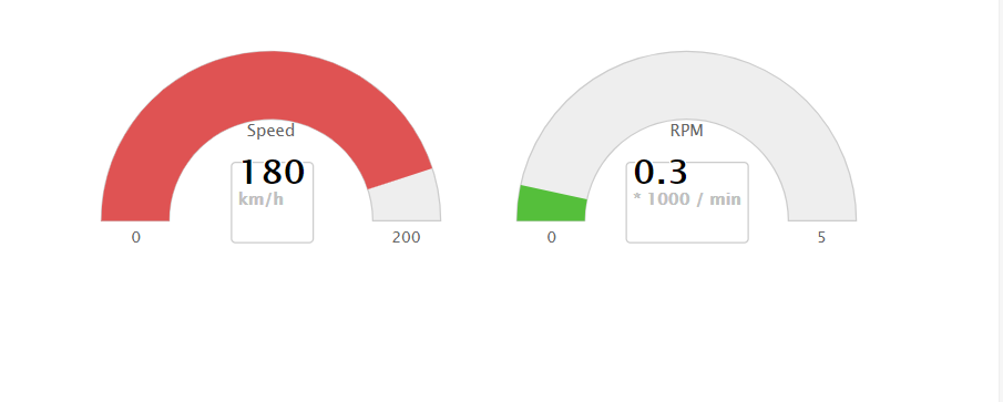
实例
文件名:highcharts_guage_solid.htm
<html>
<head>
<meta charset="UTF-8" />
<title>Highcharts 教程 | 菜鸟教程(runoob.com)</title>
<script src="http://apps.bdimg.com/libs/jquery/2.1.4/jquery.min.js"></script>
<script src="http://code.highcharts.com/highcharts.js"></script>
<script src="http://code.highcharts.com/highcharts-more.js"></script>
<script src="http://code.highcharts.com/modules/solid-gauge.js"></script>
</head>
<body>
<div style="width: 600px; height: 400px; margin: 0 auto">
    <div id="container-speed" style="width: 300px; height: 200px; float: left"></div>
    <div id="container-rpm" style="width: 300px; height: 200px; float: left"></div>
</div>
<script language="JavaScript">
$(document).ready(function() {
   var chart = {
      type: 'solidgauge'
   };
   var title = null;

   var pane = {
      center: ['50%', '85%'],
      size: '140%',
      startAngle: -90,
      endAngle: 90,
      background: {
         backgroundColor: (Highcharts.theme && Highcharts.theme.background2) || '#EEE',
         innerRadius: '60%',
         outerRadius: '100%',
         shape: 'arc'
      }
   };

   var tooltip = {
      enabled: false
   };

   // the value axis
   var yAxis = {
      stops: [
         [0.1, '#55BF3B'], // green
         [0.5, '#DDDF0D'], // yellow
         [0.9, '#DF5353'] // red
      ],
      lineWidth: 0,
      minorTickInterval: null,
      tickPixelInterval: 400,
      tickWidth: 0,
      title: {
         y: -70
      },
      labels: {
         y: 16
      },
      min: 0,
      max: 200,
      title: {
         text: 'Speed'
      }
   };

   var plotOptions = {
      solidgauge: {
         dataLabels: {
            y: 5,
            borderWidth: 0,
            useHTML: true
         }
      }
   };

   var credits = {
      enabled: false
   };

   var series = [{
      name: 'Speed',
      data: [80],
      dataLabels: {
         format: '<div style="text-align:center"><span style="font-size:25px;color:' +
         ((Highcharts.theme && Highcharts.theme.contrastTextColor) || 'black') + '">{y}</span><br/>' +
         '<span style="font-size:12px;color:silver">km/h</span></div>'
      },
      tooltip: {
         valueSuffix: ' km/h'
      }
   }];

   var json = {};
   json.chart = chart;
   json.title = title;
   json.pane = pane;
   json.tooltip = tooltip;
   json.yAxis = yAxis;
   json.credits = credits;
   json.series = series;
   $('#container-speed').highcharts(json);


   // the value axis
   yAxis = {
      stops: [
         [0.1, '#55BF3B'], // green
         [0.5, '#DDDF0D'], // yellow
         [0.9, '#DF5353'] // red
      ],
      lineWidth: 0,
      minorTickInterval: null,
      tickPixelInterval: 400,
      tickWidth: 0,
      title: {
         y: -70
      },
      labels: {
         y: 16
      },
      min: 0,
      max: 5,
      title: {
         text: 'RPM'
      }
   };

   series = [{
      name: 'RPM',
      data: [1],
      dataLabels: {
         format: '<div style="text-align:center"><span style="font-size:25px;color:' +
         ((Highcharts.theme && Highcharts.theme.contrastTextColor) || 'black') + '">{y:.1f}</span><br/>' +
         '<span style="font-size:12px;color:silver">* 1000 / min</span></div>'
      },
      tooltip: {
         valueSuffix: ' revolutions/min'
      }
   }];

   json.yAxis = yAxis;
   json.series = series;
   $('#container-rpm').highcharts(json);

   var chartFunction = function() {
      // Speed
      var chart = $('#container-speed').highcharts();
      var point;
      var newVal;
      var inc;

      if (chart) {
         point = chart.series[0].points[0];
         inc = Math.round((Math.random() - 0.5) * 100);
         newVal = point.y + inc;

         if (newVal < 0 || newVal > 200) {
            newVal = point.y - inc;
         }
         point.update(newVal);
      }

      // RPM
      chart = $('#container-rpm').highcharts();
      if (chart) {
         point = chart.series[0].points[0];
         inc = Math.random() - 0.5;
         newVal = point.y + inc;

         if (newVal < 0 || newVal > 5) {
            newVal = point.y - inc;
         }

         point.update(newVal);
      }
   };

   // Bring life to the dials
   setInterval(chartFunction, 2000);
});
</script>
</body>
</html>
以上实例输出结果为:
Highcharts 时钟
配置
chart.type 配置
配置 chart 的 type 为 'gauge' 。chart.type 描述了图表类型。默认值为 "line"。
var chart = { type: 'gauge' };
pane 配置
pane 只适用在极坐标图和角度测量仪。此可配置对象持有组合x轴和y周的常规选项。每个x轴和y轴都可以通过索引关联到窗格中。
var pane = { startAngle: -150, // x轴或测量轴的开始度数,以度数的方式给出。0是北 endAngle: 150 //x轴极坐标或角度轴的最终度数,以度数的方式给出。0是北 };
实例
文件名:highcharts_guage_clock.htm
<html>
<head>
<meta charset="UTF-8" /> <title>Highcharts 教程 | 菜鸟教程(runoob.com)</title> <script src="http://apps.bdimg.com/libs/jquery/2.1.4/jquery.min.js"></script> <script src="http://code.highcharts.com/highcharts.js"></script> <script src="http://code.highcharts.com/highcharts-more.js"></script> </head> <body> <div id="container" style="width: 550px; height: 400px; margin: 0 auto"></div> <script language="JavaScript"> $(document).ready(function() { /** * 获取当前时间 */ function getNow() { var now = new Date(); return { hours: now.getHours() + now.getMinutes() / 60, minutes: now.getMinutes() * 12 / 60 + now.getSeconds() * 12 / 3600, seconds: now.getSeconds() * 12 / 60 }; } /** * Pad numbers */ function pad(number, length) { // Create an array of the remaining length + 1 and join it with 0's return new Array((length || 2) + 1 - String(number).length).join(0) + number; } var now = getNow(); var chart = { type