


clip-path
clip-path 属性使用裁剪方式创建元素的可显示区域。区域内的部分显示,区域外的隐藏。可以指定一些特定形状。
语法: clip: clip-source|basic-shape|margin-box|border-box|padding-box|content-box|fill-box|stroke-box|view-box|none|initial|inherit;
| 属性 | 描述 |
|---|---|
| clip-source | 用 URL 表示剪切元素的路径 |
| basic-shape | 将元素裁剪为基本形状:圆形、椭圆形、多边形或插图 |
clip-source
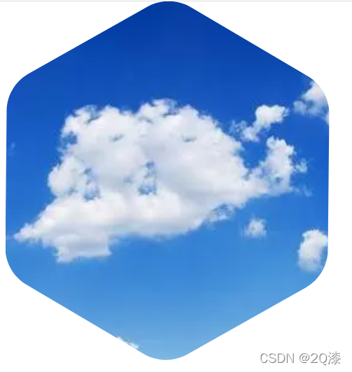
我们可以使用clip-source,使元素按照我们想要的样子裁剪。以下将图片裁剪为六边形,也可使用其他的svg来达到自己想要的效果。
<!DOCTYPE html>
<html lang="en">
<head>
    <meta charset="UTF-8">
    <meta http-equiv="X-UA-Compatible" content="IE=edge">
    <meta name="viewport" content="width=device-width, initial-scale=1.0">
    <title>Document</title>
    <style>
        .img {
            clip-path: url(#svgPath);
        }
    </style>
</head>
<body>
    <svg height="0" width="0">
        <defs>
            <clipPath id="svgPath">
                <path class="st0" id="svgPath" d="M245,233.8l-96.8,54.6c-11,6.2-24.6,6.1-35.5-0.3l-95.7-56.5c-10.9-6.4-17.6-18.2-17.4-30.9L0.7,89.5
	c0.1-12.7,7-24.3,18-30.5l96.8-54.6c11-6.2,24.6-6.1,35.5,0.3l95.7,56.5c10.9,6.4,17.6,18.2,17.4,30.9l-1.1,111.1
	C263,215.9,256.1,227.5,245,233.8z"/>
            </clipPath>
        </defs>
    </svg>
    <img class='img' src="https://img0.baidu.com/it/u=3462535223,4279572903&fm=253&fmt=auto&app=138&f=JPEG?w=658&h=424" />
</body>
</html>
得到以下效果:
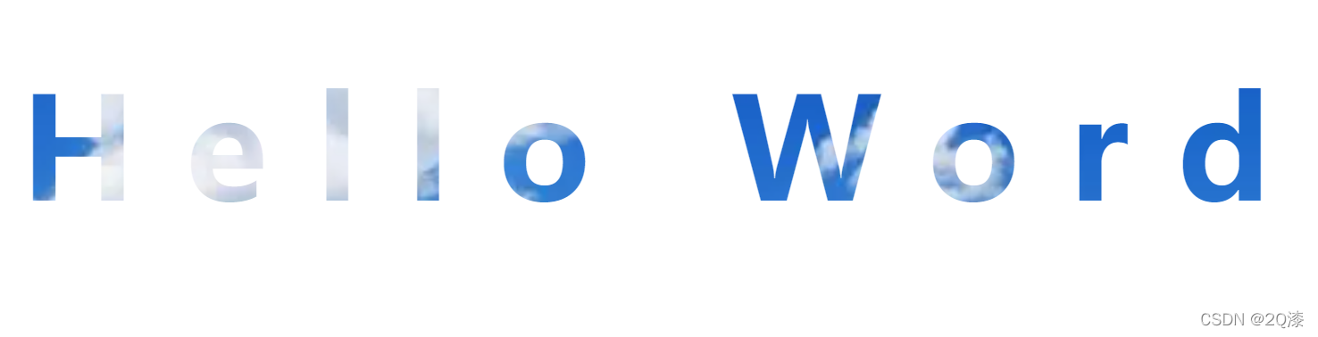
或者也可以应用文字:
<!DOCTYPE html>
<html lang="en">
<head>
    <meta charset="UTF-8">
    <meta http-equiv="X-UA-Compatible" content="IE=edge">
    <meta name="viewport" content="width=device-width, initial-scale=1.0">
    <title>Document</title>
    <style>
        .img {
            clip-path: url(#svgPath);
        }
    </style>
</head>
<body>
    <svg height="0" width="0">
        <defs>
            <clipPath id="svgPath">
                <text x="20" y="300" textLength="800px" font-size="90px" font-weight="700" font-style="none"> Hello Word </text>
            </clipPath>
        </defs>
    </svg>
    <img class='img' src="https://img0.baidu.com/it/u=3462535223,4279572903&fm=253&fmt=auto&app=138&f=JPEG?w=658&h=424" />
</body>
</html>
效果如下:
basic-shape
它分为好几种类型:circle 、inset、ellipse、polygon、triangle
**特别需要注意的是,clip-path在剪切基本图形时,需要用到inset()、circle()、polygon()、ellopse()这些函数的时候,其中所有需要的坐标所在的参考系,均是被剪切元素本身。 **
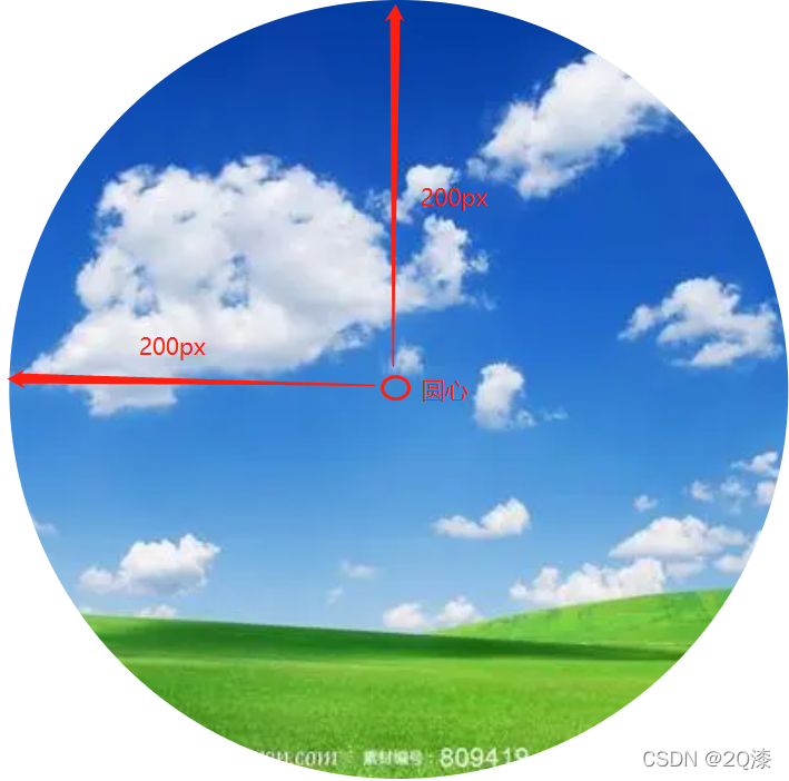
- circle-圆
<!DOCTYPE html>
<html lang="en">
<head>
    <meta charset="UTF-8">
    <meta http-equiv="X-UA-Compatible" content="IE=edge">
    <meta name="viewport" content="width=device-width, initial-scale=1.0">
    <title>Document</title>
    <style>
        * {
            padding: 0;
            margin: 0;
        }
        .img {
            clip-path: circle(200px at 200px 200px);
        }
    </style>
</head>
<body>
    <img class='img' src="https://img0.baidu.com/it/u=3462535223,4279572903&fm=253&fmt=auto&app=138&f=JPEG?w=658&h=424" />
</body>
</html>
效果如下:
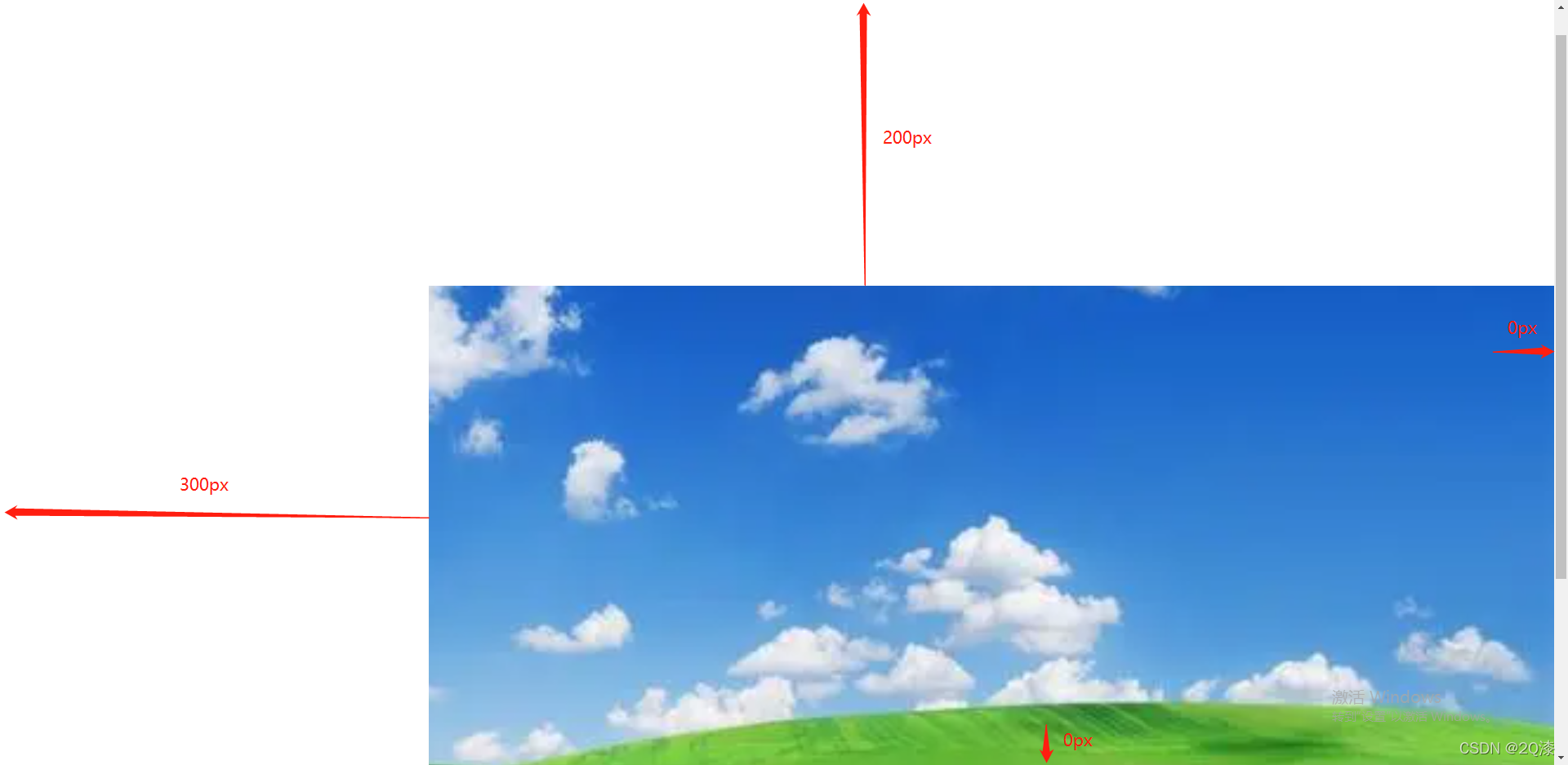
- inset-矩形
它的四个值和平时的margin、padding类似,代表距离上、右、下、左的距离
clip-path: inset(200px 0 0 300px);
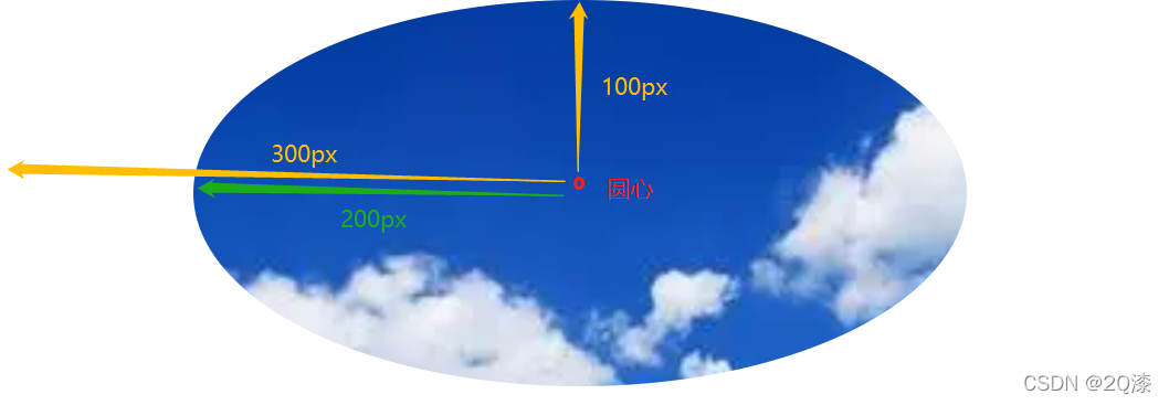
- ellipse-椭圆
前两个值设定椭圆的长轴以及短轴,后两个值分别指圆点到左侧、顶部的值
clip-path: ellipse(200px 100px at 300px 100px);
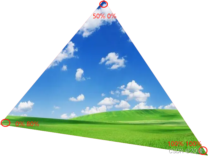
- triangle-三角形
它分别定义的三个角的位置,分别是顶部、左下、右下(逆时针)
clip-path: polygon(50% 0%, 0% 80%, 100% 100%);
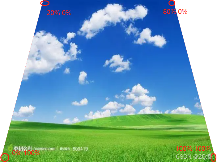
- polygon-多边形
它分别定义的四个角的位置,分别是左上、右上、右下、左下(顺时针)
clip-path: polygon(20% 0%, 80% 0%, 100% 100%, 0% 100%);
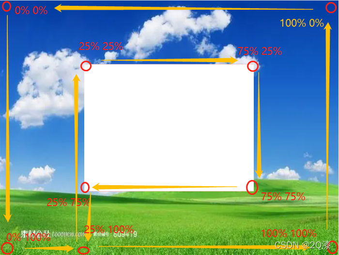
空心多边形:
clip-path: polygon(0% 0%, 0% 100%, 25% 100%, 25% 25%, 75% 25%, 75% 75%, 25% 75%, 25% 100%, 100% 100%, 100% 0%);


 扫一扫
扫一扫


 6361
6361

 被折叠的 条评论
为什么被折叠?
被折叠的 条评论
为什么被折叠?
 到【灌水乐园】发言


