


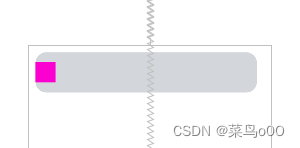
问题:当progress为0的时候进度条显示这样,所以我将progress默认从1开始,但是总觉得不好,后期想到了解决
default居中
//获取外层长宽
ViewGroup mViewGroup = (ViewGroup) getParent();
canvas.drawCircle(mViewGroup.getWidth()/2.0f,mViewGroup.getHeight()/2.0f,mRadius,mPaint);
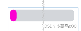
代码改为以下就可以了
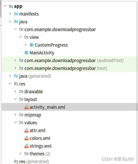
目录
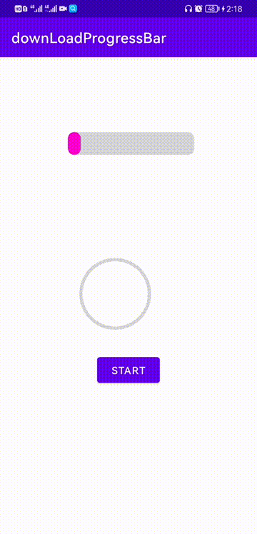
效果:
MainActivity
package com.example.downloadprogressbar;

import androidx.appcompat.app.AppCompatActivity;

import android.os.Bundle;
import android.os.Handler;
import android.os.Message;
import android.util.Log;
import android.view.View;
import android.widget.Button;

import com.example.downloadprogressbar.view.CustomProgress;

public class MainActivity extends AppCompatActivity {
    private static final String TAG = MainActivity.class.getSimpleName();
    private CustomProgress circleProgress;
    private CustomProgress rectangleProgress;
    public static final int PROGRESS_CIRCLE_STARTING = 0x110;
    public static final int PROGRESS_RECTANGLE_STARTING = 0x111;
    private int intCircleProgress;
    private int intRectangleProgress;
    private Button btn;

    @Override
    protected void onCreate(Bundle savedInstanceState) {
        super.onCreate(savedInstanceState);
        setContentView(R.layout.activity_main);

        initView();
    }

    private void initView() {
        btn = findViewById(R.id.btn);
        circleProgress = findViewById(R.id.circleProgress);
        rectangleProgress = findViewById(R.id.rectangleProgress);
        btn.setOnClickListener(new View.OnClickListener() {
            @Override
            public void onClick(View v) {
                if(circleProgress.getStatus() == CustomProgress.Status.Starting){//如果是开始状态
                    Log.d(TAG, "1() called with: v = [" + v + "]");
                    btn.setText("END");
                    //点击则变成关闭暂停状态
                    circleProgress.setStatus(CustomProgress.Status.End);
                    //注意,当我们暂停时,同时还要移除消息,不然的话进度不会被停止
                    handler.removeMessages(PROGRESS_CIRCLE_STARTING);
                }else if (circleProgress.getStatus() == CustomProgress.Status.End){
                    Log.d(TAG, "2() called with: v = [" + v + "]");
                    btn.setText("START");
                    //点击则变成开启状态
                    circleProgress.setStatus(CustomProgress.Status.Starting);
                    Message message = Message.obtain();
                    message.what = PROGRESS_CIRCLE_STARTING;
                    handler.sendMessage(message);
                }

                if(rectangleProgress.getStatus() == CustomProgress.Status.Starting){//如果是开始状态
                    Log.d(TAG, "1() called with: v = [" + v + "]");
                    btn.setText("END");
                    //点击则变成关闭暂停状态
                    rectangleProgress.setStatus(CustomProgress.Status.End);
                    //注意,当我们暂停时,同时还要移除消息,不然的话进度不会被停止
                    handler.removeMessages(PROGRESS_RECTANGLE_STARTING);
                }else if (rectangleProgress.getStatus() == CustomProgress.Status.End){
                    Log.d(TAG, "2() called with: v = [" + v + "]");
                    btn.setText("START");
                    //点击则变成开启状态
                    rectangleProgress.setStatus(CustomProgress.Status.Starting);
                    Message message = Message.obtain();
                    message.what = PROGRESS_RECTANGLE_STARTING;
                    handler.sendMessage(message);
                }
            }
        });
    }

    private Handler handler = new Handler(new Handler.Callback() {


        @Override
        public boolean handleMessage(Message msg) {
            switch (msg.what){
                case PROGRESS_CIRCLE_STARTING:
                    circleProgress.setProgress(++intCircleProgress);
                    if(intCircleProgress >= 100){
                        handler.removeMessages(PROGRESS_CIRCLE_STARTING);
                        intCircleProgress = 0;
//                        circleProgress.setProgress(0);
                        circleProgress.setStatus(CustomProgress.Status.End);//修改显示状态为完成
                    }else{
                        Log.d(TAG, "intCircleProgress" + intCircleProgress + "]");
                        //延迟100ms后继续发消息,实现循环,直到progress=100
                        handler.sendEmptyMessageDelayed(PROGRESS_CIRCLE_STARTING, 100);
                    }
                    break;
                case PROGRESS_RECTANGLE_STARTING:
                    rectangleProgress.setProgress(++intRectangleProgress);
                    if(intRectangleProgress >= 100){
                        handler.removeMessages(PROGRESS_RECTANGLE_STARTING);
                        intRectangleProgress = 0;
                        rectangleProgress.setStatus(CustomProgress.Status.End);//修改显示状态为完成
                    }else{
                        //延迟100ms后继续发消息,实现循环,直到progress=100
                        handler.sendEmptyMessageDelayed(PROGRESS_RECTANGLE_STARTING, 100);
                    }
                    break;
            }
            return false;
        }
    });
}
自定义ProgressBar
package com.example.downloadprogressbar.view;
import android.annotation.SuppressLint;
import android.content.Context;
import android.content.res.TypedArray;
import android.graphics.Canvas;
import android.graphics.Color;
import android.graphics.Paint;
import android.graphics.PorterDuff;
import android.graphics.PorterDuffXfermode;
import android.graphics.RectF;
import android.graphics.Typeface;
import android.graphics.Xfermode;
import android.util.AttributeSet;
import android.util.Log;
import android.util.TypedValue;
import android.view.View;
import android.widget.ProgressBar;
import com.example.downloadprogressbar.R;
public class CustomProgress extends View {
//定义一些属性常量
private static final int PROGRESS_DEFAULT_SHAPE = 3;//默认进度条形状(矩形 )
private static final int PROGRESS_DEFAULT_COLOR = 0xFFd3d6da;//默认(边框)的颜色
private static final int PROGRESS_REACHED_COLOR = 0XFFFC00D1;//进度条的颜色
private static final int PROGRESS_REACHED_HEIGHT = 6;//进度条的高度
private static final int PROGRESS_DEFAULT_HEIGHT = 6;//默认圆的高度
private static final int PROGRESS_REACHED_WIDTH = 20;//进度条的宽度
private static final int PROGRESS_DEFAULT_WIDTH = 10;//默认圆的宽度
private static final int PROGRESS_RADIUS = 30;//圆的半径
private static final String TAG = "CustomCircleProgress";
//View的当前状态,默认为未开始
private Status mStatus = Status.End;
//画笔
private Paint mPaint;
//进度条形状 1.环形,2.圆形 ,3.矩形
private int mProgressShape = PROGRESS_DEFAULT_SHAPE;
//进度条的颜色
private int mReachedColor = PROGRESS_REACHED_COLOR;
//进度条的高度
private int mReachedHeight = dp2px(PROGRESS_REACHED_HEIGHT);
//进度条的宽度
private int mReachedWidth = dp2px(PROGRESS_REACHED_WIDTH);
//默认(边框)的颜色
private int mDefaultColor = PROGRESS_DEFAULT_COLOR;
//默认(边框)的高度
private int mDefaultHeight = dp2px(PROGRESS_DEFAULT_HEIGHT);
//默认(边框)的宽度
private int mDefaultWidth = dp2px(PROGRESS_DEFAULT_WIDTH);
private int mRadius = dp2px(2);
private float textSize;//文字大小
private boolean textShow;//是否显示文字
private int textColor;//文字颜色
private int mProgress;
private int mMax;
public CustomProgress(Context context) {
this(context, null);
}
public CustomProgress(Context context, AttributeSet attrs) {
this(context, attrs, 0);
}
public CustomProgress(Context context, AttributeSet attrs, int defStyleAttr) {
super(context, attrs, defStyleAttr);
mMax = 100;
//获取自定义属性的值
TypedArray array = getContext().obtainStyledAttributes(attrs, R.styleable.CustomProgress);
//进度条形状 1.环形,2.圆形 ,3.矩形
mProgressShape = array.getInt(R.styleable.CustomProgress_progress_shape, PROGRESS_DEFAULT_SHAPE);
//默认圆的颜色
mDefaultColor = array.getColor(R.styleable.CustomProgress_progress_default_color, PROGRESS_DEFAULT_COLOR);
//进度条的颜色
mReachedColor = array.getColor(R.styleable.CustomProgress_progress_bar_color, PROGRESS_REACHED_COLOR);
//默认圆的高度
mDefaultHeight = (int) array.getDimension(R.styleable.CustomProgress_progress_default_height, mDefaultHeight);
//进度条的高度
mReachedHeight = (int) array.getDimension(R.styleable.CustomProgress_progress_bar_height, mReachedHeight);
//默认圆的宽度
mDefaultWidth = (int) array.getDimension(R.styleable.CustomProgress_progress_default_width, mDefaultWidth);
//进度条的宽度
mReachedWidth = (int) array.getDimension(R.styleable.CustomProgress_progress_bar_width, mReachedWidth);
mRadius = (int)array.getDimension(R.styleable.CustomProgress_radius,mRadius);
textColor = array.getColor(R.styleable.CustomProgress_textColor, Color.GREEN);
textSize = array.getDimension(R.styleable.CustomProgress_textSize, 55);
textShow = array.getBoolean(R.styleable.CustomProgress_textShow, true);
//最后不要忘了回收 TypedArray
array.recycle();
//设置画笔(new画笔的操作一般不要放在onDraw方法中,因为在绘制的过程中onDraw方法会被多次调用)
setPaint();
}
public void setProgress(int progress) {
Log.d(TAG, "setProgress() called with: progress = [" + progress + "]");
if (progress < 0) {
throw new IllegalArgumentException("进度Progress不能小于0");
}
if (progress > mMax) {
progress = mMax;
}
if (progress <= mMax) {
this.mProgress = progress;
postInvalidate();
}
}
private void setPaint() {
mPaint = new Paint();
//下面是设置画笔的一些属性
mPaint.setAntiAlias(true);//抗锯齿
mPaint.setDither(true);//防抖动,绘制出来的图要更加柔和清晰
mPaint.setStyle(Paint.Style.STROKE);//设置填充样式
/**
* Paint.Style.FILL :填充内部
* Paint.Style.FILL_AND_STROKE :填充内部和描边
* Paint.Style.STROKE :仅描边
*/
mPaint.setStrokeCap(Paint.Cap.ROUND);//设置画笔笔刷类型
}
/**
* 使用onMeasure方法是因为我们的自定义圆形View的一些属性(如:进度条宽度等)都交给用户自己去自定义了,所以我们需要去测量下
* 看是否符合要求
*
* @param widthMeasureSpec
* @param heightMeasureSpec
*/
@Override
protected synchronized void onMeasure(int widthMeasureSpec, int heightMeasureSpec) {
int widthMode = MeasureSpec.getMode(widthMeasureSpec);
int heightMode = MeasureSpec.getMode(heightMeasureSpec);
int widthSize = MeasureSpec.getSize(widthMeasureSpec);
int heightSize = MeasureSpec.getSize(heightMeasureSpec);
int paintHeight = Math.max(mReachedHeight, mDefaultHeight);//比较两数,取最大值
if (heightMode != MeasureSpec.EXACTLY) {
//如果用户没有精确指出宽高时,我们就要测量整个View所需要分配的高度了,测量自定义圆形View设置的上下内边距+圆形view的直径+圆形描边边框的高度
int exceptHeight = getPaddingTop() + getPaddingBottom() + getWidth() + paintHeight;
//然后再将测量后的值作为精确值传给父类,告诉他我需要这么大的空间,你给我分配吧
heightMeasureSpec = MeasureSpec.makeMeasureSpec(exceptHeight, MeasureSpec.EXACTLY);
}
if (widthMode != MeasureSpec.EXACTLY) {
//这里在自定义属性中没有设置圆形边框的宽度,所以这里直接用高度代替
int exceptWidth = getPaddingLeft() + getPaddingRight() + getWidth() + paintHeight;
widthMeasureSpec = MeasureSpec.makeMeasureSpec(exceptWidth, MeasureSpec.EXACTLY);
}
super.onMeasure(widthMeasureSpec, heightMeasureSpec);
}
@Override
protected synchronized void onDraw(Canvas canvas) {
super.onDraw(canvas);
/**
* 这里canvas.save();和canvas.restore();是两个相互匹配出现的,作用是用来保存画布的状态和取出保存的状态的
* 当我们对画布进行旋转,缩放,平移等操作的时候其实我们是想对特定的元素进行操作,但是当你用canvas的方法来进行这些操作的时候,其实是对整个画布进行了操作,
* 那么之后在画布上的元素都会受到影响,所以我们在操作之前调用canvas.save()来保存画布当前的状态,当操作之后取出之前保存过的状态,
* (比如:前面元素设置了平移或旋转的操作后,下一个元素在进行绘制之前执行了canvas.save();和canvas.restore()操作)这样后面的元素就不会受到(平移或旋转的)影响
*/
canvas.save();
//为了保证最外层的圆弧全部显示,我们通常会设置自定义view的padding属性,这样就有了内边距,所以画笔应该平移到内边距的位置,这样画笔才会刚好在最外层的圆弧上
//画笔平移到指定paddingLeft, getPaddingTop()位置
canvas.translate(getPaddingLeft(), getPaddingTop());
//第一步 画圆环
int centerX = getWidth() / 2;//中心点x坐标
int centerY = getHeight() / 2;//中心点y坐标
float radius = centerX - mDefaultHeight / 2;//画笔半径
mPaint.setStyle(Paint.Style.STROKE);//描边 空心圆
mPaint.setColor(mDefaultColor);//圆形颜色
mPaint.setStrokeWidth(mDefaultHeight);//圆环宽度
mPaint.setAntiAlias(true);//抗锯齿
if (mProgressShape != PROGRESS_DEFAULT_SHAPE) {
// centerX:圆心的x坐标。
// centerY:圆心的y坐标。
// radius:圆的半径。
// mPaint:绘制时所使用的画笔
canvas.drawCircle(centerX, centerY, radius, mPaint);
} else {
//横向进度条
RectF bgRectF = new RectF(0, 0, mDefaultWidth, mDefaultHeight);
canvas.drawRoundRect(bgRectF, mRadius, mRadius, mPaint);
}
//第二步 画进度百分比 也就是中间文字
if (textShow) {
mPaint.setColor(textColor);//文字颜色
mPaint.setStrokeWidth(0);//文字笔画宽度
mPaint.setTextSize(textSize);//文字大小
mPaint.setTypeface(Typeface.DEFAULT_BOLD);//字体
int percent = (int) (mProgress / (float) mMax * 100);
String strPercent = percent + "%";
Paint.FontMetricsInt pfm = mPaint.getFontMetricsInt();//绘制文本对象
if (percent != 0) {
canvas.drawText(strPercent, centerX - mPaint.measureText(strPercent) / 2,
centerY + (pfm.bottom - pfm.top) / 2 - pfm.bottom, mPaint);
}
}
//画进度条的一些设置
mPaint.setColor(mReachedColor);
mPaint.setStrokeWidth(mReachedHeight);
float sweepAngle;
//根据进度绘制圆弧
if (mProgressShape != PROGRESS_DEFAULT_SHAPE) {
// 第三步 画圆弧
RectF oval = new RectF(mReachedHeight / 2, mReachedHeight / 2,
getWidth() - mReachedHeight / 2, getWidth() - mReachedHeight / 2);
sweepAngle = mProgress * 1.0f / mMax * 360;
Log.d(TAG, "onDraw() called with: sweepAngle = [" + mProgress + "]");
canvas.drawArc(oval, 0, sweepAngle, false, mPaint);//drawArc:绘制圆弧
} else {
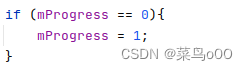
if (mProgress == 0){
mProgress = 1;
}
sweepAngle = mProgress * 1.0f / mMax * mDefaultWidth;
RectF bgRectF = new RectF(0, 0, 3+sweepAngle, mReachedHeight);
canvas.drawRoundRect(bgRectF, mRadius, mRadius, mPaint);
}
canvas.restore();
}
/**
* dp 2 px
*
* @param dpVal
*/
protected int dp2px(int dpVal) {
return (int) TypedValue.applyDimension(TypedValue.COMPLEX_UNIT_DIP,
dpVal, getResources().getDisplayMetrics());
}
/**
* sp 2 px
*
* @param spVal
* @return
*/
protected int sp2px(int spVal) {
return (int) TypedValue.applyDimension(TypedValue.COMPLEX_UNIT_SP,
spVal, getResources().getDisplayMetrics());
}
//当前view显示的状态
public enum Status {
End,
Starting,
cancel
}
//设置Status的set/get方法
public Status getStatus() {
return mStatus;
}
public void setStatus(Status status) {
this.mStatus = status;
invalidate();
}
}
activity.xml
<?xml version="1.0" encoding="utf-8"?>
<RelativeLayout xmlns:android="http://schemas.android.com/apk/res/android"
    xmlns:tools="http://schemas.android.com/tools"
    android:layout_width="match_parent"
    android:layout_height="match_parent"
    xmlns:app="http://schemas.android.com/apk/res-auto">

    <com.example.downloadprogressbar.view.CustomProgress
        android:id="@+id/rectangleProgress"
        android:layout_width="120pt"
        android:layout_height="120pt"
        android:layout_above="@+id/circleProgress"
        android:layout_centerHorizontal="true"
        android:padding="20dp"
        app:progress_bar_height="10pt"
        app:progress_bar_width="50pt"
        app:progress_default_height="10pt"
        app:progress_default_width="100pt"
        app:textShow="false"
        app:radius="0.2px"
        app:progress_shape="RECTANGLE" />

    <com.example.downloadprogressbar.view.CustomProgress
        android:id="@+id/circleProgress"
        android:layout_width="100pt"
        android:layout_height="100pt"
        android:layout_centerInParent="true"
        app:progress_bar_height="3pt"
        app:progress_default_height="3pt"
        app:progress_shape="ANNULAR"
        app:textShow="true"
        app:textSize="32px"
        app:textColor="@color/teal_200"/>
    <Button
        android:id="@+id/btn"
        android:layout_width="wrap_content"
        android:layout_height="wrap_content"
        android:layout_centerHorizontal="true"
        android:layout_below="@+id/circleProgress"
        android:text="start"/>
</RelativeLayout>
attr.xml
<?xml version="1.0" encoding="utf-8"?>
<resources>
    <!-- 自定义圆形进度条,属性设置 -->
    <declare-styleable name="CustomProgress">
        <!-- 进度条形状 -->
        <attr name="progress_shape">
            <!-- 环形 -->
            <flag name="ANNULAR" value="1" />
            <!-- 圆形 -->
            <flag name="CIRCULAR" value="2" />
            <!-- 矩形 -->
            <flag name="RECTANGLE" value="3" />
        </attr>
        <!-- 默认颜色 -->
        <attr name="progress_default_color" format="color" />
        <!-- 进度条颜色 -->
        <attr name="progress_bar_color" format="color" />
        <!-- 进度条的高度 -->
        <attr name="progress_bar_height" format="dimension" />
        <!-- 进度条的宽度(矩形) -->
        <attr name="progress_bar_width" format="dimension" />
        <!-- 默认高度 -->
        <attr name="progress_default_height" format="dimension" />
        <!-- 默认宽度(矩形) -->
        <attr name="progress_default_width" format="dimension" />
        <!-- 矩形圆角 -->
        <attr name="radius" format="dimension" />

        <attr name="textSize" format="dimension"></attr>

        <attr name="textShow" format="boolean"></attr>\

        <attr name="max" format="integer"></attr>

        <attr name="textColor" format="color"></attr>
    </declare-styleable>
</resources>


 扫一扫
扫一扫


 被折叠的 条评论
为什么被折叠?
被折叠的 条评论
为什么被折叠?
 到【灌水乐园】发言


