


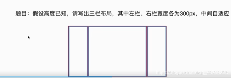
题目
解决方案有一下几种
1.flex布局
2.grid布局
3.absolute布局
4.float布局
5.table布局
1.flex布局解决方案
<section class="layout flex">
        <style>
            .layout.flex .left-main-right {
                display: flex;
                height: 300px;
            }

            .layout.flex .left-main-right .left,
            .layout.flex .left-main-right .right {
                flex: 300px 0 0;
                background-color: red;
            }

            .layout.flex .left-main-right .main {
                flex: 1;
                background-color: blueviolet;
            }
        </style>
        <article class="left-main-right">
            <div class="left"></div>
            <div class="main">flex布局解决方案</div>
            <div class="right"></div>
        </article>
    </section>
优点:快捷方便 并且兼容性好
如果不明白flex布局的可以参考阮一峰老师的博客
2.grid布局解决方案
<section class="layout grid">
        <style>
            .layout.grid .left-main-right {
                display: grid;
                grid-template-columns: 300px auto 300px;
            }

            .layout.grid .left-main-right div {
                height: 300px;
            }

            .layout.grid .left-main-right .left,
            .layout.grid .left-main-right .right {
                background-color: red;
            }

            .layout.grid .left-main-right .main {
                background-color: purple;
            }
        </style>
        <article class="left-main-right">
            <div class="left"></div>
            <div class="main">grid布局解决方案</div>
            <div class="right"></div>
        </article>
</section>不明白grid布局的同学可以参考阮一峰老师的博客
目前最强的布局方式
3.absolute布局解决方案
<section class="layout absolute">
        <style>
            .layout.absolute {
                height: 300px;
            }

            .layout.absolute .left-main-right div {
                position: absolute;
                height: 300px;
            }

            .layout.absolute .left {
                left: 0;
                width: 300px;
                background-color: red;

            }

            .layout.absolute .right {
                right: 0;
                width: 300px;
                background-color: red;
            }

            .layout.absolute .main {
                left: 300px;
                right: 300px;
                background-color: purple;
            }
        </style>
        <article class="left-main-right">
            <div class="left"></div>
            <div class="main">absolute布局解决方案</div>
            <div class="right"></div>
        </article>
    </section>
缺点:可使用性比较差 (用了absolute 子元素也要脱离文档流)
优点:快捷,兼容性好
4.float布局解决方案
<section class="layout float">
        <style>
            .layout.float {
                height: 300px;
                overflow: hidden;
            }

            .layout.float .left {
                float: left;
                width: 300px;
                height: 300px;
                background-color: aqua;
            }

            .layout.float .right {
                float: right;
                width: 300px;
                height: 300px;
                background-color: aqua;
            }

            .layout.float .main {
                background-color: rebeccapurple;
                height: 300px;
            }
        </style>
        <article class="left-right-main">
            <div class="left"></div>
            <div class="right"></div>
            <div class="main">浮动的解决方案</div>
        </article>
    </section>
缺点:要记得清除浮动
优点:兼容性好
5.table布局解决方案
<section class="layout table">
        <style>
            .layout.table .left-main-right {
                display: table;
                width: 100%;
                height: 300px;
            }
            .layout.table .left-main-right  div {
                display: table-cell;
            }
            .layout.table .left-main-right .left {
                background-color: blanchedalmond;
                width: 300px;
            }
            .layout.table .left-main-right .right {
                background-color: blanchedalmond;
                width: 300px;
            }
            .layout.table .left-main-right .main {
                background-color:blueviolet
            }
        </style>
        <article class="left-main-right">
            <div class="left"></div>
            <div class="main">table布局解决方案</div>
            <div class="right"></div>
        </article>
    </section>
缺点:
优点:比较方便,兼容性好
页面布局变通
三栏布局
左右宽度固定,中间自适应
上下高度固定,中间自适应
两栏布局
左宽度固定,右宽度自适应
右宽度固定,左宽度自适应
上高度固定,下高度自适应
下高度固定,上高度自适应
页面布局小结
1.语义化要掌握到位
2.页面布局理解深刻
3.CSS基础扎实
4.思维灵活并且上进
5.代码书写规范


 扫一扫
扫一扫


 被折叠的 条评论
为什么被折叠?
被折叠的 条评论
为什么被折叠?
 到【灌水乐园】发言


