


文章目录
1. CSS 元素显示模式
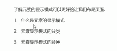
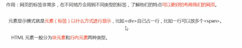
2. 什么是元素显示模式
作用:在不同的地方会用到不同类型的标签,了解他们的特点可以更好的布局网页
3. 块元素
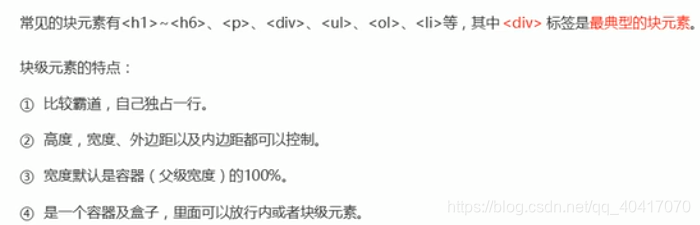
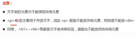
文字类的元素不允许放置其他的元素,比如文字中只能放文字,其他的东西不能放
比如 h p 标签等
4. 行内元素
注:链接里面不能再放其他元素
4.1 示例代码
<!DOCTYPE html>
<html lang="en">
<head>
<meta charset="UTF-8">
<meta name="viewport" content="width=device-width, initial-scale=1.0">
<title>Document</title>
<style>
div {
height: 200px;
background-color: skyblue;
}
/*行块元素的高 宽的设置是无效的 行内元素只能容纳文本或其它行内元素*/
/*默认宽度就是内容本身的宽度*/
</style>
</head>
<body>
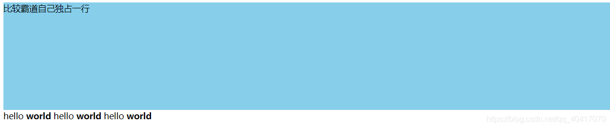
<div>比较霸道自己独占一行</div>
<span>hello</span> <strong>world</strong>
<span>hello</span> <strong>world</strong>
<span>hello</span> <strong>world</strong>
</body>
</html>
4.2 运行结果
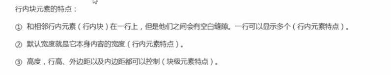
5. 行内块元素(既有块 又有行元素 特点)

5.1 示例代码
<!DOCTYPE html>
<html lang="en">
<head>
<meta charset="UTF-8">
<meta name="viewport" content="width=device-width, initial-scale=1.0">
<title>行内块元素</title>
<style>
input {
width: 200px;
height: 200px;
}
</style>
</head>
<body>
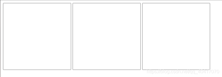
<input type="text" name="" id="">
<input type="text" name="" id="">
<input type="text" name="" id="">
</body>
</html>
5.2 运行结果
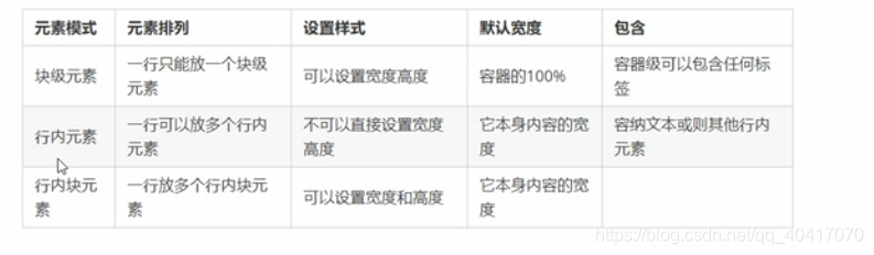
6 元素显示模式总结
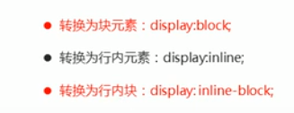
7. 元素显示模式转换
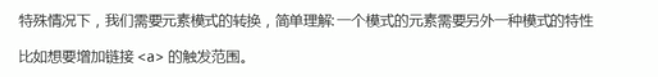
因为只有块才有长度和宽度,此时加大触发范围
7.1 示例代码
<!DOCTYPE html>
<html lang="en">
<head>
<meta charset="UTF-8">
<meta name="viewport" content="width=device-width, initial-scale=1.0">
<title>元素显示模式转换</title>
<style>
a {
/*此时的行元素的出发范围太小了 需要将触发范围变大 所以将行元素变成大的块元素*/
width: 150px;
height: 50px;
background-color: skyblue;
/*将行元素转变为块元素*/
/*用的最多*/
display: block;
}
div {
width: 200px;
height: 200px;
background-color: green;
/*块元素转换成为行元素*/
display: inline;
}
span {
width: 200px;
height: 200px;
display: inline-block;
background: green;
}
</style>
</head>
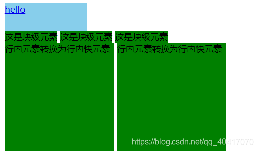
<body>
<a href="#">hello</a>
<div>这是块级元素</div>
<div>这是块级元素</div>
<div>这是块级元素</div><br />
<span>行内元素转换为行内快元素</span>
<span>行内元素转换为行内快元素</span>
</body>
</html>
7.2 运行结果


 扫一扫
扫一扫


 1370
1370

 被折叠的 条评论
为什么被折叠?
被折叠的 条评论
为什么被折叠?
 到【灌水乐园】发言


