


 本文通过两个实例展示了uni-nav-bar组件的应用方法。第一个示例介绍了如何使用uni-nav-bar进行基本导航操作,并演示了如何定义左侧图标、标题以及响应点击事件等。第二个示例则进一步展示了如何自定义导航栏的左侧区域,包括城市选择和搜索框的设计。
例1

代码
<template>
<view>
<uni-nav-bar left-icon="arrowleft" title="标题" @clickLeft="back" />
<br>
<uni-nav-bar color="#ffffff" background-color="#007AFF" left-icon="arrowleft" left-text="返回" title="标题" @clickLeft="back" @clickTitle="clickTitle" />
<br>
<uni-nav-bar left-icon="arrowleft" left-text="返回" title="标题" right-text="菜单" @clickLeft="back" @clickTitle="clickTitle" @clickRight="showMenu"/>
</view>
</template>
<script>
export default {
components: {},
data() {
return {}
},
methods: {
back() {
uni.navigateBack({
delta: 1
})
},
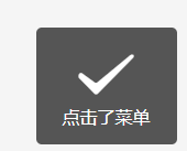
showMenu() {
uni.showToast({
title: '点击了菜单'
})
},
clickLeft() {
uni.showToast({
title: '左侧按钮'
})
},
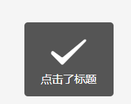
clickTitle() {
uni.showToast({
title: '点击了标题'
})
}
}
}
</script>
例2
<template>
<view>
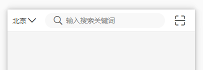
<uni-nav-bar color="#333333" background-color="white" right-icon="scan" @clickLeft="showCity" @clickRight="scan">
<block slot="left">
<view class="city">
<view><text style="font-size: 14px">北京</text></view>
<uni-icons type="arrowdown" color="#333333" size="22" />
</view>
</block>
<view class="input-view">
<uni-icons style="line-height: 30px;" type="search" size="22" color="#666666"/>
<input confirm-type="search" class="nav-bar-input" type="text" placeholder="输入搜索关键词" @confirm="confirm">
</view>
</uni-nav-bar>
</view>
</template>
<script>
export default {
components: {},
data() {
return {
}
},
methods: {
showCity() {
uni.showToast({
title: '选择城市'
})
},
scan() {
uni.showToast({
title: '扫码'
})
},
confirm() {
uni.showToast({
title: '搜索'
})
}
}
}
</script>
<style>
.city {
display: flex;
flex-direction: row;
align-items: center;
margin-left: 4px;
}
.input-view {
display: flex;
flex-direction: row;
flex: 1;
background-color: #f8f8f8;
height: 30px;
border-radius: 15px;
padding: 0 15px;
flex-wrap: nowrap;
margin: 7px 0;
line-height: 30px;
}
.nav-bar-input {
height: 30px;
line-height: 30px;
width: 370rpx;
padding: 0 5px;
font-size: 14px;
background-color: #f8f8f8;
}
</style>


 扫一扫
扫一扫


 1607
1607

 被折叠的 条评论
为什么被折叠?
被折叠的 条评论
为什么被折叠?
 到【灌水乐园】发言


