


答案是有的,但也要看情况
如果你父子级别 宽高 写死 是 肯定没有区别的
  <style>
    .grid-all {
      width: 600px;
      height: 150px;
    }
    .grid-item {
      /* width: 100%; */
      /* height: 100%; */
      width: 150px;
      height: 150px;
    }
    .green {
      background-color: aquamarine;
    }
    .blue {
      background-color: rgb(127, 182, 255);
    }
    .red {
      background-color: rgba(224, 57, 71, 0.158);
    }
    .pink {
      background-color: rgb(174, 0, 255);
    }
    .grid-fr {
      display: grid;
      height: 100%;
      grid-template-columns: 1fr 1fr 1fr 1fr;
      gap: 20px;
    }
    .grid-per {
      height: 100%;
      margin-top: 20px;
      display: grid;
      grid-template-columns: 25% 25% 25% 25%;
      gap: 20px;
    }
  </style>
  <body>
    <div class="grid-all">
      <div class="grid-fr">
        <div class="grid-item green"></div>
        <div class="grid-item blue"></div>
        <div class="grid-item red"></div>
        <div class="grid-item pink"></div>
      </div>

      <div class="grid-per">
        <div class="grid-item green"></div>
        <div class="grid-item blue"></div>
        <div class="grid-item red"></div>
        <div class="grid-item pink"></div>
      </div>
    </div>
  </body>
</html>
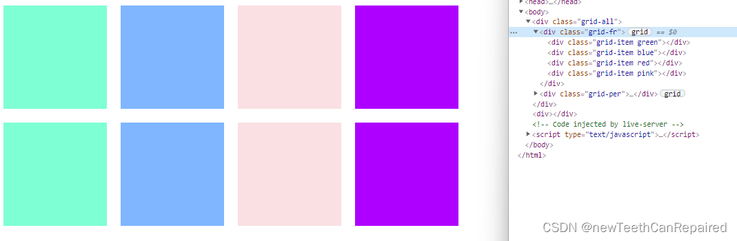
得到的图形是什么呢,如图
如果改成百分比的话,如图
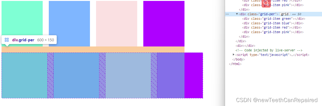
你会发现 百分比 并没有 gap 之间的间距 算上,所以有些时候冒然使用 百分比的话,可能会让布局错位。而fr 是算上了gap的距离的,所以要适配的话,一般fr 好于百分比的。当然还要什么更好的呢。
css grid 使用多了后 不太想使用flex ,flex 写的有些麻烦,虽然兼容好。但是 现在的手机 浏览器 都在更新,老版本也很老了,所以个人觉得 grid 更能提高生产力


 扫一扫
扫一扫


 被折叠的 条评论
为什么被折叠?
被折叠的 条评论
为什么被折叠?
 到【灌水乐园】发言


