


 本文通过三个实例介绍了HTML和CSS的应用。首先展示了一个表格的示例,接着探讨了img元素的拖放功能,详细解释了如何通过JavaScript实现元素的拖放操作。最后,通过一个复杂的布局演练,展示了如何使用CSS实现标准盒模型和怪异盒模型的布局,并利用绝对定位创建灵活的页面结构。这些实例涵盖了HTML基础、CSS布局和交互设计的关键知识点。
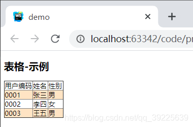
Table
<!DOCTYPE html>
<html lang="en">
<head>
    <meta charset="UTF-8">
    <title>demo</title>
</head>
<body>
<h2>表格-示例</h2>
<table  class="table" border="1">
    <tr>
        <td>用户编码</td>
        <td>姓名</td>
        <td>性别</td>
    </tr>
    <tr>
        <td>0001</td>
        <td>张三</td>
        <td>男</td>
    </tr>
    <tr>
        <td>0002</td>
        <td>李四</td>
        <td>女</td>
    </tr>
    <tr>
        <td>0003</td>
        <td>王五</td>
        <td>男</td>
    </tr>
</table>

</body>
<script type="text/javascript" >
</script>
<style type="text/css">
    .table{
        border-collapse: collapse;
    }
    tr:nth-child(even){
        background-color: bisque;
    }
    tr td{

    }
</style>
</html>
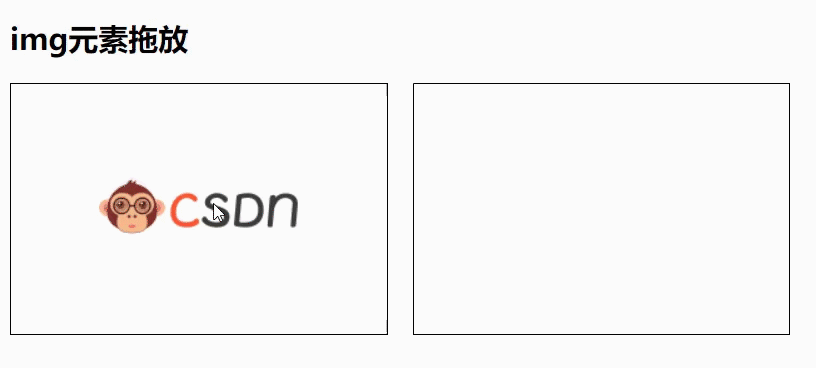
元素拖放
<!DOCTYPE html>
<html lang="en">
<head>
    <meta charset="UTF-8">
    <title>demo</title>
</head>
<body>
<h2>img元素拖放</h2>
<div class="left-box" ondrop="drop(event)" ondragover="prevent(event)">
    <img  id="img" src="csdn.png" draggable="true"  ondragstart="dropStart(event)">
</div>
<div class="right-box" ondrop="drop(event)" ondragover="prevent(event)">
</div>

</body>
<script type="text/javascript" >
    function prevent(ev){
        ev.preventDefault()
    }
    function dropStart(ev) {
        console.log("拽")
        ev.dataTransfer.setData("text",ev.target.id)
    }
    function drop(ev) {
        console.log("放")
        const data = ev.dataTransfer.getData("text")
        ev.target.appendChild(document.getElementById(data))
    }
</script>
<style type="text/css">
    .left-box,.right-box {
        height: 200px;
        width: 300px;
        border: 1px solid black;
        float: left;
        display: flex;
        justify-content: center;
        align-items: center;
        margin-right: 20px;
    }
</style>
</html>
盒子模型:标准盒模型-怪异盒模型的区别
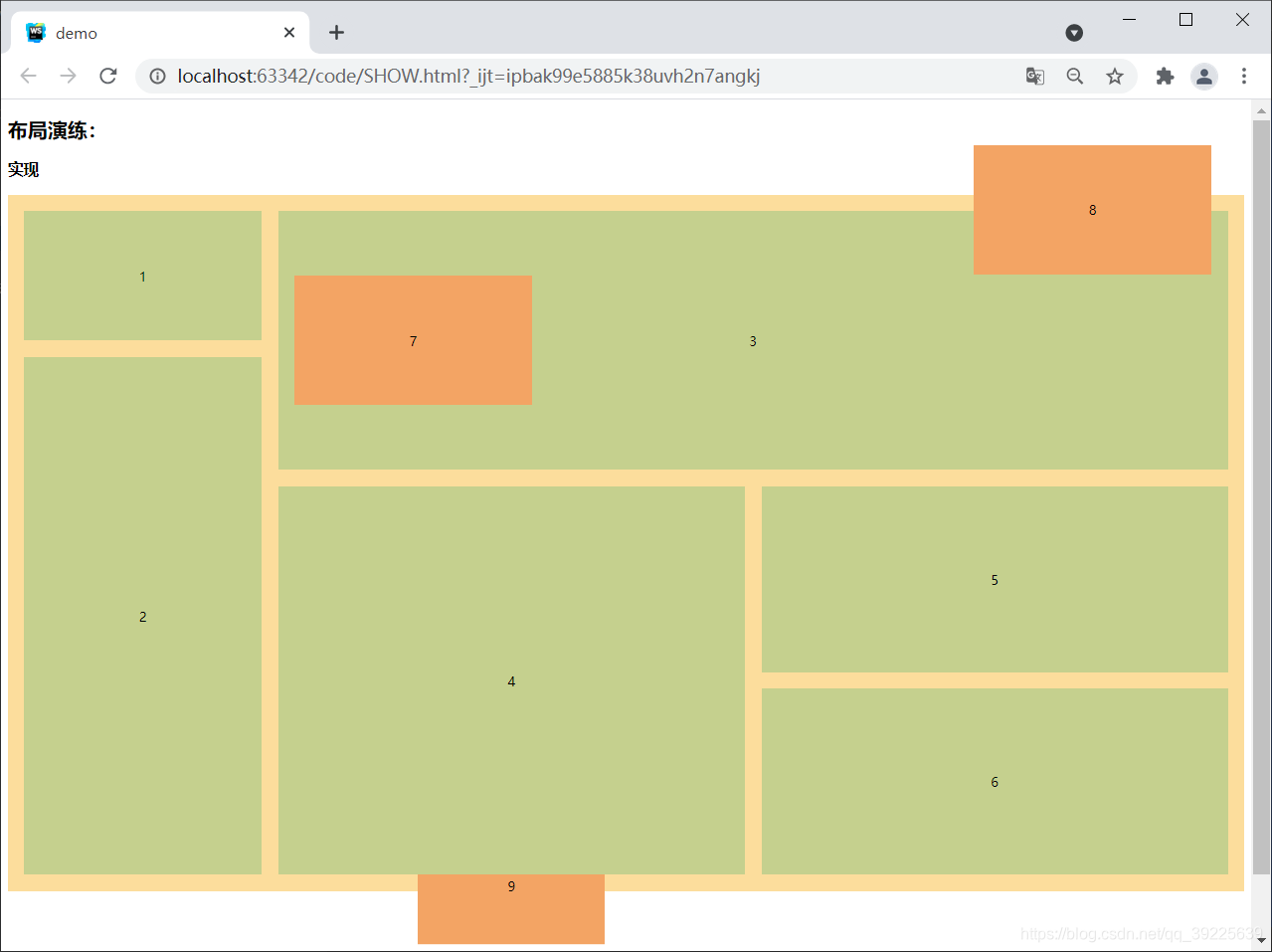
布局练习
<!DOCTYPE html>
<html lang="en">
<head>
    <meta charset="UTF-8">
    <title>demo</title>
</head>
<body>
<h2>布局演练:</h2>
<h3 class="">实现</h3>
<div class="layout">
    <div class="left">
        <div class="item-1 item">1</div>
        <div class="item-2 item">2</div>
    </div>
    <div class="right">
        <div class="item-3 item">
            <span>3</span>
            <div class="item-7 absolute">7</div>
            <div class="item-8 absolute">8</div>
        </div>
        <div class="inner-box">
            <div class="item-4 item">
                <span>4</span>
                <div class="item-9 absolute">9</div>
            </div>
            <div class="inner-box-inner">
                <div class="item-5 item">5</div>
                <div class="item-6 item">6</div>
            </div>
        </div>
    </div>
</div>

</body>
<script type="text/javascript" >
</script>
<style type="text/css">
    .layout{
        height: 800px;
        display: flex;
        padding: 20px;
        background-color: rgb(252, 221, 156);
        margin-bottom: 150px;
        position:relative;
        z-index: -1;
    }
    .item{
        display: flex;
        position:relative;
        align-items: center;
        justify-content: center;
        background-color: rgb(197, 208, 142);
    }
    .item-1{
        flex: 1;
        margin-bottom:20px;
    }
    .item-2{
        flex: 4;
    }
    .left{
        flex: 2;
        display: flex;
        flex-direction: column;
        margin-right: 20px;
    }
    .right{
        display: flex;
        flex-direction: column;
        flex: 8;
    }
    .item-3{
        flex: 4;
        margin-bottom: 20px;
    }
    .inner-box{
        flex:6;
        display: flex;
    }
    .inner-box .item-4{
        flex: 1;
        height: 100%;
        margin-right: 20px;
    }
    .inner-box-inner{
        flex: 1;
        display: flex;
        flex-direction: column;
    }
    .inner-box-inner .item-6{
        margin-top: 20px;
    }
    .inner-box-inner .item-6,.item-5{
        flex: 1;
    }
    .absolute{
        display: flex;
        justify-content: center;
        align-items: center;
        position: absolute;
    }
    .item-7{
        height: 50%;
        width: 25%;
        background-color: rgb(243, 164, 100);
        left: 20px;
    }
    .item-8{
        height: 50%;
        width: 25%;
        background-color: rgb(243, 164, 100);
        right: 20px;
        top: -80px;
    }
    .item-9{
        height: 30%;
        width: 40%;
        background-color: rgb(243, 164, 100);
        bottom: 0;
        z-index: -1;
        transform: translateY(60%);
    }
</style>
</html>
题目:
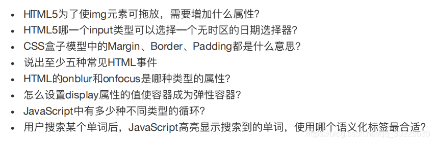
1,draggable
2,date
3.外边距,边框,内边距
4,窗口事件,鼠标事件,键盘事件,媒体事件,表单事件,其他事件
5,onblur失去焦点时候触发事件,onfocus获取焦点时触发事件
6,display:flex
7,do while ;while;for;for…in;
8,mark


 扫一扫
扫一扫


 1121
1121

 被折叠的 条评论
为什么被折叠?
被折叠的 条评论
为什么被折叠?
 到【灌水乐园】发言


