


 本文是Android Developer Fundamentals课程的一部分,讲解如何遵循Material Design指南改进应用设计。内容包括添加CardView和图片、实现卡片滑动、拖放和点击功能,以及选择Material Design配色方案。通过实例教你如何提升用户体验,包括使用Glide加载图片和使用FloatingActionButton等。
Android fundamentals 05.2:Cards and colors
Tutorial source : Google CodeLab
Date : 2021/04/06
Complete course : 教程目录 (java).
Note : The link in this article requires Google access
1、Welcome
This practical codelab is part of Unit 2: User experience in the Android Developer Fundamentals (Version 2) course. You will get the most value out of this course if you work through the codelabs in sequence:
- For the complete list of codelabs in the course, see Codelabs for Android Developer Fundamentals (V2).
- For details about the course, including links to all the concept chapters, apps, and slides, see Android Developer Fundamentals (Version 2).
Note: This course uses the terms “codelab” and “practical” interchangeably.
Introduction
Google’s Material Design guidelines are a series of best practices for creating visually appealing and intuitive applications. In this practical you learn how to add CardView and FloatingActionButton widgets to your app, how to use images efficiently, and how to employ Material Design best practices to make your user’s experience delightful.
What you should already know
You should be able to:
- Create and run apps in Android Studio.
- Create and edit UI elements using the layout editor.
- Edit XML layout code, and access elements from your Java code.
- Create a click handler for a
Buttonclick. - Extract text to a string resource and a dimension to a dimension resource.
- Use drawables, styles, and themes.
- Use a
RecyclerViewto display a list.
What you’ll learn
- Recommended use of Material Design widgets such as
FloatingActionButtonandCardView. - How to efficiently use images in your app.
- Recommended best practices for designing intuitive layouts using bold colors.
What you’ll do
- Modify an app to follow Material Design guidelines.
- Add images and styling to a
RecyclerViewlist. - Implement an
ItemTouchHelperto add drag-and-drop functionality to your app.
2、App overview
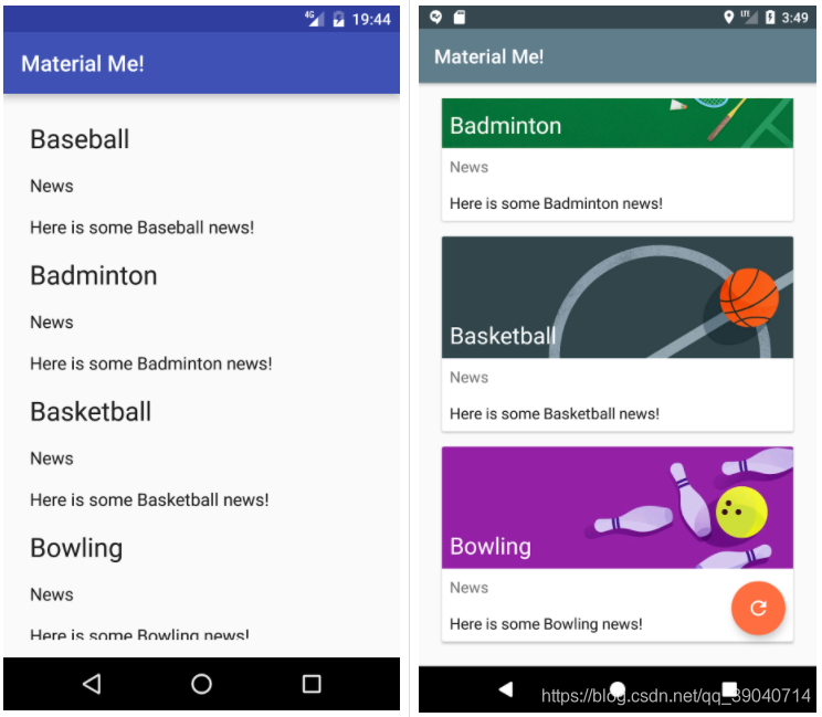
The MaterialMe app is a mock sports-news app with very poor design implementation. You will fix it up to meet the design guidelines to create a delightful user experience! Below are screenshots of the app before and after the Material Design improvements.
3、Task 1: Download the starter code
The complete starter app project for this practical is available at MaterialMe-Starter. In this task you will load the project into Android Studio and explore some of the app’s key features.
1.1 Open and run the MaterialMe project
- Download the MaterialMe-Starter code.
- Open the app in Android Studio.
- Run the app.
The app shows a list of sports names with some placeholder news text for each sport. The current layout and style of the app makes it nearly unusable: each row of data is not clearly separated and there is no imagery or color to engage the user.
1.2 Explore the app
Before making modifications to the app, explore its current structure. It contains the following elements:
Sport.java
This class represents the data model for each row of data in the RecyclerView. Right now it contains a field for the title of the sport and a field for some information about the sport.
SportsAdapter.java
This is the adapter for the RecyclerView. It uses an ArrayList of Sport objects as its data and populates each row with this data.
MainActivity.java
The MainActivity initializes the RecyclerView and adapter, and creates the data from resource files.
strings.xml
This resource file contains all of the data for the app, including the titles and information for each sport.
list_item.xml
This layout file defines each row of the RecyclerView. It consists of three TextView elements, one for each piece of data (the title and the info for each sport) and one used as a label.
4、Task 2: Add a CardView and images
One of the fundamental principles of Material Design is the use of bold imagery to enhance the user experience. Adding images to the RecyclerView list items is a good start for creating a dynamic and captivating user experience.
When presenting information that has mixed media (like images and text), the Material Design guidelines recommend using a CardView, which is a FrameLayout with some extra features (such as elevation and rounded corners) that give it a consistent look and feel across many different applications and platforms. CardView is a UI component found in the Android Support Libraries.
In this section, you will move each list item into a CardView and add an Image to make the app comply with Material guidelines.
2.1 Add the CardView
CardView is not included in the default Android SDK, so you must add it as a build.gradle dependency. Do the following:
- Open the build.gradle (Module: app) file, and add the following line to the
dependenciessection:
implementation 'com.android.support:cardview-v7:26.1.0'
The version of the support library may have changed since the writing of this practical. Update the above to the version suggested by Android Studio, and click Sync to sync your build.gradle files.
- Open the list_item.xml file, and surround the root
LinearLayoutwithandroid.support.v7.widget.CardView. Move the schema declaration (xmlns:android="http://schemas.android.com/apk/res/android) to theCardView, and add the following attributes:
| Attribute | Value |
|---|---|
android:layout_width |
"match_parent" |
android:layout_height |
"wrap_content" |
android:layout_margin |
"8dp" |
The schema declaration needs to move to the CardView because the CardView is now the top-level view in your layout file.
- Choose Code > Reformat Code to reformat the XML code, which should now look like this at the beginning and end of the file:
<android.support.v7.widget.CardView
     xmlns:android="http://schemas.android.com/apk/res/android"
    android:layout_width="match_parent"
    android:layout_height="wrap_content"
    android:layout_margin="8dp">

    <LinearLayout
        android:layout_width="match_parent"
        android:layout_height="wrap_content"
        android:orientation="vertical">
        <!-- Rest of LinearLayout -->
        <!-- TextView elements -->
 最低0.47元/天 解锁文章


 扫一扫
扫一扫


 1046
1046

 被折叠的 条评论
为什么被折叠?
被折叠的 条评论
为什么被折叠?
 到【灌水乐园】发言


