


 本文详细介绍了CSS布局中的三种主要技术:浮动布局、定位布局和伸缩盒布局。浮动布局用于让元素在一行内显示,定位布局则常用于创建悬停效果和固定元素,而伸缩盒布局适用于响应式设计,让元素根据空间自动调整排列。内容包括各种布局的实现方法及其特性,并提供了实例展示。
文章目录
布局
- 使用块元素搭建页面框架
- 块元素独占一行空间
- 布局的本质就是让块元素在一行中显示
默认文档流:
默认文档流就是对页面布局不加任何修饰,元素自动的布局方式,其特点如下:
1)元素在页面中的显示顺序与元素在代码中出现的顺序是一致的。
2)块级元素独占一行空间,宽度默认为父级的100%,高度由其内容高度所决定。
3)行内元素与其他元素共享一行空间,宽度由其内容所决定。
默认文档流往往不能满足布局需求,所以可以使用 float、position、display 属性改变默认布局。
1、浮动布局
浮动布局的主要用法是为了让块级元素在一行中显示,或者让文字在图片的周围显示。
float : left / right
浮动布局脱离文档流:
1)宽度高度默认由内容决定
2)原先所在位置就会被其他块元素抢占
3)浮动元素在一行中依次排列,当一行无法容纳的时候会自动换行
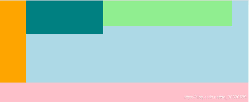
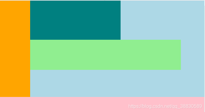
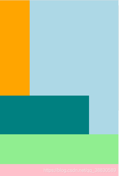
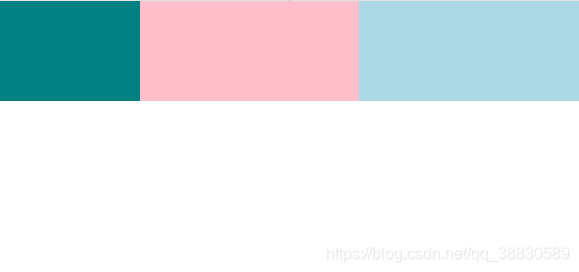
2+ 列浮动
给所有的子元素添加浮动,使其排列在一行内,当浏览器视口缩小时,子元素会自动换行。
<!DOCTYPE html>
<html lang="en">
<head>
	<meta charset="UTF-8">
	<title>浮动布局</title>
	<style>
		body {
			margin: 0;
		}
		.first {
			background-color: lightblue;
		}
		/*子元素浮动*/
		.first > div.one {
			background-color: orange;
			width: 100px;
			height: 320px;
			float: left;
			/*opacity: 0.4;*/
		}
		.first > div.two {
			background-color: teal;
			width: 300px;
			height: 130px;
			float: left;
		}
		.first > div.three {
			background-color: lightgreen;
			width: 500px;
			height: 100px;
			float: left;
		}
		/*给父元素添加伪元素,清除浮动*/
		.first::after {
			content: "";
			display: block;
			clear: both;
		}
		.second {
			background-color: pink;
			height: 400px;
		}
	</style>
</head>
<body>
	<div class="first">
		<div class="one"></div>
		<div class="two"></div>
		<div class="three"></div>
		<!-- <div class="clear"></div> -->
	</div>
	<div class="second">

	</div>

</body>
</html>
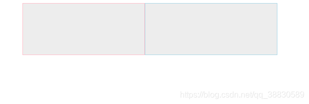
2 列(左侧浮动,右侧不浮动)
给左侧块元素添加浮动,右侧块元素只需添加左外边距,即可使两列块元素在一行显示。
<!DOCTYPE html>
<html lang="en">
<head>
	<meta charset="UTF-8">
	<title>浮动边框</title>
	<style>
		.content {
			width: 500px;
			margin: 0 auto;
			background-color: #ededed;
		}
		.content::after {
			display: block;
			content: "";
			clear: both;
		}
		/*给左侧块元素添加浮动*/
		.content > .left {
			width: 238px;
			height: 100px;
			border: 1px solid pink;
			float: left;
		}
		/*右侧块元素添加左外边距*/
		.content > .right {
			margin-left: 240px;
			height: 100px;
			border: 1px solid lightblue;
		}
	</style>
</head>
<body>
	<div class="content">
		<div class="left"></div>
		<div class="right"></div>
	</div>
</body>
</html>
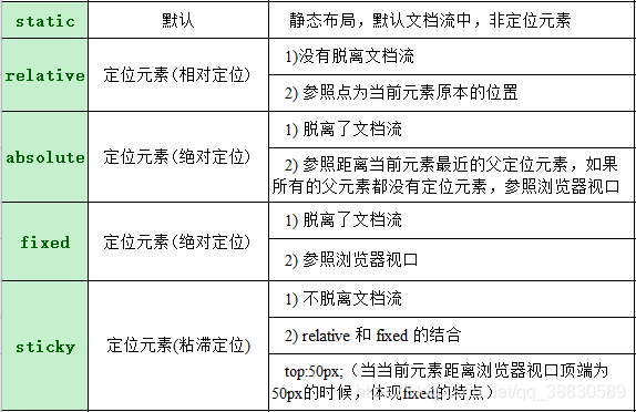
2、定位布局
- 作用:
当一个元素悬挂在其他元素之上,优先考虑定位布局
eg: 模态框、下拉菜单、二级菜单、固定宣传栏、网页聊天页面 - 用法:
position : static / relative / absolute / fixed
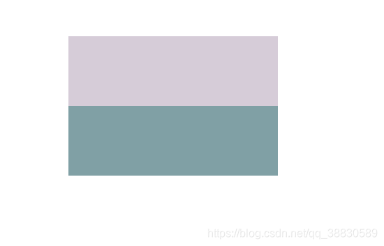
相对定位 relative
<!DOCTYPE html>
<html lang="en">
<head>
	<meta charset="UTF-8">
	<title>相对定位</title>
	<style>
		.outer {
			background-color: #ccc;
		}
		.outer > div {
			height: 100px;
		}
		.outer > div.one {
			background-color: lightblue;
		}
		/*给two添加相对定位relative*/
		.outer > div.two {
			background-color: pink;
			position: relative;
			/*使two在原本的位置向下、向右移动50px*/
			top: 50px;
			left: 50px;
			/*让two显示到最上层*/
			z-index: 1;
		}
		/*给three添加相对定位relative*/
		.outer > div.three {
			background-color: teal;
			position: relative;
		}
	</style>
</head>
<body>
	<div class="outer">
		<div class="one"></div>
		<div class="two"></div>
		<div class="three"></div>
	</div>
</body>
</html>
two 没有脱离文档流,它原来的位置不会被抢占。
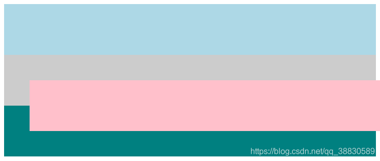
绝对定位 absolute
<!DOCTYPE html>
<html lang="en">
<head>
	<meta charset="UTF-8">
	<title>绝对定位</title>
	<style>
		body {
		}
		/*父元素添加相对定位*/
		.outer {
			background-color: #ccc;
			width: 300px;
			margin: 100px auto;
			position: relative;
		}
		.outer > div:nth-child(1),
		.outer > div:nth-child(3) {
			height: 100px;
		}
		.outer > div.one {
			background-color: lightblue;
		}
		/*子元素添加绝对定位*/
		.outer > div.two {
			background-color: pink;
			position: absolute;
			top: 0;
			left: 0;
			right: 0;
			bottom: 0;
			opacity: .5;
		}
		.outer > div.three {
			background-color: teal;
		}
	</style>
</head>
<body>
	<div class="outer">
		<div class="one"></div>
		<div class="two"></div>
		<div class="three"></div>
	</div>
</body>
</html>
父元素添加了相对定位,子元素参照父元素,two 参照父元素 outer,因此 two 的位置、宽和高均参照父元素的。
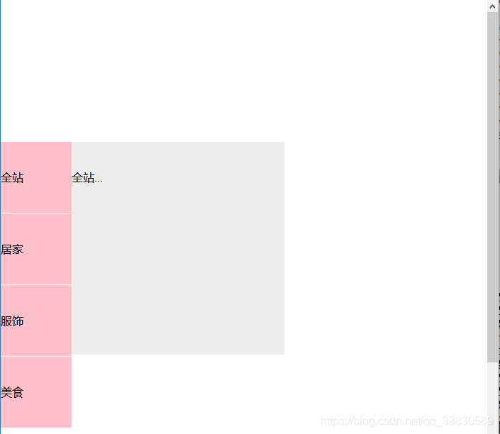
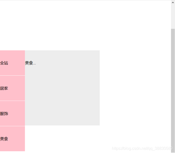
固定定位 fixed
<!DOCTYPE html>
<html lang="en">
<head>
	<meta charset="UTF-8">
	<title>固定定位</title>
	<style>
		p {
			margin: 0;
		}
		ul {
			margin: 0;
			padding: 0;
			list-style: none;
		}

		/*固定定位fixed*/
		.left-aside {
			position: fixed;
			left: 0;
			top: 200px;
			width: 100px;
			background-color: pink;
		}
		.left-aside > div {
			height: 100px;
			line-height: 100px;
			border-bottom: 1px solid #fff;
		}
		.left-aside > div:hover > div{
			display: block;
		}
		/*子元素添加绝对定位absolute,位置参照父元素*/
		.left-aside > div > div{
			position: absolute;
			top: 0;
			left: 100%;
			width: 300px;
			background-color: #ededed;
			display: none;
			height: 300px;
		}
	</style>
</head>
<body>
	<div class="container">
		<div class="left-aside">
			<div>
				<p>全站</p>
				<div>
					全站...
				</div>
			</div>
			<div>
				<p>居家</p>
				<div>
					居家....
				</div>
			</div>
			<div>
				<p>服饰</p>
				<div>
					服饰...
				</div>
			</div>
			<div>
				<p>美食</p>
				<div>
					美食...
				</div>
			</div>
		</div>
	</div>
	<br>
	<br>
	<br>
	<br>
	<br>
	<br>
	<br>
	<br>
	<br>
	<br>
	<br>
	<br>
	<br>
	<br>
	<br>
	<br>
	<br>
	<br>
	<br>
	<br>
	<br>
	<br>
	<br>
	<br>
	<br>
	<br>
	<br>
	<br>
	<br>
	<br>
	<br>
	<br>
	<br>
	<br>
	<br>
	<br>
	<br>
	<br>
	<br>
	<br>
</body>
</html>
固定定位使元素在浏览器视口的位置不变,参照的是浏览器视口,不会随着浏览器的滚动而滚动。
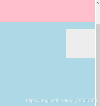
粘滞定位 sticky
<!DOCTYPE html>
<html lang="en">
<head>
	<meta charset="UTF-8">
	<title>粘滞定位</title>
	<style>
		body {
			margin: 0;
		}
		/*给box添加粘滞定位,当box距离浏览器视口顶端为100px的时候,体现fixed的特点*/
		.box {
			height: 100px;
			width: 100px;
			background-color: #ededed;
			position: sticky;
			top:100px;
			float: right;

		}
	</style>
</head>
<body>
	<div style="height: 200px;background-color: pink"></div>
	<div class="box"></div>
	<div style="height: 1000px;background-color: lightblue;"></div>
</body>
</html>
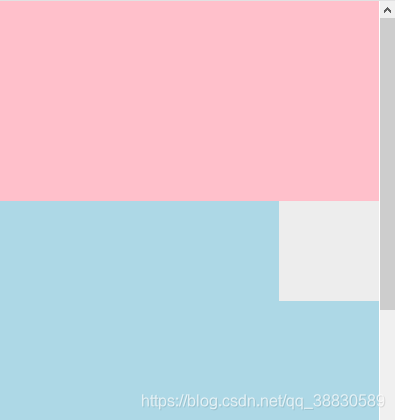
当 box 距离浏览器视口顶端100px 时,box 固定不再随着浏览器的滚动而滚动。
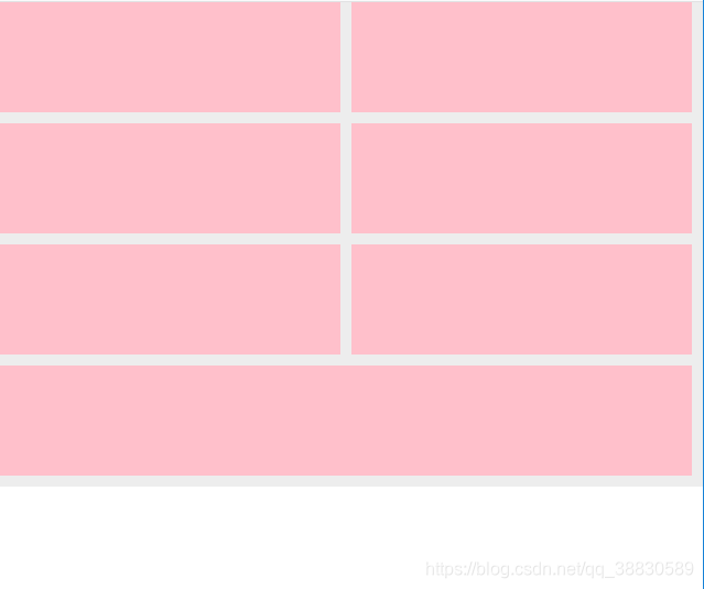
3、伸缩盒布局
作用:
使得子元素在父元素中分列显示,与 float 的作用类似。一般用于响应式布局(手机 app 中)
用法:
1. 父元素在主轴上一定要有一个固定的宽/高
2. 子元素在交叉轴上默认宽/高占满父元素
如果主轴为 x 轴,那么资源的默认高度占满父元素
如果主轴为 y 轴,那么资源的默认宽度占满父元素
ul 伸缩盒
1)设置父元素为伸缩盒
display : flex ;
2)主轴
默认情况下主轴为 x 轴,交叉轴为 y 轴,元素沿着伸缩盒的主轴排列的
主轴为 x 轴:flex-direction : row
主轴为 y 轴:flex-direction : column
3)伸缩盒自动换行
子元素宽度和大于父元素的时候是否换行
默认值,不换行:flex-wrap : nowrap
换行: flex-wrap : wrap
li 伸缩盒的元素
1)基础值
主轴上元素的基础值(宽/高):flex-basis : 200px ;
2)对盈余空间的分配
flex-grow : 1 ;
3)对亏损空间的贡献
flex-shrink : 2 ;
4)速写
flex : grow shrink basis ;
<!DOCTYPE html>
<html lang="en">
<head>
	<meta charset="UTF-8">
	<title>伸缩盒布局</title>
	<style>
		body {
			margin: 0;
		}
		/*给父元素添加flex布局*/
		.outer {
			display: flex;
			/*主轴为x轴*/
			flex-direction: row;
			/*子元素宽度和大于父元素的时候不换行*/
			flex-wrap: nowrap;
			background-color: #ededed;
		}
		.outer > div {
			height: 100px;
			width: 300px;
		}
		/*设置子元素对盈余空间和亏损空间的分配与贡献*/
		.outer >div:nth-child(1){
			background-color: teal;
			flex-grow: 1;
			flex-shrink: 2;
		}
		.outer >div:nth-child(2){
			background-color: pink;
			flex-grow: 2;
			flex-shrink: 1;
		}
		.outer >div:nth-child(3){
			background-color: lightblue;
		}
	</style>
</head>
<body>
	<div class="outer">
		<div></div>
		<div></div>
		<div></div>
	</div>
</body>
</html>
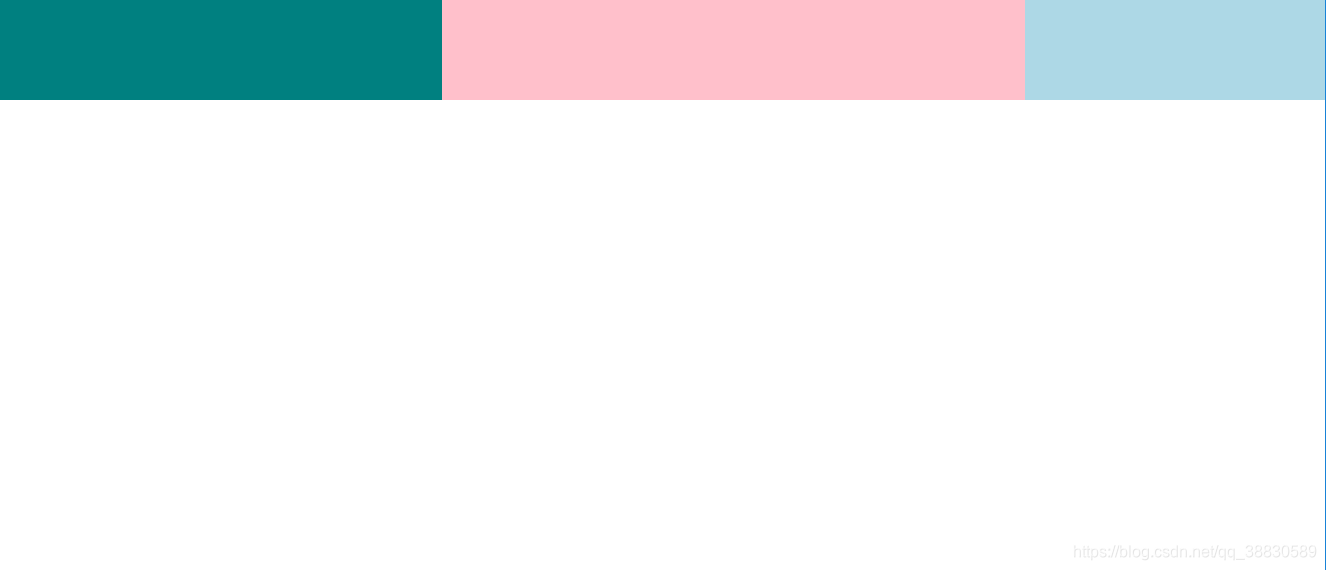
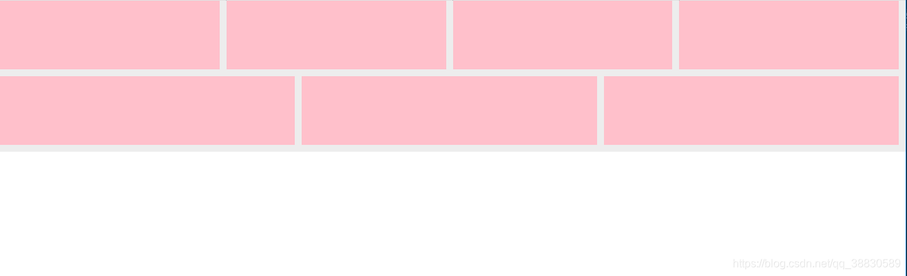
当浏览器视口缩小时,按照设置好的 flex-shrink 分配比例,三个块元素会有不同比例的缩小。
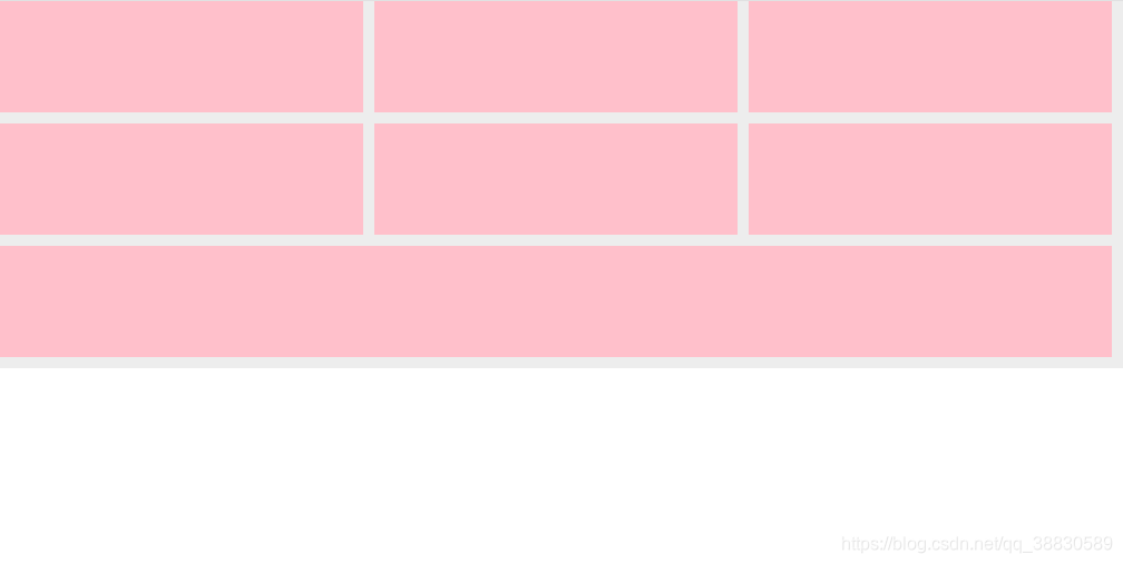
- 当父元素在主轴上满足不了子元素的基础分配需求,换行来满足。
<!DOCTYPE html>
<html lang="en">
<head>
	<meta charset="UTF-8">
	<title>伸缩盒布局</title>
	<style>
		body {
			margin: 0;
		}
		.content {
			display: flex;
			/*x轴,左中右*/
			flex-direction: row;
			/*当父元素在主轴上满足不了子元素的基础分配需求,换行来满足*/
			flex-wrap: wrap;
			/*height: 400px;*/
			background-color: #ededed;
		}
		.content > div{
			flex-basis: 300px;
			flex-grow: 1;	/*对于剩余空间分配所占份额*/
			height: 100px;
			background-color: pink;
			margin-right: 10px;
			margin-bottom: 10px;
		}
	</style>
</head>
<body>
	<div class="content">
		<div></div>
		<div></div>
		<div></div>
		<div></div>
		<div></div>
		<div></div>
		<div></div>
	</div>
</body>
</html>
随着浏览器视口的缩小,每一行溢出的元素自动换到下一行。


 扫一扫
扫一扫


 4898
4898

 被折叠的 条评论
为什么被折叠?
被折叠的 条评论
为什么被折叠?
 到【灌水乐园】发言


