


 该博客介绍了如何使用CSS3创建3D动画效果,强调了设置透视和transform-style属性对于实现3D效果的重要性,并提供了代码示例,包括定义旋转动画和鼠标悬停效果。
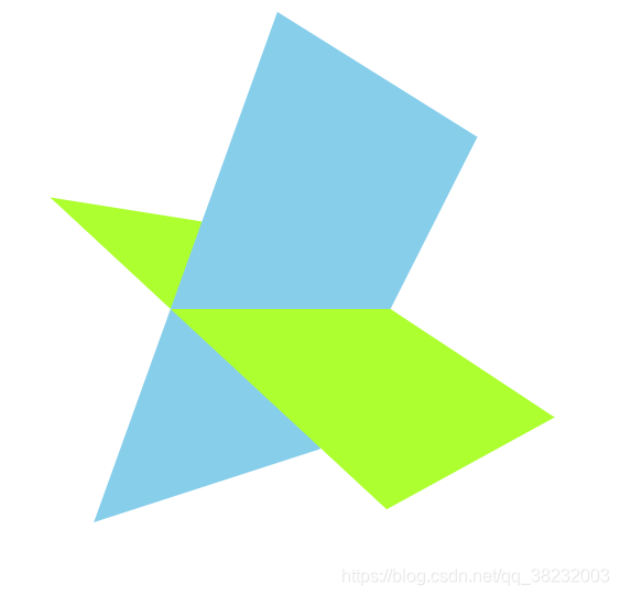
利用css3完成3d效果的简单呈现
动画效果用图片呈现不出来,大家自己动手写一个看看吧
新建html
<!DOCTYPE html>
<html lang="en">
<head>
  <meta charset="UTF-8">
  <meta name="viewport" content="width=device-width, initial-scale=1.0">
  <title>Document</title>
</head>
<body>
  <div class="box">
    <div></div>
    <div></div>
   </div>
</body>
</html>
首先在body加上透视,3d效果必须设置
      body {
        perspective: 500px;
      }
div.box样式
动画样式为3d
transform-style: preserve-3d;
      .box {
        width: 400px;
        height: 400px;
        margin: 100px auto;
        position: relative;
        transform-style: preserve-3d;
        transition: all 2s;
        animation: move 2s linear infinite forwards;
        /* transform: rotateY(90deg); */
      }
box下的两个div样式
      .box div:first-child {
        position: absolute;
        left: 50px;
        width: 300px;
        height: 400px;
        transform: rotateX(-30deg);
        background-color: skyblue;
      }
      .box div:last-child {
        position: absolute;
        left: 50px;
        width: 300px;
        height: 400px;
        background-color: greenyellow;
        transform: rotateX(60deg);
      }
定义动画旋转
      @keyframes move {
        0% {
        }
        100% {
          transform: rotateY(-360deg);
        }
      }
鼠标经过效果
      .box:hover {
        transform: rotateY(-360deg);
      }
完整代码:
<!DOCTYPE html>
<html lang="en">
  <head>
    <meta charset="UTF-8" />
    <meta name="viewport" content="width=device-width, initial-scale=1.0" />
    <title>Document</title>
    <style>
      body {
        perspective: 500px;
      }
      .box {
        width: 400px;
        height: 400px;
        margin: 100px auto;
        position: relative;
        transform-style: preserve-3d;
        transition: all 2s;
        animation: move 2s linear infinite forwards;
        /* transform: rotateY(90deg); */
      }
      .box:hover {
        transform: rotateY(-360deg);
      }
      .box div:first-child {
        position: absolute;
        left: 50px;
        width: 300px;
        height: 400px;
        transform: rotateX(-30deg);
        background-color: skyblue;
      }
      .box div:last-child {
        position: absolute;
        left: 50px;
        width: 300px;
        height: 400px;
        background-color: greenyellow;
        transform: rotateX(60deg);
      }
      @keyframes move {
        0% {
        }
        100% {
          transform: rotateY(-360deg);
        }
      }
    </style>
  </head>
  <body>
    <div class="box">
      <div></div>
      <div></div>
    </div>
  </body>
</html>


 扫一扫
扫一扫


 被折叠的 条评论
为什么被折叠?
被折叠的 条评论
为什么被折叠?
 到【灌水乐园】发言


