


背景:
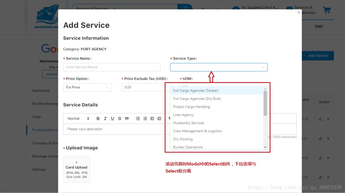
使用Ant Design,在Modal组件中使用Select组件,当点击Select组件出现下拉选项后滚动原始页面,出现下拉选项和Select框分离的异常。
异常图片:
异常代码:
<Select>
    // some <Option></Option>
</Select>
问题点:
Select组件有个API getPopupContainer,Ant Design官方文档给出的用途解释为:“菜单渲染父节点。默认渲染到 body 上,如果你遇到菜单滚动定位问题,试试修改为滚动的区域,并相对其定位”。同时官网也强调一个特殊情况需要注意:“如果发现下拉菜单跟随页面滚动,或者需要在其他弹层中触发 Select,请尝试使用 getPopupContainer={triggerNode => triggerNode.parentNode} 将下拉弹层渲染节点固定在触发器的父元素中”。
解决方案:
在Select组件中添加“getPopupContainer={triggerNode => triggerNode.parentNode}”属性即可。
正确代码:
<Select getPopupContainer={triggerNode => triggerNode.parentNode}>
    // some <Option></Option>
</Select>
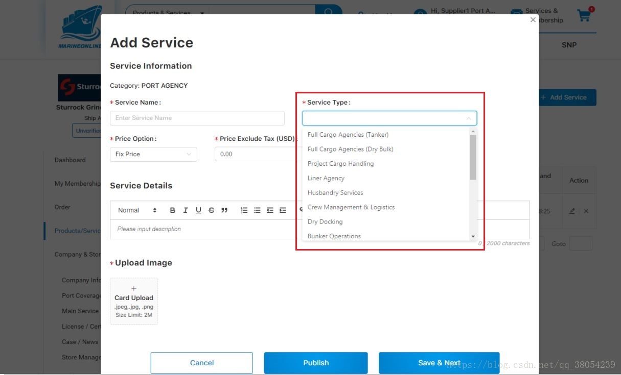
修改后效果:


 扫一扫
扫一扫


 607
607

 被折叠的 条评论
为什么被折叠?
被折叠的 条评论
为什么被折叠?
 到【灌水乐园】发言


