ve-float-button 悬浮按钮
功能描述
- 用于网站上的全局功能。
- 无论浏览到何处都可以看见的按钮。
Api
最简单的用法
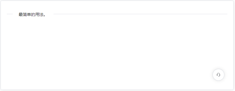
<ve-float-button
  :open-btn="{shape:'circle', size: 'large'}"
  @handle-open-click="handleOpenClick"/>
通过 type 改变悬浮按钮的类型
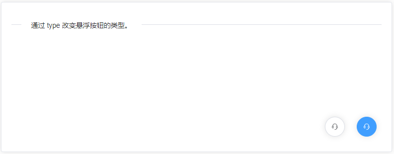
<ve-float-button
  :open-btn="{type:'primary',shape:'circle', size: 'large'}"
  @handle-open-click="handleOpenClick"/>
<ve-float-button
  :open-btn="{shape:'circle', size: 'large'}"
  style="right: 94px"
  @handle-open-click="handleOpenClick"/>
通过 shape 设置不同的形状
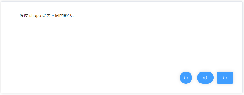
<ve-float-button
  :open-btn="{type:'primary', size:'large'}"
  @handle-open-click="handleOpenClick"/>
<ve-float-button
  :open-btn="{type:'primary', shape: 'round', size:'large'}"
  style="right: 94px"
  @handle-open-click="handleOpenClick"/>
<ve-float-button
  :open-btn="{type:'primary', shape: 'circle', size:'large'}"
  style="right: 164px"
  @handle-open-click="handleOpenClick"/>
可以通过 description 设置文字内容
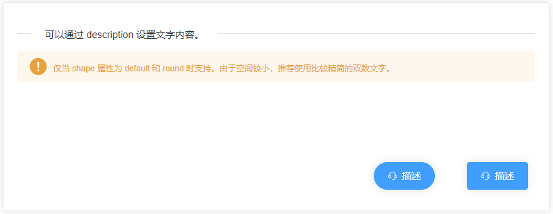
<ve-float-button
  :open-btn="{type:'primary', size:'large', description:'描述'}"
  @handle-open-click="handleOpenClick"/>
<ve-float-button
  :open-btn="{type:'primary', shape: 'round', size:'large', description:'描述'}"
  style="right: 164px"
  @handle-open-click="handleOpenClick"/>
设置 tooltip 属性,即可开启气泡卡片
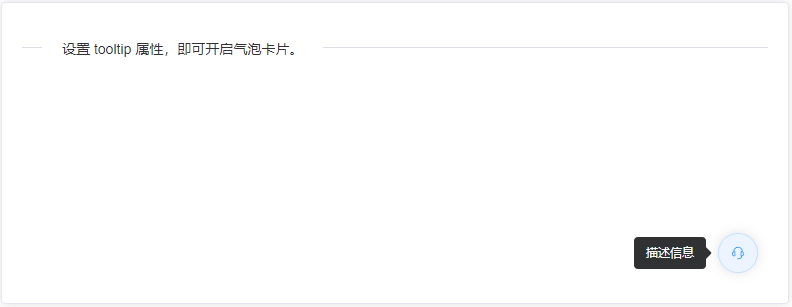
<ve-float-button
  :open-btn="{shape:'circle', size: 'large', tooltip: '描述信息'}"
  @handle-open-click="handleOpenClick"/>
浮动按钮组
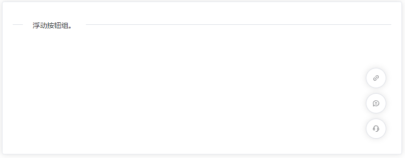
<ve-float-button
  :fold-btn="foldBtn" :open-btn="{shape:'circle', size: 'large', show: true}"
  @handle-fold-click="handleFoldClick"
  @handle-open-click="handleOpenClick"/>
菜单模式,提供 click 触发方式
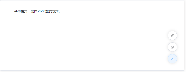
<ve-float-button
  :fold-btn="foldBtn" :open-btn="{shape:'circle', size: 'large'}"
  @handle-fold-click="handleFoldClick"
  @handle-open-click="handleOpenClick"/>
徽标数,右上角附带圆形徽标数字的悬浮按钮
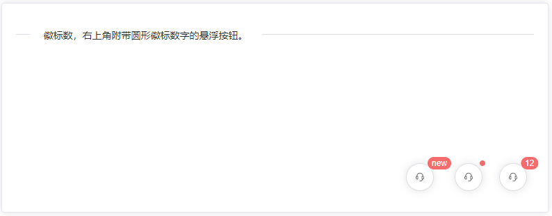
<ve-float-button
  :open-btn="{shape:'circle', size: 'large', badge: '12'}"
  @handle-open-click="handleOpenClick"/>
<ve-float-button
  :open-btn="{shape:'circle', size: 'large', isDot: true}"
  style="right: 94px"
  @handle-open-click="handleOpenClick"/>
<ve-float-button
  :open-btn="{shape:'circle', size: 'large', badge: 'new'}"
  style="right: 164px"
  @handle-open-click="handleOpenClick"/>
属性
| 属性名 | 说明 | 类型 | 可选值 | 默认值 |
|---|
| open-btn:key | 按钮键值,点击回调事件会返回该值 | string | - | - |
| open-btn:type | 按钮属性 | string | primary,success,warning,danger,info | - |
| open-btn:plain | 是否为朴素按钮 | boolean | true,false | false |
| open-btn:shape | 按钮形状 | string | round,circle | - |
| open-btn:disabled | 按钮是否为禁用状态 | boolean | true,false | false |
| open-btn:icon | 图标组件 | string/Component | - | - |
| open-btn:size | 尺寸 | string | large,default,small | - |
| open-btn:description | 按钮文字,shape属性值不为 circle 时生效 | string | - | - |
| open-btn:tooltip | tooltip描述文字 | string | - | - |
| open-btn:badge | badge显示值 | string | - | - |
| open-btn:isDot | 是否显示小圆点 | boolean | true,false | false |
| open-btn:show | 菜单默认展开show,该属性需要配合fold-btn一起使用 | boolean | true,false | false |
| fold-btn | 该属性为菜单组,属性于open-btn的数据一致,按钮形状依附于open-btn:icon | array | - | - |
事件
| 事件名 | 说明 | 回调参数 |
|---|
| handle-open-click | 点击打开按钮回调事件 | openBtn:key |
| handle-fold-click | 点击菜单中的按钮回调事件 | foldBtn:key |
Assets
插件市场:ve-float-button
源码:Github
源码:Gitee
组件库演示地址
Warn
- 该组件是基于element-plus开发,需要在此基础上使用。


 扫一扫
扫一扫


 被折叠的 条评论
为什么被折叠?
被折叠的 条评论
为什么被折叠?
 到【灌水乐园】发言


