


 为了解决原生单选框样式与网页整体风格不匹配的问题,本文介绍了如何创建一个自定义Vue单选框组件。该组件支持v-model双向绑定、disabled属性禁用、label属性定义值以及点击触发change事件。提供了详细的代码实现、使用方法和动画效果展示。
由于原生的单选框的样式太丑,在网页中使用与整体的样式不搭配。因此需要自定义样式
实现功能
- 自定义v-model,使组件之间数据能够进行双向绑定。
- 使用disabled属性禁用radio。
- 使用label属性定义radio的值。
- 当用户点击radio时触发组件上绑定的change事件。
代码实现
- template
<template>
  <label role="radio" aria-checked="true" class="lg-radio"
  :class="{'checked': checked, 'disabled': disabled}">
    <span class="lg-radio__icon"></span>
    <input type="radio" ref="radio" class="lg-radio__original" :value="label" @click="select"
    :disabled='disabled'>
    <span class="lg-radio__label">
      <slot></slot>
    </span>
  </label>
</template>
- script
<script>
export default {
  name: 'lg-radio',
  // 自定义v-model,使用change事件更新model的值
  model: {
    prop: 'model',
    event: 'change'
  },
  props: {
    label: {
      type: [Number, String],
      required: true
    },
    // 这里的model指的是上面定义的v-model的prop
    model: {
      type: [Number, String],
      required: true
    },
    disabled: {
      type: Boolean,
      default: false
    }
  },
  data () {
    return {
      checked: false
    }
  },
  methods: {
    select () {
      this.$emit('change', this.$refs.radio.value)
    }
  },
  watch: {
    // 监听model值的改变,以便更新checked的值
    model: function (val) {
      this.checked = val === this.label
    }
  },
  mounted () {
    this.select()
  }
}
</script>
- style
<style scoped>
.lg-radio{
  font-size: 14px;
  color: #4a4949;
  font-weight: 500;
  cursor: pointer;
  outline: none;
  display: inline-block;
  text-align: left;
  margin: 0 20px 0 0;
}
.lg-radio.checked{
  color: #21b4e0;
}
.lg-radio.disabled {
  border-color: #ccc;
  opacity: 0.6;
  cursor: no-drop;
}
.lg-radio__icon {
  width: 14px;
  height: 14px;
  display: inline-block;
  border: 1px solid #c5c5c5;
  border-radius: 50%;
  margin-right: 6px;
  vertical-align: -2px;
  position: relative;
}
.lg-radio__icon::after{
  content: '';
  position: absolute;
  width: 8px;
  height: 8px;
  border-radius: 50%;
  display: inline-block;
  top: 3px;
  left: 3px;
  background: rgba(33, 180, 224, 0);
  transform: scale(0);
  transition: all 0.5s ease;
}
.lg-radio.checked .lg-radio__icon{
  border-color: #21b4e0;
}
.lg-radio.checked .lg-radio__icon::after{
  background: rgba(33, 180, 224, 1);
  transform: scale(1);
}
.lg-radio__original {
  display: none;
  outline: medium none!important;
}
</style>
在父组件中使用
// 首先导入
import {lgRadio, lgSearch} from '../../common/index'

// 然后在父组件中使用
<lg-radio v-model="user.sex" label='1'><i class="iconfont lg-boy"></i></lg-radio>
<lg-radio v-model="user.sex" label='0'><i class="iconfont lg-girl"></i></lg-radio>
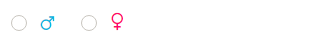
效果图
初始:
选中后,在选中的过程中会有动画:

详细代码请看https://github.com/Lz-y/Vue-Components/blob/master/radio.vue


 扫一扫
扫一扫


 915
915

 被折叠的 条评论
为什么被折叠?
被折叠的 条评论
为什么被折叠?
 到【灌水乐园】发言


