


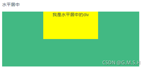
一、水平居中
- 预览图
- Html
 <p>水平居中</p>
    <div class="div1">
      <div class="parent">
        <div class="child">
          我是水平居中的div
        </div>
      </div>
    </div>
- Css
.div1 {
  .parent {
    width: 500px;
    height: 200px;
    background-color: #42b983;

    .child {
      width: 200px;
      height: 100px;
      margin: 0 auto;
      background-color: yellow;
      text-align: center;
    }
  }
}
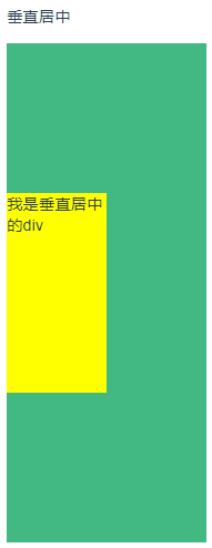
二、垂直居中
-
预览图
-
-
Html
 <p>垂直居中</p>
    <div class="div2">
      <div class="parent">
        <div class="child">
          我是垂直居中的div
        </div>
      </div>
    </div>
- Css
/*垂直布局的css*/
.div2 {
  .parent {
    display: flex;
    background: #42b983;
    height: 500px;
    width: 200px;
    align-items: center;

    .child {
      width: 100px;
      height: 200px;
      background: yellow;
    }
  }
}
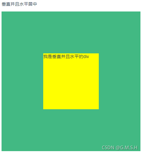
三、垂直且水平居中
-
预览图
-
Html
  <p>垂直并且水平居中</p>
    <div class="div3">
      <div class="parent">
        <div class="child">
          我是垂直并且水平的div
        </div>
      </div>
    </div>
- Css
/*垂直并且水平居中*/
.div3 {
  .parent {
    background: #42b983;
    height: 500px;
    width: 500px;
    display: flex;
    justify-content: center;
    align-items: center;

    .child {
      width: 200px;
      height: 200px;
      background: yellow;
    }
  }
}
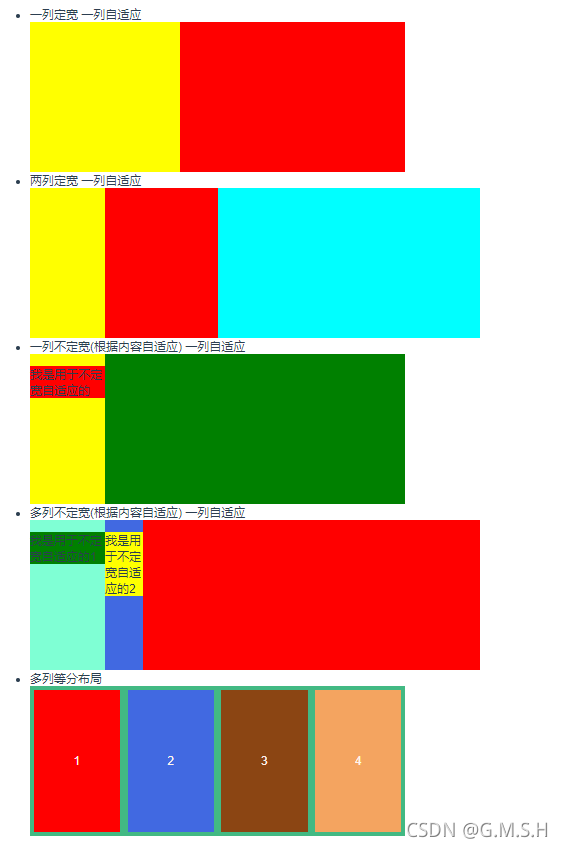
四、多列布局
本来想分开写的 撒了个懒 不过css 和html 注释都很明白
- 预览图
- Html
 <p>多列布局</p>
    <div class="div4">
      <ul>
        <li>一列定宽 一列自适应</li>
        <div class="parent1">
          <div class="left">
          </div>
          <div class="right">
          </div>
        </div>
        <li>两列定宽 一列自适应</li>
        <div class="parent2">
          <div class="left"></div>
          <div class="center"></div>
          <div class="right"></div>
        </div>
        <li>一列不定宽(根据内容自适应) 一列自适应</li>
        <div class="parent3">
          <div class="left">
            <p style="width: 100px ; background: red">我是用于不定宽自适应的</p>
          </div>
          <div class="right"></div>
        </div>
        <li>多列不定宽(根据内容自适应) 一列自适应</li>
        <div class="parent4">
          <div class="left">
            <p style="width: 100px; background: green">我是用于不定宽自适应的1</p>
          </div>
          <div class="center">
            <p style="width: 50px; background: yellow">我是用于不定宽自适应的2</p>
          </div>
          <div class="right"></div>
        </div>
        <li>多列等分布局</li>
        <div class="parent5">
          <div class="child1" style="background: red">
            <p>1</p>
          </div>
          <div class="child2" style="background: royalblue">2</div>
          <div class="child3" style="background: saddlebrown">3</div>
          <div class="child4" style="background: sandybrown">4</div>
        </div>
      </ul>
    </div>
- Css
/*多列布局的*/
.div4 {
  /*一列定宽 一列自适应*/
  .parent1 {
    background: #42b983;
    width: 500px;
    height: 200px;
    display: flex;

    .left {
      width: 200px;
      height: 100%;
      background: yellow;
    }

    .right {
      background: red;
      flex: 1;
    }
  }
/*两列定宽 一列自适应*/
  .parent2 {
    width: 600px;
    height: 200px;
    background: #42b983;
    display: flex;

    .left {
      height: 100%;
      width: 100px;
      background: yellow;
    }

    .center {
      height: 100%;
      width: 150px;
      background: red;
    }

    .right {
      height: 100%;
      flex: 1;
      background: aqua;
    }

  }
/*一列不定宽(根据内容自适应) 一列自适应*/
  .parent3 {
    width: 500px;
    height: 200px;
    background: #42b983;
    display: flex;

    .left {
      background: yellow;
      height: 100%;
      width: fit-content;
    }

    .right {
      flex: 1;
      background: green;
    }
  }
/*多列不定宽(根据内容自适应) 一列自适应*/
  .parent4 {
    background: #42b983;
    width: 600px;
    height: 200px;
    display: flex;

    .left {
      background: aquamarine;
      width: fit-content;
    }

    .center {
      background: royalblue;
      width: fit-content;
    }

    .right {
      background: red;
      flex: 1;
    }
  }
/*多列等分布局*/
  .parent5 {
    background: #42b983;
    width: 500px;
    height: 200px;
    display: flex;

    .child1, .child2, .child3, .child4 {
      flex: 1;
      background: yellow;
      margin: 5px;
      display: flex;
      align-items: center;
      justify-content: center;
      color: seashell;
    }
  }
}
五、常用全屏布局方案
- 预览图
- Html
<!-- 布局方案 -->
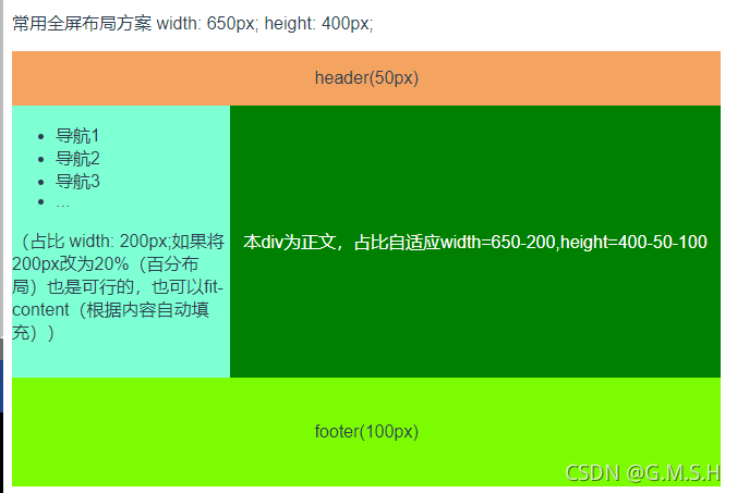
<p>常用全屏布局方案 width: 650px; height: 400px;</p>
<div class="div5">
<div class="header">
<p>header(50px)</p>
</div>
<div class="center">
<div class="nav">
<ul>
<li>导航1</li>
<li>导航2</li>
<li>导航3</li>
<li>...</li>
</ul>
<p>(占比 width: 200px;如果将200px改为20%(百分布局)也是可行的,也可以fit-content(根据内容自动填充))</p>
</div>
<div class="context">
<p>本div为正文,占比自适应width=650-200,height=400-50-100</p>
</div>
</div>
<div class="footer">
<p>footer(100px)</p>
</div>
</div>
- Css
/*布局方案*/
.div5 {
  width: 650px;
  height: 400px;
  background: #42b983;
  display: flex;
  flex-direction: column;
  .header{
    width: 100%;
    height: 50px;
    background: sandybrown;
    display: flex;
    justify-content: center;
    align-items: center;
  }
  .center{
    flex: 1;
    display: flex;
    flex-direction: row;
    background: seashell;
    .nav{
      width: 200px;
      height: 100%;
      background: aquamarine;
    }
    .context{
      flex: 1;
      background: green;
      display: flex;
      justify-content: center;
      align-items: center;
      color: white;
    }
  }
  .footer{
    width: 100%;
    height: 100px;
    background: lawngreen;
    display: flex;
    justify-content: center;
    align-items: center;
  }
}


 扫一扫
扫一扫


 被折叠的 条评论
为什么被折叠?
被折叠的 条评论
为什么被折叠?
 到【灌水乐园】发言


