


 本文深入探讨了使用Pandas、Matplotlib和Seaborn进行数据可视化的多种技巧,包括基础图形、散点图、热力图等高级图表的绘制,以及如何调整图形属性如颜色、线型和图例。
目录
代码环境:Jupyter iPython
栗子数据准备:
import numpy as np
import pandas as pd
import seaborn as sns;
%matplotlib inline
import matplotlib.pyplot as plt

a = np.random.randn(30, 2)
a.round(2)

df = pd.DataFrame(a)                          #通过ndarray来构建DataFrame

df.columns = ['Data1', 'Data2']

dates = pd.date_range('2017-1-1', periods = len(a), freq='D')         #时间日期的生成;

df.index = dates
df.head()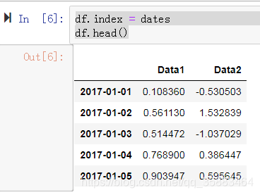
一. Pandas内置图形可视化
1.1 基础图形可视化
- DataFrame整体可视化;
df.plot(figsize= (8, 6), title = 'Random numbers')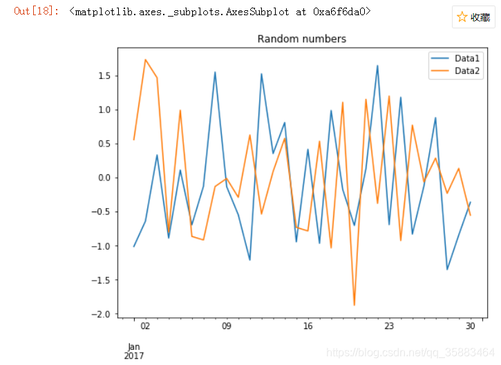
- 也可以单独绘制某一个Series
df['Data2'].plot(figsize = (8,5), ylim = [df['Data2'].min() * 1.2, df['Data2'].max() * 1.2]) #ylim:y轴范围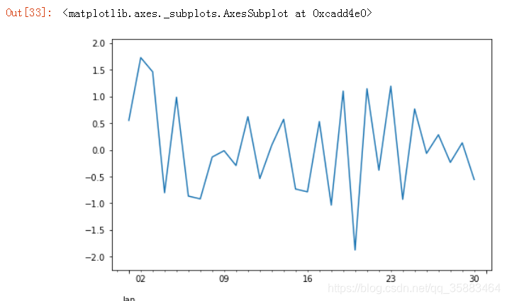
- 子图;
df[['Data1','Data2']].plot(subplots=True,figsize = (8, 6)); #子图;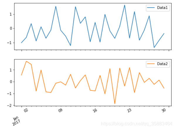
- 直方图
df.hist(figsize = (9,4), bins = 50) #直方图;bins:柱的宽度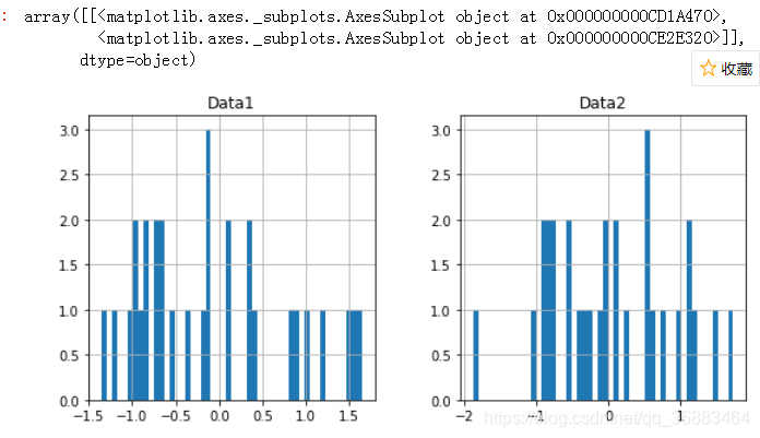
- 散点图 关键字:kind
df.plot(x = 'Data1',y = 'Data2', kind='scatter',figsize = (8,6), title = 'Scatter plot') #散点图;画出股价相关性;kind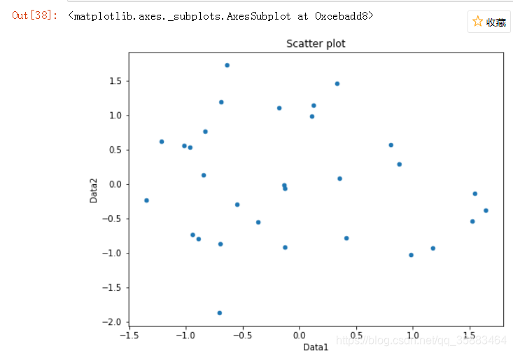
- 颜色和样式
df.plot(style=['o', 'b--'],figsize = (8,6)) #颜色和样式都可以个性化修改;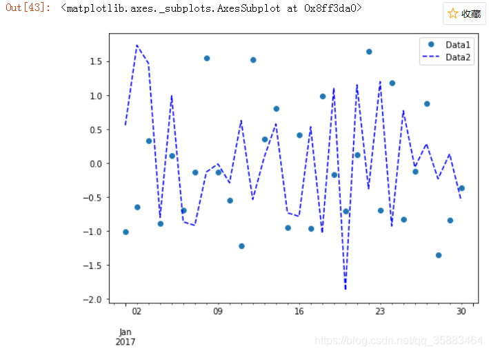
- 数据大小差距很大,2条y轴,secondary_y
df.plot(grid=True, figsize=(10, 5),secondary_y = 'Data2', style = '--') # 解决方案:,secondary_y='Data2'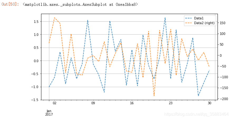
1.2 数据选择及可视化
- 散点图
df[(df.Data1 > 2) & (df.Data2 < -2)].plot(x='Data1', y='Data2', kind='scatter',title = 'Outlier') # scatter是plot里面的内置参数;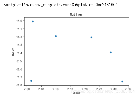
二、Matplotlib图形绘制
3.1 Matplotlib基础图形绘制:
Plt常用功能:
--plt.plot() : 绘制图形;x轴和y轴;
--plt.show():图形显示;IDE,pycharm是一定要加这句话的;
--plt.figure():生成图形对象,确定图片大小;
--plt.title():确定图片标题;
--plt.xlabel():确定图片x轴的名字;
--plt.legend():显示图例;
--plt.scatter():绘制散点图;
--plt.grid(True):出现网格;
--plt.subplot():绘制子图;
--plt.bar():绘制柱状图;
3.1.1 添加图例和设置线型及颜色
import matplotlib.pyplot as plt
%matplotlib inline

plt.plot([1,2,3,4],[2,4,6,8],lw = 1.0)
plt.ylabel('Numbers')
plt.xlabel('Numbers')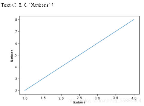
3.1.2 图例
plt.plot([1,2,3,4],[2,4,6,8], 'r--', linewidth=1.0, label = 'Line',)    #'ro',plt.ylim(0,10)
plt.ylabel('Numbers')
plt.legend()     #显示图例一要加的;
plt.ylim(0,10)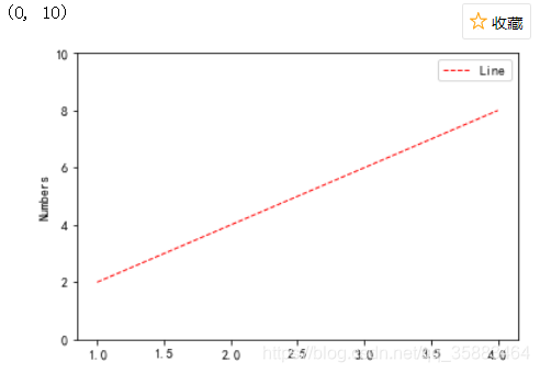
3.1.3 一次绘制多条线并设置线形及颜色
t = np.arange(0, 3, 0.2)

plt.plot(t, t, 'r--',
         t, t ** 2, 'b',
         t, t ** 3, 'm .')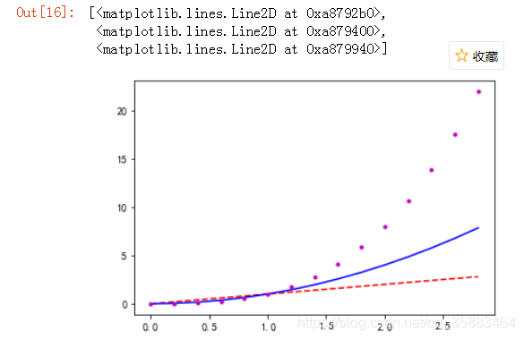
3.1.4 分别编写绘图命令,输出在同一张图内
x = [1,5,10]
y = [2,8,16]

x2 = [10,5,1]
y2 = [9,20,7]

# 分别编写绘图命令,输出在同一张图内
plt.figure(figsize = (8,6))    #生成图片对象;
plt.plot(x,y,linewidth=1, label = 'line1')     #这里的label是图例;
plt.plot(x2,y2,linewidth=1, label = 'line2')

plt.title('Two Line Plot')
plt.ylabel('Y axis')
plt.xlabel('X axis')
plt.legend()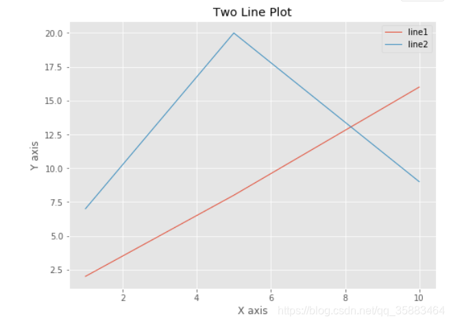
3.2 绘制散点图
x = [1,5,10,10,5,4,6,9,12]
y = [2,8,16,12,10,7,8,13,15]

plt.figure(figsize = (8,6))
plt.scatter(x,y,color = 'r')    #plt.scatter()
plt.title('Scatter plot')
plt.xlabel('X axis')
plt.ylabel('Y axis')
plt.grid(True)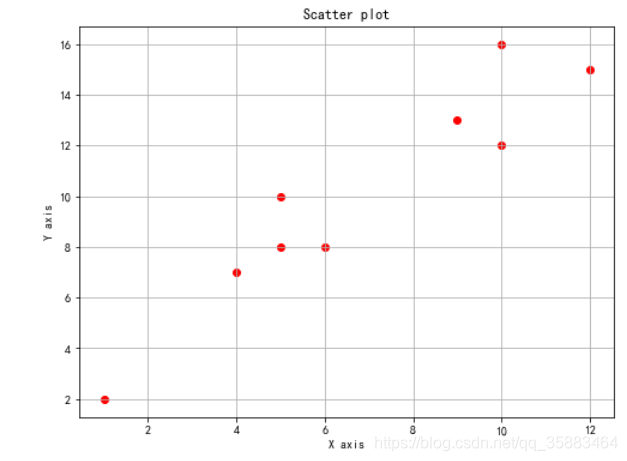
3.3 Matplotlib两维图形绘制
np.random.seed(2000)
y = np.random.randn(20, 2).cumsum(axis=0)   #  累计求和  按列
plt.figure(figsize=(7, 4))
plt.plot(y[:, 0], lw=1.5, label='line1')
plt.plot(y[:, 1], lw=1.5, label='line2')
plt.grid(True)
plt.legend(loc=0)
plt.xlabel('Index')
plt.ylabel('Value')
plt.title('2 dimensions Plot')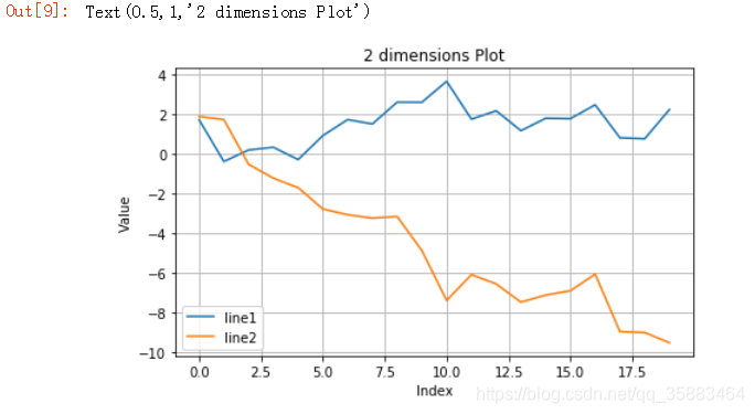
3.3.1 两个Y轴
fig1,ax = plt.subplots(figsize = (10,6))      #plt.subplot会返回一个figure对象和一个坐标轴对象;

plt.plot(y[:, 0], lw=1.5, label='line1')
plt.grid(True)
plt.legend(loc=6)
plt.xlabel('x')
plt.ylabel('y')
plt.title('plot')

ax2 = ax.twinx()       #复制上一张子图的横坐标轴
plt.plot(y[:, 1], 'g', lw=1.5, label='line2')
plt.legend()
plt.ylabel('y2')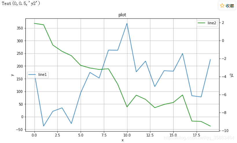
3.4 Matplotlib子图绘制
plt.figure(figsize=(8,6))
plt.subplot(211)          # 2行1列的第一张图
plt.plot(y[:, 0], lw=1.5, label='1st')
plt.legend(loc=0)
plt.ylabel('Value')
plt.title('Sub Plot')

plt.subplot(212)          # 2行1列的第二张图
plt.plot(y[:, 1], 'm', lw=1.5, label='2nd')
plt.legend(loc=0)
plt.xlabel('index')
plt.ylabel('value')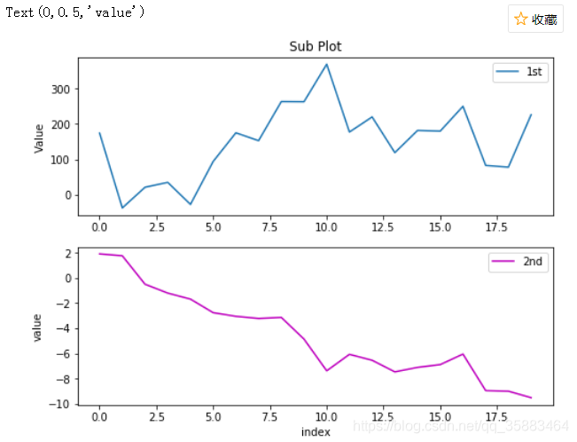
plt.figure(figsize=(12, 5))

plt.subplot(121)       # 1行2列的第一张图
plt.plot(y[:, 0], lw=1.5, label='1st')
plt.legend()
plt.xlabel('Index')
plt.ylabel('Value')
plt.title('1st Data Set')

plt.subplot(122)       # 1行2列的第二张图
plt.bar(np.arange(len(y)), y[:, 1], width=0.5,
        color='g', label='2nd')
plt.legend()
plt.xlabel('Index')
plt.title('2nd Data Set')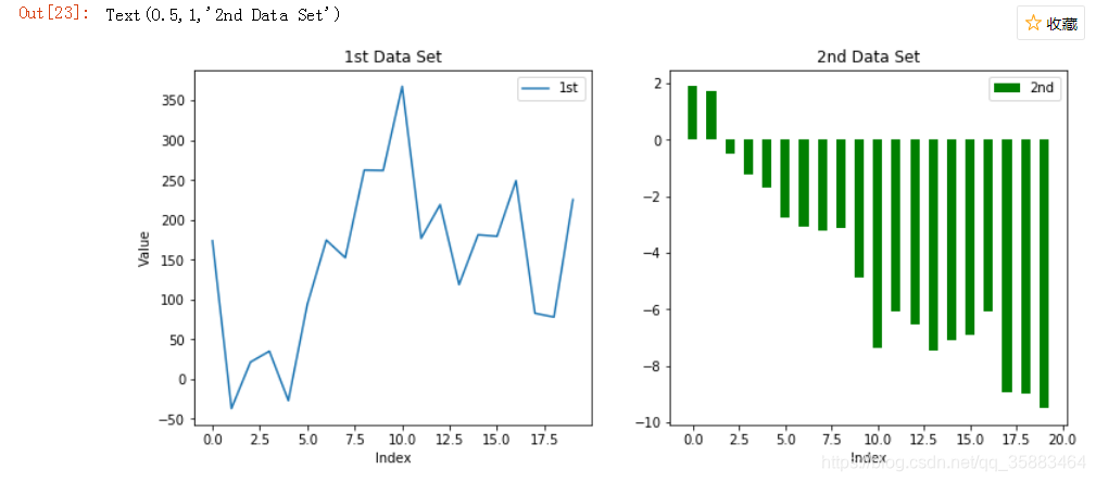
3.5 其他图形
y = np.random.randn(1000, 2)
import matplotlib as mpl
mpl.rcParams['font.sans-serif'] = ['SimHei']    # 指定默认字体
mpl.rcParams['axes.unicode_minus'] = False     # 解决保存图像是负号'-'显示为方块的问题

plt.figure(figsize=(7, 5))
plt.plot(y[:, 0], y[:, 1],'c.')
plt.grid(True)
plt.xlabel('x')
plt.ylabel('y')
plt.title('散点图')                     #散点图在分析股价的相关性的时候用的很多;              #散点图在分析股价的相关性的时候用的很多;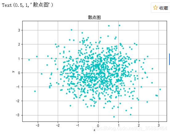
四. Seaborn
Example参考网址:https://seaborn.pydata.org/examples/index.html
4.1 热力图
from string import ascii_letters
import numpy as np
import pandas as pd
import seaborn as sns
import matplotlib.pyplot as plt
%matplotlib inline

sns.set(style="white")

# 生成大型随机数据集
rs = np.random.RandomState(33)
d = pd.DataFrame(data=rs.normal(size=(100, 26)),
                 columns=list(ascii_letters[26:]))

# 计算相关矩阵(协方差矩阵、 dataframe、)
corr = d.corr()

# 为上三角形生成遮罩(协方差矩阵是对称阵,就可以设置只显示一半)
mask = np.zeros_like(corr, dtype=np.bool)
mask[np.triu_indices_from(mask)] = True

# 设置Matplotlib图形
f, ax = plt.subplots(figsize=(11, 9))

# 生成自定义分流颜色
# cmap = sns.diverging_palette(220, 10, as_cmap=True)
cmap = sns.light_palette("#2ecc71", as_cmap=True)

# 用遮罩和正确的纵横比绘制热图
sns.heatmap(corr, mask=mask,  cmap=cmap, vmax=.3, linewidths=.5)   # vmax:相关性  cmap:颜色  mask:遮挡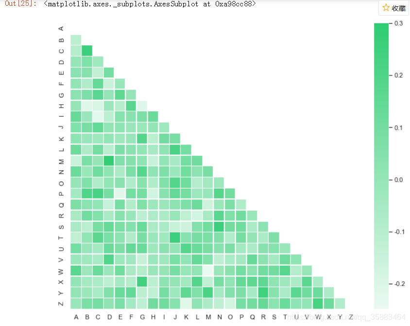


 6813
6813

 被折叠的 条评论
为什么被折叠?
被折叠的 条评论
为什么被折叠?
 到【灌水乐园】发言


