


1、flex实现下面布局
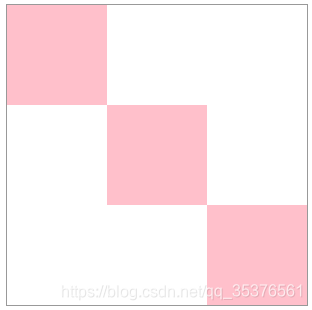
2、结构
<div class="box">
	<div class="item1"></div>
	<div class="item2"></div>
	<div class="item3"></div>
</div>
3、解决方案
方案一
.box{
		height: 300px;
		width: 300px;
		border: 1px solid #999;
		display: flex;
		justify-content:space-between;
		align-items:center;
	}
	.box div{
		flex: 1;
		background: pink;
	}
	.item1{
		align-self: flex-start;
	}
	.item3{
		align-self: flex-end;
	}
方案二
.box{
		position: relative;
		height: 300px;
		width: 300px;
		border: 1px solid #999;
	}
	.box div{
		position: absolute;
		width: 100px;
		height: 100px;
		background: pink;
	}
	.item1{
		top: 0;
		left: 0;
	}
	.item1{
		top: 50%;
		left: 50%;
		transform: translate(-50%,-50%)
	}
	.item3{
		right: 0;
		bottom: 0;
	}


 扫一扫
扫一扫


 被折叠的 条评论
为什么被折叠?
被折叠的 条评论
为什么被折叠?
 到【灌水乐园】发言


