


Flutter练习demo
效果图:
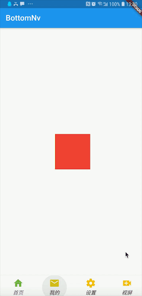
BottomNavigationBar实现底部导航
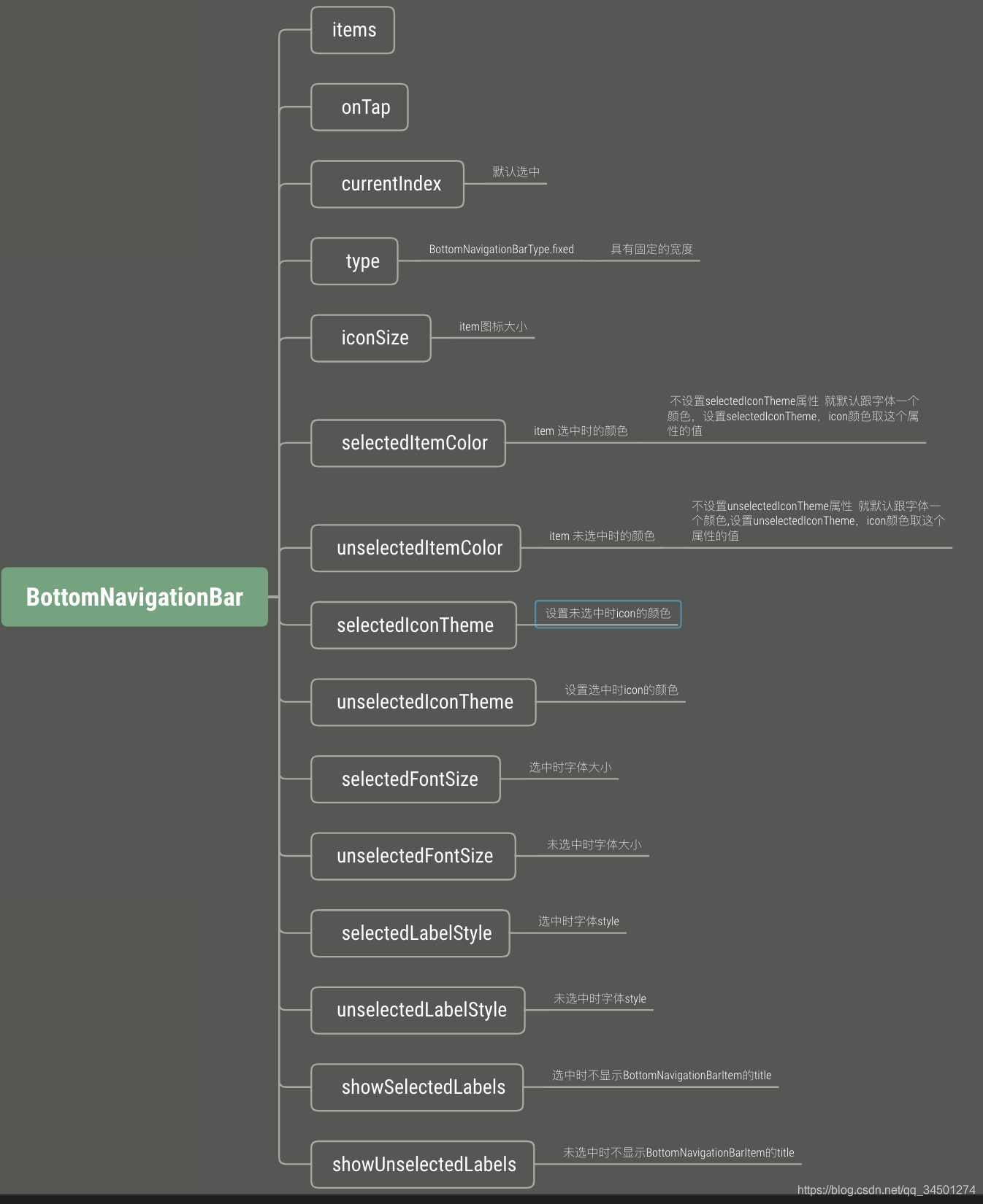
常用属性
使用
void main() => runApp(MyApp());

class MyApp extends StatelessWidget {
  @override
  Widget build(BuildContext context) {
    return MaterialApp(
      home: TabBootomNvPage(),
    );
  }
}


import 'package:flutter/material.dart';

import 'HomeTabPage.dart';
import 'MeTabPage.dart';
import 'SetTabPage.dart';
import 'VideoTabPage.dart';

class TabBootomNvPage extends StatefulWidget {
  @override
  State<StatefulWidget> createState() {
    // TODO: implement createState
    return BootomNvPage();
  }
}

class BootomNvPage extends State {

  List _mList = [
    HomeTabPage(),
    MeTabPage(),
    SetTabPage(),
    VideoTabPage(),
  ];

  List _titleList = ["首页", "我的","设置","视屏"];

  List _mIcons = [
    Icon(Icons.home),
    Icon(Icons.mail),
    Icon(Icons.settings),
    Icon(Icons.video_call),
  ];

  int _currentIndex = 0;

  @override
  Widget build(BuildContext context) {
    // TODO: implement build
    return Scaffold(
      appBar: AppBar(title: Text("BottomNv")),
      body: this._mList[this._currentIndex],
      bottomNavigationBar: BottomNavigationBar(
        selectedItemColor:Colors.deepPurple ,// item 选中时的颜色   不设置selectedIconTheme属性  就默认跟字体一个颜色
        unselectedItemColor: Colors.black,// item 未选中时的颜色   不设置unselectedIconTheme属性  就默认跟字体一个颜色

        selectedFontSize: 14, // 选中时字体大小
        unselectedFontSize: 14,// 未选中时字体大小

        iconSize: 30,// item图标大小

        selectedLabelStyle: TextStyle(fontStyle: FontStyle.italic), // 选中时字体style
        unselectedLabelStyle: TextStyle(fontStyle: FontStyle.italic), // 未选中时字体style

        unselectedIconTheme:IconThemeData(color: Colors.amber) ,//设置未选中时icon的颜色
        selectedIconTheme:IconThemeData(color: Colors.green) ,//设置选中时icon的颜色

//        showSelectedLabels: false, // 选中时不显示BottomNavigationBarItem的title
//        showUnselectedLabels: false,//未选中时不显示BottomNavigationBarItem的title

        type: BottomNavigationBarType.fixed,
        currentIndex: this._currentIndex,
        onTap: (index) {
          setState(() {
            this._currentIndex = index;
          });
        },
        items: [_getBottomNv(0),_getBottomNv(1),_getBottomNv(2),_getBottomNv(3)],
      ),
    );
  }

  /**
   * 获取Tab的
   * */
  BottomNavigationBarItem _getBottomNv(int index) {
    return new BottomNavigationBarItem(
      backgroundColor: Colors.amber,
      title: Text(_titleList[index]),
      icon: _mIcons[index],
    );
  }
}
扩展
真实项目中,肯定都会设计自己的底部导航的icon的,看如何实现:
两种实现方式:
1. 第一种(不推荐)
items: [
        _getBottomNv(0),
        _getBottomNv(1),
        _getBottomNv(2),
      ],
/**
   * 获取Tab的item
   * */
  BottomNavigationBarItem _getBottomNv(int index) {
    return new BottomNavigationBarItem(
      backgroundColor: Colors.amber,
      title: Text(_titleList[index]),
      icon: IconButton(
          icon: Container(

            width: 20,
            height: 20,
            //三元表达式
            child: currentIndex == 0
                ? Image.asset("images/home_select.png",
                : Image.asset("images/home_unselect.png"),
          ),
          onPressed: null),
    );
  }
这里只有了一个做展示,需要区分 index,去做处理,
注意:
- 这样有一个问题就是icon和title之间的距离无法控制
- 要想改动icon的大小需要使用Container包裹,借助Container的width、height才可以修改
- BottomNavigationBar的iconsize属性将失效
2. 借助BottomNavigationBarItem的activeIcon 属性
我使用的Flutter版是flutter_macos_v1.7.8+hotfix.4-stable .
效果:
BottomNavigationBarItem提供的又一个activeIcon属性
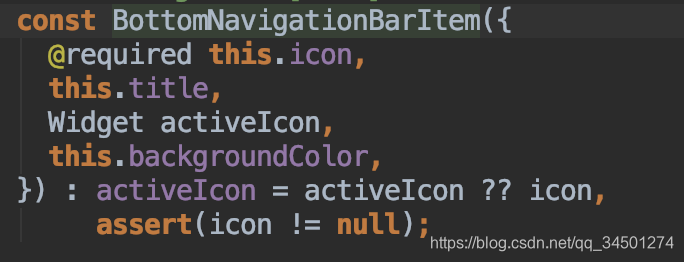
activeIcon的源码注释意思就是:选中状态下的图标展示
使用activeIcon必须和icon一起使用
BottomNavigationBarItem _getBottomNv_1(int index) {
    return new BottomNavigationBarItem(
        backgroundColor: Colors.amber,
        title: Text(_titleList[index]),
        icon: _getIcon(index),
        activeIcon: _getActiveIcon(index));
  }

  Widget _getIcon(int index) {
    var image;

    switch (index) {
      case 0:
        image = new Image.asset(
          "images/home_unselect.png",
          width: 25,
          height: 25,
        );
        break;
      case 1:
        image = new Image.asset(
          "images/tax_unselect.png",
          width: 25,
          height: 25,
        );
        break;
      case 2:
        image = new Image.asset(
          "images/me_tab_unselect.png",
          width: 25,
          height: 25,
        );
        break;
    }
    return image;
  }

  Widget _getActiveIcon(int index) {
    var image;

    switch (index) {
      case 0:
        image = new Image.asset(
          "images/home_select.png",
          width: 25,
          height: 25,
        );
        break;
      case 1:
        image = new Image.asset(
          "images/tax_select.png",
          width: 25,
          height: 25,
        );
        break;
      case 2:
        image = new Image.asset(
          "images/me_tab_select.png",
          width: 25,
          height: 25,
        );
        break;
    }
    return image;
  }
注:BottomNavigationBar的iconsize属性将失效
TabBar+TabBarView实现Tab切换
AppBar属性
只简单介绍下本文用到的AppBar的属性
AppBar({
    this.leading,//可以在标题前面显示的一个控件
    this.title,// 一般显示一个text,也可显示其他的组件,title需要返回的是一个widget
    this.bottom,//一个 AppBarBottomWidget 对象,通常是 TabBar。用来在 Toolbar 标题下面显示一个 Tab 导航栏。
  })
TabBar属性
源码:
 const TabBar({
    Key key,
    @required this.tabs,
    this.controller,
    this.isScrollable = false,//支持滚动展示
    this.indicatorColor,指示器颜色
    this.indicatorWeight = 2.0,// 指示器的高度
    this.indicatorPadding = EdgeInsets.zero,//指示器距离底部的距离  默认时0
    this.indicator,
    this.indicatorSize,//设置 indicator的长度等于tab标题的长度
    this.labelColor,// 选中时Tab 字体颜色
    this.unselectedLabelColor,// 未选中时Tab 字体颜
    this.labelStyle,// 选中时Tab字体Style
    this.unselectedLabelStyle,// 未选中时Tab字体Style
    this.labelPadding,
    this.dragStartBehavior = DragStartBehavior.start,
    this.onTap,
  })
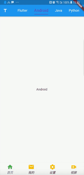
使用
import 'package:flutter/material.dart';

class HomeTabPage extends StatefulWidget {
  @override
  State<StatefulWidget> createState() {
    // TODO: implement createState
    return HomeContent();
  }
}

class HomeContent extends State {
  List _tabList = [
    "Flutter",
    "Android",
    "Java",
    "Python",
    "C++",
  ];

  @override
  Widget build(BuildContext context) {
    // TODO: implement build
    return DefaultTabController(
      length: _tabList.length,
      child: Scaffold(
        appBar: AppBar(
          leading: Icon(Icons.title),
            //bottom: TabBar(。。) 这里用bottom也行,但是顶部会空出来appbar的title部分
          title: TabBar(
            isScrollable: true,
            labelColor: Colors.deepPurple,// 选中时Tab 字体颜色
            unselectedLabelColor: Colors.white,// 未选中时Tab 字体颜
            indicatorWeight: 1.5,// 指示器的高度
            indicatorPadding: EdgeInsets.only(bottom:6), //指示器距离底部的距离  默认时0

            labelStyle: TextStyle(// 选中时Tab字体大小
              fontSize: 18.0,
            ),
            unselectedLabelStyle: TextStyle(
              fontSize: 15.0,
            ),
            indicatorColor: Colors.deepPurple,//指示器颜色
            indicatorSize: TabBarIndicatorSize.label,//设置 indicator的长度等于tab标题的长度

            tabs: [
              _getTabTitle(0),
              _getTabTitle(1),
              _getTabTitle(2),
              _getTabTitle(3),
              _getTabTitle(4),
            ],
          ),
        ),
        body: TabBarView(children: [
          _getTabContent(0),
          _getTabContent(1),
          _getTabContent(2),
          _getTabContent(3),
          _getTabContent(4),
        ]),
      ),
    );
  }

  Widget _getTabTitle(int index) {
    return Tab(
      text: this._tabList[index],
    );
  }

  Widget _getTabContent(int index) {
    return Center(
      child: Text(this._tabList[index]),
    );
  }
}
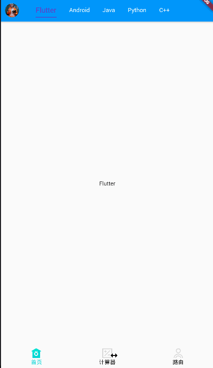
最后整体的效果:
具体更多的内容扩展可以自行尝试!


 扫一扫
扫一扫


 被折叠的 条评论
为什么被折叠?
被折叠的 条评论
为什么被折叠?
 到【灌水乐园】发言


