


 文章讲述了在Echarts中如何实现圆滑的虚实曲线图,遇到的趋势不圆滑问题以及如何通过拆分series数组、处理tooltip提示中的无效值和交叉值来解决。
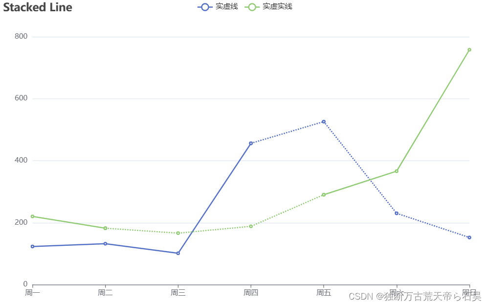
最终效果图
问题:曲线如果smooth为true时,趋势不圆滑,参考 【2024-05-03】Echarts 使用 visualMap 来实现圆滑的虚实曲线图-优快云博客
该种方式会有趋势不圆滑问题:
曲线虚实结合主要是根据series数组内的数据确定
1、series数组内的name相同,则多个相同name的对象是一条线,将数组内的数据拆分,
比如数组1:[220, 182, '-', '-', '-', '-', '-']设置为实线,则以 182 为起点,构造下
一个数组2:['-', 182, 166, 188, 290, '-', '-']设置为虚线,则虚实交叉点为182,至此
可以变成前部分是实线,后部分是虚线,可继续扩展,构造下
一个数组3:['-', '-', '-', '-', 290, 366, 758]设置为实线,则虚实交叉点为290,至此
可以变成整条线是 实线->虚线->实线。
此时因为存在三个同名的对象,tooltip 提示会存在多个同名的提示,则需要处理过滤无效值和交叉的值
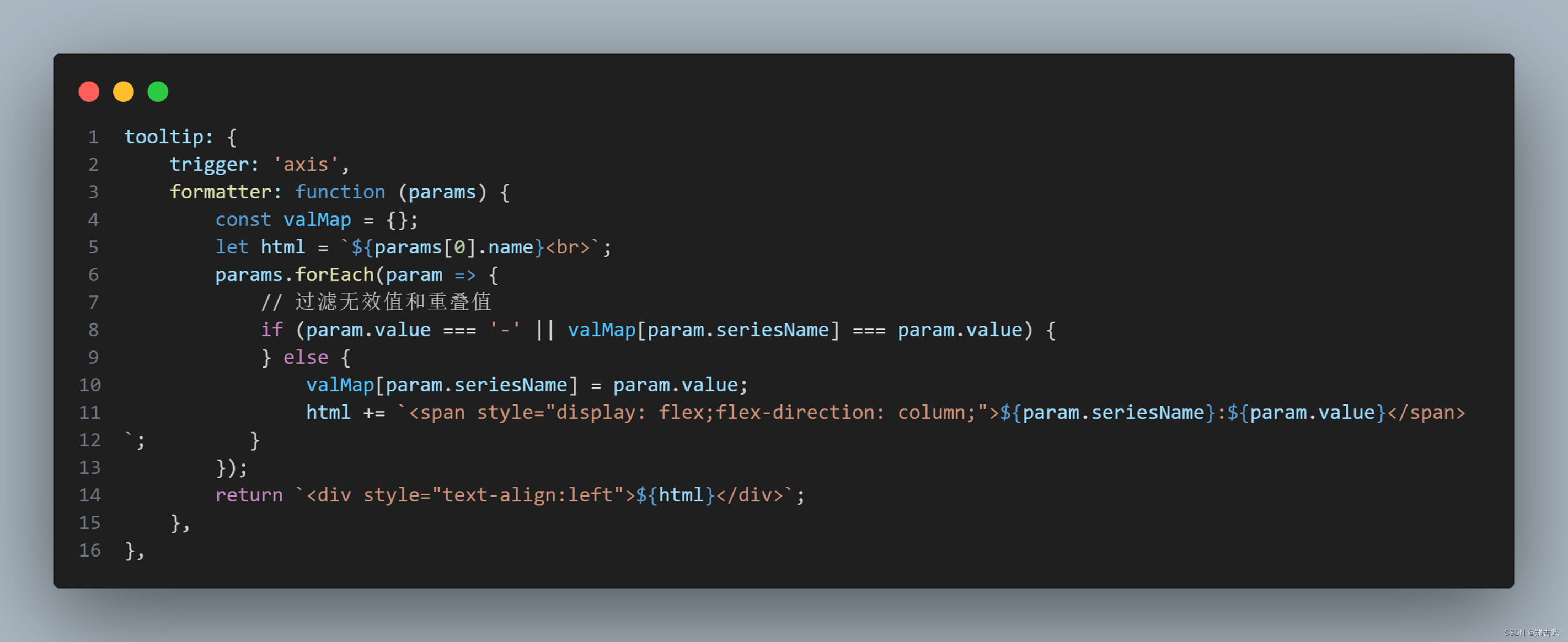
主要代码如下
<template>
    <div class="out-scc main">
        <div class="chart-css" id="main"></div>
    </div>
</template>

<script setup>
import { onMounted } from 'vue';
import * as echarts from 'echarts';

onMounted(() => {
    showCurve();
});

function showCurve() {
    const chartDom = document.getElementById('main');
    let myChart = echarts.init(chartDom);
    let option= {
        title: {
            text: 'Stacked Line',
        },
        tooltip: {
            trigger: 'axis',
        },
        legend: {
            data: ['实虚线', '实虚实线'],
        },
        grid: {
            left: '3%',
            right: '4%',
            bottom: '3%',
            containLabel: true,
        },
        toolbox: {
            feature: {
                saveAsImage: {},
            },
        },
        xAxis: {
            type: 'category',
            boundaryGap: false,
            data: ['周一', '周二', '周三', '周四', '周五', '周六', '周日'],
        },
        yAxis: {
            type: 'value',
        },
        tooltip: {
            trigger: 'axis',
            formatter: function (params) {
                const hasMap = {};
                let html = `${params[0].name}<br>`;
                params.forEach(param => {
                    // 过滤无效值和重叠值
                    if (param.value === '-' || hasMap[param.seriesName] === param.value) {
                    } else {
                        hasMap[param.seriesName] = param.value;
                        html += `<span style="display: flex;flex-direction: column;">${param.seriesName}:${param.value}</span>`;
                    }
                });
                return `<div style="text-align:left">${html}</div>`;
            },
        },

        series: [
            {
                name: '实虚线',
                type: 'line',
                smooth: false,
                data: [123, 132, 101, 456, '-', '-', '-'],
            },
            {
                name: '实虚线',
                type: 'line',
                smooth: false,
                data: ['-', '-', '-', 456, 526, 230, 152],
                lineStyle: {
                    width: 2,
                    type: 'dotted',
                },
            },
            {
                name: '实虚实线',
                type: 'line',
                smooth: false,
                data: [220, 182, '-', '-', '-', '-', '-'],
            },
            {
                name: '实虚实线',
                type: 'line',
                smooth: false,
                data: ['-', 182, 166, 188, 290, '-', '-'],
                lineStyle: {
                    width: 2,
                    type: 'dotted',
                },
            },
            {
                name: '实虚实线',
                type: 'line',
                smooth: false,
                data: ['-', '-', '-', '-', 290, 366, 758],
            },
        ],
        dataZoom: {
            type: 'inside',
        },
    };

    option && myChart.setOption(option);
}
</script>

<style lang="scss" scoped>
.out-scc {
    background: #ffffff;
    box-shadow: 0px 2px 20px 0px rgba(0, 0, 0, 0.1);
    margin-bottom: 30px;
    width: 100%;

    .chart-css {
        height: 500px;
        width: 800px;
    }
}
</style>


 被折叠的 条评论
为什么被折叠?
被折叠的 条评论
为什么被折叠?
 到【灌水乐园】发言


