


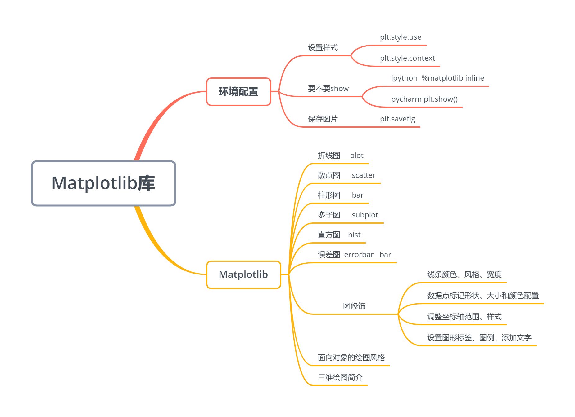
第十三章 Matplotlib库
数据可视化是数据分析的一个重要工具,掌声有请Matplotlib
13.0 环境配置
【1】 要不要plt.show()
-
ipython中可用魔术方法 %matplotlib inline
-
pycharm 中必须使用plt.show()
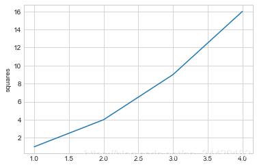
%matplotlib inline
import matplotlib.pyplot as plt
plt.style.use("seaborn-whitegrid")
x = [1, 2, 3, 4]
y = [1, 4, 9, 16]
plt.plot(x, y)
plt.ylabel("squares")
# plt.show()
Text(0, 0.5, ‘squares’)
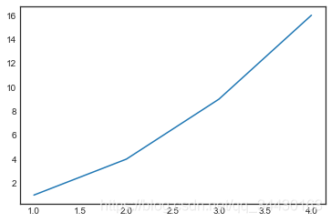
【2】设置样式
plt.style.available[:5]
[‘bmh’, ‘classic’, ‘dark_background’, ‘fast’, ‘fivethirtyeight’]
with plt.style.context("seaborn-white"):  # 临时改变风格
    plt.plot(x, y)
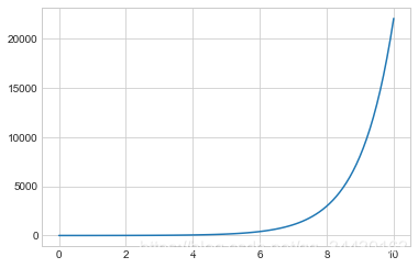
【3】将图像保存为文件
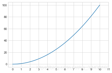
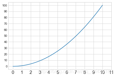
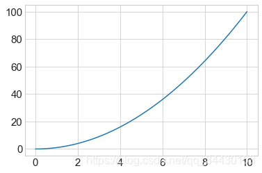
import numpy as np
x = np.linspace(0, 10 ,100)
plt.plot(x, np.exp(x))
plt.savefig("my_figure.png")
13.1 Matplotlib库
13.1.1 折线图
%matplotlib inline
import matplotlib.pyplot as plt
plt.style.use("seaborn-whitegrid")
import numpy as np
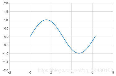
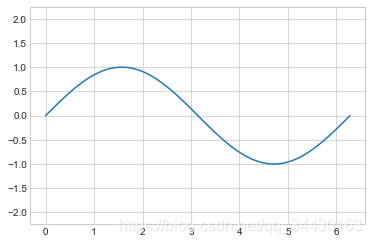
x = np.linspace(0, 2*np.pi, 100)
plt.plot(x, np.sin(x))
[<matplotlib.lines.Line2D at 0x1b4ee942308>]

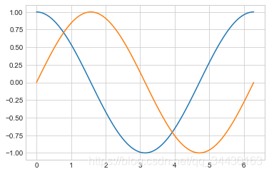
- 绘制多条曲线
x = np.linspace(0, 2*np.pi, 100)
plt.plot(x, np.cos(x))
plt.plot(x, np.sin(x))
[<matplotlib.lines.Line2D at 0x1b4ee9c2f88>]
【1】调整线条颜色和风格
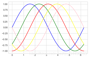
- 调整线条颜色
offsets = np.linspace(0, np.pi, 5)
colors = ["blue", "g", "r", "yellow", "pink"]
for offset, color in zip(offsets, colors):
    plt.plot(x, np.sin(x-offset), color=color)         # color可缩写为c
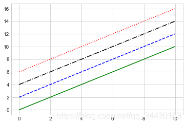
- 调整线条风格
x = np.linspace(0, 10, 11)
offsets = list(range(8))
linestyles = ["solid", "dashed", "dashdot", "dotted", "-", "--", "-.", ":"]
for offset, linestyle in zip(offsets, linestyles):
    plt.plot(x, x+offset, linestyle=linestyle)        # linestyle可简写为ls
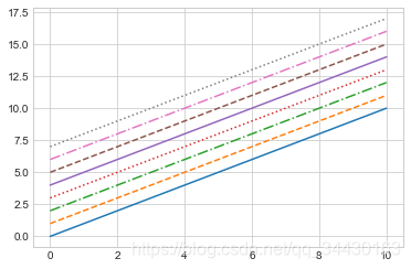
- 调整线宽
x = np.linspace(0, 10, 11)
offsets = list(range(0, 12, 3))
linewidths = (i*2 for i in range(1,5))
for offset, linewidth in zip(offsets, linewidths):
    plt.plot(x, x+offset, linewidth=linewidth)                 # linewidth可简写为lw
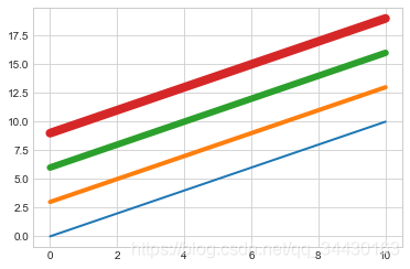
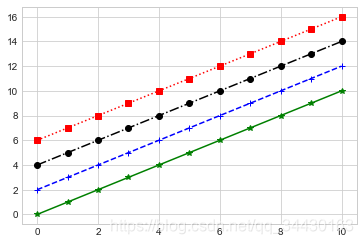
- 调整数据点标记
x = np.linspace(0, 10, 11)
offsets = list(range(0, 12, 3))
markers = ["*", "+", "o", "s"]
for offset, marker in zip(offsets, markers):
    plt.plot(x, x+offset, marker=marker)
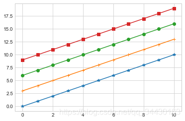
x = np.linspace(0, 10, 11)
offsets = list(range(0, 12, 3))
markers = ["*", "+", "o", "s"]
for offset, marker in zip(offsets, markers):
    plt.plot(x, x+offset, marker=marker, markersize=10)      # markersize可简写为ms
- 颜色跟风格设置的简写
x = np.linspace(0, 10, 11)
offsets = list(range(0, 8, 2))
color_linestyles = ["g-", "b--", "k-.", "r:"]
for offset, color_linestyle in zip(offsets, color_linestyles):
    plt.plot(x, x+offset, color_linestyle)
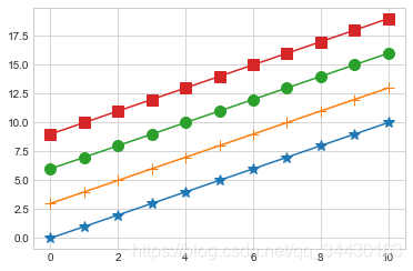
- 颜色、风格、数据点三联
x = np.linspace(0, 10, 11)
offsets = list(range(0, 8, 2))
color_marker_linestyles = ["g*-", "b+--", "ko-.", "rs:"]
for offset, color_marker_linestyle in zip(offsets, color_marker_linestyles):
    plt.plot(x, x+offset, color_marker_linestyle)
其他用法及颜色缩写、数据点标记缩写等请查看官方文档,如下:
https://matplotlib.org/api/_as_gen/matplotlib.pyplot.plot.html#matplotlib.pyplot.plot
【2】调整坐标轴
- xlim, ylim
x = np.linspace(0, 2*np.pi, 100)
plt.plot(x, np.sin(x))
plt.xlim(-1, 7)
plt.ylim(-1.5, 1.5)
(-1.5, 1.5)
- axis
x = np.linspace(0, 2*np.pi, 100)
plt.plot(x, np.sin(x))
plt.axis([-2, 8, -2, 2])
[-2, 8, -2, 2]
x = np.linspace(0, 2*np.pi, 100)
plt.plot(x, np.sin(x))
plt.axis("tight")  # 紧致
(-0.3141592653589793,
6.5973445725385655,
-1.0998615404412626,
1.0998615404412626)
x = np.linspace(0, 2*np.pi, 100)
plt.plot(x, np.sin(x))
plt.axis("equal")  # 扁平
(-0.3141592653589793,
6.5973445725385655,
-1.0998615404412626,
1.0998615404412626)
?plt.axis
- 对数坐标
x = np.logspace(0, 5, 100)
plt.plot(x, np.log(x))
plt.xscale("log")

- 调整坐标轴刻度
x = np.linspace(0, 10, 100)
plt.plot(x, x**2)
plt.xticks(np.arange(0, 12, step=1))
([<matplotlib.axis.XTick at 0x1b4eec3e2c8>,
<matplotlib.axis.XTick at 0x1b4eea42548>,
<matplotlib.axis.XTick at 0x1b4eea42d08>,
<matplotlib.axis.XTick at 0x1b4ee8c7e08>,
<matplotlib.axis.XTick at 0x1b4ee88ff88>,
<matplotlib.axis.XTick at 0x1b4ee88fc08>,
<matplotlib.axis.XTick at 0x1b4ea559f08>,
<matplotlib.axis.XTick at 0x1b4ee88f608>,
<matplotlib.axis.XTick at 0x1b4ea57b188>,
<matplotlib.axis.XTick at 0x1b4eeba2e48>,
<matplotlib.axis.XTick at 0x1b4eeba2548>,
<matplotlib.axis.XTick at 0x1b4ee8a6e88>],
<a list of 12 Text xticklabel objects>)
x = np.linspace(0, 10, 100)
plt.plot(x, x**2)
plt.xticks(np.arange(0, 12, step=1), fontsize=15)
plt.yticks(np.arange(0, 110, step=10))
([<matplotlib.axis.YTick at 0x1b4ee8bd988>,
<matplotlib.axis.YTick at 0x1b4ee8bdb08>,
<matplotlib.axis.YTick at 0x1b4ee8acb88>,
<matplotlib.axis.YTick at 0x1b4ee8e58c8>,
<matplotlib.axis.YTick at 0x1b4ee8e5588>,
<matplotlib.axis.YTick at 0x1b4ee872088>,
<matplotlib.axis.YTick at 0x1b4ee872b08>,
<matplotlib.axis.YTick at 0x1b4ee8a1608>,
<matplotlib.axis.YTick at 0x1b4eea59b08>,
<matplotlib.axis.YTick at 0x1b4eea21ec8>,
<matplotlib.axis.YTick at 0x1b4eea21048>],
<a list of 11 Text yticklabel objects>)
- 调整刻度样式
x = np.linspace(0, 10, 100)
plt.plot(x, x**2)
plt.tick_params(axis="both", labelsize=15)
【3】设置图形标签
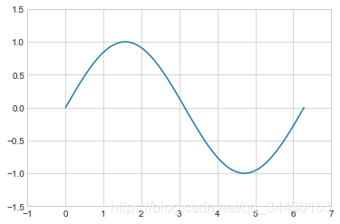
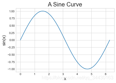
x = np.linspace(0, 2*np.pi, 100)
plt.plot(x, np.sin(x))
plt.title("A Sine Curve", fontsize=20)
plt.xlabel("x", fontsize=15)
plt.ylabel("sin(x)", fontsize=15)
Text(0, 0.5, ‘sin(x)’)
【4】设置图例
- 默认
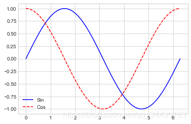
x = np.linspace(0, 2*np.pi, 100)
plt.plot(x, np.sin(x), "b-", label="Sin")
plt.plot(x, np.cos(x), "r--", label="Cos")
plt.legend()
<matplotlib.legend.Legend at 0x1b4eebaa748>
- 修饰图例
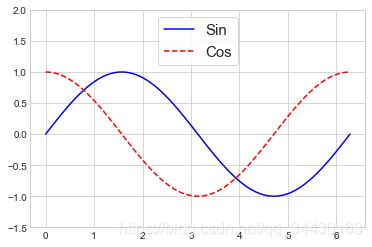
x = np.linspace(0, 2*np.pi, 100)
plt.plot(x, np.sin(x), "b-", label="Sin")
plt.plot(x, np.cos(x), "r--", label="Cos")
plt.ylim(-1.5, 2)
plt.legend(loc="upper center", frameon=True, fontsize=15)
<matplotlib.legend.Legend at 0x1b4eed30808>
【5】添加文字和箭头
- 添加文字
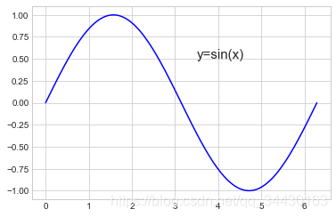
x = np.linspace(0, 2*np.pi, 100)
plt.plot(x, np.sin(x), "b-")
plt.text(3.5, 0.5, "y=sin(x)", fontsize=15)  # (3.5, 0.5)是文字的坐标
Text(3.5, 0.5, ‘y=sin(x)’)
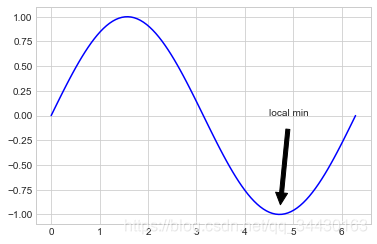
- 添加箭头
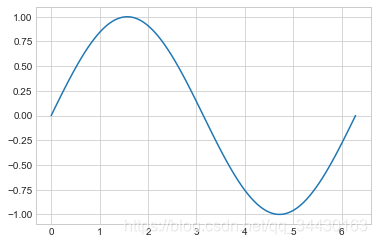
x = np.linspace(0, 2*np.pi, 100)
plt.plot(x, np.sin(x), "b-")
plt.annotate('local min', xy=(1.5*np.pi, -1), xytext=(4.5, 0),
             arrowprops=dict(facecolor='black', shrink=0.1),
             )
Text(4.5, 0, ‘local min’)
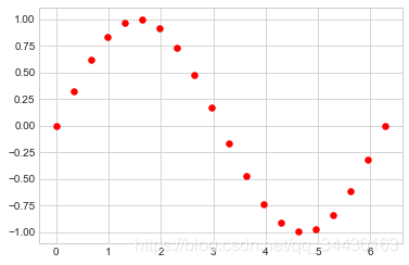
13.1.2 散点图
【1】简单散点图
x = np.linspace(0, 2*np.pi, 20)
plt.scatter(x, np.sin(x), marker="o", s=30, c="r")    # s 大小  c 颜色
<matplotlib.collections.PathCollection at 0x1b4eeedd688>
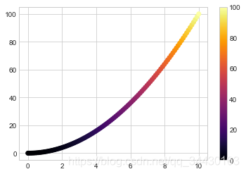
【2】颜色配置
x = np.linspace(0, 10, 100)
y = x**2
plt.scatter(x, y, c=y, cmap="inferno")  # c按照y的规律到cmap中映射
plt.colorbar()
<matplotlib.colorbar.Colorbar at 0x1b4eef85c08>
颜色配置参考官方文档:
https://matplotlib.org/examples/color/colormaps_reference.html
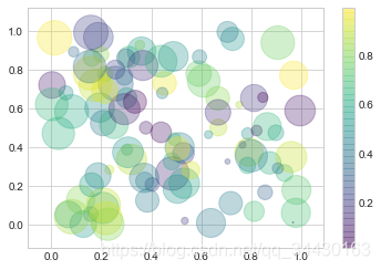
【3】根据数据控制点的大小
x, y, colors, size = (np.random.rand(100) for i in range(4))
plt.scatter(x, y, c=colors, s=1000*size, cmap="viridis")  # 映射,一一对应
<matplotlib.collections.PathCollection at 0x1b4eeb5d3c8>
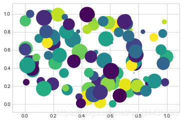
【4】透明度
x, y, colors, size = (np.random.rand(100) for i in range(4))
plt.scatter(x, y, c=colors, s=1000*size, cmap="viridis", alpha=0.3)
plt.colorbar()
<matplotlib.colorbar.Colorbar at 0x1b4eea2e1c8>
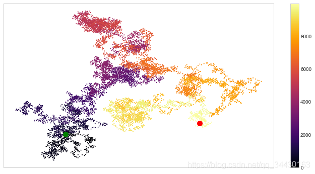
【例】随机漫步
from random import choice

class RandomWalk():
    """一个生产随机漫步的类"""
    def __init__(self, num_points=5000):
        self.num_points = num_points
        self.x_values = [0]
        self.y_values = [0]

    def fill_walk(self):
        while len(self.x_values) < self.num_points:
            x_direction = choice([1, -1])
            x_distance = choice([0, 1, 2, 3, 4])
            x_step = x_direction * x_distance

            y_direction = choice([1, -1])
            y_distance = choice([0, 1, 2, 3, 4])
            y_step = y_direction * y_distance

            if x_step == 0 or y_step == 0:
                continue
            next_x = self.x_values[-1] + x_step
            next_y = self.y_values[-1] + y_step
            self.x_values.append(next_x)
            self.y_values.append(next_y)
rw = RandomWalk(10000)
rw.fill_walk()
point_numbers = list(range(rw.num_points))
plt.figure(figsize=(12, 6))
plt.scatter(rw.x_values, rw.y_values, c=point_numbers, cmap="inferno", s=1)
plt.colorbar()
plt.scatter(0, 0, c="green", s=100)
plt.scatter(rw.x_values[-1], rw.y_values[-1], c="red", s=100)

plt.xticks([])
plt.yticks([])
([], <a list of 0 Text yticklabel objects>)
13.1.3 柱形图
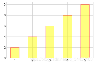
【1】简单柱形图
x = np.arange(1, 6)
plt.bar(x, 2*x, align="center", width=0.5, alpha=0.5, color='yellow', edgecolor='red')
plt.tick_params(axis="both", labelsize=13)
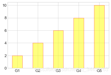
x = np.arange(1, 6)
plt.bar(x, 2*x, align="center", width=0.5, alpha=0.5, color='yellow', edgecolor='red')
plt.xticks(x, ('G1', 'G2', 'G3', 'G4', 'G5'))
plt.tick_params(axis="both", labelsize=13)

x = ('G1', 'G2', 'G3', 'G4', 'G5')
y = 2 * np.arange(1, 6)
plt.bar(x, y, align="center", width=0.5, alpha=0.5, color='yellow', edgecolor='red')
plt.tick_params(axis="both", labelsize=13)
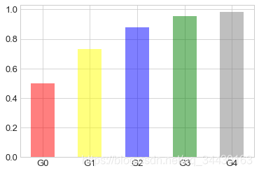
x = ["G"+str(i) for i in range(5)]
y = 1/(1+np.exp(-np.arange(5)))

colors = ['red', 'yellow', 'blue', 'green', 'gray']
plt.bar(x, y, align="center", width=0.5, alpha=0.5, color=colors)
plt.tick_params(axis="both", labelsize=13)
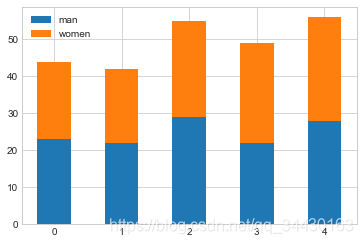
【2】累加柱形图
x = np.arange(5)
y1 = np.random.randint(20, 30, size=5)
y2 = np.random.randint(20, 30, size=5)
plt.bar(x, y1, width=0.5, label="man")
plt.bar(x, y2, width=0.5, bottom=y1, label="women")
plt.legend()
<matplotlib.legend.Legend at 0x1b4f01fb3c8>
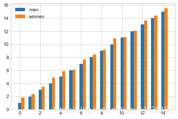
【3】并列柱形图
x = np.arange(15)
y1 = x+1
y2 = y1+np.random.random(15)
plt.bar(x, y1, width=0.3, label="man")
plt.bar(x+0.3, y2, width=0.3, label="women")
plt.legend()
<matplotlib.legend.Legend at 0x1b4f029dec8>
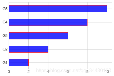
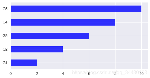
【4】横向柱形图
x = ['G1', 'G2', 'G3', 'G4', 'G5']
y = 2 * np.arange(1, 6)
plt.barh(x, y, align="center", height=0.5, alpha=0.8, color="blue", edgecolor="red")  # 柱子宽度需要用height设置
plt.tick_params(axis="both", labelsize=13)
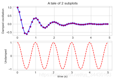
13.1.4 多子图
【1】简单多子图
def f(t):
    return np.exp(-t) * np.cos(2*np.pi*t)

t1 = np.arange(0.0, 5.0, 0.1)
t2 = np.arange(0.0, 5.0, 0.02)

plt.subplot(211)  # 两行一列第一个
plt.plot(t1, f(t1), "bo-", markerfacecolor="r", markersize=5)
plt.title("A tale of 2 subplots")
plt.ylabel("Damped oscillation")

plt.subplot(212)  # 两行一列第二个
plt.plot(t2, np.cos(2*np.pi*t2), "r--")
plt.xlabel("time (s)")
plt.ylabel("Undamped")
Text(0, 0.5, ‘Undamped’)
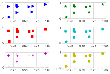
【2】多行多列子图
x = np.random.random(10)
y = np.random.random(10)

plt.subplots_adjust(hspace=0.5, wspace=0.3)  # 调整横向纵向间隔

plt.subplot(321)
plt.scatter(x, y, s=80, c="b", marker=">")

plt.subplot(322)
plt.scatter(x, y, s=80, c="g", marker="*")

plt.subplot(323)
plt.scatter(x, y, s=80, c="r", marker="s")

plt.subplot(324)
plt.scatter(x, y, s=80, c="c", marker="p")

plt.subplot(325)
plt.scatter(x, y, s=80, c="m", marker="+")

plt.subplot(326)
plt.scatter(x, y, s=80, c="y", marker="H")
<matplotlib.collections.PathCollection at 0x1b4ef0c3848>
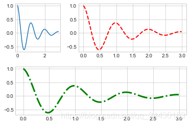
【3】不规则多子图
def f(x):
    return np.exp(-x) * np.cos(2*np.pi*x)


x = np.arange(0.0, 3.0, 0.01)
grid = plt.GridSpec(2, 3, wspace=0.4, hspace=0.3)

plt.subplot(grid[0, 0])
plt.plot(x, f(x))

plt.subplot(grid[0, 1:])
plt.plot(x, f(x), "r--", lw=2)

plt.subplot(grid[1, :])
plt.plot(x, f(x), "g-.", lw=3)
[<matplotlib.lines.Line2D at 0x1b4ef058e08>]
13.1.5 直方图
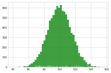
【1】普通频次直方图
mu, sigma = 100, 15
x = mu + sigma * np.random.randn(10000)
# randn函数返回一个或一组样本,具有标准正态分布。
# dn表格每个维度
# 返回值为指定维度的array
plt.hist(x, bins=50, facecolor='g', alpha=0.75)
(array([ 1., 0., 1., 3., 2., 2., 9., 7., 10., 26., 37.,
52., 74., 101., 130., 155., 233., 271., 328., 375., 468., 494.,
526., 580., 618., 598., 626., 568., 561., 533., 479., 407., 346.,
327., 258., 219., 143., 107., 101., 69., 49., 29., 33., 14.,
11., 9., 2., 5., 1., 2.]),
array([ 39.68188074, 42.0110338 , 44.34018686, 46.66933992,
48.99849298, 51.32764603, 53.65679909, 55.98595215,
58.31510521, 60.64425826, 62.97341132, 65.30256438,
67.63171744, 69.96087049, 72.29002355, 74.61917661,
76.94832967, 79.27748272, 81.60663578, 83.93578884,
86.2649419 , 88.59409496, 90.92324801, 93.25240107,
95.58155413, 97.91070719, 100.23986024, 102.5690133 ,
104.89816636, 107.22731942, 109.55647247, 111.88562553,
114.21477859, 116.54393165, 118.8730847 , 121.20223776,
123.53139082, 125.86054388, 128.18969693, 130.51884999,
132.84800305, 135.17715611, 137.50630917, 139.83546222,
142.16461528, 144.49376834, 146.8229214 , 149.15207445,
151.48122751, 153.81038057, 156.13953363]),
<a list of 50 Patch objects>)
【2】概率密度
mu, sigma = 100, 15
x = mu + sigma * np.random.randn(10000)
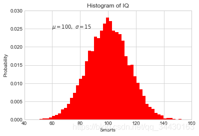
plt.hist(x, 50, density=True, color="r")
plt.xlabel('Smarts')
plt.ylabel('Probability')
plt.title('Histogram of IQ')
plt.text(60, .025, r'$\mu=100,\ \sigma=15$')
plt.xlim(40, 160)
plt.ylim(0, 0.03)
(0, 0.03)
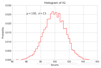
mu, sigma = 100, 15
x = mu + sigma * np.random.randn(10000)

plt.hist(x, bins=50, density=True, color="r", histtype='step')
plt.xlabel('Smarts')
plt.ylabel('Probability')
plt.title('Histogram of IQ')
plt.text(60, .025, r'$\mu=100,\ \sigma=15$')
plt.xlim(40, 160)
plt.ylim(0, 0.03)
(0, 0.03)
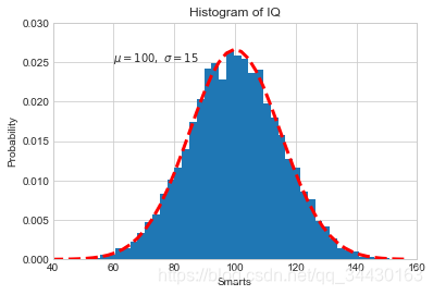
from scipy.stats import norm
mu, sigma = 100, 15
x = mu + sigma * np.random.randn(10000)

_, bins, __ = plt.hist(x, 50, density=True)
y = norm.pdf(bins, mu, sigma)
plt.plot(bins, y, 'r--', lw=3)
plt.xlabel('Smarts')
plt.ylabel('Probability')
plt.title('Histogram of IQ')
plt.text(60, .025, r'$\mu=100,\ \sigma=15$')
plt.xlim(40, 160)
plt.ylim(0, 0.03)
(0, 0.03)
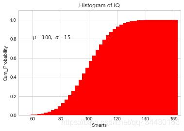
【3】累计概率分布
mu, sigma = 100, 15
x = mu + sigma * np.random.randn(10000)

plt.hist(x, 50, density=True, cumulative=True, color="r")
plt.xlabel('Smarts')
plt.ylabel('Cum_Probability')
plt.title('Histogram of IQ')
plt.text(60, 0.8, r'$\mu=100,\ \sigma=15$')
plt.xlim(50, 165)
plt.ylim(0, 1.1)
(0, 1.1)
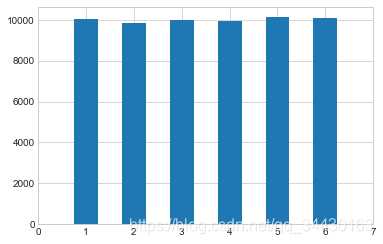
【例】模拟投两个骰子
class Die():
    "模拟一个骰子的类"

    def __init__(self, num_sides=6):
        self.num_sides = num_sides

    def roll(self):
        return np.random.randint(1, self.num_sides+1)
- 重复投一个骰子
die = Die()
results = []
for i in range(60000):
    result = die.roll()
    results.append(result)

plt.hist(results, bins=6, range=(0.75, 6.75), align="mid", width=0.5)
plt.xlim(0 ,7)
(0, 7)
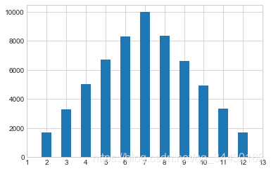
- 重复投两个骰子
die1 = Die()
die2 = Die()
results = []
for i in range(60000):
    result = die1.roll()+die2.roll()
    results.append(result)

plt.hist(results, bins=11, range=(1.75, 12.75), align="mid", width=0.5)
plt.xlim(1 ,13)
plt.xticks(np.arange(1, 14))
([<matplotlib.axis.XTick at 0x1b4f129b0c8>,
<matplotlib.axis.XTick at 0x1b4f132c408>,
<matplotlib.axis.XTick at 0x1b4f1328f88>,
<matplotlib.axis.XTick at 0x1b4f1368d88>,
<matplotlib.axis.XTick at 0x1b4f136c448>,
<matplotlib.axis.XTick at 0x1b4f136cb08>,
<matplotlib.axis.XTick at 0x1b4f1368d48>,
<matplotlib.axis.XTick at 0x1b4f13712c8>,
<matplotlib.axis.XTick at 0x1b4f1375148>,
<matplotlib.axis.XTick at 0x1b4f1375708>,
<matplotlib.axis.XTick at 0x1b4f137a0c8>,
<matplotlib.axis.XTick at 0x1b4f137aa88>,
<matplotlib.axis.XTick at 0x1b4f137e488>],
<a list of 13 Text xticklabel objects>)
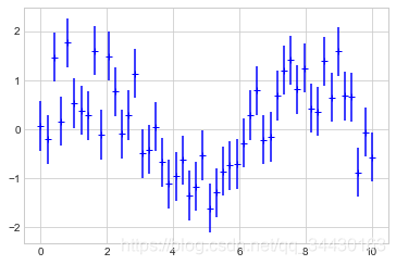
13.1.6 误差图
【1】基本误差图
x = np.linspace(0, 10 ,50)
dy = 0.5
y = np.sin(x) + dy*np.random.randn(50)

plt.errorbar(x, y , yerr=dy, fmt="+b")
<ErrorbarContainer object of 3 artists>
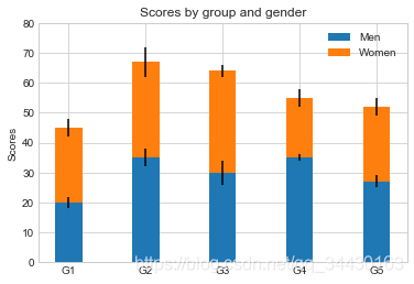
【2】柱形图误差图
menMeans = (20, 35, 30, 35, 27)
womenMeans = (25, 32, 34, 20, 25)
menStd = (2, 3, 4, 1, 2)
womenStd = (3, 5, 2, 3, 3)
ind = ['G1', 'G2', 'G3', 'G4', 'G5']
width = 0.35

p1 = plt.bar(ind, menMeans, width=width, label="Men", yerr=menStd)
p2 = plt.bar(ind, womenMeans, width=width, bottom=menMeans, label="Women", yerr=womenStd)

plt.ylabel('Scores')
plt.title('Scores by group and gender')
plt.yticks(np.arange(0, 81, 10))
plt.legend()
<matplotlib.legend.Legend at 0x1b4f144fb88>
13.1.7 面向对象的风格简介
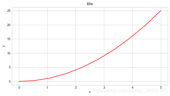
【例1】 普通图
x = np.linspace(0, 5, 10)
y = x ** 2

fig = plt.figure(figsize=(8,4), dpi=80)        # 图像
axes = fig.add_axes([0.1, 0.1, 0.8, 0.8])      # 轴 left, bottom, width, height (range 0 to 1)

axes.plot(x, y, 'r')
axes.set_xlabel('x')
axes.set_ylabel('y')
axes.set_title('title')
Text(0.5, 1.0, ‘title’)
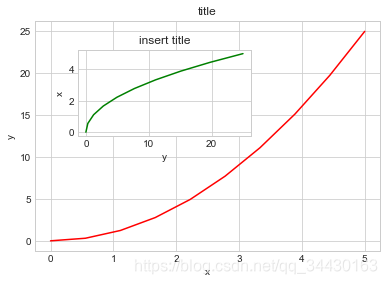
【2】画中画
x = np.linspace(0, 5, 10)
y = x ** 2

fig = plt.figure()

ax1 = fig.add_axes([0.1, 0.1, 0.8, 0.8])
ax2 = fig.add_axes([0.2, 0.5, 0.4, 0.3])

ax1.plot(x, y, 'r')

ax1.set_xlabel('x')
ax1.set_ylabel('y')
ax1.set_title('title')

ax2.plot(y, x, 'g')
ax2.set_xlabel('y')
ax2.set_ylabel('x')
ax2.set_title('insert title')
Text(0.5, 1.0, ‘insert title’)
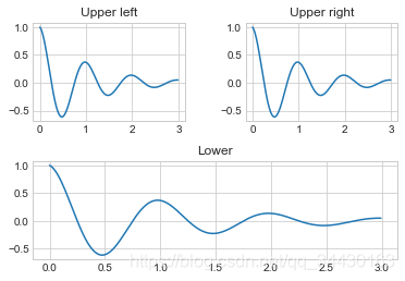
【3】 多子图
def f(t):
    return np.exp(-t) * np.cos(2*np.pi*t)


t1 = np.arange(0.0, 3.0, 0.01)

fig= plt.figure()
fig.subplots_adjust(hspace=0.4, wspace=0.4)

ax1 = plt.subplot(2, 2, 1)
ax1.plot(t1, f(t1))
ax1.set_title("Upper left")

ax2 = plt.subplot(2, 2, 2)
ax2.plot(t1, f(t1))
ax2.set_title("Upper right")

ax3 = plt.subplot(2, 1, 2)
ax3.plot(t1, f(t1))
ax3.set_title("Lower")
Text(0.5, 1.0, ‘Lower’)
13.1.8 三维图形简介
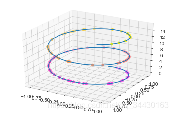
【1】三维数据点与线
from mpl_toolkits import mplot3d

ax = plt.axes(projection="3d")
zline = np.linspace(0, 15, 1000)
xline = np.sin(zline)
yline = np.cos(zline)
ax.plot3D(xline, yline ,zline)

zdata = 15*np.random.random(100)
xdata = np.sin(zdata)
ydata = np.cos(zdata)
ax.scatter3D(xdata, ydata ,zdata, c=zdata, cmap="spring")
<mpl_toolkits.mplot3d.art3d.Path3DCollection at 0x1b4f258bdc8>
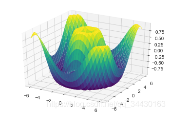
【2】三维数据曲面图
def f(x, y):
    return np.sin(np.sqrt(x**2 + y**2))

x = np.linspace(-6, 6, 30)
y = np.linspace(-6, 6, 30)
X, Y = np.meshgrid(x, y)
Z = f(X, Y)

ax = plt.axes(projection="3d")
ax.plot_surface(X, Y, Z, cmap="viridis")
<mpl_toolkits.mplot3d.art3d.Poly3DCollection at 0x1b4f2b45e08>
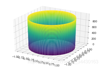
import numpy as np
import matplotlib.pyplot as plt
from mpl_toolkits import mplot3d

t = np.linspace(0, 2*np.pi, 1000)
X = np.sin(t)
Y = np.cos(t)
Z = np.arange(t.size)[:, np.newaxis]

ax = plt.axes(projection="3d")
ax.plot_surface(X, Y, Z, cmap="viridis")
<mpl_toolkits.mplot3d.art3d.Poly3DCollection at 0x1b4f2cbff08>
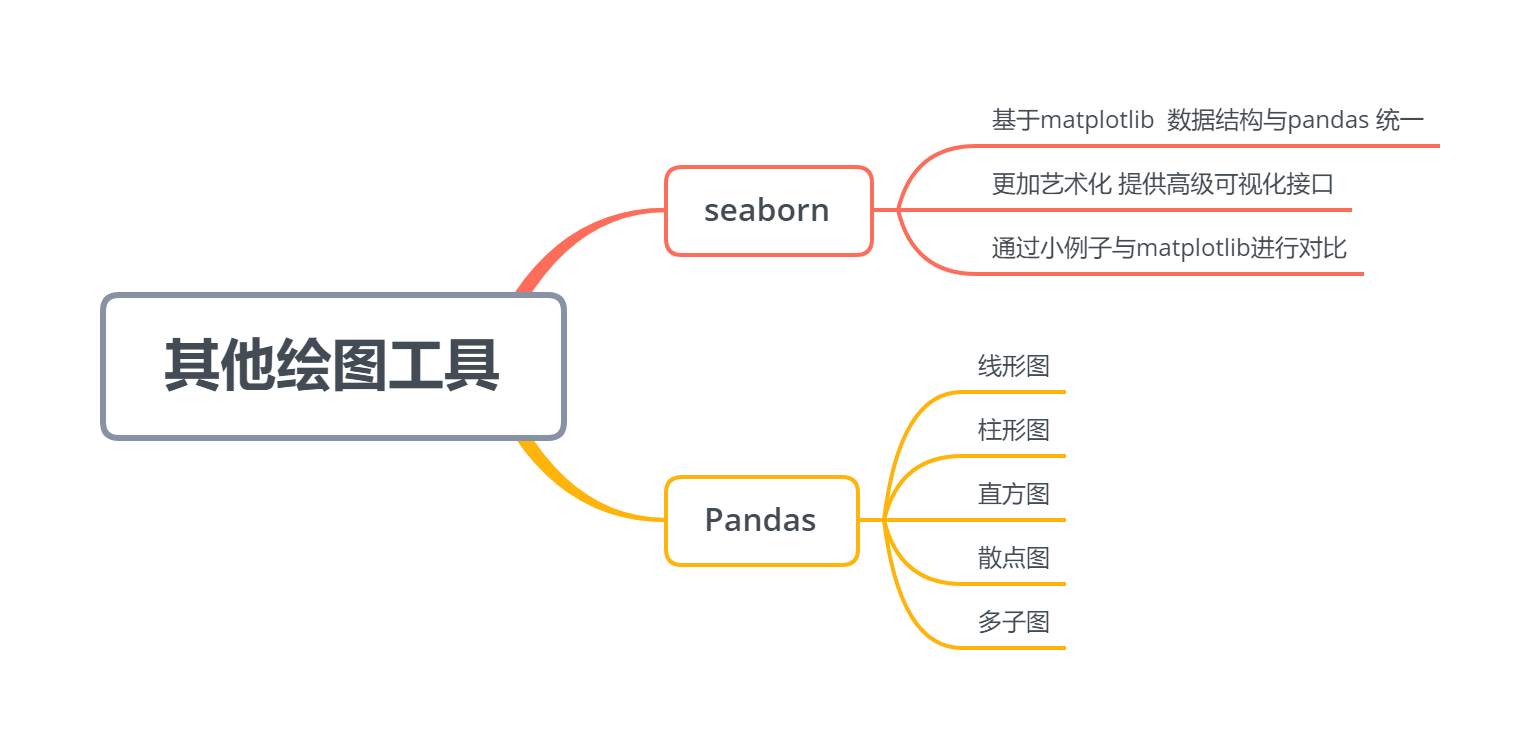
13.2 Seaborn库-文艺青年的最爱
【1】Seaborn 与 Matplotlib
Seaborn 是一个基于 matplotlib 且数据结构与 pandas 统一的统计图制作库
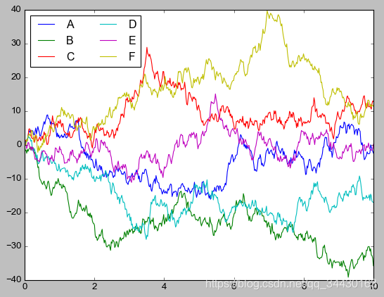
x = np.linspace(0, 10, 500)
y = np.cumsum(np.random.randn(500, 6), axis=0)

with plt.style.context("classic"):
    plt.plot(x, y)
    plt.legend("ABCDEF", ncol=2, loc="upper left")
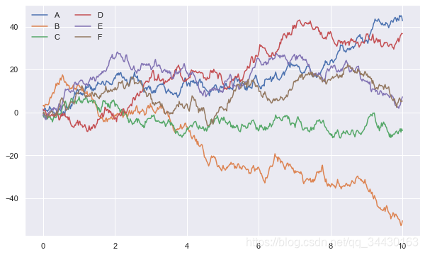
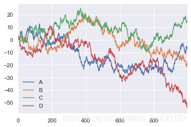
import seaborn as sns

x = np.linspace(0, 10, 500)
y = np.cumsum(np.random.randn(500, 6), axis=0)
sns.set()
plt.figure(figsize=(10, 6))
plt.plot(x, y)
plt.legend("ABCDEF", ncol=2, loc="upper left")
<matplotlib.legend.Legend at 0x1b4f3f3e948>
【2】柱形图的对比
x = ['G1', 'G2', 'G3', 'G4', 'G5']
y = 2 * np.arange(1, 6)

plt.figure(figsize=(8, 4))
plt.barh(x, y, align="center", height=0.5, alpha=0.8, color="blue")
plt.tick_params(axis="both", labelsize=13)
import seaborn as sns

plt.figure(figsize=(8, 4))
x = ['G5', 'G4', 'G3', 'G2', 'G1']
y = 2 * np.arange(5, 0, -1)
#sns.barplot(y, x)
sns.barplot(y, x, linewidth=5)
<matplotlib.axes._subplots.AxesSubplot at 0x1b4f152a548>

sns.barplot?
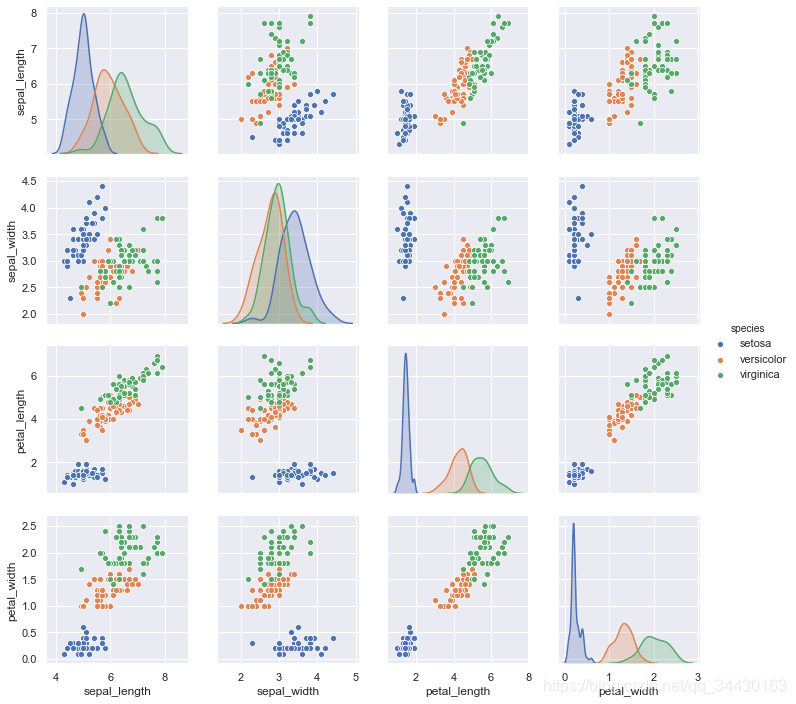
【3】以鸢尾花数据集为例
iris = sns.load_dataset("iris")
iris.head()
| sepal_length | sepal_width | petal_length | petal_width | species | |
|---|---|---|---|---|---|
| 0 | 5.1 | 3.5 | 1.4 | 0.2 | setosa |
| 1 | 4.9 | 3.0 | 1.4 | 0.2 | setosa |
| 2 | 4.7 | 3.2 | 1.3 | 0.2 | setosa |
| 3 | 4.6 | 3.1 | 1.5 | 0.2 | setosa |
| 4 | 5.0 | 3.6 | 1.4 | 0.2 | setosa |
sns.pairplot(data=iris, hue="species")
<seaborn.axisgrid.PairGrid at 0x1b4f4076888>
13.3 Pandas 中的绘图函数概览
import pandas as pd
【1】线形图
df = pd.DataFrame(np.random.randn(1000, 4).cumsum(axis=0),
                  columns=list("ABCD"),
                  index=np.arange(1000))
df.head()
| A | B | C | D | |
|---|---|---|---|---|
| 0 | 0.610190 | 2.491729 | -0.416243 | 0.195232 |
| 1 | 0.801074 | 0.948180 | 1.202199 | 1.823726 |
| 2 | 1.443251 | -0.035233 | 2.268661 | 3.067113 |
| 3 | 0.007057 | 0.265931 | -0.106440 | 2.358350 |
| 4 | 0.595312 | 0.200028 | 1.657994 | 2.176714 |
df.plot()
<matplotlib.axes._subplots.AxesSubplot at 0x1b4f5ffe288>
df = pd.DataFrame()
df.plot?
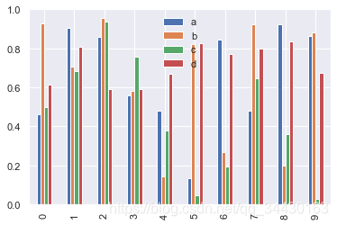
【2】柱形图
df2 = pd.DataFrame(np.random.rand(10, 4), columns=['a', 'b', 'c', 'd'])
df2
| a | b | c | d | |
|---|---|---|---|---|
| 0 | 0.460322 | 0.927683 | 0.497551 | 0.615176 |
| 1 | 0.905349 | 0.708518 | 0.681371 | 0.807877 |
| 2 | 0.858319 | 0.955934 | 0.937798 | 0.588875 |
| 3 | 0.559846 | 0.580694 | 0.758526 | 0.591128 |
| 4 | 0.480769 | 0.141956 | 0.380555 | 0.669430 |
| 5 | 0.132974 | 0.823903 | 0.045693 | 0.827573 |
| 6 | 0.843738 | 0.269459 | 0.193693 | 0.773033 |
| 7 | 0.480637 | 0.922371 | 0.645137 | 0.796784 |
| 8 | 0.923653 | 0.197706 | 0.359804 | 0.836856 |
| 9 | 0.863878 | 0.883514 | 0.026586 | 0.674246 |
- 多组数据竖图
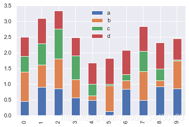
df2.plot.bar()
<matplotlib.axes._subplots.AxesSubplot at 0x1b4f6070148>
- 多组数据累加竖图
df2.plot.bar(stacked=True)
<matplotlib.axes._subplots.AxesSubplot at 0x1b4f6140f08>
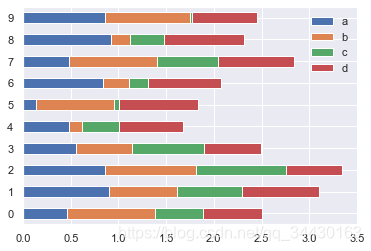
- 多组数据累加横图
df2.plot.barh(stacked=True)
<matplotlib.axes._subplots.AxesSubplot at 0x1b4f6140c08>
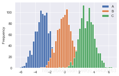
【3】直方图和密度图
df4 = pd.DataFrame({"A": np.random.randn(1000) - 3, "B": np.random.randn(1000),
                     "C": np.random.randn(1000) + 3})
df4.head()
| A | B | C | |
|---|---|---|---|
| 0 | -2.697886 | -0.460158 | 2.356080 |
| 1 | -4.359562 | 0.375553 | 0.746122 |
| 2 | -0.911547 | 0.349979 | 3.683907 |
| 3 | -4.677279 | 0.085438 | 4.297629 |
| 4 | -1.572772 | 0.262125 | 2.618193 |
- 普通直方图
df4.plot.hist(bins=50)
<matplotlib.axes._subplots.AxesSubplot at 0x1b4f65538c8>
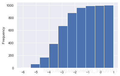
- 累加直方图
df4['A'].plot.hist(cumulative=True)
<matplotlib.axes._subplots.AxesSubplot at 0x1b4f3fd0a08>
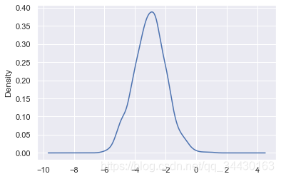
- 概率密度图
df4['A'].plot(kind="kde")
<matplotlib.axes._subplots.AxesSubplot at 0x1b4f6792ec8>
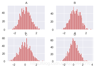
- 差分
df = pd.DataFrame(np.random.randn(1000, 4).cumsum(axis=0),
                  columns=list("ABCD"),
                  index=np.arange(1000))
df.head()
| A | B | C | D | |
|---|---|---|---|---|
| 0 | 1.409508 | 0.713121 | 0.245520 | 0.813048 |
| 1 | 2.033788 | 1.328676 | -0.457580 | 0.668991 |
| 2 | 1.631314 | 1.153951 | -0.932114 | 1.434192 |
| 3 | 2.413020 | 1.337651 | -0.662001 | -0.548179 |
| 4 | 3.559789 | -0.466859 | 0.495125 | -0.531648 |
df.diff().hist(bins=50, color="r")
array([[<matplotlib.axes._subplots.AxesSubplot object at 0x000001B4F67E0748>,
<matplotlib.axes._subplots.AxesSubplot object at 0x000001B4F6881CC8>],
[<matplotlib.axes._subplots.AxesSubplot object at 0x000001B4F68B7588>,
<matplotlib.axes._subplots.AxesSubplot object at 0x000001B4F68ECF88>]],
dtype=object)
df = pd.DataFrame()
df.hist?
【4】散点图
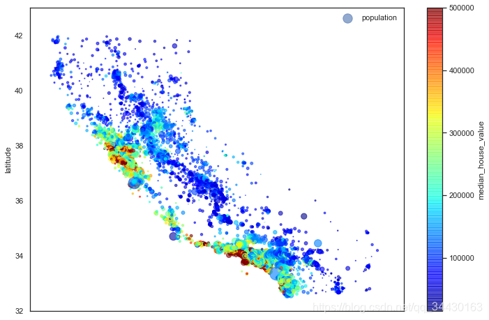
housing = pd.read_csv("housing.csv")
housing.head()
| longitude | latitude | housing_median_age | total_rooms | total_bedrooms | population | households | median_income | median_house_value | ocean_proximity | |
|---|---|---|---|---|---|---|---|---|---|---|
| 0 | -122.23 | 37.88 | 41.0 | 880.0 | 129.0 | 322.0 | 126.0 | 8.3252 | 452600.0 | NEAR BAY |
| 1 | -122.22 | 37.86 | 21.0 | 7099.0 | 1106.0 | 2401.0 | 1138.0 | 8.3014 | 358500.0 | NEAR BAY |
| 2 | -122.24 | 37.85 | 52.0 | 1467.0 | 190.0 | 496.0 | 177.0 | 7.2574 | 352100.0 | NEAR BAY |
| 3 | -122.25 | 37.85 | 52.0 | 1274.0 | 235.0 | 558.0 | 219.0 | 5.6431 | 341300.0 | NEAR BAY |
| 4 | -122.25 | 37.85 | 52.0 | 1627.0 | 280.0 | 565.0 | 259.0 | 3.8462 | 342200.0 | NEAR BAY |
"""基于地理数据的人口、房价可视化"""
# 圆的半价大小代表每个区域人口数量(s),颜色代表价格(c),用预定义的jet表进行可视化
with sns.axes_style("white"):
    housing.plot(kind="scatter", x="longitude", y="latitude", alpha=0.6,
                 s=housing["population"]/100, label="population",
                 c="median_house_value", cmap="jet", colorbar=True, figsize=(12, 8))
plt.legend()
plt.axis([-125, -113.5, 32, 43])
[-125, -113.5, 32, 43]
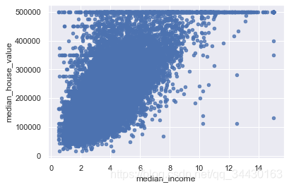
housing.plot(kind="scatter", x="median_income", y="median_house_value", alpha=0.8)
‘c’ argument looks like a single numeric RGB or RGBA sequence, which should be avoided as value-mapping will have precedence in case its length matches with ‘x’ & ‘y’. Please use a 2-D array with a single row if you really want to specify the same RGB or RGBA value for all points.
<matplotlib.axes._subplots.AxesSubplot at 0x1b4f6de45c8>
【5】多子图
df = pd.DataFrame(np.random.randn(1000, 4).cumsum(axis=0),
                  columns=list("ABCD"),
                  index=np.arange(1000))
df.head()
| A | B | C | D | |
|---|---|---|---|---|
| 0 | -0.067419 | 0.405971 | 0.062414 | 0.179485 |
| 1 | 1.409774 | 0.611998 | 0.298608 | 1.315329 |
| 2 | 2.042297 | 1.269211 | 0.309474 | 1.742142 |
| 3 | 3.371700 | 2.208398 | -0.739020 | 1.504048 |
| 4 | 3.288138 | 1.520472 | -1.923087 | 1.458104 |
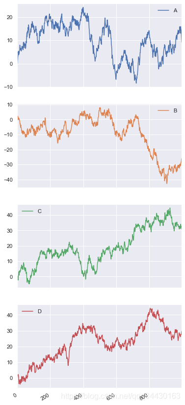
- 默认情形
df.plot(subplots=True, figsize=(6, 16))
array([<matplotlib.axes._subplots.AxesSubplot object at 0x000001B4F6BF3108>,
<matplotlib.axes._subplots.AxesSubplot object at 0x000001B4F6E75D48>,
<matplotlib.axes._subplots.AxesSubplot object at 0x000001B4F6E4D088>,
<matplotlib.axes._subplots.AxesSubplot object at 0x000001B4F6EDE448>],
dtype=object)
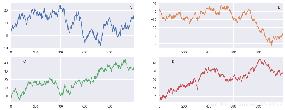
- 设定图形安排
df.plot(subplots=True, layout=(2, 2), figsize=(16, 6), sharex=False)
array([[<matplotlib.axes._subplots.AxesSubplot object at 0x000001B4F6E4D448>,
<matplotlib.axes._subplots.AxesSubplot object at 0x000001B4F7199D08>],
[<matplotlib.axes._subplots.AxesSubplot object at 0x000001B4F71CF5C8>,
<matplotlib.axes._subplots.AxesSubplot object at 0x000001B4F7203F88>]],
dtype=object)
其他内容请参考Pandas中文文档:
https://www.pypandas.cn/docs/user_guide/visualization.html#plot-formatting


 被折叠的 条评论
为什么被折叠?
被折叠的 条评论
为什么被折叠?
 到【灌水乐园】发言


