


0 代码import的包
from matplotlib import pyplot as plt
from matplotlib.pyplot import savefig
import numpy as np
import pandas as pd
from statsmodels.graphics.tsaplots import plot_acf
import matplotlib.gridspec as gs
1 散点图
1.1 normal scatter
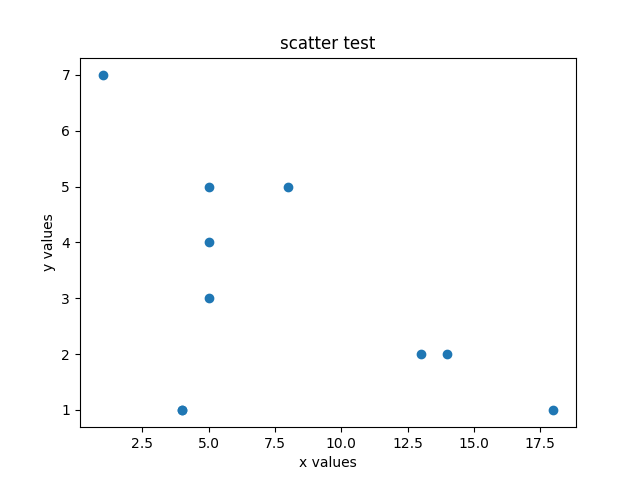
def scatter():
    x = np.random.randint(1,20,10)
    y = np.random.randint(1,10,10)
    plt.scatter(x,y)
    plt.xlabel("x values") # 设置x轴的显示
    plt.ylabel("y values") # 设置y轴的显示
    plt.title("scatter test") #设置标题
    savefig("img/scatter.png") #保存图片  该语句必须放在plt.show()之前,否则会是空白
    plt.show() #显示
1.2 add a colorbar
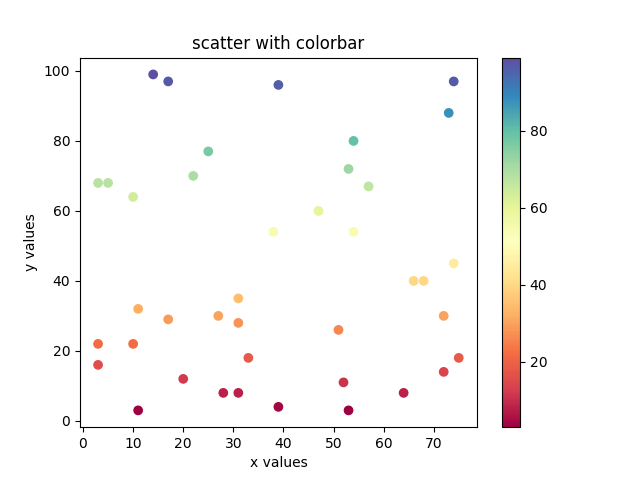
def scatter():
    x = np.random.randint(1,80,40)
    y = np.random.randint(1,100,40)
    plt.scatter(x,y,c=y,cmap="Spectral")  # ket code
    plt.colorbar() # key codde
    plt.xlabel("x values") # 设置x轴的显示
    plt.ylabel("y values") # 设置y轴的显示
    plt.title("scatter with colorbar") #设置标题
    savefig("img/scatter_colorbar.png") #保存图片  该语句必须放在plt.show()之前,否则会是空白
    plt.show() #显示
2 折线图
2.1 draw a function
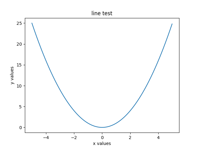
def line():
    x = np.arange(-5,5,0.02)
    plt.plot(x,np.power(x,2))
    plt.xlabel("x values")  # 设置x轴的显示
    plt.ylabel("y values")  # 设置y轴的显示
    plt.title("line test")  # 设置标题
    savefig("img/line.png")  # 保存图片  该语句必须放在plt.show()之前,否则会是空白
    plt.show()
2.2 draw stuck data
def line():
    data = pd.read_csv("data/000001.SZ.csv")
    x = pd.to_datetime([str(i) for i in data["trade_date"].values])
    y = data["close"]
    plt.figure(figsize=(16,12))
    plt.plot(x,y)
    plt.xlabel("year")  # 设置x轴的显示
    plt.ylabel("close data")  # 设置y轴的显示
    plt.title("stuck data chart")  # 设置标题
    savefig("img/line-stuck.png")  # 保存图片  该语句必须放在plt.show()之前,否则会是空白
    plt.show()
[外链图片转存失败,源站可能有防盗链机制,建议将图片保存下来直接上传(img-eHGjpTge-1641870079788)(https://jums.club/images/article/line-stuck.png)]
2.3 marker
'''
marker, 指定标签,相关标签样式见下表
markevery, 指定间隔多少个值画一个标签
'''
plt.plot([i for i in range(1,30)], marker="x", markevery=2)
plt.plot([i for i in range(3,32)], marker="o", markevery=2)
plt.legend(loc="best")
plt.show()
| marker | symbol | description |
|---|---|---|
"." |  | point |
"," |  | pixel |
"o" |  | circle |
"v" |  | triangle_down |
"^" |  | triangle_up |
"<" |  | triangle_left |
">" |  | triangle_right |
"1" |  | tri_down |
"2" |  | tri_up |
"3" |  | tri_left |
"4" |  | tri_right |
"8" |  | octagon |
"s" |  | square |
"p" |  | pentagon |
"P" |  | plus (filled) |
"*" |  | star |
"h" |  | hexagon1 |
"H" |  | hexagon2 |
"+" |  | plus |
"x" |  | x |
"X" |  | x (filled) |
"D" |  | diamond |
"d" |  | thin_diamond |
"|" |  | vline |
"_" |  | hline |
3 柱状图
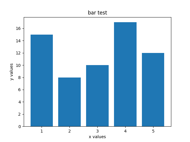
3.1 simple bar chart
def bar():
    x = [1,2,3,4,5]
    y = [15,8,10,17,12]
    plt.bar(x,y)
    plt.xlabel("x values")  # 设置x轴的显示
    plt.ylabel("y values")  # 设置y轴的显示
    plt.title("bar test")  # 设置标题
    savefig("img/bar.png")  # 保存图片  该语句必须放在plt.show()之前,否则会是空白
    plt.show()
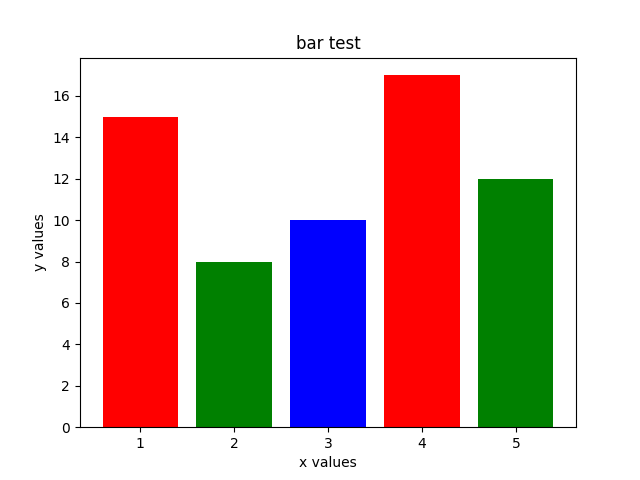
3.2 add color
def bar():
    x = [1,2,3,4,5]
    y = [15,8,10,17,12]
    plt.bar(x,y,color="rgb")
    plt.xlabel("x values")  # 设置x轴的显示
    plt.ylabel("y values")  # 设置y轴的显示
    plt.title("bar test")  # 设置标题
    savefig("img/bar.png")  # 保存图片  该语句必须放在plt.show()之前,否则会是空白
    plt.show()
3.3 add target
def bar():
    x = [1,2,3,4,5]
    y = [15,8,10,17,12]
    plt.bar(x,y,color="rgb",tick_label=["mon","thu","wen","tu","fri"])
    plt.xlabel("x values")  # 设置x轴的显示
    plt.ylabel("y values")  # 设置y轴的显示
    plt.title("bar test")  # 设置标题
    savefig("img/bar_target.png")  # 保存图片  该语句必须放在plt.show()之前,否则会是空白
    plt.show()

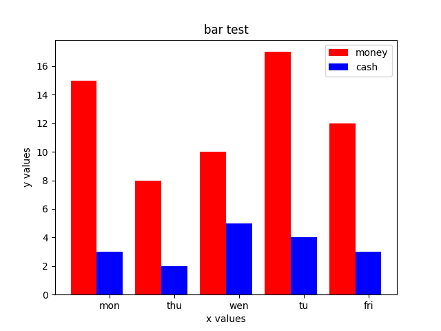
3.4 stack bar
def bar():
    x = [1,2,3,4,5]
    y = [15,8,10,17,12]
    y2 = [3,2,5,4,3]
    plt.bar(x,y,color="red",label="money")
    plt.bar(x,y2,color="b",bottom=y,label="cash",tick_label=["mon","thu","wen","tu","fri"])
    plt.legend(loc="best")
    plt.xlabel("x values")  # 设置x轴的显示
    plt.ylabel("y values")  # 设置y轴的显示
    plt.title("bar test")  # 设置标题
    savefig("img/bar_stack.png")  # 保存图片  该语句必须放在plt.show()之前,否则会是空白
    plt.show()

3.5 paralleling bar
def bar():
    x = [1,2,3,4,5]
    y = [15,8,10,17,12]
    y2 = [3,2,5,4,3]
    width = 0.4
    plt.bar(x,y,color="red",label="money",width=width)
    for i in range(len(x)):
        x[i] += width #增加X轴的距离
    plt.bar(x,y2,color="b", width=width,  label="cash",tick_label=["mon","thu","wen","tu","fri"])
    plt.legend(loc="best")
    plt.xlabel("x values")  # 设置x轴的显示
    plt.ylabel("y values")  # 设置y轴的显示
    plt.title("bar test")  # 设置标题
    savefig("img/bar_paralleling.png")  # 保存图片  该语句必须放在plt.show()之前,否则会是空白
    plt.show()
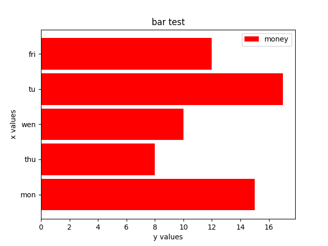
3.6 bar-type bar chart
def bar():
    x = [1,2,3,4,5]
    y = [15,8,10,17,12]
    y2 = [3,2,5,4,3]
    height = 0.9
    plt.barh(x,y,color="red",label="money",height=height,tick_label=["mon","thu","wen","tu","fri"])
    plt.legend(loc="best")
    plt.xlabel("y values")  # 设置x轴的显示
    plt.ylabel("x values")  # 设置y轴的显示
    plt.title("bar test")  # 设置标题
    savefig("img/bar_type.png")  # 保存图片  该语句必须放在plt.show()之前,否则会是空白
    plt.show()
4 饼图
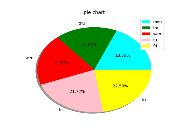
4.1 normal
def pie():
    x = ["mon","thu","wen","tu","fri"]
    y = [190,180,200,222,230]
    color = ["cyan","green","red","pink","yellow"]
    plt.pie(y,labels=x,colors=color,shadow=True,autopct="%1.2f%%")
    plt.legend(loc="best")
    plt.title("pie chart")
    savefig("img/pie.png")
    plt.show()
4.2 exploded
import matplotlib

matplotlib.rcParams['font.family'] = 'Simsun'
matplotlib.rcParams['font.size'] = 20
x = [u"交通事故", u"水灾事故", u"其他事故"]
y = [4005, 3625, 1206]
color = ["cyan", "green", "red", "pink", "yellow", "b"]
exploed = (0, 0.1, 0)  ## 关键代码
plt.pie(y, labels=x, colors=color, shadow=True, autopct="%1.2f%%", explode=exploed)
plt.tight_layout()
plt.savefig("img/pie2.png")
plt.show()

5 子图
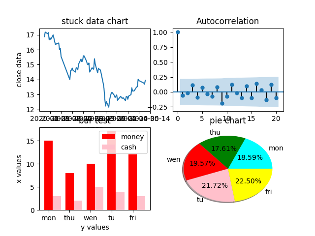
5.1 subplot
def subpl():
    plt.figure(1)
    # sub 1
    plt.subplot(221)# 将画面分成2行2列共4个plot,下面的数据显示在第一个plot中
    data = pd.read_csv("data/000001.SZ.csv")
    x = pd.to_datetime([str(i) for i in data["trade_date"].values])
    y = data["close"]
    plt.plot(x, y)
    plt.xlabel("year")  # 设置x轴的显示
    plt.ylabel("close data")  # 设置y轴的显示
    plt.title("stuck data chart")  # 设置标题
    # sub 2
    plot_acf(y.diff().dropna(),ax=plt.subplot(222))
    # sub 3
    plt.subplot(223)
    x = [1, 2, 3, 4, 5]
    y = [15, 8, 10, 17, 12]
    y2 = [3, 2, 5, 4, 3]
    height = 0.4
    labels = ["mon", "thu", "wen", "tu", "fri"]
    plt.bar(x, y, color="red", label="money", width=height, tick_label=labels)
    for i in range(len(x)):
        x[i] += height
    plt.bar(x,y2,width=height,color="pink",label="cash")
    plt.legend(loc="best")
    plt.xlabel("y values")  # 设置x轴的显示
    plt.ylabel("x values")  # 设置y轴的显示
    plt.title("bar test")  # 设置标题
    # sub 4
    plt.subplot(224)
    y = [190, 180, 200, 222, 230]
    color = ["cyan", "green", "red", "pink", "yellow"]
    plt.pie(y, labels=labels, colors=color, shadow=True, autopct="%1.2f%%")
    plt.title("pie chart")
    savefig("img/subplot.png")
    plt.show()
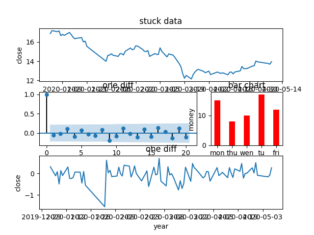
5.2 subplots
def subplots():
    # subplots显示subplot的数据
    fig, ax = plt.subplots(2,2) # 画2行2列共4个plot,返回的是一个元组型的数据,fig是画布,ax是子图
    data = pd.read_csv("data/000001.SZ.csv")
    x = pd.to_datetime([str(i) for i in data["trade_date"].values])
    y = data["close"]
    # sub 1
    ax[0][0].plot(x, y)
    ax[0,0].set_xlabel("year")
    ax[0,0].set_ylabel("close")
    ax[0,0].set_title("stuck data")
    # sub 2
    plot_acf(y.diff().dropna(),ax=ax[0,1])
    ax[0,1].set_title("one diff")
    # sub 3
    x = [1, 2, 3, 4, 5]
    y = [15, 8, 10, 17, 12]
    y2 = [3, 2, 5, 4, 3]
    height = 0.4
    labels = ["mon", "thu", "wen", "tu", "fri"]
    ax[1,0].bar(x, y, color="red", label="money", width=height, tick_label=labels)
    for i in range(len(x)):
        x[i] += height
    ax[1,0].bar(x, y2, width=height, color="pink", label="cash")
    ax[1,0].legend(loc="best")
    ax[1,0].set_xlabel("y values")  # 设置x轴的显示
    ax[1,0].set_ylabel("x values")  # 设置y轴的显示
    ax[1,0].set_title("bar test")  # 设置标题
    # sub 4
    y = [190, 180, 200, 222, 230]
    color = ["cyan", "green", "red", "pink", "yellow"]
    ax[1,1].pie(y, labels=labels, colors=color, shadow=True, autopct="%1.2f%%")
    ax[1,1].set_title("pie chart")
    savefig("img/subplots.png")
    plt.show()

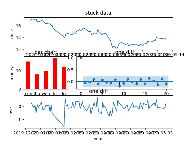
5.3 subplot2gird
def subgrid():
    shape = (3,3)
    ax1 = plt.subplot2grid(shape,(0,0),rowspan=1,colspan=3)
    data = pd.read_csv("data/000001.SZ.csv")
    year = pd.to_datetime([str(i) for i in data["trade_date"].values])
    clo = data["close"]
    # sub 1
    ax1.plot(year,clo)
    ax1.set_xlabel("year")
    ax1.set_ylabel("close")
    ax1.set_title("stuck data")
    # sub 2
    ax2 = plt.subplot2grid(shape,(1,0),rowspan=1,colspan=2)
    plot_acf(clo.diff().dropna(),ax=ax2)
    ax2.set_title("one diff")
    # sub 3
    ax3 = plt.subplot2grid(shape,(1,2))
    x = [1, 2, 3, 4, 5]
    y = [15, 8, 10, 17, 12]
    height = 0.4
    labels = ["mon", "thu", "wen", "tu", "fri"]
    ax3.bar(x, y, color="red", label="money", width=height, tick_label=labels)
    ax3.set_title("bar chart")
    ax3.set_xlabel("week")
    ax3.set_ylabel("money")
    #sub 4
    ax4 = plt.subplot2grid(shape,(2,0),rowspan=1,colspan=3)
    ax4.plot(year,clo.diff())
    ax4.set_title("one diff")
    ax4.set_xlabel("year")
    ax4.set_ylabel("close")
    savefig("img/subplot2grid.png")
    plt.show()
5.4 gridspec
def gridspec():
    plt.figure(1)
    g = gs.GridSpec(3,3) # 定义3行3列
    ax1 = plt.subplot(g[0,:]) # 使用索引进行标记位置,第一个0表示第一行,第二个:号,表示所有列
    data = pd.read_csv("data/000001.SZ.csv")
    year = pd.to_datetime([str(i) for i in data["trade_date"].values])
    clo = data["close"]
    # sub 1
    ax1.plot(year, clo)
    ax1.set_xlabel("year")
    ax1.set_ylabel("close")
    ax1.set_title("stuck data")
    # sub 2
    ax2 = plt.subplot(g[1,0])
    x = [1, 2, 3, 4, 5]
    y = [15, 8, 10, 17, 12]
    height = 0.4
    labels = ["mon", "thu", "wen", "tu", "fri"]
    ax2.bar(x, y, color="red", label="money", width=height, tick_label=labels)
    ax2.set_title("bar chart")
    ax2.set_xlabel("week")
    ax2.set_ylabel("money")
    # sub 3
    ax3 = plt.subplot(g[1,1:])
    plot_acf(clo.diff().dropna(), ax=ax3)
    ax3.set_title("one diff")
    # sub 4
    ax4 = plt.subplot(g[2,:])
    ax4.plot(year, clo.diff())
    ax4.set_title("one diff")
    ax4.set_xlabel("year")
    ax4.set_ylabel("close")
    savefig("img/gridspec.png")
    plt.show()
写在最后
欢迎大家关注鄙人的公众号【麦田里的守望者zhg】,让我们一起成长,谢谢。


 被折叠的 条评论
为什么被折叠?
被折叠的 条评论
为什么被折叠?
 到【灌水乐园】发言


