


本文介绍开发一个弹框组件
//组件代码
<template>
  <div class="yui-wrapper">
    <transition name="fade">
      <div class="mask" v-show="showModal"></div>
    </transition>
    <transition name="yui-dialog">
      <div class="yui-alert" v-show="showModal">
        <div class="header_title">
          <slot name="title">提示</slot>
        </div>
        <div class="content">
          <slot>测试内容</slot>
        </div>
        <div class="footer">
          <div class="footer_btn" style="border-right:1px solid #eee">
            <a href="javascript:;" class="footer_btn--cancel" @click="changeStatus('hide')">取消</a>
          </div>
          <div class="footer_btn">
            <a href="javascript:;" class="footer_btn--confirm" @click="changeStatus('confirm')">确定</a>
          </div>
        </div>
      </div>
    </transition>
  </div>
</template>
<script>
export default {
  name: "alert",
  props: {
    showModal: Boolean
  },
  methods: {
    changeStatus(type) {
      this.$emit("statusChange", type);
    }
  }
};
</script>
<style lang="less" scoped>
.yui-wrapper {
  .mask {
    top: 0;
    bottom: 0;
    left: 0;
    right: 0;
    display: block;
    background: rgba(0, 0, 0, 0.4);
    position: fixed;
    z-index: 1;
  }
  .yui-alert {
    border-radius: 3px;
    position: fixed;
    width: 80%;
    background: #fff;
    left: 0;
    top: 0;
    right: 0;
    bottom: 0;
    z-index: 2;
    margin: auto;
    display: table;
    // transform: translateX(-50%);
    .header_title {
      padding: 10px 10px 5px;
      text-align: center;
      font-size: 18px;
    }
    .content {
      text-align: center;
      color: #999;
      padding-bottom: 20px;
      border-bottom: 1px solid #eee;
    }
    .footer {
      display: flex;
      padding: 0 6px;
      .footer_btn {
        padding: 6px;
        flex: 1;
        text-align: center;
        a {
          font-size: 18px;
          width: 100%;
          display: inline-block;
        }
        .footer_btn--confirm {
          color: blue;
        }
        .footer_btn--cancel {
          color: #999;
        }
      }
    }
  }
}
</style>
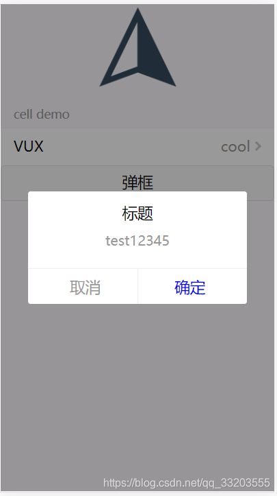
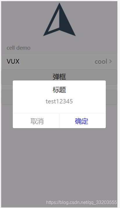
弹框样式如下
调用方法
<template>
  <div>
    <div class="vux-demo">
      <img class="logo" src="../assets/vux_logo.png">
      <h1> </h1>
    </div>
    <group title="cell demo">
      <cell title="VUX" value="cool" is-link></cell>
    <x-button @click.native="show">弹框</x-button>
    </group>
    <confirm :showModal="showPop" @statusChange="confirmHandle">
      <div slot='title'>标题</div>
      <div>
        test12345
      </div>
    </confirm>
  </div>
</template>

<script>
import { Group, Cell,XButton } from 'vux'
import confirm from './confirm/index.vue'
export default {
  components: {
    Group,
    Cell,
    XButton,
    confirm
  },
  data () {
    return {
      // note: changing this line won't causes changes
      // with hot-reload because the reloaded component
      // preserves its current state and we are modifying
      // its initial state.
      msg: 'Hello World!',
      showPop:false
    }
  },
  methods:{
    show(){
      this.showPop = true
    },
    confirmHandle(action){
      this.showPop = false;
      if(action == 'confirm'){
        console.log('confirm')
      }
    }
  }
}
</script>

<style>
.vux-demo {
  text-align: center;
}
.logo {
  width: 100px;
  height: 100px
}
</style>
动画相关css
.fade-enter-active, .fade-leave-active {
  transition: opacity .5s;
}
.fade-enter, .fade-leave-active /* .fade-leave-active below version 2.1.8 */ {
  opacity: 0;
}
.yui-dialog-enter-active, .yui-dialog-leave-active {
  opacity: 1;
  transition-duration: 400ms;
  transform: scale(1)!important;
  transition-property: transform, opacity!important;
}
.yui-dialog-leave-active {
  transition-duration: 300ms;
}
.yui-dialog-enter {
  opacity: 0;
  transform: scale(1.125)!important;
}
.yui-dialog-leave-active {
  opacity: 0;
  transform: scale(0.85)!important;
}
以上便是一般组件的开发方法,在父组件通过slot插槽可自定义弹框内容。父组件通过props传递数据到子组件,子组件通过$emit触发父组件注册的事件处理程序实现父子组件通信。
另外一种比较常见的组件开发方法是以插件的形式来调用组件。如下介绍
下面对以上组件进行改造,使之可以以插件的方式调用
this.$confirm({
        title:'温馨提示',
        content:'测试信息',
        onConfirm(msg){
          console.log(msg)
        }
      })
简单方便
改造代码如下
//组件代码index.vue
<template>
  <div class="yui-wrapper">
    <transition name="fade">
      <div class="mask" v-show="showValue"></div>
    </transition>
    <transition name="yui-dialog">
      <div class="yui-alert" v-show="showValue">
        <div class="header_title">
          <slot name="title">{{title}}</slot>
        </div>
        <div class="content">
          <slot><div v-html="content"></div></slot>
        </div>
        <div class="footer">
          <div class="footer_btn" style="border-right:1px solid #eee">
            <a href="javascript:;" class="footer_btn--cancel" @click="changeStatus('hide')">取消</a>
          </div>
          <div class="footer_btn">
            <a href="javascript:;" class="footer_btn--confirm" @click="changeStatus('confirm')">确定</a>
          </div>
        </div>
      </div>
    </transition>
  </div>
</template>
<script>
export default {
  name: "alert",
  props: {
    showModal: Boolean,
    content:String,
    title:{
      type:String,
      default:'提示'
    }
  },
  data(){
    return {
      showValue:false
    }
  },
  watch:{
    showModal(newVal){
      this.showValue = newVal
    }
  },
  methods: {
    changeStatus(type) {
      this.$emit("statusChange", type);
    }
  }
};
</script>
<style lang="less" scoped>
.yui-wrapper {
  .mask {
    top: 0;
    bottom: 0;
    left: 0;
    right: 0;
    display: block;
    background: rgba(0, 0, 0, 0.4);
    position: fixed;
    z-index: 1;
  }
  .yui-alert {
    border-radius: 3px;
    position: fixed;
    width: 80%;
    background: #fff;
    left: 0;
    top: 0;
    right: 0;
    bottom: 0;
    z-index: 2;
    margin: auto;
    display: table;
    // transform: translateX(-50%);
    .header_title {
      padding: 10px 10px 5px;
      text-align: center;
      font-size: 18px;
    }
    .content {
      text-align: center;
      color: #999;
      padding-bottom: 20px;
      border-bottom: 1px solid #eee;
    }
    .footer {
      display: flex;
      padding: 0 6px;
      .footer_btn {
        padding: 6px;
        flex: 1;
        text-align: center;
        a {
          font-size: 18px;
          width: 100%;
          display: inline-block;
        }
        .footer_btn--confirm {
          color: blue;
        }
        .footer_btn--cancel {
          color: #999;
        }
      }
    }
  }
}
</style>
//插件安装代码
import ConfirmComponent from './index.vue'

let $vm
const plugin = {
  install(vue, opt = {}){
    const Confirm = vue.extend(ConfirmComponent)
    if(!$vm){
      $vm = new Confirm({
        el: document.createElement('div'),
        title:'提示'
      })
      document.body.appendChild($vm.$el)
    }
    const confirm = {
      show(options){
        for (const key in options) {
          if (options.hasOwnProperty(key) && typeof options[key] != 'function') {
            $vm[key] = options[key]
          }
        }
        $vm.showValue = true
        $vm.$off('statusChange')
        $vm.$on('statusChange', action => {
          $vm.showValue = false
          if(action == 'confirm'){
            options && options.onConfirm && options.onConfirm(action)
          }
        })
      },
      hide () {
        $vm.showValue = false
      }
    }
    vue.prototype.$confirm = confirm.show
  }
}

export default plugin
注册插件
import confirm from './components/confirm/index.js'
Vue.use(confirm)
//调用
       <x-button @click.native="show()">弹框</x-button>
        <x-button @click.native="show2()">弹框2</x-button>


show(){
  this.showPop = true
},
show2(){
  this.$confirm({
    title:'温馨提示',
    content:'测试信息',
    onConfirm(msg){
      console.log(msg)
    }
  })
},
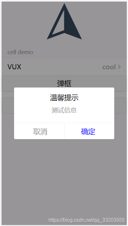
两种方式调用。效果无差异,显然以插件方式调用简便很多


 扫一扫
扫一扫


 2784
2784

 被折叠的 条评论
为什么被折叠?
被折叠的 条评论
为什么被折叠?
 到【灌水乐园】发言


