


 该博客记录了CSS的多种用法,包括浏览器前缀、动态设置变量值、绝对相对居中定位、自适应布局、去除浮动、媒体查询、选择器、盒子模型、字体设置、阴影、渐变、旋转、过渡和动画等内容,还提及了部分属性在不同情况下的计算方式。
css记录
浏览器前缀:
-ms-		/* IE 9 */
-webkit-	/* Safari and Chrome */
-o-		/* Opera */
-moz-	/* Firefox */
css动态设置变量值(IE兼容不佳):
/* 回退值 */


:root {
  --main-bg-color: pink;
}

body {
  background-color: var(--main-bg-color, blue);  //blue 是默认值
}
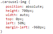
绝对相对居中定位
自适应:
min-width:1200px;
max-width:1440px;
margin:0 auto;
float:left/right;
overflow:hidden;
去除浮动(float):
1、overflow:hidden;
2、增加 div 空标签将其style设置为clear:both;
媒体查询:
1200px到 1440px 宽度 - 添加操作
@media screen and (max-width: 1440px) and (min-width: 1200px){}
选择器:
[class*="col-"]
a.active a:hover:not(.active)
input去除padding而增加长度(盒子模型设置为box-sizing: border-box;去除padding对长度的影响)
input{

box-sizing: border-box;

padding-left: 15px;

}

.login input::-webkit-input-placeholder {
    color: #C8C8C8;
    /* padding-left: 21px; */
}
盒子模型:
box-sizing: border-box;
即:padding不会影响到盒子大小
width(宽) + border(边框) = 元素实际宽度
height(高) + border(边框) = 元素实际高度
默认情况下,元素的宽度与高度计算方式如下:
即:box-sizing:content-box;(默认)
width(宽) + padding(内边距) + border(边框) = 元素实际宽度
height(高) + padding(内边距) + border(边框) = 元素实际高度
字体:
@font-face
{
font-family: myFirstFont;
src: url('/example/css3/Sansation_Light.ttf')
}
div
{
font-family:myFirstFont;
}
css阴影
box-shadow: 10px 10px 5px #888888;
css渐变
background: linear-gradient(red,yellow,blue);
2d旋转
div
{
transform: translate(50px,100px);//左侧移动 50 像素,从顶端移动 100 像素。
transform: rotate(30deg);//正顺负逆
transform: scale(2,4);//X,Y
transform: skew(30deg,20deg);//围绕 X 轴把元素翻转 30 度,围绕 Y 轴翻转 20 度。transform:matrix(0.866,0.5,-0.5,0.866,0,0);//matrix() 方法把所有 2D 转换方法组合在一起。
}
3d旋转
div
{
transform: rotateX(130deg);
transform: rotateY(130deg);
}
css过渡
div
{ width:100px;
height:100px;
transition:width 2s linear 2s;, height 2s linear 2s;, transform 2s linear 2s;
//transition-property: width;transition-duration: 1s;transition-timing-function: linear;transition-delay: 2s;
}
div:hover{
width:300px;
height:300px;
}
css动画
@keyframes myfirst
{
from {background: red;}
to {background: yellow;}
}
div
{
animation: myfirst 5s linear 2s infinite alternate;
//animation-name: myfirst;animation-duration: 5s;animation-timing-function: linear;
//animation-delay: 2s;animation-iteration-count: infinite;animation-direction: alternate;
//animation-play-state: running;
}


 扫一扫
扫一扫


 93
93

 被折叠的 条评论
为什么被折叠?
被折叠的 条评论
为什么被折叠?
 到【灌水乐园】发言


