


效果图: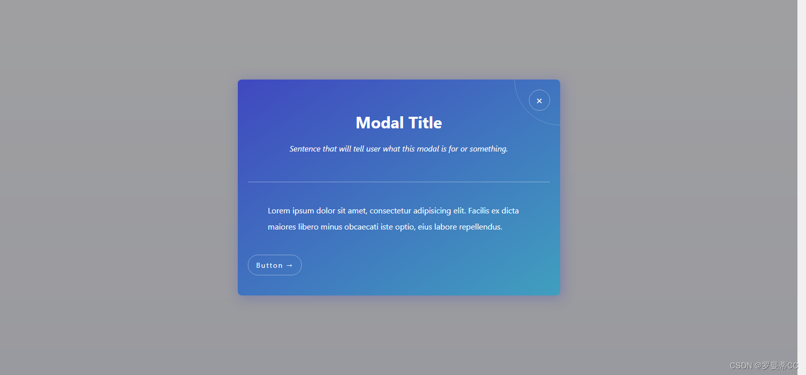
带透明半遮罩效果,有关闭按钮,很不错,能自定义自己的广告标题和内容。
代码如下:
<html>
<head>
<style>
/* defaults */
/* =============================================== */
html {
font-size: 62.5%;
}
body {
--light: hsl(0, 0%, 100%);
--background: linear-gradient(to right bottom, hsl(236, 50%, 50%), hsl(195, 50%, 50%));
display: flex;
flex-direction: column;
justify-content: center;
align-items: center;
font-family: -apple-system, BlinkMacSystemFont, 'Segoe UI', 'Open Sans', sans-serif;
min-height: 100vh;
background: linear-gradient(to bottom, hsl(236, 50%, 98%), hsl(236, 50%, 94%));
}
a,
a:link {
font-family: inherit;
text-decoration: none;
}
/* modal */
/* =============================================== */
.modal-container {
position: fixed;
top: 0;
left: 0;
z-index: 10;
display: flex;
justify-content: center;
align-items: center;
width: 100%;
height: 100%;
background: hsla(0, 0%, 40%, .6);
}
/* using :target */
.modal-container:target {
display: flex;
}
.modal {
width: 60rem;
padding: 4rem 2rem;
border-radius: .8rem;
color: var(--light);
background: var(--background);
box-shadow: .4rem .4rem 2.4rem .2rem hsla(236, 50%, 50%, 0.3);
position: relative;
overflow: hidden;
}
.modal__details {
text-align: center;
margin-bottom: 4rem;
padding-bottom: 4rem;
border-bottom: 1px solid hsla(0, 0%, 100%, .4);
}
.modal__title {
font-size: 3.2rem;
}
.modal__description {
margin-top: 2rem;
font-size: 1.6rem;
font-style: italic;
}
.modal__text {
padding: 0 4rem;
margin-bottom: 4rem;
font-size: 1.6rem;
line-height: 2;
}
.modal__text::before {
content: '';
position: absolute;
top: 0%;
left: 100%;
transform: translate(-50%, -50%);
width: 18rem;
height: 18rem;
border: 1px solid hsla(0, 0%, 100%, .2);
border-radius: 100rem;
pointer-events: none;
}
.modal__btn {
padding: 1rem 1.6rem;
border: 1px solid hsla(0, 0%, 100%, .4);
border-radius: 100rem;
color: inherit;
background: transparent;
font-size: 1.4rem;
font-family: inherit;
letter-spacing: .2rem;
transition: .2s;
cursor: pointer;
}
.modal__btn:hover,
.modal__btn:focus {
border-color: hsla(0, 0%, 100%, .6);
transform: translateY(-.2rem);
}
/* links */
/* =============================================== */
.link-1 {
font-size: 1.8rem;
color: var(--light);
background: var(--background);
box-shadow: .4rem .4rem 2.4rem .2rem hsla(236, 50%, 50%, 0.3);
border-radius: 100rem;
padding: 1.4rem 3.2rem;
transition: .2s;
}
.link-1:hover,
.link-1:focus {
transform: translateY(-.2rem);
box-shadow: 0 0 4.4rem .2rem hsla(236, 50%, 50%, 0.4);
}
.link-2 {
width: 4rem;
height: 4rem;
border: 1px solid hsla(0, 0%, 100%, .4);
border-radius: 100rem;
color: inherit;
font-size: 2.2rem;
position: absolute;
top: 2rem;
right: 2rem;
display: flex;
justify-content: center;
align-items: center;
transition: .2s;
}
.link-2::before {
content: '×';
transform: translateY(-.1rem);
}
.link-2:hover,
.link-2:focus {
border-color: hsla(0, 0%, 100%, .6);
transform: translateY(-.2rem);
}
/* Second Version Link */
/* =============================================== */
.second-version-link,
.second-version-link:link {
color: hsl(236, 50%, 50%);
padding: .8rem 1.6rem .8rem .2rem;
border-bottom: 2px solid hsl(236, 50%, 50%);
font-size: 1.4rem;
font-weight: bold;
position: absolute;
top: 4rem;
right: 4rem;
}
.second-version-link::after {
content: '\2197';
position: absolute;
top: 0;
right: 0;
font-size: .9em;
}
.abs-site-link {
position: fixed;
bottom: 20px;
left: 20px;
color: hsla(0, 0%, 0%, .6);
font-size: 1.6rem;
}
</style>
</head>
<body>
<div class="modal-container" id="modal-opened" style="display: none" >
<div class="modal">
<div class="modal__details">
<h1 class="modal__title">Modal Title</h1>
<p class="modal__description">Sentence that will tell user what this modal is for or something.</p>
</div>
<p class="modal__text">Lorem ipsum dolor sit amet, consectetur adipisicing elit. Facilis ex dicta maiores libero minus obcaecati iste optio, eius labore repellendus.</p>
<button class="modal__btn">Button →</button>
<a href="#modal-closed" onclick="closs()" class="link-2"></a>
</div>
</div>
<script src="https://code.jquery.com/jquery-3.1.1.min.js"></script>
<script>
open();
function closs(){
$("#modal-opened").hide();
}
function open() {
$("#modal-opened").show();
}
</script>
</body>
</html>


 扫一扫
扫一扫


 2258
2258

 被折叠的 条评论
为什么被折叠?
被折叠的 条评论
为什么被折叠?
 到【灌水乐园】发言


