


使用 Google Earth Engine 进行人口增长分析
在这篇博客中,我们将介绍如何使用 Google Earth Engine 处理人口数据,并可视化人口增长。以下是完整的代码及其详细解析。
1. 定义研究区域
首先,我们定义一个点作为研究区域:
var geometry = ee.Geometry.Point([109.67199579055922, 18.943060724859865]);
2. 获取国家边界
使用 FAO GAUL 数据集获取包含该点的国家边界:
var country = ee.FeatureCollection("FAO/GAUL/2015/level1").filterBounds(geometry);
Map.addLayer(country); // 将国家边界添加到地图上
Map.centerObject(geometry, 3); // 设置地图中心
3. 加载人口数据
加载 JRC GHSL 人口数据集,并选择相关波段:
var population = ee.ImageCollection("JRC/GHSL/P2023A/GHS_POP")
  .select('population_count')
  .filterBounds(country)
  .filterDate('1975-01-01', '2030-12-31');
4. 处理人口数据
对人口数据进行处理,裁剪到国家边界并进行简单的数学运算:
population = population.map(function(img) {
  return img.clip(country).multiply(1).subtract(0).add(0).copyProperties(img, ['system:time_start']);
});
5. 打印人口数据集的大小
输出人口数据集的大小,以便了解数据的数量:
print(population.size());
6. 可视化人口数据
将处理后的人口数据添加到地图上,并设置颜色调色板:
Map.addLayer(population.sum(), {min: 0, max: 100, palette: ['000004', '320A5A', '781B6C', 'BB3654', 'EC6824', 'FBB41A', 'FCFFA4']}, 'Population');
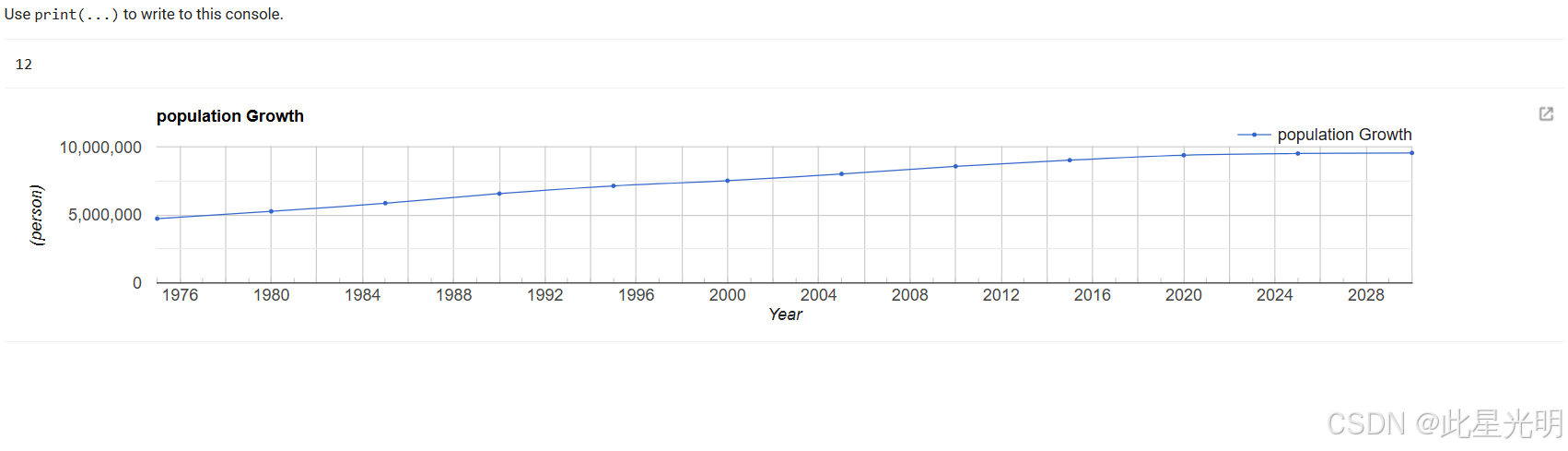
7. 创建人口增长时间序列图表
生成一个时间序列图表,显示人口增长情况:
print(ui.Chart.image.series({
  imageCollection: population,
  region: country,
  reducer: ee.Reducer.sum(),
  scale: 100,
  xProperty: 'system:time_start'
}).setSeriesNames(['Population Growth'])
.setOptions({
  title: 'Population Growth',
  hAxis: {title: 'Year'},
  vAxis: {title: '(person)'},
  interpolateNulls: true,
  lineWidth: 1,
  pointSize: 2,
  curveType: 'function'
}));
8. 创建图例
创建一个图例面板,以便在地图上展示人口增长的颜色表示:
var legend = ui.Panel({
  style: {
    position: 'bottom-right',  // 将面板放置在右下角
    padding: '8px 13px'  // 添加内边距以改善外观
  }
});

// 添加图例标题
var legendTitle = ui.Label({
  value: 'Population Growth',  // 标题文本
  style: {
    fontWeight: 'bold',  // 字体加粗
    fontSize: '18px',  // 设置字体大小
    margin: '0 0 4px 0',  // 设置外边距
    padding: '0'  // 不添加内边距
  }
});

// 将标题添加到图例面板
legend.add(legendTitle);
9. 创建颜色条
创建一个垂直的颜色条,以便在图例中显示颜色渐变:
var makeColorBar = function(palette) {
  var colorBar = ui.Thumbnail({
    image: ee.Image.pixelLonLat().select(1),  // 使用经度作为渐变图像
    params: {
      bbox: [0, 0, 0.1, 1],  // 创建垂直颜色条
      dimensions: '10x100',  // 设置颜色条的大小(10 像素宽,100 像素高)
      format: 'png',  // 图像格式
      min: 0,  // 颜色条的最小值
      max: 1,  // 颜色条的最大值
      palette: palette,  // 使用提供的调色板
    },
    style: {stretch: 'vertical', margin: '8px 0'}  // 垂直拉伸颜色条并添加边距
  });
  return colorBar;  // 返回创建的颜色条
};

// 定义调色板
var palette = ['000004', '320A5A', '781B6C', 'BB3654', 'EC6824', 'FBB41A', 'FCFFA4']; // 调色板颜色

// 创建最小值和最大值标签
var minLabel = ui.Label({
  value: '172',  // 最小值标签
  style: {margin: '4px 8px'}  // 添加边距以改善外观
});
var maxLabel = ui.Label({
  value: '162',  // 最大值标签
  style: {margin: '4px 8px'}  // 添加边距以改善外观
});

// 将最小标签、颜色条和最大标签以垂直布局添加到图例面板
legend.add(minLabel);  // 在顶部添加最小标签
legend.add(makeColorBar(palette));  // 在中间添加颜色条
legend.add(maxLabel);  // 在底部添加最大标签
10. 将图例添加到地图
最后,将图例面板添加到地图上:
Map.add(legend);
总结
通过以上步骤,我们展示了如何使用 Google Earth Engine 进行人口数据的可视化和分析。这些工具使我们能够深入了解人口增长的动态变化,并为未来的研究提供了基础。希望这篇博客能够帮助你更好地掌握这些技术!
```javascript
// 使用 Google Earth Engine 进行人口增长分析

// 1. 定义研究区域
var geometry = ee.Geometry.Point([109.67199579055922, 18.943060724859865]);

// 2. 获取国家边界
var country = ee.FeatureCollection("FAO/GAUL/2015/level1").filterBounds(geometry);
Map.addLayer(country); // 将国家边界添加到地图上
Map.centerObject(geometry, 3); // 设置地图中心

// 3. 加载人口数据
var population = ee.ImageCollection("JRC/GHSL/P2023A/GHS_POP")
  .select('population_count')
  .filterBounds(country)
  .filterDate('1975-01-01', '2030-12-31');

// 4. 处理人口数据
population = population.map(function(img) {
  return img.clip(country).multiply(1).subtract(0).add(0).copyProperties(img, ['system:time_start']);
});

// 5. 打印人口数据集的大小
print(population.size());

// 6. 可视化人口数据
Map.addLayer(population.sum(), {min: 0, max: 100, palette: ['000004', '320A5A', '781B6C', 'BB3654', 'EC6824', 'FBB41A', 'FCFFA4']}, 'Population');

// 7. 创建人口增长时间序列图表
print(ui.Chart.image.series({
  imageCollection: population,
  region: country,
  reducer: ee.Reducer.sum(),
  scale: 100,
  xProperty: 'system:time_start'
}).setSeriesNames(['Population Growth'])
.setOptions({
  title: 'Population Growth',
  hAxis: {title: 'Year'},
  vAxis: {title: '(person)'},
  interpolateNulls: true,
  lineWidth: 1,
  pointSize: 2,
  curveType: 'function'
}));

// 8. 创建图例
var legend = ui.Panel({
  style: {
    position: 'bottom-right',  // 将面板放置在右下角
    padding: '8px 13px'  // 添加内边距以改善外观
  }
});

// 添加图例标题
var legendTitle = ui.Label({
  value: 'Population Growth',  // 标题文本
  style: {
    fontWeight: 'bold',  // 字体加粗
    fontSize: '18px',  // 设置字体大小
    margin: '0 0 4px 0',  // 设置外边距
    padding: '0'  // 不添加内边距
  }
});

// 将标题添加到图例面板
legend.add(legendTitle);

// 创建颜色条
var makeColorBar = function(palette) {
  var colorBar = ui.Thumbnail({
    image: ee.Image.pixelLonLat().select(1),  // 使用经度作为渐变图像
    params: {
      bbox: [0, 0, 0.1, 1],  // 创建垂直颜色条
      dimensions: '10x100',  // 设置颜色条的大小(10 像素宽,100 像素高)
      format: 'png',  // 图像格式
      min: 0,  // 颜色条的最小值
      max: 1,  // 颜色条的最大值
      palette: palette,  // 使用提供的调色板
    },
    style: {stretch: 'vertical', margin: '8px 0'}  // 垂直拉伸颜色条并添加边距
  });
  return colorBar;  // 返回创建的颜色条
};

// 定义调色板
var palette = ['000004', '320A5A', '781B6C', 'BB3654', 'EC6824', 'FBB41A', 'FCFFA4']; // 调色板颜色

// 创建最小值和最大值标签
var minLabel = ui.Label({
  value: '172',  // 最小值标签
  style: {margin: '4px 8px'}  // 添加边距以改善外观
});
var maxLabel = ui.Label({
  value: '162',  // 最大值标签
  style: {margin: '4px 8px'}  // 添加边距以改善外观
});

// 将最小标签、颜色条和最大标签以垂直布局添加到图例面板
legend.add(minLabel);  // 在顶部添加最小标签
legend.add(makeColorBar(palette));  // 在中间添加颜色条
legend.add(maxLabel);  // 在底部添加最大标签

// 将图例面板添加到地图
Map.add(legend);


 被折叠的 条评论
为什么被折叠?
被折叠的 条评论
为什么被折叠?
 到【灌水乐园】发言


