


基于R 4.4.2版本演示
一、写在前面
有不少大佬问做机器学习分类能不能用R语言,不想学Python咯。
答曰:可!用GPT或者Kimi转一下就得了呗。
加上最近也没啥内容写了,就帮各位搬运一下吧。
二、R代码实现随机森林分类
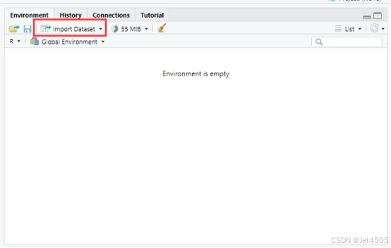
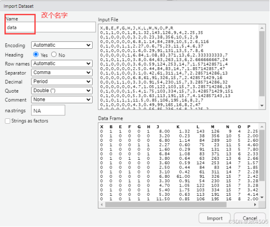
(1)导入数据
我习惯用RStudio自带的导入功能:
(2)建立随机森林模型(默认参数)
# Load necessary libraries
library(caret)
library(pROC)
library(ggplot2)

# Assume 'data' is your dataframe containing the data
# Set seed to ensure reproducibility
set.seed(123)

# Split data into training and validation sets (80% training, 20% validation)
trainIndex <- createDataPartition(data$X, p = 0.8, list = FALSE)
trainData <- data[trainIndex, ]
validData <- data[-trainIndex, ]

# Convert the target variable to a factor for classification
trainData$X <- as.factor(trainData$X)
validData$X <- as.factor(validData$X)

# Define control method for training with cross-validation
trainControl <- trainControl(method = "cv", number = 10)

# Fit Random Forest model on the training set
model <- train(X ~ ., data = trainData, method = "rf", trControl = trainControl)

# Print the best parameters found by the model
best_params <- model$bestTune
cat("The best parameters found are:\n")
print(best_params)

# Predict on the training and validation sets
trainPredict <- predict(model, trainData, type = "prob")[,2]
validPredict <- predict(model, validData, type = "prob")[,2]

# Calculate ROC curves and AUC values
trainRoc <- roc(response = trainData$X, predictor = trainPredict)
validRoc <- roc(response = validData$X, predictor = validPredict)

# Plot ROC curves with AUC values
ggplot(data = data.frame(fpr = trainRoc$specificities, tpr = trainRoc$sensitivities), aes(x = 1 - fpr, y = tpr)) +
  geom_line(color = "blue") +
  geom_area(alpha = 0.2, fill = "blue") +
  geom_abline(slope = 1, intercept = 0, linetype = "dashed", color = "black") +
  ggtitle("Training ROC Curve") +
  xlab("False Positive Rate") +
  ylab("True Positive Rate") +
  annotate("text", x = 0.5, y = 0.1, label = paste("Training AUC =", round(auc(trainRoc), 2)), hjust = 0.5, color = "blue")

ggplot(data = data.frame(fpr = validRoc$specificities, tpr = validRoc$sensitivities), aes(x = 1 - fpr, y = tpr)) +
  geom_line(color = "red") +
  geom_area(alpha = 0.2, fill = "red") +
  geom_abline(slope = 1, intercept = 0, linetype = "dashed", color = "black") +
  ggtitle("Validation ROC Curve") +
  xlab("False Positive Rate") +
  ylab("True Positive Rate") +
  annotate("text", x = 0.5, y = 0.2, label = paste("Validation AUC =", round(auc(validRoc), 2)), hjust = 0.5, color = "red")

# Calculate confusion matrices based on 0.5 cutoff for probability
confMatTrain <- table(trainData$X, trainPredict >= 0.5)
confMatValid <- table(validData$X, validPredict >= 0.5)

# Function to plot confusion matrix using ggplot2
plot_confusion_matrix <- function(conf_mat, dataset_name) {
  conf_mat_df <- as.data.frame(as.table(conf_mat))
  colnames(conf_mat_df) <- c("Actual", "Predicted", "Freq")

  p <- ggplot(data = conf_mat_df, aes(x = Predicted, y = Actual, fill = Freq)) +
    geom_tile(color = "white") +
    geom_text(aes(label = Freq), vjust = 1.5, color = "black", size = 5) +
    scale_fill_gradient(low = "white", high = "steelblue") +
    labs(title = paste("Confusion Matrix -", dataset_name, "Set"), x = "Predicted Class", y = "Actual Class") +
    theme_minimal() +
    theme(axis.text.x = element_text(angle = 45, hjust = 1), plot.title = element_text(hjust = 0.5))

  print(p)
}

# Now call the function to plot and display the confusion matrices
plot_confusion_matrix(confMatTrain, "Training")
plot_confusion_matrix(confMatValid, "Validation")

# Extract values for calculations
a_train <- confMatTrain[1, 1]
b_train <- confMatTrain[1, 2]
c_train <- confMatTrain[2, 1]
d_train <- confMatTrain[2, 2]

a_valid <- confMatValid[1, 1]
b_valid <- confMatValid[1, 2]
c_valid <- confMatValid[2, 1]
d_valid <- confMatValid[2, 2]

# Training Set Metrics
acc_train <- (a_train + d_train) / sum(confMatTrain)
error_rate_train <- 1 - acc_train
sen_train <- d_train / (d_train + c_train)
sep_train <- a_train / (a_train + b_train)
precision_train <- d_train / (b_train + d_train)
F1_train <- (2 * precision_train * sen_train) / (precision_train + sen_train)
MCC_train <- (d_train * a_train - b_train * c_train) / sqrt((d_train + b_train) * (d_train + c_train) * (a_train + b_train) * (a_train + c_train))
auc_train <- roc(response = trainData$X, predictor = trainPredict)$auc

# Validation Set Metrics
acc_valid <- (a_valid + d_valid) / sum(confMatValid)
error_rate_valid <- 1 - acc_valid
sen_valid <- d_valid / (d_valid + c_valid)
sep_valid <- a_valid / (a_valid + b_valid)
precision_valid <- d_valid / (b_valid + d_valid)
F1_valid <- (2 * precision_valid * sen_valid) / (precision_valid + sen_valid)
MCC_valid <- (d_valid * a_valid - b_valid * c_valid) / sqrt((d_valid + b_valid) * (d_valid + c_valid) * (a_valid + b_valid) * (a_valid + c_valid))
auc_valid <- roc(response = validData$X, predictor = validPredict)$auc

# Print Metrics
cat("Training Metrics\n")
cat("Accuracy:", acc_train, "\n")
cat("Error Rate:", error_rate_train, "\n")
cat("Sensitivity:", sen_train, "\n")
cat("Specificity:", sep_train, "\n")
cat("Precision:", precision_train, "\n")
cat("F1 Score:", F1_train, "\n")
cat("MCC:", MCC_train, "\n")
cat("AUC:", auc_train, "\n\n")

cat("Validation Metrics\n")
cat("Accuracy:", acc_valid, "\n")
cat("Error Rate:", error_rate_valid, "\n")
cat("Sensitivity:", sen_valid, "\n")
cat("Specificity:", sep_valid, "\n")
cat("Precision:", precision_valid, "\n")
cat("F1 Score:", F1_valid, "\n")
cat("MCC:", MCC_valid, "\n")
cat("AUC:", auc_valid, "\n")(3)SHAP(Kimi解决方案)
看看Kimi的解决方案怎么样:
咒语如下:

我让Kimi把SHAP的代码单独隔离出来:
# SHAP analysis starts here
library(SHAP)

# Calculate SHAP values for the training set
shap_values_train <- shap(model, trainData)

# Plot the SHAP summary plot for the training set
shap.summaryPlot(shap_values_train, trainData)

# Calculate SHAP values for the validation set
shap_values_valid <- shap(model, validData)

# Plot the SHAP summary plot for the validation set
shap.summaryPlot(shap_values_valid, validData)

# Plot the SHAP dependence plot for each feature
# Assuming 'feature_names' is a vector of all feature names in your dataset
feature_names <- names(trainData)[names(trainData) != "X"] # Replace "X" with your target variable name
for (feature in feature_names) {
  shap.dependencePlot(shap_values_train, trainData, feature)
}
然后发现被骗了啊,哪里有SHAP这个包,笑死了。
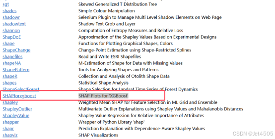
我查了R语言官网的包列表,只有一个SHAPforxgboost包,是SHAP Plots for 'XGBoost':
再去问Kimi,它已经自行崩溃了。其实上图就有答案的嘛:Wrapper of Python Library 'shap',叫做shapper的包。
(4)SHAP(GPT-4解决方案)
代码是给了:
# SHAP-related Code
# Use the shapper package for SHAP explanations
explainer <- DALEX::explain(model = model$finalModel,
                            data = trainData[, -which(names(trainData) == "X")],
                            y = as.numeric(trainData$X),
                            label = "Random Forest")

# Generate SHAP values for a specific observation
shap_values <- shap(explainer, new_observation = trainData[1, -which(names(trainData) == "X")])

# Visualize SHAP values
# 1. SHAP summary plot
plot(shap_values)

# 2. SHAP dependence plot
plot(shap_values, type = "dependence", variable = "FeatureName")  # Replace "FeatureName" with your desired feature

# 3. Force plot
plot(shap_values, type = "force")
但是悲剧了:
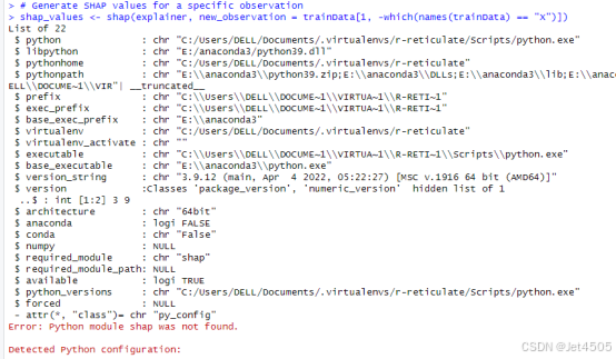
我就有预感,得调用Python来实现SHAP,跟GPT-4确认一下,果然:
---------------------------------------------------------------
是的,shapper包依赖于Python中的shap模块来计算SHAP值。因此,您需要:
1. 安装Python
如果您的系统尚未安装Python,您需要先安装它:
到 Python官网 下载适合您系统的版本(建议Python 3.9或以上)。
在安装时,确保勾选“Add Python to PATH”选项,以便系统可以识别Python命令。
2. 配置R和Python的集成
在R中使用reticulate包可以连接到Python环境。按照以下步骤操作:
a. 确保R识别Python
复制代码
library(reticulate)
use_python("C:/Path/To/Your/Python", required = TRUE) # 替换为Python的实际安装路径
b. 创建虚拟环境(推荐)
使用虚拟环境隔离Python依赖:
复制代码
virtualenv_create("r-reticulate")
或者如果您使用的是Anaconda:
复制代码
conda_create("r-reticulate")
3. 安装shap模块
激活虚拟环境并安装所需模块:
复制代码
virtualenv_install("r-reticulate", packages = c("shap", "numpy", "scipy"))
如果您使用Anaconda环境:
复制代码
conda_install("r-reticulate", packages = c("shap", "numpy", "scipy"))
4. 检查安装是否成功
测试是否成功加载shap模块:
复制代码
py_run_string("import shap")
5. 运行代码
确认shap模块安装完成后,您可以继续运行shapper代码生成SHAP可视化。
6. 如果需要自动化
如果不希望手动安装和配置,可以安装R中替代SHAP计算的包,例如iml,但效果可能略有不同。如果需要进一步帮助,请随时告诉我!
---------------------------------------------------------------
还得去配置Python,那不如直接取用Python?
不过也得试试他推荐的iml咯:
# SHAP-like interpretations using the iml package
library(iml)  # For SHAP-like interpretations

# Convert the Random Forest model to an iml Predictor object
predictor <- Predictor$new(model = model$finalModel,
                           data = trainData[, -which(names(trainData) == "X")],
                           y = as.numeric(trainData$X))

# Calculate feature importance
importance <- FeatureImp$new(predictor, loss = "ce")

# Plot feature importance
plot(importance)

# SHAP values for a specific observation
shapley <- Shapley$new(predictor, x.interest = trainData[1, -which(names(trainData) == "X")])

# Plot SHAP values
plot(shapley)

# SHAP dependence plot for a specific feature
dependence <- FeatureEffect$new(predictor, feature = "R", method = "pdp")  # Replace "FeatureName" with the actual feature name
plot(dependence)
我们看看结果:
# SHAP-like interpretations using the iml package
library(iml)  # For SHAP-like interpretations
# Convert the Random Forest model to an iml Predictor object
predictor <- Predictor$new(model = model$finalModel,
                           data = trainData[, -which(names(trainData) == "X")],
                           y = as.numeric(trainData$X))
# Calculate feature importance
importance <- FeatureImp$new(predictor, loss = "ce")
# Plot feature importance
plot(importance)
# SHAP values for a specific observation
shapley <- Shapley$new(predictor, x.interest = trainData[1, -which(names(trainData) == "X")])
# Plot SHAP values
plot(shapley)
# SHAP dependence plot for a specific feature
dependence <- FeatureEffect$new(predictor, feature = "R", method = "pdp")  # Replace "FeatureName" with the actual feature name
plot(dependence)
看看结果:
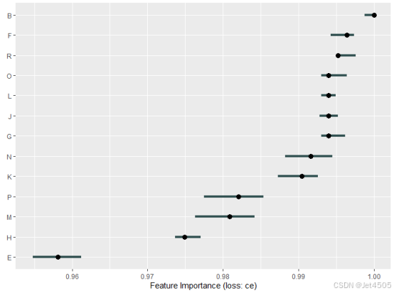
(1)特征重要性图(Feature Importance Plot),没啥好说的:
(2)SHAP值图(SHAP Values Plot):
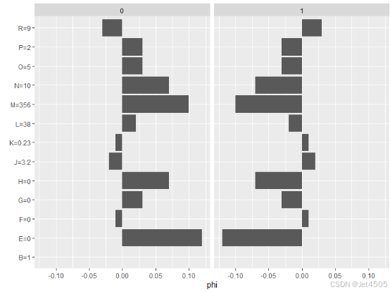
输出图解释:
横轴(SHAP值): 表示每个特征对单个观察值的预测贡献,正值表示提高预测概率,负值表示降低预测概率。
纵轴(Features): 列出每个特征。
Base Value(基础值): 模型未考虑任何特征时的平均预测值。
预测解释:
通过图中每个特征的SHAP值,可以看到特定观察值的预测是如何由不同特征的贡献叠加而成。
例如,特征 Age 的 SHAP 值为 +0.15,说明它使预测概率增加了 0.15。
(3)特征依赖图(Feature Dependence Plot)
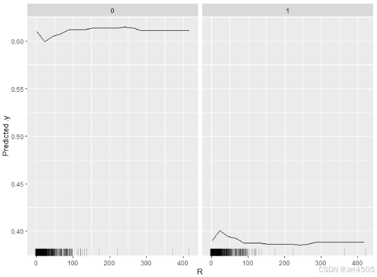
输出图解释:
横轴(Feature Value): 选定特征的值范围。
纵轴(Model Prediction): 该特征值对模型预测的影响。
用途: 观察单个特征如何影响预测结果,帮助理解特征与预测目标之间的关系。
如果曲线是单调的,说明特征对预测的影响是单调的(例如,特征值越大,预测越高)。
三、最后
画不出那种标准的SHAP的红红绿绿的图,恕我直言,直接去用Python吧。
数据还是那个例子:
链接:https://pan.baidu.com/s/1rEf6JZyzA1ia5exoq5OF7g?pwd=x8xm
提取码:x8xm


 被折叠的 条评论
为什么被折叠?
被折叠的 条评论
为什么被折叠?
 到【灌水乐园】发言


