<ion-header-bar align-title="center " class="title-bgc" style="background-image: url('img/title.jpg'); ">
<button class="button button-icon communal-button" ng-click="$ionicGoBack()"><img src="img/icon-back.png">返回
</button>
<div class="h1 title communal-title">缴费详情</div>
<p class="communal-city">{{addressCity}}</p>
</ion-header-bar>
<ion-view>
<ion-content has-bouncing="true" scroll="false" class="communal-content">
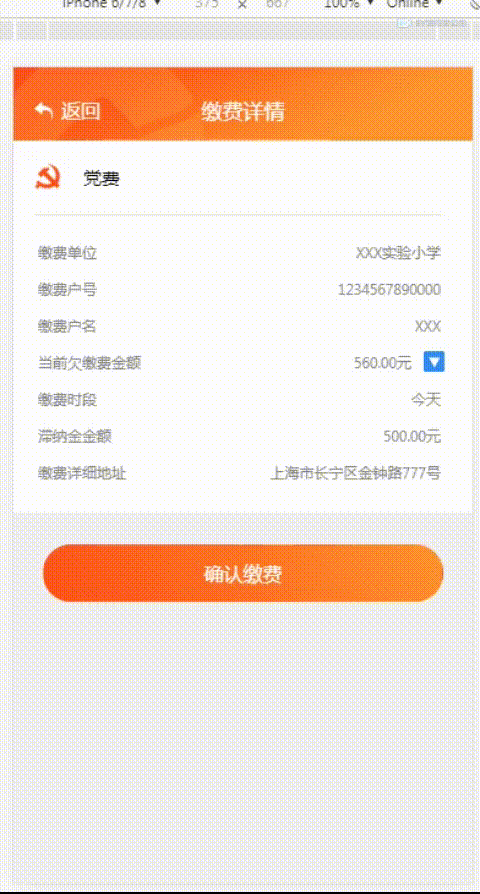
<div class="payment-details">
<img ng-src="{{paymentList.imgURL}}">
<span>{{paymentList.name}}</span>
</div>
<div>
<hr style="width: 91%;opacity: 0.2;margin-top: 10px;margin-left: 7px;">
<ul style=" padding: 7px 10px 18px; font-size: 12px; color: #888;">
<li style="padding: 5px 0;" ng-repeat="item in paymentDetailsList" >{{item.paymentDetailsTitle}}
<p style=" text-align: right; margin: -20px 16px 0px 0px;"
ng-if="item.paymentDetailsTitle != '当前欠缴费金额'">{{item.paymentDetailsValue}}</p>
<p style=" text-align: right; margin: -20px 40px 0px 0px;"
ng-if="item.paymentDetailsTitle == '当前欠缴费金额'">{{item.paymentDetailsValue}}</p>
<button ng-if="item.paymentDetailsTitle == '当前欠缴费金额'" class="img-payment" id="imgBottom" ng-click="openArrears()">
<img src="img/ArrearsPic.png">
</button>
</li>
</ul>
</div>
<div style="" id="arrearsModal">
<div class="list card">
<div class="item item-body">
<li class="row" ng-repeat="item in arrearsDetailsList">
<span class="col col-50" style="text-align: right;">{{item.arrearsDetailsTitle}}:</span>
<span class="col col-50" style=" text-align: right; padding: 5px 13px 5px 0;">{{item.arrearsDetailsValue}}</span>
</li>
</div>
</div>
</div>
<button class="button button-block next-button" style="top: 4px;" ui-sref="home">
确认缴费
</button>
</ion-content>
</ion-view>
var arrearsModal = document.getElementById('arrearsModal');
console.log(arrearsModal);
$scope.openArrears = function (index) {
var imgBottom = document.getElementById('imgBottom');
var imgBottomFa = imgBottom.parentNode;
console.log(imgBottom);
console.log(arrearsModal);
if (arrearsModal.classList.contains('arrearsModal-play-first')) {
arrearsModal.className = 'arrearsModal-play-second';
imgBottomFa.className = 'imgBottom-play-second';
} else {
arrearsModal.className = 'arrearsModal-play-first';
imgBottomFa.className = 'imgBottom-play-first';
}
}
#arrearsModal {
width: 200px;
position: absolute;
right: -4px;
top: 155px;
padding: 16px;
opacity: 0;
}
#arrearsModal .item-body {
margin: 0;
list-style: none;
padding: 5px 0;
font-size: 12px;
color: #888;
}
.arrearsModal-play-first {
animation: arrearsModalShow 1s;
animation-fill-mode: forwards;
-webkit-animation: arrearsModalShow 1s;
-webkit-animation-fill-mode: forwards;
}
.arrearsModal-play-second {
animation: arrearsModalHide 1s;
animation-fill-mode: forwards;
-webkit-animation: arrearsModalHide 1s;
-webkit-animation-fill-mode: forwards;
}
@keyframes arrearsModalShow {
from {
top: 110px;
opacity: 0;
transform:rotateX(90deg);
}
to {
top: 155px;
opacity: 1;
transform:rotateX(0deg);
}
}
@-webkit-keyframes arrearsModalShow
{
from {
top: 110px;
opacity: 0;
-webkit-transform:rotateX(90deg);
}
to {
top: 155px;
-webkit-transform:rotateX(0deg);
opacity: 1;
}
}
@keyframes arrearsModalHide {
from {
top: 155px;
transform:rotateX(0deg);
opacity: 1;
}
to {
top: 110px;
transform:rotateX(90deg);
opacity: 0;
}
}
@-webkit-keyframes arrearsModalHide
{
from {
top: 155px;
-webkit-transform:rotateX(0deg);
opacity: 1;
}
to {
top: 110px;
-webkit-transform:rotateX(90deg);
opacity: 0;
}
}
.imgBottom-play-first {
animation: imgBottomShow 1s;
animation-fill-mode: forwards;
-webkit-animation: imgBottomShow 1s;
-webkit-animation-fill-mode: forwards;
}
.imgBottom-play-second {
animation: imgBottomHide 1s;
animation-fill-mode: forwards;
-webkit-animation: imgBottomHide 1s;
-webkit-animation-fill-mode: forwards;
}
@keyframes imgBottomShow {
from {
padding: 5px 0;
}
to {
padding: 5px 0 90px 0;
}
}
@-webkit-keyframes imgBottomShow
{
from {
padding: 5px 0;
}
to {
padding: 5px 0 90px 0;
}
}
@keyframes imgBottomHide {
from {
padding: 5px 0 90px 0;
}
to {
padding: 5px 0;
}
}
@-webkit-keyframes imgBottomHide
{
from {
padding: 5px 0 90px 0;
}
to {
padding: 5px 0;
}
}


 本文深入探讨了CSS3的3D旋转特性,讲解如何利用此特性实现元素的动态显示和隐藏,提升网页交互体验。通过实例代码,详细解析关键属性如`transform`和`perspective`的应用。


 扫一扫
扫一扫


 1万+
1万+

 被折叠的 条评论
为什么被折叠?
被折叠的 条评论
为什么被折叠?
 到【灌水乐园】发言


