


ArkUI-GridRow 详解
栅格布局可以为布局提供规律性的结构,解决多尺寸多设备的动态布局问题,保证不同设备上各个模块的布局一致性。
栅格容器组件,仅可以和栅格子组件(GridCol)在栅格布局场景中使用。
- 接口: GridRow(option?: GridRowOptions)
GridRowOptions 的属性说明
-
columns: 列数
-
direction: 方向
-
span属性说明
xs	Length	否	在最小宽度类型设备上,栅格子组件的间距。
sm	Length	否	在小宽度类型设备上,栅格子组件的间距。
md	Length	否	在中等宽度类型设备上,栅格子组件的间距。
lg	Length	否	在大宽度类型设备上,栅格子组件的间距。
xl	Length	否	在特大宽度类型设备上,栅格子组件的间距。
xxl	Length	否	在超大宽度类型设备上,栅格子组件的间距。
  // 启用xs、sm、md共3个断点
  breakpoints: {value: ["100vp", "200vp"]}
  // 启用xs、sm、md、lg共4个断点,断点范围值必须单调递增
  breakpoints: {value: ["320vp", "600vp", "840vp"]}
  // 启用xs、sm、md、lg、xl共5个断点,断点范围数量不可超过断点可取值数量-1
  breakpoints: {value: ["320vp", "600vp", "840vp", "1080vp"]}
具体案例
export class Item {
  title: number = 0
  hasCode: string = ''
  index: number = 0

  constructor(title: number, index: number) {
    this.title = title ?? 0
    this.hasCode = Math.random().toString()
    this.index = index
  }
}
@Entry
@Component
struct ColorPreview {
@State items: Item[] = []
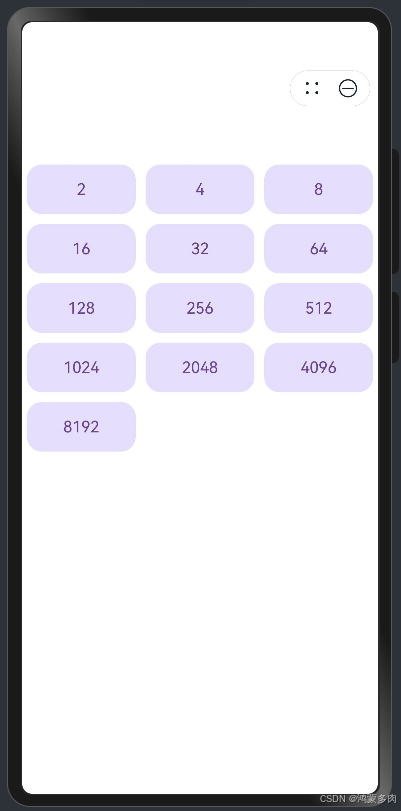
/// 展示 2 4 8 16 ... 1024
onPageShow(): void {
for (let i = 0; i < 16; i++) {
let v = Math.pow(2, i)
let item = new Item(v,i)
this.items.push(item)
}
}
build() {
Scroll() {
Column() {
GridRow({ columns: 3, direction: GridRowDirection.Row }) {
ForEach(this.items,(item: Item) => {
GridCol({span:{xs:10, sm: 1, md: 12,lg:20}}) {
Text(item.titleStr())
.fontColor(0x7947A0)
.textAlign(TextAlign.Center)
.width('100%')
.height('60vp')
.backgroundColor(0xEAE0FF)
.border({width: 5, color: Color.White,radius: 20})
}
})
}
}
// .padding(20)
.padding({top: 100})
.height('100%')
}
}
}
- 效果如下


 扫一扫
扫一扫


 被折叠的 条评论
为什么被折叠?
被折叠的 条评论
为什么被折叠?
 到【灌水乐园】发言


