


<!DOCTYPE html>
<html lang="en">
<head>
    <meta charset="UTF-8">
    <meta name="viewport" content="width=device-width, initial-scale=1.0">
    <meta http-equiv="X-UA-Compatible" content="ie=edge">
    <title>Document</title>
    <style>
        .DiSe{
            width: 288px;
            height: 435px;
            /* background-color: yellowgreen; */
            /* border: 1px solid black; */
            margin: auto;
            position: relative;
        }
        .TouFa{
            width: 57px;
            height: 57px;

            border-radius: 50%;
            position:absolute;
            top: 20px;
            /* transform: rotateZ(90deg); */
            transform-origin: 10px;
            animation:  toufax1 3s infinite;
        }
        .TouFa2{
            width: 57px;
            height: 57px;

            border-radius: 50%;
            position:absolute;
            top: 29px;
            /* transform: rotateZ(90deg); */
            transform-origin: 10px;
            animation:  toufax2 3s infinite;
        }

        .ShenTi{
            width: 184px;
            height: 293px;
            background-color: yellow;
            /* 使用像素比百分比更像 */
            border-radius: 90px;
            position:absolute;
            left:52px ;
            top: 48px;
            border: 3px black solid;
        }
        .Shou{
            width: 100px;
            height: 40px;
            border: 3px black solid;
            border-radius: 14px;
            background-color: yellow;
            position:absolute;
            top: 200px;
        }
        .HeiYin{
            width: 0;
            height: 0;
            border: 5px solid black;
            position: relative;
        }
        .Tui{
            width: 29px;
            height: 20px;
            background-color: black;
            position:absolute;
        }
        .Jiao{
            width: 59px;
            height: 28px;
            background-color: black;
            position:absolute;
            top: 361px;
        }


        .KuCha{
            width: 180px;
            height: 74px;
            background-color: blue;
            border-bottom-left-radius: 90px;
            border-bottom-right-radius: 90px;
            position:absolute;
            top: 219px;
            border: 3px black solid;
            /* border-top: 0; */
        }
        .KuCha1{
            width: 113px;
            height: 40px;
            background-color: blue;
            position:absolute;
            top:179px;
            left: 34px;
            border: 3px black solid;
            border-bottom: 0;
        }
        .KuChaBeiDai{
            width: 19px;
            height: 75px;
            background-color: blue;
            border:3px black solid;
            position:absolute;
            top: 136px;

        }
        .BeiDaiKou{
            width: 10px;
            height: 10px;
            border-radius: 50%;
            background-color: black;
            margin: 0 auto;
            position: relative;
            top: 60px;
        }
        .Zui{
            width: 80px;
            height: 40px;
            background-color: white;
            position:absolute;
            top: 127px;
            left: 57px;
            border-bottom-left-radius: 252px;
            transform: rotate(-25deg);
            border: 3px black solid;
            border-top: 0;
            border-right: 0;
        }
        .Zui1{
            width: 92px;
            height: 40px;
            background-color:yellow;
            position:absolute;
            top: 106px;
            left: 53px;
            border-bottom: 3px black solid;
        }
        .YanJingKuang{
	       width: 20px;
	       height: 40px;
	       background-color: black;
	       position: absolute;
	       top: 50px;
        }

        .YanJing{
            width: 65px;
            height: 65px;
            border-radius: 50%;
            background-color: white;
            border: 3px black solid;
            position:absolute;
            top:45px;

        }
        .YanZhu{
            width: 35px;
            height: 35px;
            background-color: black;
            border-radius: 50%;
            position: relative;
            left: 15px;
            top: 15px;
            animation: yanjingx 3s infinite ;
        }
        .Guang{
            width: 15px;
            height: 15px;
            background-color: white;
            border-radius: 50%;
            position: relative;
            top: 10px;
        }

        @keyframes toufax1{
            0%{
                top: 20px;
            }
            50%{
                top: 28px;
            }
            100%{
                top: 20px;
            }
        }
        @keyframes toufax2{
            0%{
                top: 29px;
            }
            50%{
                top: 37px;
            }
            100%{
                top: 29px;
            }
        }
        @keyframes yanjingx{
            0%{
                left: 0;
            }
            50%{
                left: 25px;
            }
            100%{
                left: 0;;
            }
        }
    </style>
</head>
<body>
    <div class="DiSe">
        <div class="TouFa" style="left: 100px; background-color: black;transform: rotate(340deg);"></div>
        <div class="TouFa" style="left:96px; background-color: white;" ></div>
        <div class="TouFa2" style="left: 100px; background-color: black;transform: rotate(340deg);"></div>
        <div class="TouFa2" style="left:96px; background-color: white;" ></div>
        <div class="Shou" style="transform:rotate(290deg);left: 10px;">
            <div class="HeiYin" style="left:30px;top:10px"></div>
        </div>
        <div class="Shou" style="transform:rotate(70deg);left: 180px;">
            <div class="HeiYin" style="left:54px;top:10px"></div>
        </div>
        <div class="Tui" style="left: 115px;top: 343px;"></div>
        <div class="Tui" style="left: 150px;top: 343px;"></div>
        <div class="Jiao" style="left: 85px;border-top-left-radius: 20px;border-bottom-left-radius: 20px;"></div>
        <div class="Jiao" style="left: 150px;border-top-right-radius: 20px;border-bottom-right-radius: 20px;"></div>

        <div class="ShenTi">

           <div class="Zui"></div>
           <div class="Zui1"></div>

           <div class="YanJingKuang" style="
           transform: rotate(120deg);
           left: 8px;"></div>
           <div class="YanJingKuang" style="
           transform: rotate(240deg);
           left: 154px;"></div>


            <div class="KuCha"></div>
            <div class="KuCha1"></div>
            <div class="KuChaBeiDai" style="transform: rotate(307deg);left: 13px;">
                <div class="BeiDaiKou"></div>
            </div>
            <div class="KuChaBeiDai" style="transform: rotate(53deg);left: 146px;">
                 <div class="BeiDaiKou"></div>
            </div>
            <div class="YanJing" style=" left: 20px;">
                <div class="YanZhu">
                    <div class="Guang" style="left: 15px;"></div>
                </div>
            </div>
            <div class="YanJing" style=" left: 89px;">
                 <div class="YanZhu">
                    <div class="Guang" style="left:5px;"></div>
                 </div>
            </div>
        </div>
    </div>
</body>
</html>
原图: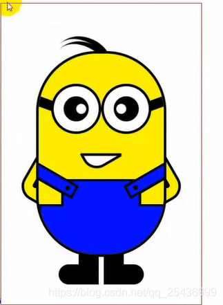 知识点包括:盒子模型 定位 旋转 图层 动画 花了3个小时20分钟。
难点是头发和手:头发是两个圆遮盖出来的,然后头发的那个圆还要设置原点旋转,手就是长方形被旋转被遮盖。
效果图:
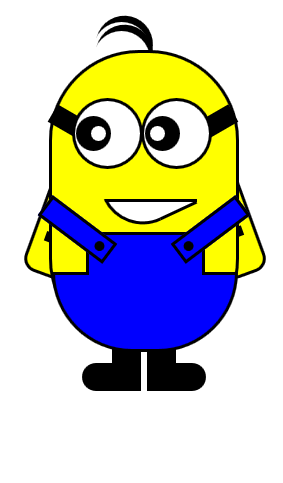 眼睛左右动,头发上下动。这边的宽高是用qq截图确定的,看视频学习有时候会学到一些小技巧,就这很舒服。


 扫一扫
扫一扫


 3195
3195

 被折叠的 条评论
为什么被折叠?
被折叠的 条评论
为什么被折叠?
 到【灌水乐园】发言


