


源数据文件(下岗数据)链接:https://pan.baidu.com/s/1JjaCdPKe704oWNjMUKiBuw?pwd=pyth
提取码:pyth
数据导入,数据形式查看
import pandas as pd
unrate = pd.read_csv('unrate.csv')
unrate['DATE'] = pd.to_datetime(unrate['DATE'])
print(unrate.head(12))
'''
         DATE  VALUE
0  1948-01-01    3.4
1  1948-02-01    3.8
2  1948-03-01    4.0
3  1948-04-01    3.9
4  1948-05-01    3.5
5  1948-06-01    3.6
6  1948-07-01    3.6
7  1948-08-01    3.9
8  1948-09-01    3.8
9  1948-10-01    3.7
10 1948-11-01    3.8
11 1948-12-01    4.0
'''
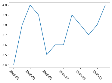
x轴展示数据可以旋转
#While the y-axis looks fine, the x-axis tick labels are too close together and are unreadable
#We can rotate the x-axis tick labels by 90 degrees so they don't overlap
#We can specify degrees of rotation using a float or integer value.
plt.plot(first_twelve['DATE'], first_twelve['VALUE'])
plt.xticks(rotation=-45)#旋转度数
#print help(plt.xticks)
plt.show()
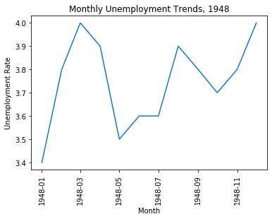
图的标题,x、y轴名称
#xlabel(): accepts a string value, which gets set as the x-axis label.
#ylabel(): accepts a string value, which is set as the y-axis label.
#title(): accepts a string value, which is set as the plot title.

plt.plot(first_twelve['DATE'], first_twelve['VALUE'])
plt.xticks(rotation=90)
plt.xlabel('Month')#x轴名称
plt.ylabel('Unemployment Rate')#y轴名称
plt.title('Monthly Unemployment Trends, 1948')#标题
plt.show()
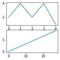
在figure中画子图
import numpy as np
fig = plt.figure()
fig = plt.figure(figsize=(3, 3))#两个参数,左为宽,右为高,单位是英寸
ax1 = fig.add_subplot(2,1,1)#fig的子图,两行一列,ax1占据位置1
ax2 = fig.add_subplot(2,1,2)

ax1.plot(np.random.randint(1,5,5), np.arange(5))
ax2.plot(np.arange(10)*3, np.arange(10))
plt.show()
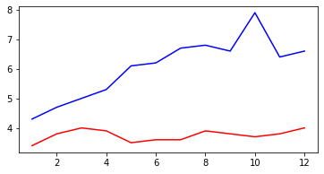
多个折线可以画在一个图中
unrate['MONTH'] = unrate['DATE'].dt.month#提取月份,在后续绘图时作为x轴参数
fig = plt.figure(figsize=(6,3))#宽6英寸,高3英寸
plt.plot(unrate[0:12]['MONTH'], unrate[0:12]['VALUE'], c='red')
plt.plot(unrate[12:24]['MONTH'], unrate[12:24]['VALUE'], c='blue')
plt.show()
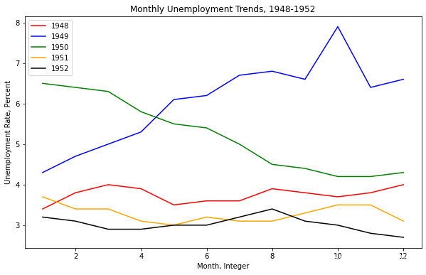
每条线都可以有自己的标题(标记),没有标记,不知线条是何含义。需使用plot的label参数与legend配合使用。
fig = plt.figure(figsize=(10,6))
colors = ['red', 'blue', 'green', 'orange', 'black']
for i in range(5):
    start_index = i*12
    end_index = (i+1)*12
    subset = unrate[start_index:end_index]
    label = str(1948 + i)
    plt.plot(subset['MONTH'], subset['VALUE'], c=colors[i], label=label)#lable是此图中左上角的标记,需配合plt.legend使用
plt.legend(loc='upper left')#除了自行选择最合适位置放置标记,还可以指定位置,如upper left', 'upper right', 'lower left', 'lower right'
plt.xlabel('Month, Integer')
plt.ylabel('Unemployment Rate, Percent')
plt.title('Monthly Unemployment Trends, 1948-1952')
plt.show()


 被折叠的 条评论
为什么被折叠?
被折叠的 条评论
为什么被折叠?
 到【灌水乐园】发言


