


考试需求
- 在
index.html文件<style>中加入下述@media媒体查询规则。 - 当屏幕宽度
max-width为1400px时,页面效果如下(不包括图上尺寸标记)。

- 当屏幕宽度
max-width为900px时,页面效果如下(不包括图上尺寸标记)。
当屏幕宽度
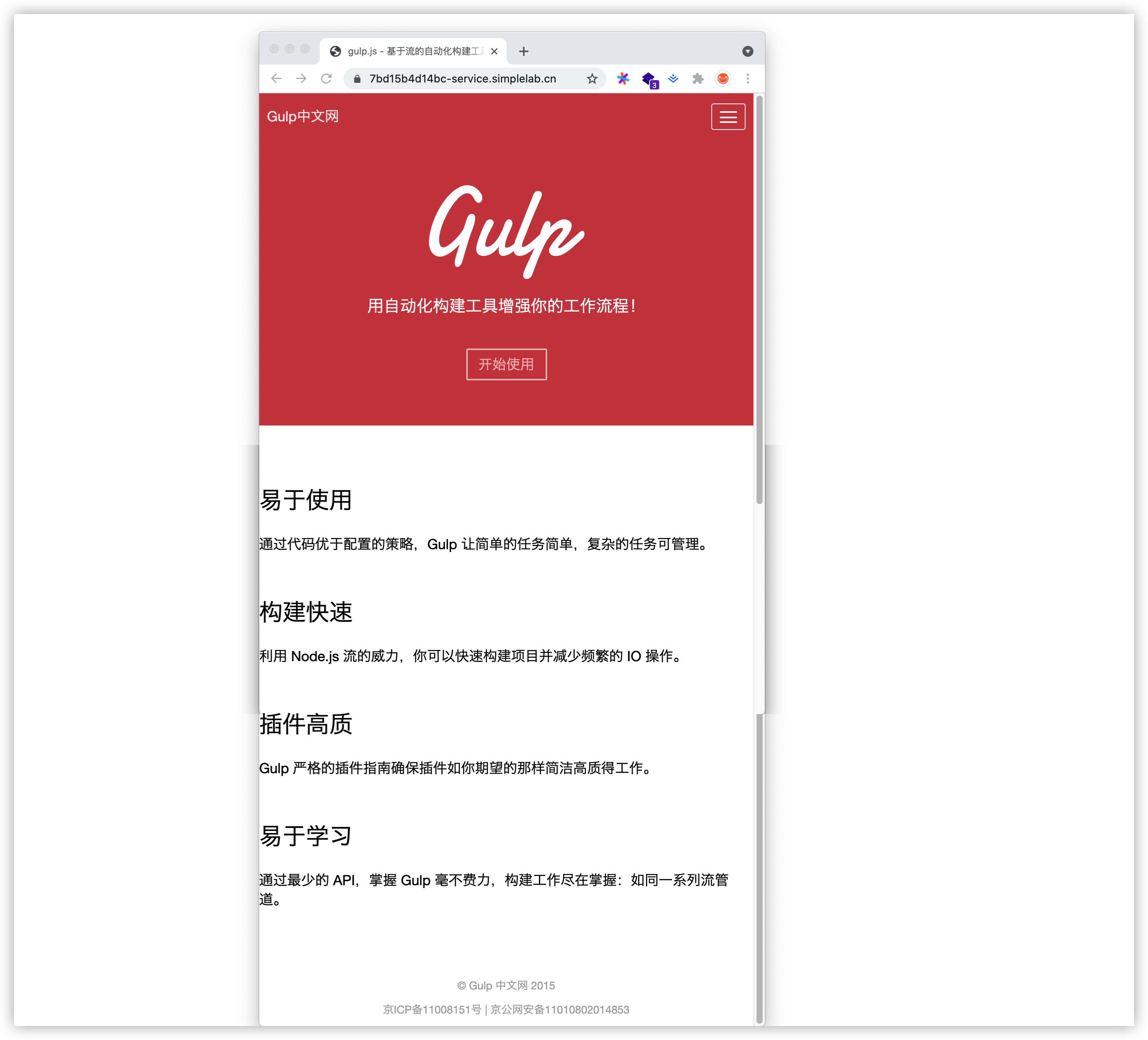max-width为650px时,头部导航隐藏,并在右侧显示图标,底部列表的宽度为 100% ,页面效果如下。
解决办法
在头部的style中设置 @media screen and ( max-width: XXXpx ) 媒体查询规则对应的css布局即可
参考代码
index.html
<!DOCTYPE html>
<html>
    <head>
        <meta charset="utf-8">
        <meta name="viewport" content="width=device-width, initial-scale=1.0, maximum-scale=1.0, user-scalable=no">
        <title>gulp.js - 基于流的自动化构建工具。 | gulp.js 中文网</title>
        <link rel="stylesheet" href="css/reset.css">
        <style media="screen">
            body {
                font-family: "Helvetica Neue", "Helvetica", "Lucida Grande", "Arial", "Hiragino Sans GB", "Microsoft Yahei", "WenQuanYi Micro Hei", "sans-serif";
                font-weight: normal;
            }
            .container > nav {
                position: fixed;
                top: 0;
                left: 0;
                width: 100%;
                height: 51px;
                background-color: #CD4749;
            }

            main header {
                height: 427px;
                background-color: #CD4749;
                text-align: center;
            }
            main header img {
                margin-top: 118px;
                width: 200px;
            }
            main header h3 {
                color: white;
                margin-top: 16px;
                font-size: 21px;
                font-weight: 200;
            }
            main header div:last-child {
                margin-top: 45px;
            }
            main header span {
                color: #efbfbf;
                box-shadow: inset 0 0 0 2px #efbfbf;
                border-radius: 2px;
                background-color: transparent;
                padding: 10px 16px;
                font-size: 18px;
            }
            main header span:hover {
                color: white;
                box-shadow: inset 0 0 0 2px white;
                border-color: white;
            }

            main section {
                width: 1137px;
                margin: 74px auto 0;
            }


            main ul {
                /*overflow: hidden;*/
            }
            main ul li {
                float: left;
                width: 49%;
                height: 144px;
            }
            main ul li:nth-child(even) {
                margin-left: 2%;
            }
            main li h3 {
                margin-bottom: 21px;
                font-size: 30px;
                font-weight: 200;
            }
            main li p {
                margin-bottom: 57px;
                font-size: 18px;
                line-height: 1.4em;
            }


            .container footer {
                font-size: 14px;
                margin-top: 60px;
                text-align: center;
                color: #aaa;
            }
            footer p {
                margin-bottom: 10px;
            }
            footer a {
                color: #aaa;
            }

        </style>
        <style media="screen">
            nav .content {
                margin: 0 auto;
                width: 1129px;
                /*height: 100%;*/
                overflow: hidden;
            }
            nav h1 {
                float: left;
                font-weight: normal;
                margin-top: 13px;
            }
            nav h1 a {
                color: #efefef;
                font-size: 18px;
                margin-left: 10px;
                /*line-height: 20px;*/
            }
            nav .menu {
                float: right;
                width: 22px;
                height: 14px;
                border: 1px solid white;
                border-radius: 3px;
                padding: 9px 10px;
                display: none;
                margin-right: 10px;
            }
            nav .menu span {
                display: inline-block;
                background-color: white;
                width: 22px;
                height: 2px;
                float: left;
                margin-bottom: 4.5px;
            }
            nav .list {
                float: right;
            }
            nav .list ul li {
                float: left;
                margin-top: 18px;
            }
            nav .list ul li a {
                color: #e8e8e8;
                font-size: 14px;
                line-height: 20px;
                margin: 0 16px;
            }
            nav .list li:hover a {
                color: white;
            }
        </style>
        <style media="screen">
            /* 响应式布局答案在此标签内 */
            @media screen and (max-width: 1400px){
                nav .content {
                    width: 900px
                }
                body > div > main > section > ul > li{
                    width: 450px;
                }
                main ul li:nth-child(even) {
                    margin-left: 0px;
                }
            }
            @media screen and (max-width: 900px){
                nav .content {
                    width: 700px
                }
                body > div > main > section > ul > li{
                    width: 700px;
                    padding-left: 100px;
                }
                main ul li:nth-child(even) {
                    margin-left: 0%;
                }
            }
            @media screen and (max-width: 650px){
                body > div > main > section > ul > li{
                    /* width: 700px; */
                    padding-left: 0px;
                }
                .list {
                    visibility: hidden;
                }
                body > div > nav > div > h1 {
                    display: block;
                }
                nav .menu {
                    display: inline-block;
                    margin-left: 480px;
                }
                body > div > footer {
                    width: 100%;
                }
            }
        </style>

    </head>
    <body>

        <div class="container">

            <nav>
                <div class="content">
                    <h1>
                        <a href="#">Gulp中文网</a>
                        <section class="menu">
                            <span></span>
                            <span></span>
                            <span></span>
                        </section>
                    </h1>
                    <div class="list">
                        <ul class="clear">
                            <li><a href="#">首页</a></li>
                            <li><a href="#">中文文档</a></li>
                            <li><a href="#">入门指南</a></li>
                            <li><a href="#">API</a></li>
                            <li><a href="#">插件开发</a></li>
                            <li><a href="#">常见问题</a></li>
                            <li><a href="#">使用技巧</a></li>
                        </ul>
                    </div>
                </div>
            </nav>

            <main class="clear">
                <!-- 红色背景的头部区域 -->
                <header>
                    <div>
                        <img src="imgs/gulp-white-text.svg" alt="" />
                    </div>
                    <h3>用自动化构建工具增强你的工作流程!</h3>
                    <div>
                        <span>开始使用</span>
                    </div>
                </header>

                <!-- 中间列表内容 -->
                <section>
                    <ul>
                        <li>
                            <h3>易于使用</h3>
                            <p>通过代码优于配置的策略,Gulp 让简单的任务简单,复杂的任务可管理。</p>
                        </li>
                        <li>
                            <h3>构建快速</h3>
                            <p>利用 Node.js 流的威力,你可以快速构建项目并减少频繁的 IO 操作。</p>
                        </li>
                        <li>
                            <h3>插件高质</h3>
                            <p>Gulp 严格的插件指南确保插件如你期望的那样简洁高质得工作。</p>
                        </li>
                        <li>
                            <h3>易于学习</h3>
                            <p>通过最少的 API,掌握 Gulp 毫不费力,构建工作尽在掌握:如同一系列流管道。</p>
                        </li>
                    </ul>
                </section>
            </main>
            <footer>
                <p>© Gulp 中文网 2015</p>
                <p><a href="#">京ICP备11008151号</a> | 京公网安备11010802014853</p>
            </footer>
        </div>
    </body>
    <script src="js/jquery-2.2.3.js" charset="utf-8"></script>
    <script type="text/javascript">
        $(function () {
        });
    </script>
</html>
检测结果:


 扫一扫
扫一扫


 5133
5133

 被折叠的 条评论
为什么被折叠?
被折叠的 条评论
为什么被折叠?
 到【灌水乐园】发言


