


 本文介绍了如何使用HTML、CSS和JavaScript实现手风琴效果,包括关键代码展示、动画过渡效果的实现,并提及jQuery的slidedown等方法作为替代方案。
无论横向还是竖向,逻辑都是一样的,先上图

上代码
<!DOCTYPE html>
<html>
<head>
<meta charset="utf-8">
<title></title>
</head>
<body>
<div class="w">
<button >我点你一下咋了</button>
<div class="size">你不能点我的</div>
<button >我点你一下咋了</button>
<div class="size">你不能点我的</div>
<button >我点你一下咋了</button>
<div class="size">你不能点我的</div>
</div>
<script>
var btn=document.getElementsByTagName("button")
var size=document.getElementsByClassName("size")
for(var i=0;i<btn.length;i++){
btn[i].index=i
btn[i].onclick=function(){
for(var y=0;y<btn.length;y++){
size[y].style.height=0+"px"
btn[y].className=""
}
console.log(11);
size[this.index].style.height=100+"px"
this.className="ccg"
}
}
</script>
<style>
*{
margin: 0 ;
padding: 0 ;
}
.w{
width: 800px;
/* height: 600px; */
border:1px solid red ;
margin: 100px auto;
}
.w button{
height: 100px;
width: 800px;
border:0 ;
background-color: aqua;
}
.w .ccg{
background-color: red;
}
.w button:hover{
background-color: red;
cursor: pointer;
}
.w .size{
padding: 0 18px;
background-color: white;
/* max-height: 0; */
text-align: center;
line-height: 100px;
background-color: green;
height: 0px;
overflow: hidden;
transition: height 0.2s ease-out;
}
</style>
</body>
</html>
复制粘贴就能用
首先这玩意和轮播图很像,
他就好比把下面的二级导航藏起来,那么 height: 0px;就可以,但是文字本身还是有他的高度
最后一行文字会有显示那么我们就要用overflow: hidden;
最最关键的是有一个动画效果,这里使用cs3和原生js写出来
transition: height 0.2s ease-out;这行代码是关键的cs3样式,
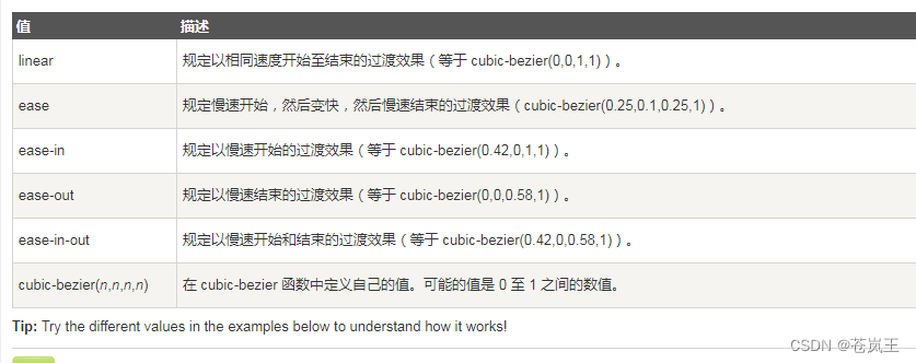
transition你可以理解是cs的过渡效果,后面的参数分别是,你要过渡的样式,时间,和效果
最后控制高度,配合就能有效果了,
这里也可以使用jq,jq有一个下拉的事件slidedown和slideup或者直接slidetoggle(切换),他是带效果的,如果jq想写横向的可以用动画,animate
希望有帮助到你


 扫一扫
扫一扫


 393
393

 被折叠的 条评论
为什么被折叠?
被折叠的 条评论
为什么被折叠?
 到【灌水乐园】发言


