


 博客围绕灰度图像直方图展开,先介绍了直方图的定义,它是对数据分布的图形表示。接着说明使用skimage的imread函数导入图片并转为灰度图,最后分别阐述了使用plt和np绘制灰度图像直方图的方法,包括相关函数的使用及参数设置。
直方图
定义:直方图(英语:Histogram)是一种对数据分布情况的图形表示,是一种二维统计图表,它的两个坐标分别是统计样本和该样本对应的某个属性的度量,以长条图(bar)的形式具体表现。因为直方图的长度及宽度很适合用来表现数量上的变化,所以较容易解读差异小的数值
导入图片
可以使用cv2中的imread函数进行导入,本文使用skimage的imread函数进行图片导入
from skimage import io

img = io.imread('.png', as_gray=True)
io.imshow(img)
io.show()
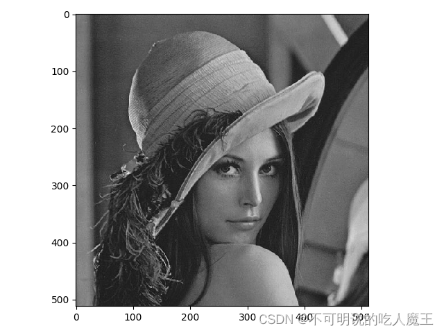
第二句代码中使用到了as_gray=True,使得导入的图片转变为灰色图片。以下图为例:

转变后变成:
使用plt绘制灰度图像的直方图
图像在计算机中以矩阵的形式存储,这里给出使用matplotlib进行直方图绘制的一种方法:
from matplotlib import pyplot as plt
from skimage import io

img = io.imread('.png', as_gray=True)
# io.imshow(img)
# io.show()


plt.figure()
plt.hist(img.flatten(), 256, color='gray', alpha=0.7)
plt.xlabel('X axis')
plt.ylabel('Y axis')
plt.title('histogram of image')
plt.show()
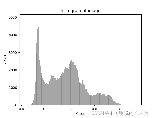
使用plt.hist()函数进行直方图的绘制,img.flatten()将图片转为一维数组格式,256指生成的直方图中X轴有256份,颜色设置为灰色,透明度设置为0.7
最终绘制结果如下:

使用np绘制灰度图像的直方图
import numpy as np
from matplotlib import pyplot as plt
from skimage import io

img = io.imread('.png', as_gray=True)

hist, bin_edges = np.histogram(img.flatten(), bins=256)

plt.figure()
plt.bar(bin_edges[:-1], hist, width=0.004, color='gray', alpha=0.7)
plt.xlabel('X axis')
plt.ylabel('Y axis')
plt.title('histogram of image')
plt.show()
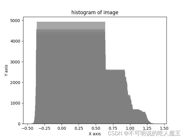
这里仍然要用到plt,不过不能使用plt.plot(),而要用绘制柱状图的plt.bar()。注意np.histogram()的使用,该函数会生成两个数组,代表每个像素的个数(y轴)与像素划分(x轴)分别赋给hist与bin_edges
plt.bar(bin_edges[:-1], hist, width=0.004, color='gray', alpha=0.7)
宽度width不能设置为1,否则绘制出的直方图会有重合,会画出这样的图:
建议设置为1/bins的值,最终得出的图片更加连贯:


 4844
4844

 被折叠的 条评论
为什么被折叠?
被折叠的 条评论
为什么被折叠?
 到【灌水乐园】发言


